Thomas Paquette has long been one of my favorite contemporary painters. Since I discovered his work and wrote about him back in 2007, I’ve featured him on Lines and Colors five additional times (see links below); this post makes seven overall.
Paquette has a unique style I find particularly appealing. On one level, his work appears naturalistic, beautifully composed scenes of woodlands, lakes and roadways and wilderness areas, that seem to sparkle and glow with color. On closer inspection, you can see that he is accomplishing this with ingenious juxtapositions of colors, often complimentary, at the edges of forms. These accentuate the forms, send the colors vibrating and give everything a scintillating glow. Somehow, Paquette manages to corral these elements into harmonious compositions filled with brilliant light and deep shadow.
Paquette works both at a large scale in oil, and at an intimate scale in gouache.
Both will be on display in an upcoming show titled Haven at the new location of the Gross McCleaf Gallery, which has recently relocated from Center City to the Manayunk section of Philadelphia.
The show opens this Saturday, May 3rd, 2025, with a reception from 1:00 to 4:00 pm. I have long considered the Gross McCleaf to be the most prestigious, and certainly most interesting, gallery in the city.
Paquette has also just released a new book reproducing his recent small gouache paintings, titled The Intimate Landscape. I have Paquette’s earlier book titled Gouaches (which is still available), and as a gouache painter myself, I have enjoyed it many times over. I’m very much looking forward to the new one.
If you like the sample images above (all of which were drawn from the gallery’s preview of the show), I can’t recommend the show (and the books) highly enough.
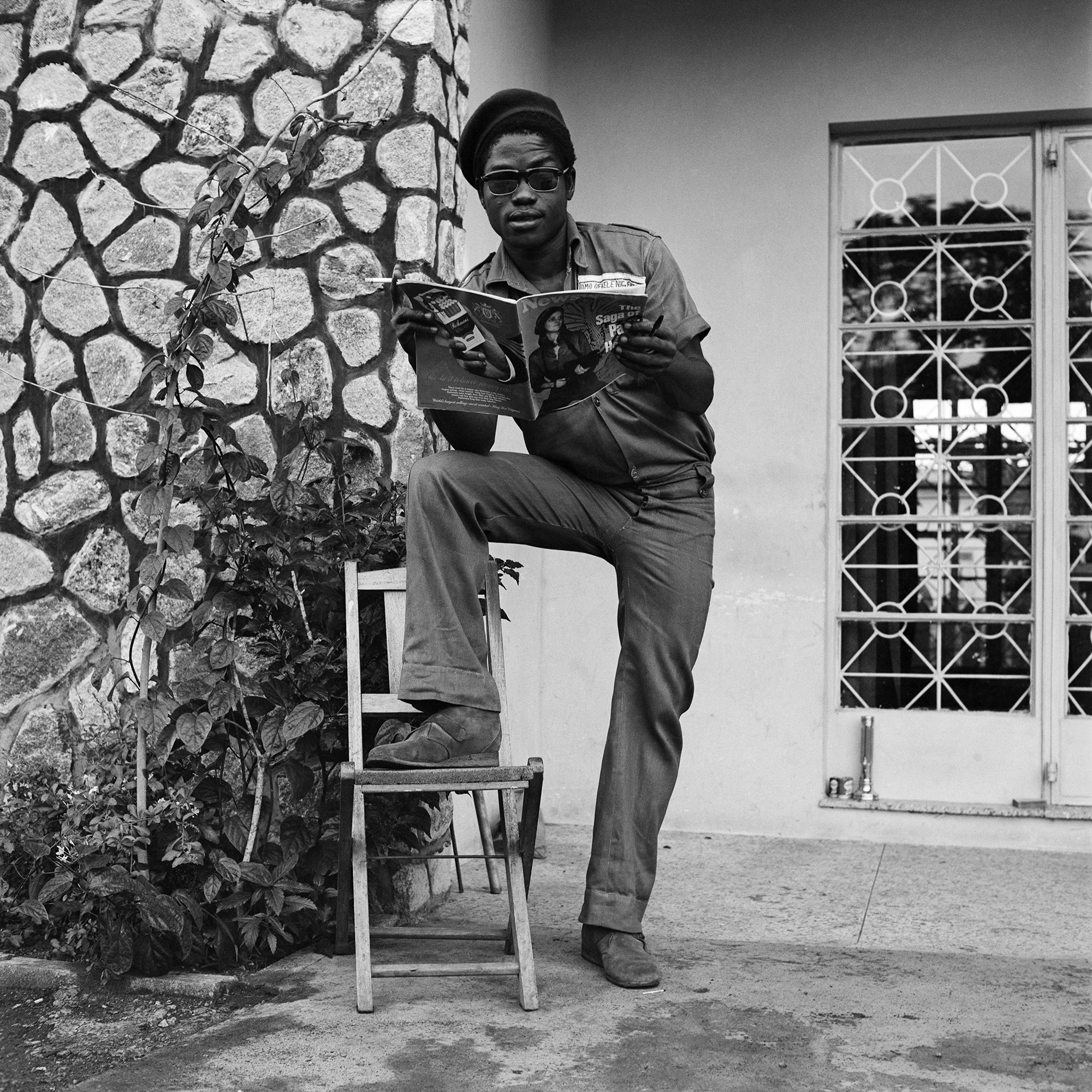
During a trip to Lagos in 2015, Karl Ohiri noticed something alarming. The British-Nigerian artist observed how long-running photography studios in the city were destroying their archives—sometimes incidentally, sometimes purposely—as they shuttered or moved out of the city into quieter village settings. And as a generation of photographers shifted to digital methods, film began to literally disappear.
Ohiri was moved to remedy this phenomenon, so he struck up relationships with local photographers and began acquiring endangered negatives “in an attempt to ensure that this precious cultural heritage was not lost over time,” he says in a statement. The Lagos Studio Archives project was born.
“The initiative’s main aims are to collect, preserve, and present the imagery of a generation of photographers that captured the style, humour, and aspirations of everyday Lagosians,” a statement says. Its mission revolves around spotlighting otherwise hidden narratives in one of Africa’s biggest hubs, “whilst further expanding dialogues around West African photography, culture, and the legacies of the diaspora.”
Ohiri, along with his partner, Finnish-British artist Riikka Kassinen, conceive of Lagos Studio Archives as a means of preserving and showcasing the wealth of history, culture, style, and daily life in Nigeria’s former capital. Formally organized in 2016, the archive has developed and exhibited images internationally at venues like the Museum of Modern Art in New York and South London Gallery
“The project was initiated out of a growing concern that on a long enough timeline, a void would be created where large sections of Lagosian history would be lost and unable to be retrieved,” Ohiri and Kassinen say. “This vacuum could lead to gaps in representation within mainstream Nigerian culture that could have serious repercussions for present and future generations of Nigerians trying to gain a deeper understanding of their heritage and culture.”
To date, the archive houses negatives saved from more than twenty studios, consisting of thousands of images. “Through conversations with photographers from the analogue era, the project has engaged in dialogues that explore the importance of preserving photographic archives as an integral part of shaping collective identity,” the artists say.
Anonymous, “Untitled, Lagos” from the series ‘Archive of Becoming’ (c. 1990s)
Currently based in Helsinki, Ohiri and Kassinen’s individual practices explore relationships between lived experiences within contemporary society and socially engaged dialogues around heritage and culture. As the pair develop images in the collection, distinct series and themes organically emerge.
The color images shown here are part of an initiative titled Archive of Becoming, which focuses on deteriorated negatives, primarily of studio portraits. As a result of humidity, mold, heat, and other elements, the photos develop with psychedelic colors, dissolved emulsion, and blank areas.
Karl Ohiri / Riikka Kassinen, “John Abe
and Funmilayo Abe, Alagbado, Lagos” (2024)
“By resurrecting these images from negatives and displaying them in their new context, the works speak of the sad state of some of the negatives,” the duo says. “However, it also talks about a certain beauty that can be found in decay that expresses the passing of time and the unpredictable life of images.”
Another body of work focuses on a husband-and-wife team who ran Abi Morocco Photos, which operated between the 1970s and 2006. The studio captured a wide array of fashionable portraits in black-and-white that celebrate myriad nearly-lost visual narratives of Lagos around the turn of the 21st century.
Ohiri and Kassinen describe the archive as an intersection between an artist-run project and a social entity, centered around the “idea of collective responsibility in preserving heritage and culture as a form of activism that starts with the individual.” Explore much more on Instagram, where you can follow updates about exhibitions, newly developed photos, and a forthcoming book focused on the work of Abi Morocco Photos. (via WePresent)
Most of you know that we can blend colored pencils with solvents or the colorless blender. In this article I’d like to share some other blending techniques that don’t require blending with Gamsol. While these blending techniques may not be brand new, I discovered these methods by experimenting with my colored pencil drawing.
Because blending with solvents may look harsh on drawing paper, not every drawing is a good candidate for it. I think solvents help a lot when you draw on the textured surface, or the size of your drawing paper is very large, and you want to cover and build the tones in the background. Not every artist likes blending with the solvents. So here is the alternative to that.
Colored pencil blending without the use of solvents
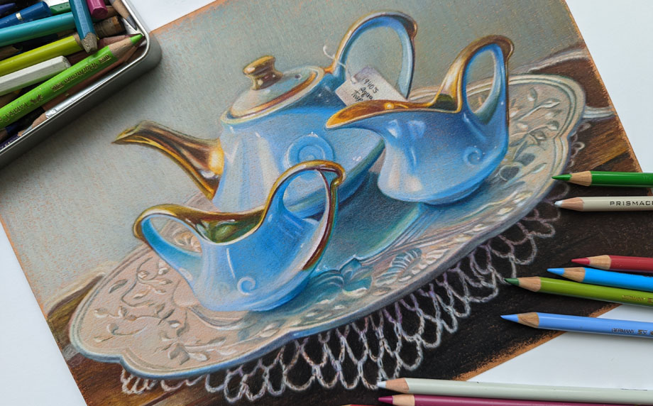
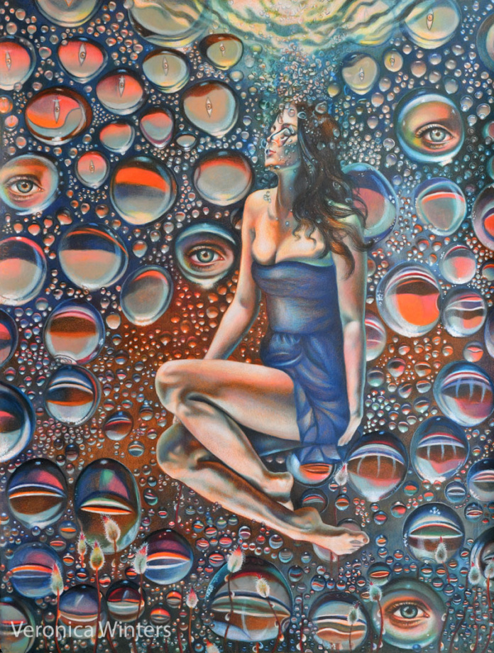
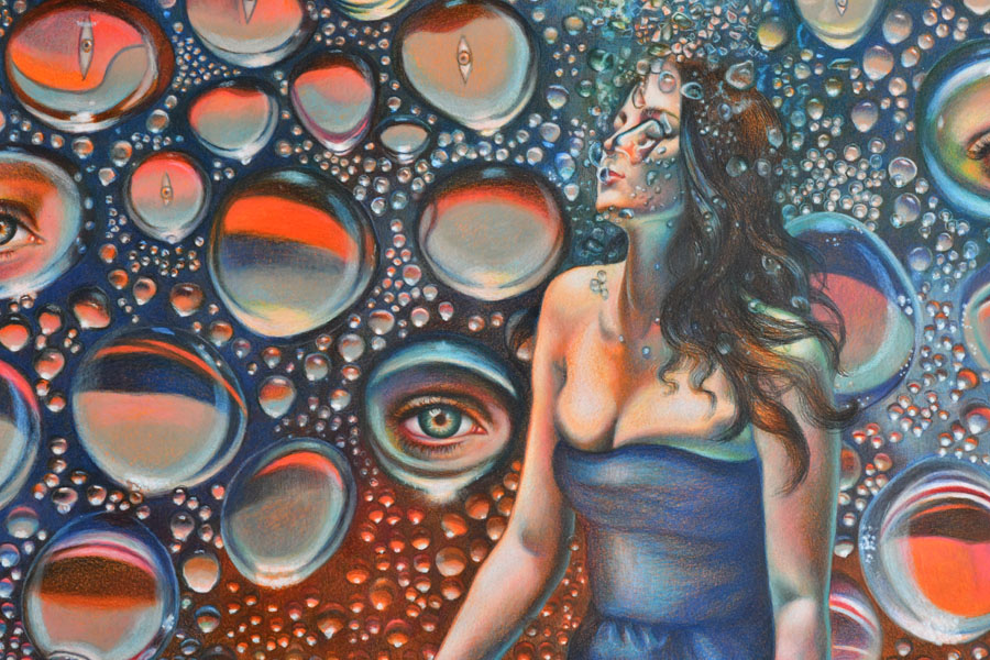
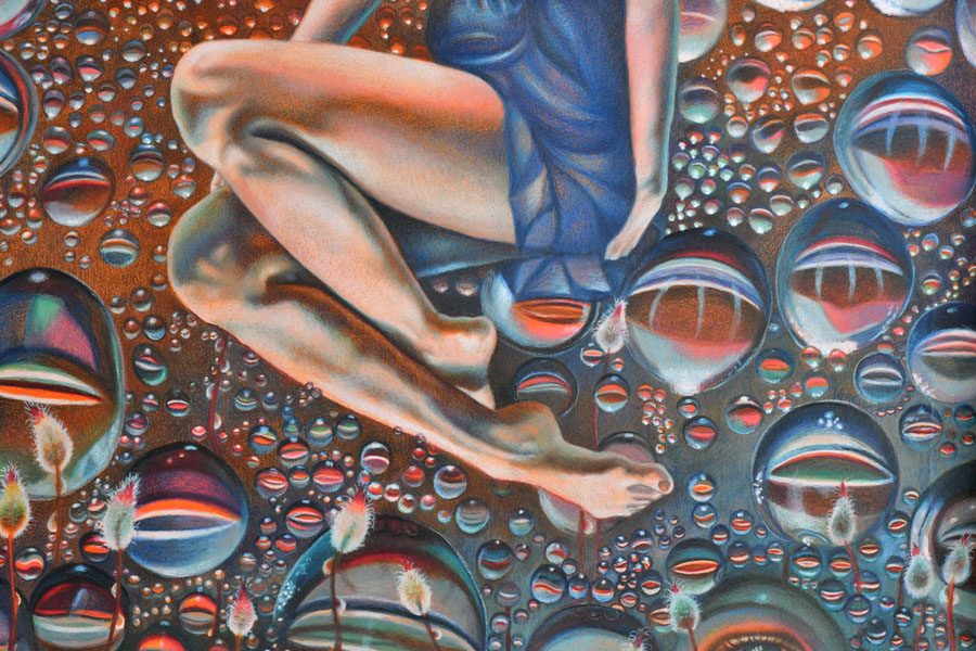
In this drawing titled “Plunge” 19×25″, I used both blending techniques discussed below.
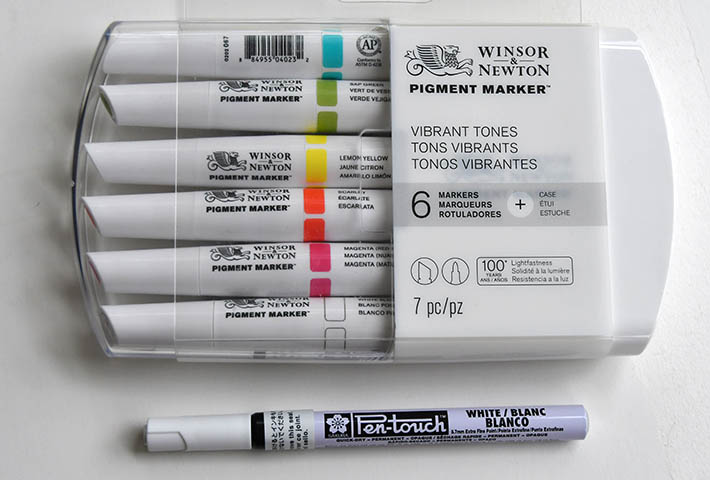
Finesse Colored Pencil blender pen is formulated to blend wax-based colored pencils like Prismacolor Premier and Caran d’Ache Luminance. It won’t do much blending for harder pencils like Polychromos but you’ll still see some blending occurring because all colored pencils have some wax in them.
This pen is very convenient because it has two tips, and you can’t spill it like solvents. It’s also non-toxic and easy to carry around or store in a colored pencil box.
I find that it dries out quite quickly, however.
I blend large areas in the background using Finesse. I continue drawing over the blended areas after that to make the colors even more vibrant.
Winsor & Newton Pigment marker, white blender is a very soft white. It’s not suitable to make strong, white highlights, but what I discovered working with it is more useful. Once I’ve done some colored pencil shading, I can blend everything with this marker. It does give some white tint to the surface, but it also blends colored pencil well. So I use it when I want to both blend and lighten up the area. I think it could be replaced with a different brand to have the same effect, but you need to always TEST your art materials on a separate piece of paper.
Although I’m not a fan of these markers, a similar alcohol markers will do the same job. They can blend colored pencils. You can also underpaint the surfaces with such markers. Pay attention to the lightfastness of markers. Don’t buy fugitive colors because they’ll fade quickly off of your paper!
This video shows my colored pencil drawing process, combining various markers with colored pencils.Winsor & Newton permanent markers and sakura pen | You can buy the W&N white blender separately. Also, you can try using the Sakura pen gives very strong white highlights. I don’t like it much because the highlights look too strong and different from the colored pencils themselves, but the Sakura pen might work well in some cases depending on the art style and drawing subject.I use a W&N white pigment marker to blend and lighten up the entire area seen at the bottom right. I also blend some of the bubbles here.
Always test your ideas on a separate piece of paper before committing to actual drawing! It’s very frustrating to ruin your colored pencil drawing testing something new right on it.
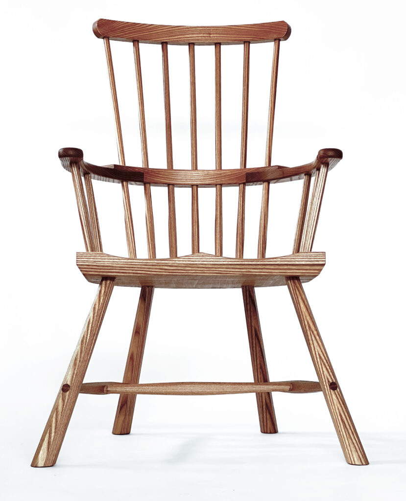
One of the gratifying things about teaching others to build stick chairs are the woodworkers who embrace the craft and grow to work at the same level (or even higher) than the teacher.
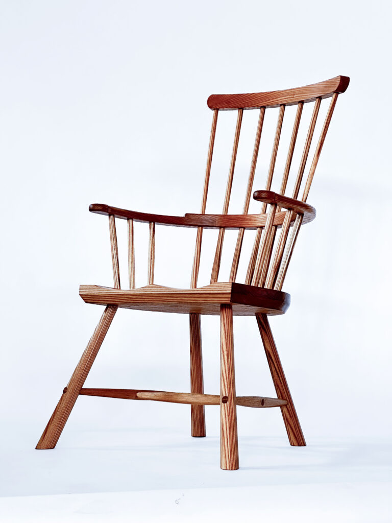
One of those woodworkers is Claire Butler, who lives outside Seattle, Wash. Claire has assisted me in teaching two chair classes during the last year and is now making stuff for sale while working a day job.
Earlier this year, Claire built this chair using some gorgeous red elm while assisting me with a class. The chair came out beautifully, it’s as good as my work. And so I offered to sell it on her behalf to help nudge her into the world of full-time furniture making.
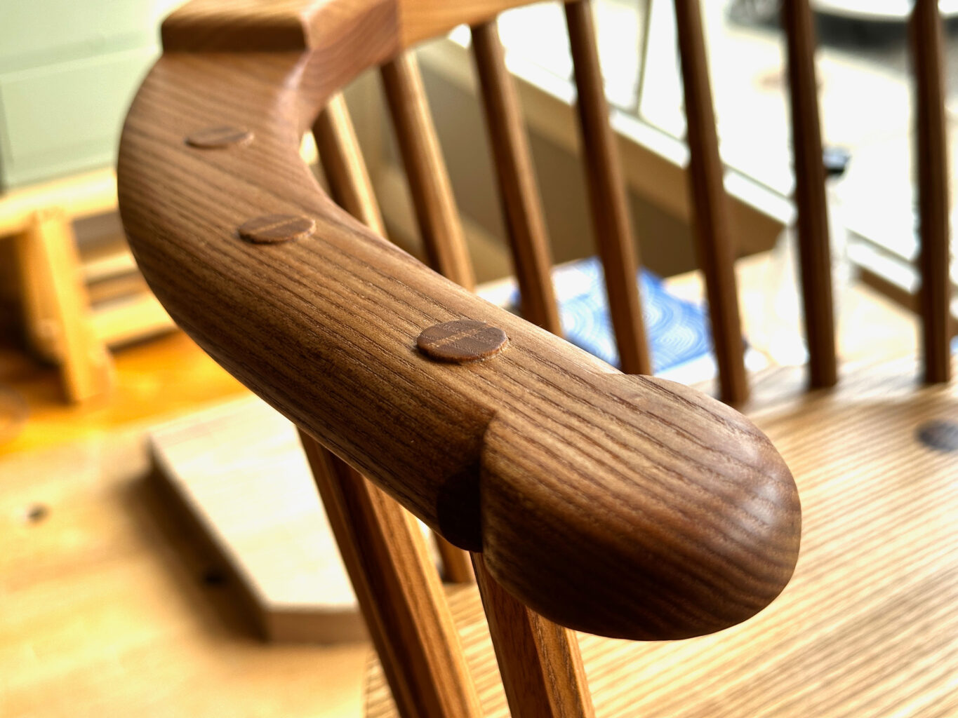
Detail of the hand.
The chair is gently raked back 14° for lounging, reading or sitting by the fire. The chair features heavily shaped arms, tapered octagonal stretchers and slightly proud and burnished tenons throughout.
The chair is made from red elm with hickory wedges, a perfect combination for chairmaking. The wood is strong, lightweight and has a difficult interlocked grain that prevents the parts from splitting. The chair’s sticks are shaved and left octagonal. All the tenons are cut slightly proud and burnished. All the chair’s joints are assembled with animal glue, which is reversible, and wedged.
The seat is tilted 5.8°. The seat is 16-3/4” off the floor, making it comfortable for most sitters. The chair is 37-3/4” tall overall.
The chair is finished with a soft wax. It offers a low lustre and looks better the more you use the chair. The finish isn’t terribly durable, but it is easily repaired (just add more soft wax).
How to Buy the Chair
The chair is $1,300. That price includes shipping and crating to anywhere in the lower 48. If you wish to buy the chair, send an email to lapdrawing@lostartpress.com before 3 p.m. (Eastern) on Thursday, May 8. Please use the subject line: “Claire’s Chair.” In the email please include your:
U.S. shipping address
Daytime phone number (this is for the trucking quote only)
If you are the “winner,” the chair will be shipped to your door in a crate built by me and Kale. The price includes the crate and all shipping charges. Alternatively, the chair can be picked up at our storefront. (I’m sorry but the chair cannot be shipped outside the U.S.)
This is an excellent chance to buy a beautiful and comfortable chair made by an up-and-coming woodworker you are going to hear more from, I’m sure.
Participating in renowned art fairs such as ARCO and Art Basel offers unparalleled exposure to a vast audience of collectors, critics, journalists, and fellow artists. These events serve as pivotal platforms for networking and elevating an artist’s profile within the international art community.
ARCO has consistently attracted significant attendance, underscoring its prominence in the art world. In its 44th edition in 2025, the fair welcomed over 95,000 visitors, including approximately 40,000 art professionals from around the globe. The event featured 214 galleries from 36 countries, solidifying its status as a key meeting point for connections and exchanges between Europe and Latin America.
Beyond the numbers, these fairs are magnets for art critics and journalists who generate extensive media coverage, amplifying the reach and impact of the exhibited works. The presence of influential media personnel increases the likelihood of garnering attention in prominent art publications and news outlets.
The Art Fair FOMO Trap
Not attending the bigger art fairs can feel like missing the party—and in many ways, you are. Fairs offer exposure, sales, and networking, so the fear of being left out is real. But this mindset can quickly spiral into a cycle: in order to stay visible, you sign up for one fair after another, including smaller ones, just to keep your résumé active enough to be considered for the next big one. Over time, it becomes hard to step back. Once you’re used to the fair circuit, there’s a fear that not showing up means falling behind, losing relevance, or being forgotten by collectors and institutions.
It becomes easy to confuse visibility with success.
But doing every fair isn’t always the smartest move. Instead of chasing every opportunity, it’s more sustainable—and often more effective—to select the right fairs that match your goals, market, and positioning. Some fairs might align better with your artists’ practice or your gallery’s collector base. Others might drain your resources without meaningful returns.
Consistency also matters.
Showing up strategically and regularly at well-chosen fairs builds recognition and trust, whereas hopping between unrelated events can dilute your brand. And don’t forget to plan ahead: successful participation isn’t just about securing a booth. It’s about having the overhead to cover marketing, staff, shipping, insurance, and those inevitable last-minute costs. Fear Of Missing Out is powerful—but long-term success comes from intentional choices, not reactive ones.
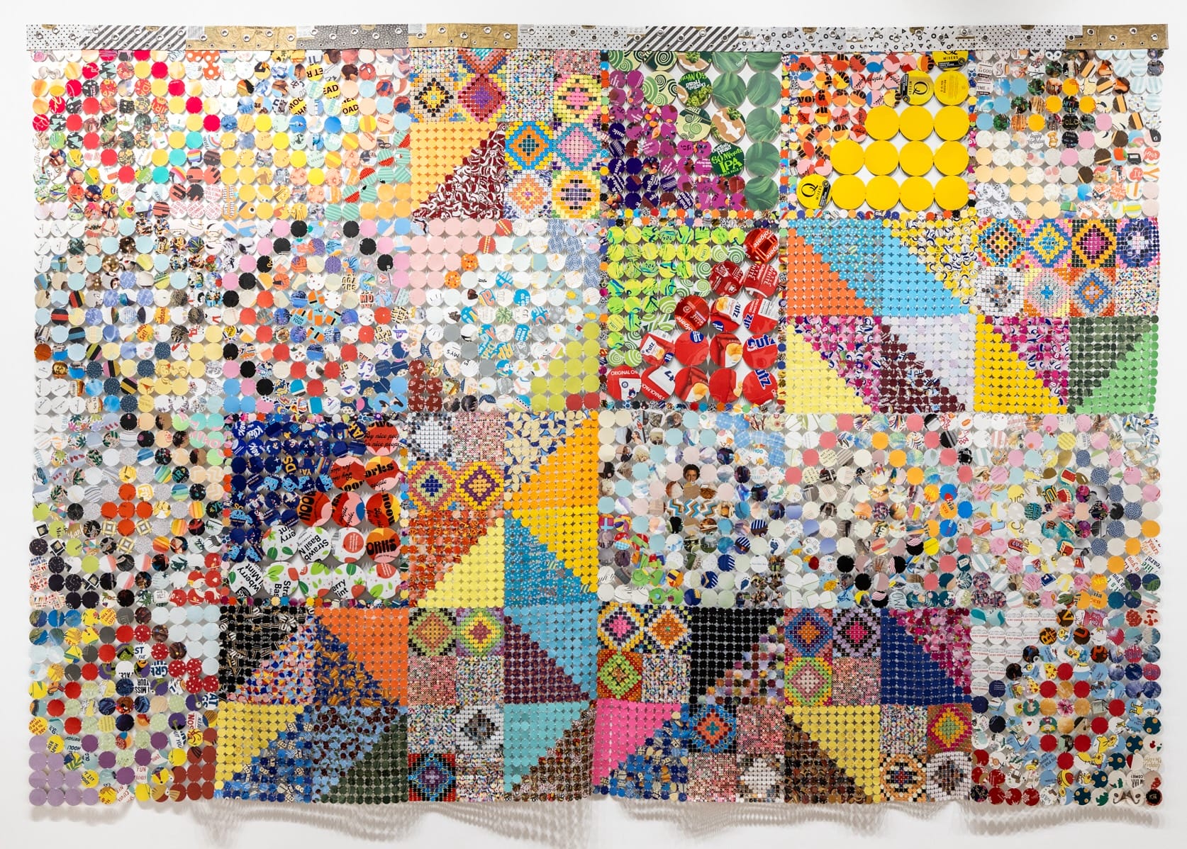
From dozens of Chiquita banana labels to toothpaste packaging to color-coded quality control stickers, Kelly Kozma finds beauty in everyday ephemera. “Piece by piece, she saves any colorful or textured box that she encounters, even though most are expected to be discarded after their original use,” says Paradigm Gallery + Studio, which opens the artist’s solo exhibition Watch Me Backflip this weekend.
Kozma takes an archival and interdisciplinary approach to working with numerous found materials, combining a variety of media into two-dimensional wall works, expansive textile-inspired assemblages, and voluminous suspended installations. “Watch Me Backflip embraces ideas of reusing material, interconnectedness, and the significance of the smallest interaction on a much larger environment,” says an exhibition statement.
Installation view of ‘Watch Me Backflip’ at Paradigm Gallery + Studio
“Iguana & Myrrh” and “Magma & Reef” mark the largest compositions Kozma has created. The former spans 22 feet in circumference and comprises more than 30,000 hand-stitched circles cut from a wide variety of greeting cards, found packaging, and other colorful materials. Committed to a minimal-waste practice, the artist incorporates scraps and loose threads into a number of accompanying works in Watch Me Backflip.
“As she stitches these lovingly collected pieces, Kozma creates connections between the people in her life and the objects she interacts with, inspiring mindfulness against overconsumption and emotional apathy,” the gallery says.
Watch Me Backflip opens today and continues through June 1 in Philadelphia. See more on the artist’s Instagram.
“I See Your Beauty” (2025), process control patches and acrylic on panelInstallation view of ‘Watch Me Backflip’ at Paradigm Gallery + StudioDetail of “Iguana & Myrrh”Installation view of ‘Watch Me Backflip’ at Paradigm Gallery + Studio“Peels So Good” (2025), banana stickers and acrylic on panelDetail of “Iguana & Myrrh”The artist working on the installation of “Magma & Reef”
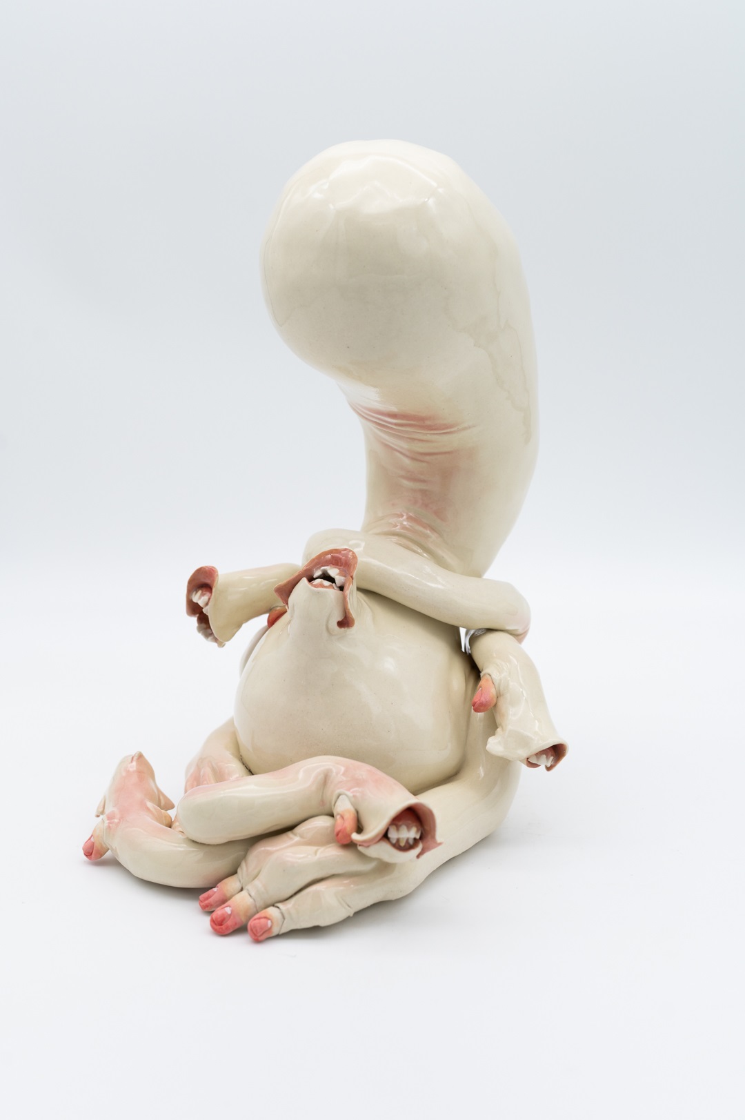
Gabs Conway is a sculptural ceramic artist based in Missoula Montana. Having grown up in Missoula, she was excited to return – as she relentlessly considers it home – after earning her BFA at the University of Wisconsin – Stout. Gabs’ work stems from the playful, mundane experiences of living. She explores relationships, such as that of siblings, friends, and lovers. Interested in creating forms for the reflection of human experience; asking the viewer to consider their appreciation of life, and to humble the adornment of our physicality. Gabs remains curious of the inherent biological responses of living, and what it means to exist together in an ever changing world.
What do you think of other people suggesting about what and how you should be making your work?
Firstly I hate it (laughter) but it’s not your work, it’s mine.
Instead of telling you how to do your work what is a supportive way for people to talk about your work?
I think just saying, This is what I think this is what you are doing well. It would be interesting to see this. But not so much saying, Do this.
How important for you to have a supportive community around you for you as a maker to be confident that you are going in the right direction?
I don’t know if I lean on my community to tell me that I am going in the right direction. I think I am going based on how I am feeling about what I am making.
What do your folks think of this journey you have been on?
My dad was definitely a potter. I know that they are both supportive but I think they both have their moments of wondering exactly what it is I am doing.
Do you believe that teaching workshops is a critical component for your personal growth, to be giving away your knowledge to others?
I think that I love teaching. I love teaching. I think that they are giving me a lot of information as well. Working with kids is absolutely unreal. But I think just having the opportunity to talk to other people and how they can build things is awesome.
What do you like to do in your free time?
I like to garden. And I like to take my dog to the park and I like to go to gymnastics with my dad.
When you begin realistic drawing in colored pencil, the artistic aim is to copy what you see in front of you or your reference. Beginners in colored pencil drawing pay attention to small things like details and textures, and they’re important. However, they become truly important only when the basic drawing is in place. If you begin shading one spot and forget about the rest of your composition, you might end up having a colored pencil drawing that has no consistency or unity in color harmony and composition. In this article, I’d like to share a few strategies I often employ using color harmony to create mood and atmosphere in colored pencil drawing. Let me give you some ideas on how to use color harmony in colored pencil drawing so you can discover your unique approach to drawing.
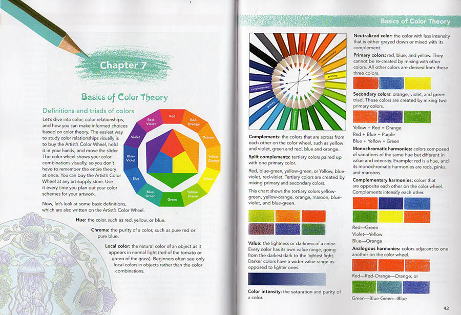
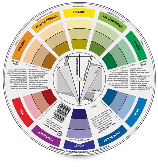
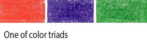
While the color wheel isn’t everything for colorful pencil drawing, you do need to know these basic definitions and color triads.
Definitions:
Hue – means color. Red, green, yellow, etc.
Value – means how light or dark the shading is.
Chroma – is the color’s strength or color intensity. Colors can be super intense or muted.
Value – the lightness or darkness of a color.
Color Intensity – the saturation or purity of a color.
Neutralized color – the color with less intensity that’s either grayed down or mixed with its complement.
Local color – the natural color of an object as it appears in daylight (green of the cucumber or blue of the blueberries). Art students see only local colors in objects rather than the colors of light and reflections.
This is a page from my coloring book titled “How to color like an artist“, in which I explain basic color theory as well. My art instruction book, titled “The Colored Pencil Manual” has the entire chapter devoted to color theory for advanced artists.
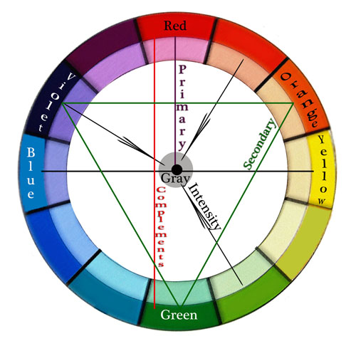
I know it’s difficult to remember all the definitions, and I strongly recommend buying a color wheel because it’s visual. You can rotate the dial to see complementary colors, triads, etc. I still use it every time I design my colored pencil drawings. You can buy it at any art supply store or on Amazon.
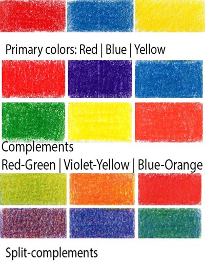
Primary colors are red, blue, and yellow. If you put all three primary colors (making them equal in intensity), your colored pencil drawing will be screaming with too much color.
Secondary colors are orange, violet, and green. They’re mixed with two primary hues.
Complementary colors in colored pencil drawing are opposite each other on the color wheel. Complements intensify each other. You don’t want to have all the complements in one drawing for that reason. Red-Green, Violet-Yellow, Blue-Orange.
Analogous colors in colored pencil drawing are hues adjacent to one another on the color wheel.
Split complementary colors in colored pencil drawing – are the colors on either side of a color’s complement. For instance, if your primary color is blue, your split-complementary colors would be yellow-orange and red-orange. Violet’s complementary color is yellow, and its split-complementary colors are yellow-green and yellow-orange. Blue-purple and red-purple are split complementary colors. Red and green are opposite each other on the color wheel, so red-orange and blue-green are split complementary colors. Split-complementary colors seem to be less color-intense.
Tetradic colors in colored pencil drawing are a color scheme that uses four colors that are equally spaced around the color wheel. The four colors are made up of two sets of complementary colors, which are also known as double complementary colors. To be honest, I don’t think this color scheme is very useful, although you can try it, of course. I think it’s too many bright colors competing for attention unless you use a single dominant color in this color scheme.
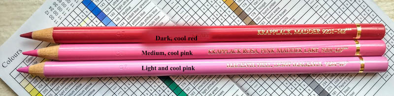
monochromatic color harmonies- colors composed of variations of the same hue but different in color intensity and value. Red is a hue. Its monochromatic variant is pink and maroon.
Color wheel & Color intensity: Color Intensity – the saturation or purity of a color. Neutral colors are mostly browns, but Neutralized color is any color with less intensity that’s either grayed down or mixed with its complement.
Colored pencils don’t mix to grey unlike oil, acrylic and watercolor paint. Therefore you need to use grey colored pencils to neutralize the color so that there are 1-3 dominant colors in the picture, and the rest are neutralized. By using the grey colors you create selective focus as well as beautiful, subtle color variations and texture. In the closeup drawing below you can see grayed down fabric. I shaded with some bright hues first and then added light greys over them.
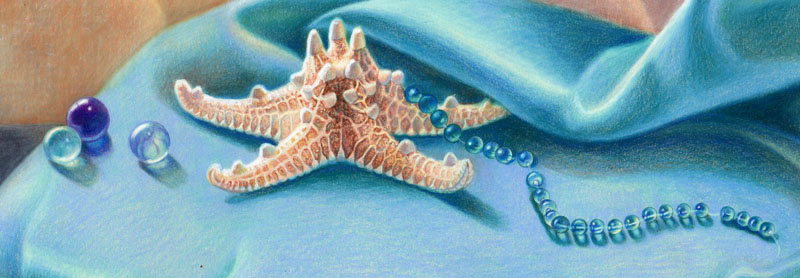
Blue lily dream, 20×30 inches, colored pencil on art board by Veronica Winters
How to use color harmony to create mood and atmosphere in colored pencil drawing
I’d like to share 5 drawing tips on using color harmony to make your colored pencil drawings more realistic.
1. Consider overall color harmony design in your colored pencil drawing
Decide on the overall color theme of your colored pencil drawing. Is it light or dark? Is it monochromatic or in full color? How do you decide? Look at your main reference to see the dominant color. Make that particular color your main focus in colored pencil shading. Everything else should be less color intense to support the dominant color. The color harmony you decide on may not be unique to you, but you make it unique by choosing the unusual point of view, stroke, or subject. Your choice of a dominant color(s) and contrast determines the mood in the drawing. For example, light blues and pinks look serene, while deep reds and blacks make us feel very different.
If you look carefully, the only dominant color here is light blue-turquoise. Everything else is grayed down using colored pencil shading in greys and less bright hues. The overall theme is light. The dominant color is present throughout the composition. It’s reflected in the silver plate. It’s noticeable in the background and crochet.
2. Test your colors to decide on the best color harmony
Once you decide on your leading colors for your drawing, look at your colored pencils to pick the colors from that color family.
Test your colored pencils on your drawing paper to have consistent color harmony and shading. If you see lots of blue in your reference, test all your blues to see which ones look similar to your picture. Start testing these colors right next to your reference, and you’ll notice that some colors are off and don’t look right as your main hue. If you have a big box of colored pencils, you have many similar colors. You don’t need to use them all in one drawing because you can adjust your pencil pressure drawing in one blue to get a range of blue tones that’s similar to several various colored pencils.
If you’re testing dark blue colored pencils based on your reference, do you see that not all of them fit that particular color range? Many blue colored pencils are too light or too greenish to be considered for the dark blue range.
3. Keep it simple to create consistent color harmony
Shade all shadows in one color first. Students love to jump around the picture, using all possible colored pencils to draw the portrait. Instead, pick one color to shade all your shadows first. Colored pencil shading in one color is key to creating volume in portrait drawing.
In this example, you can see that I picked a single purple colored pencil to shade the deepest darks first. When I’m done with basic underpainting in one color, I shade with other colored pencils, layering them one by one.
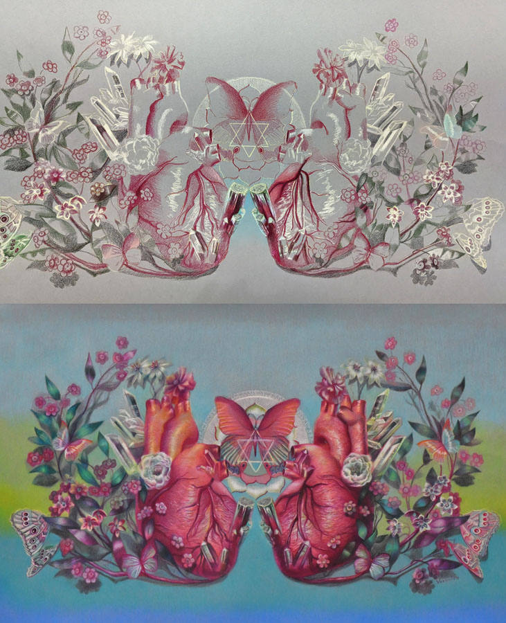
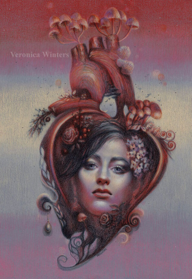
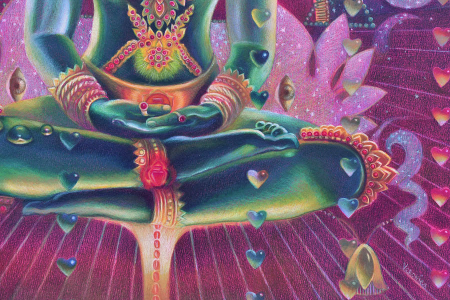
You can make personal colored pencil drawings by focusing on a familiar subject that has unique story line or idea. For example, we all know how the human heart looks like but by designing my own composition and color scheme, I make my colored pencil drawing look different from everyone else’s.
Here you can see that I used one dominant color – red for the shading of the heart and another one – dark green for the leaves. Because I created this colored pencil drawing on a light grey paper I also marked the highlights with white not to lose them by accident.
4. Add more tested colors to develop contrast in your color harmony
Most colors are warm and cool. This includes reds, greens, blues, and even greys. Some are neutral, like browns. You must consider how light or dark they are. You can’t create a very dark shadow using light pink. You can’t shade around the highlight with a dark blue ( because dark blue is too dark for shading in the light).
Build contrast by having a range of tones in your colored pencil drawing going from very light colors to very dark ones. Of course, not all references call for it but keep it as a guideline for your art and colored pencil shading.
Most colors are warm and cool. This includes reds, greens and blues. Some are neutral like browns. You also must consider how light or dark they’re to build contrast in shading.
5. Look at your colored pencil drawing from a distance!
You lose all the details by looking at your art from a distance. You do see the inconsistencies in color, awkward shapes, weak shadows and highlights, or undefined edges.
If you consider all 5 rules, you will be able to draw a photorealistic colored pencil drawing that has unity in color.
On using color harmony to create unique and personal colored pencil drawings
I’d like to share my approach to using color harmony to create unique and personal colored pencil drawings. I think it may be useful for advanced artists interested in colored pencil art.
#1 Start with a good idea
Have a good idea in mind of what colored pencil drawing you want to create. The idea is a visual story in color, subject, or light. It doesn’t have to be the figure. It could be one object displayed in a unique light, rotation, or point of view in the artist’s drawing. This is the artistic vision and interpretation of a “boring” object that becomes fun to look at because of your unique interpretation of it. You can train yourself to see the world more creatively by improving your photography, reading, looking at art masterpieces, and contemporary art.
I have a folder where I save art to learn from done by other artists. I study unique color choices, composition and subject. Sometimes, the subject isn’t new but the approach to drawing it is totally unique.
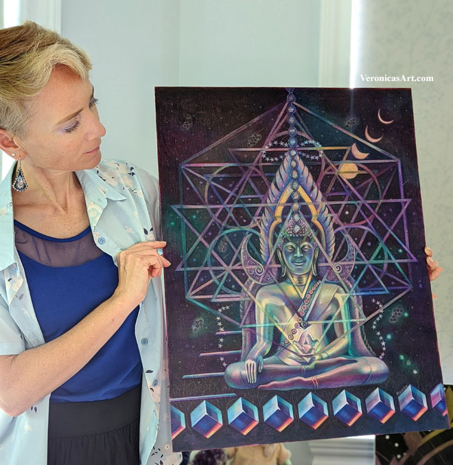
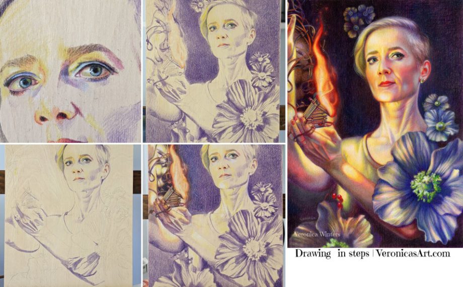
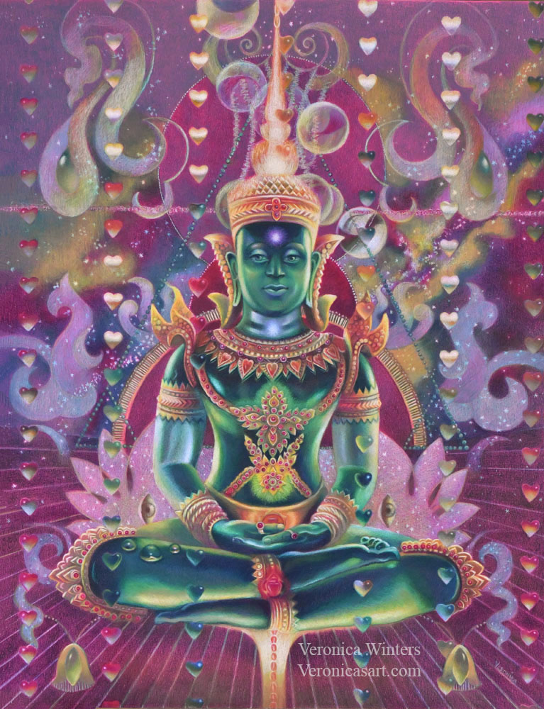
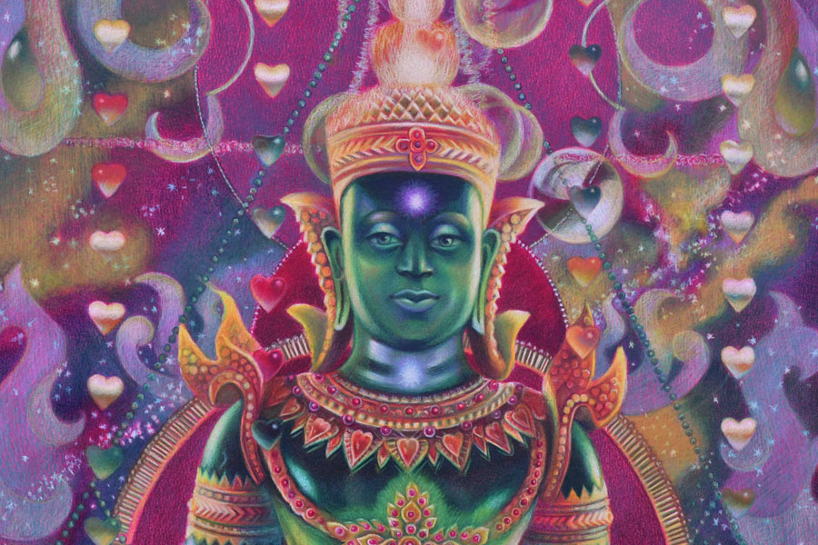
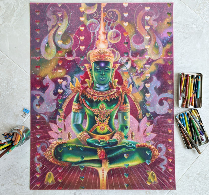
My idea starts from my imagination, reading, travel, emotions and thoughts. One day I imagined a seated figure with light passing through his body. I also imagined a rain of hearts above the figure. I made notes of this idea on my phone…I wanted to depict energy, chakras and the colors of the Universe in this colored pencil drawing of Buddha. I came home and started thinking of my references to illustrate this concept.
#2 Pick high-quality references for realistic colored pencil drawing
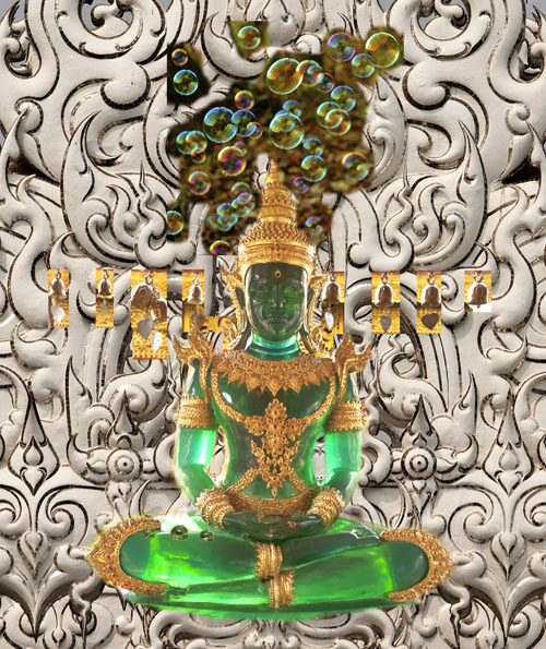
At first I wanted to paint a real person but I had no references of the pose. So I browsed pictures from my Thailand trip folder. I saw so many beautiful Buddhas and palaces there…And this green Buddha was made of semitransparent stone that looked like glass.
You need to pay attention where your references come from. Sometimes you can’t enter competitions drawing from someone else’s photo. Other times, you don’t have an emotional connection to the picture which is not yours. Or you need to get a photo release that takes time and effort. Personally I try to use my references but when it’s impossible to do, I go to Pixabay to find inspiration and you can too! Pictures are of high-quality and free for commercial use. The only problem with them is that they’re Photoshoped heavily. You must see if you have enough information to draw from as most filters remove warm/cool contrast from pictures.
This is my original idea, designed in Photoshop. I used a combination of my pictures to illustrate the visual reference to draw from. As you can see, I made considerable changes to the final drawing.
Picking the right references is not enough. They need to “connect” with each other in light and color temperature.
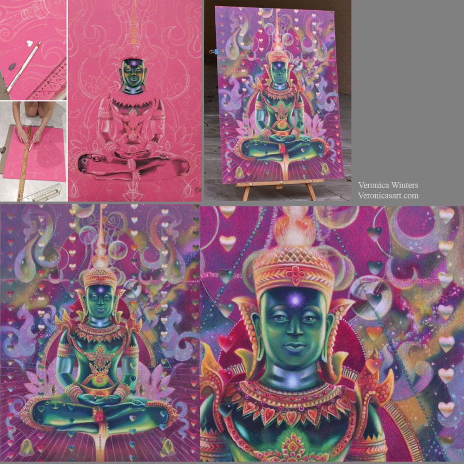
I always design my images around the main subject. I place it first and put smaller shapes around it. In this example, the largest shape is Buddha’s image, and my design revolves around the figure. I used the ruler to make straight lines and place the hearts. I cut a heart-shaped template to have a consistent shape in my colored pencil drawing. I use Photoshop to plan the design as much as possible by layering and moving elements around the main figure to arrive at a perfect composition.
step-by-step drawing on Canson Colorline paper
#3 Decide on your color harmony in colored pencil drawing
This drawing has quite a sophisticated color scheme. My color harmony is a combination of cool red, green, and cool, bluish white.
My tip is to focus on picking 1-2 main colors in your color harmony. It doesn’t mean that you use just two colored pencils for that. It means that you pick the basic scheme, say, ‘yellow-purple’ and design your colored pencil drawing in these colors. The rest of them should be grayed down or become less prominent to support the main hues.
#4 Pick the right toned paper for your specific color harmony
I love drawing on Canson Colorline paper because it comes in a variety of bright colors. The texture is not overwhelming, and colored pencils become very vibrant when drawing on this paper. (I’m linking to this paper on Amazon, but I find that DickBlick Art Materials online store has much better choices. Amazon sells a lot of fake products positioned as real ones. Be careful. Buy your art supplies from established shops. Read one-star reviews to understand if the products are fake or not. I bought several art supplies that were listed with professional images, yet the received supplies were knockoffs from China.
Once you have picked your main color scheme, say ‘yellow-purple’, look at the color of your drawing paper. In general, don’t draw on yellow paper if your main color is ‘yellow’. Don’t draw on a purple drawing paper if your main color is ‘purple’. Pick the opposite color of paper (like green or orange) and test the colored pencils on it. Test a few colored pencils on it to see how vibrant or dull they are. Some colors may disappear on colored paper, and others would be super bright.
#5 Have consistent shading in your colored pencil drawing
Begin shading the shadows first using one color. Don’t jump around the picture with many colors. Pick one color and shade all the darks with it. Mark the highlights with white colored pencil (or reserve the space for your highlights if you draw on white paper). Lastly, shade the middle tones connecting the darks with the lights.
Shade with the softest colored pencils, filling in large areas. If you start working with harder colored pencils like Polychromos, it might be frustrating to fill in a large space. I save a lot of time and hustle for myself by drawing with the softest pencils like Prismacolor Premier and Luminance or Pablos, and then switching to harder pencils like Polychromos to work on the details in my colored pencil drawing.
Have fun creating your super vibrant colored pencil drawings with beautiful and unique color harmonies!
You can learn a lot more about color and color harmonies by taking my video course, where I explain the properties of color and how you can design your images around color. I share my secretfor picking a perfect color scheme for my colored pencil drawings every time.
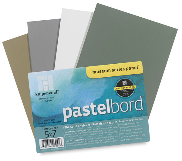
This board could be an alternative to drawing on colored paper, but you must consider the disadvantages of working on it with a colored pencil.
I like to experiment with different surfaces drawing in colored pencil, searching for the most archival support for my art. Since most people find the colored pencil work inferior to oil painting and even pastel painting, finding the right, archival surface takes the fear away from your clients who wish to buy your artwork otherwise.
This slightly sanded, colored pastelbord by Amersand is similar to the 800 grit Uart paper, which is great for soft pastel painting. Just like the Uart paper, the pastelbord has similar advantages and disadvantages to using it in colored pencil drawing.
Advantages:
Ampersand offers a nice variety of colors: sand, dark green, white, gray, and other neutral colors. It takes much less time to shade on a colored surface rather than on white.
Artworks look vividly drawn on this board.
This archival surface is durable. It doesn’t bend or crumble, stays flat at all times.
It offers easy display without a glass. Just make sure you fix your art beforehand with 3 layers of final fixative. Now you have neither glass reflections nor fear of transporting the art!
The Ampersand pastelbords come in standard sizes that make it super easy to frame them!
Disadvantages:
Colored pencil shading on pastelbord is limited. It accepts a few layers of pigment.
It “eats” my colored pencils. If you buy expensive, lightfast pencils, they don’t last long drawing on this surface, and you’d have to replenish them quite often.
It’s best to use harder pencils on these boards. I use Pablo’s to fill in all the details.
The boards cost more than the average drawing paper, of course.
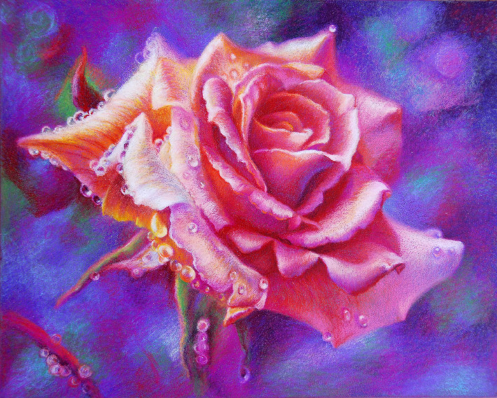
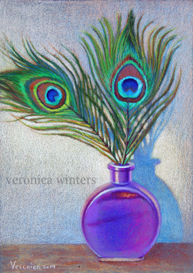
Pink rose, 9×12 inches, lightfast colored pencils on pastelbord, in private collectionPeacock feathers, 5×7 inches, lightfast colored pencils on pastelbord, in private collection
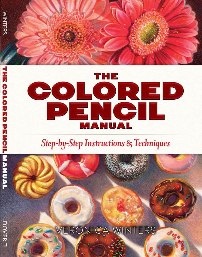
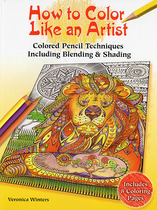
These art instruction books are on sale on Amazon!
Chris Burden’s Metropolis II is an intense kinetic sculpture, modeled…
Perhaps the most dominant art form of the last 100 years, film has an important…
Tuesday Matinees
Enjoy concerts featuring leading international and local ensembles in programs o…
Art & Music,Jazz at LACMA,Latin Sounds
LACMA offers in-person art classes for kids, teens, and adults, offering the cha…
Random International’s Rain Room (2012) is an immersive environment of…
Rain Room
Artist Robert Irwin’s work in the last five decades has investigated perception…
Barbara Kruger’s Untitled (Shafted) features her distinctive use of advertising…
Band (2006) may qualify as Richard Serra’s magnum opus, representing the fullest…
LACMA’s Modern Art collection features primarily European and American art from…
LACMA’s Acquisitions Group and Art Council members share a deep affinity for the…
Art Councils,Acquisition Groups,Art of the Middle East: CONTEMPORARY,Asian Art Council,Costume Council,Decorative Arts and Design Council,LENS: Photography Council,Modern and Contemporary Art Council,Prints and Drawings Council
Welcome to the employment page of the Los Angeles County Museum of Art. To see a…
Jobs,Careers,Internships,Volunteer
Join museum educators, artists, curators, and experts for artist talks, virtual…
Create+Collaborate
In Golden Hour, over 70 artists and three photography collectives offer an aesth…
Established in 1967, the Conservation Center at LACMA supports the museum’s comm…
Upwards of 17 million commercial flights ferry passengers across U.S. airspace each year. (It’s more than twice that, in total, worldwide.) Those hundreds of thousands of vessels share the sky with winged things that have been around way, way longer than airliners, but it’s not always an easy relationship. Through the work of people like Norman Smith at Boston’s primary international terminal, we’re learning more every day about a remarkable species and their evolving ways of life.
“The Snowy Owls of Logan Airport” is a short documentary about Smith’s extraordinary work managing unexpected avian residents. Created by Anna Miller, who also runs The Animalia Podcast, the film highlights the unique migration patterns of the largest owls in North America and why they flock from the Arctic to such an unlikely destination every winter.
Smith has been working with snowy owls at Logan Airport since 1981. “They fly 3,000 miles just to get here,” he says. “We don’t know why they come down to the Boston area. Logan Airport has the highest concentration of snowy owls in the Northeast that we know of.”
The birds’ choice to land at a busy transportation hub might not be as surprising as you’d think at first. It comprises 1,800 acres of open fields, which resemble something like the tundra they call home farther north, full of rats and mice to eat. And on three sides, water provides another ample source of food. It might be loud, but they don’t seem to lose a wink.
Programs like the one at Logan Airport have been in place for decades following tragic incidents in which jet engines ingested birds, causing the planes to crash. One particular event in 1960 in Boston prompted airports around the nation to implement programs that managed bird populations, especially roosting areas, around active airfields. And while shooting avian species has historically been one method of removal, Smith is committed to a much more humane solution: moving them to safety elsewhere.
Snowy owls are considered “vulnerable” to extinction, and their populations are dwindling as the effects of the climate crisis continue to impact habitats in the Arctic. While it’s harder to predict what will happen in the coming years, Smith is dedicated to giving the birds he encounters the best chance of survival.
So far, he has single-handedly relocated more than 900 animals, been instrumental in implementing similar programs across the U.S., and hopes his passion for conservation and the urgent need to save these incredible creatures will influence future generations to do the same. (via Kottke)


![Are Art Fairs Worth It? [Costs/ Sales] 4 Artists & Galleries](https://architectman.ir/wp-content/uploads/2025/05/are-art-fairs-worth-it-thumbnail.jpg)