Gallery Tour—We Live in Painting: The Nature of Color in Mesoamerican Art
jascencio
Mon, 05/05/2025 – 12:53
Join a LACMA for a gallery tour of We Live in Painting: The Nature of Color in Mesoamerican Art.
Mesoamerican artists held a cosmic responsibility: as they adorned the surfaces of buildings, clay vessels, textiles, bark-paper pages, and sculptures with color, they (quite literally) made the world. The power of color emerged from the materiality of its pigments, the skilled hands that crafted it, and the communities whose knowledge imbued it with meaning. Color mapped the very order of the cosmos, of time and space. By engineering and deploying color, artists wielded the power of cosmic creation in their hands. We Live in Painting: The Nature of Color in Mesoamerican Art explores the science, art, and cosmology of color in Mesoamerica. Histories of colonialism and industrialization in the “color-averse” West have minimized the deep significance of color in the Indigenous Americas. This exhibition follows two interconnected lines of inquiry—technical and material analyses, and Indigenous conceptions of art and image—to reach the full richness of color at the core of Mesoamerican worldviews.
Please be aware that these tours are volunteer-led and subject to cancellation. Ask a member of our team on the day for details.
All education and outreach programs at LACMA are underwritten by the LACMA Education Fund and are supported in part by the Judy and Bernard Briskin Family Foundation, The Rosalinde and Arthur Gilbert Foundation, the William Randolph Hearst Endowment Fund for Arts Education, Alfred E. Mann Charities, The Ralph M. Parsons Foundation, Gloria Ricci Lothrop, the Flora L. Thornton Foundation, U.S. Bank, and The Yabuki Family Foundation.
When you begin realistic drawing in colored pencil, the artistic aim is to copy what you see in front of you or your reference. Beginners in colored pencil drawing pay attention to small things like details and textures, and they’re important. However, they become truly important only when the basic drawing is in place. If you begin shading one spot and forget about the rest of your composition, you might end up having a colored pencil drawing that has no consistency or unity in color harmony and composition. In this article, I’d like to share a few strategies I often employ using color harmony to create mood and atmosphere in colored pencil drawing. Let me give you some ideas on how to use color harmony in colored pencil drawing so you can discover your unique approach to drawing.
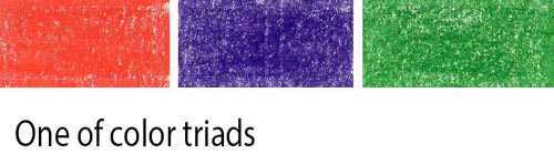
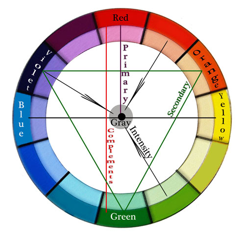
While the color wheel isn’t everything for colorful pencil drawing, you do need to know these basic definitions and color triads.
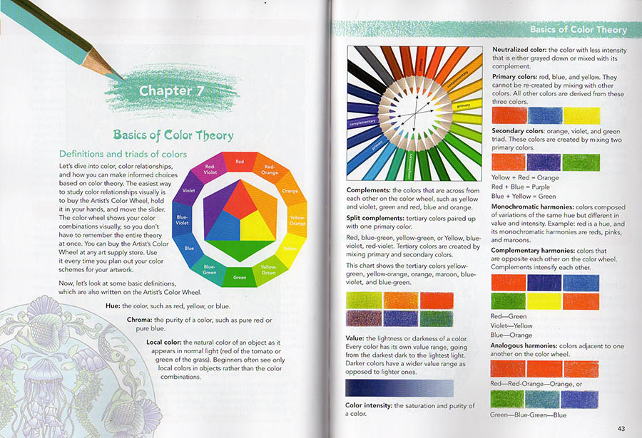
Definitions:
Hue – means color. Red, green, yellow, etc.
Value – means how light or dark the shading is.
Chroma – is the color’s strength or color intensity. Colors can be super intense or muted.
Value – the lightness or darkness of a color.
Color Intensity – the saturation or purity of a color.
Neutralized color – the color with less intensity that’s either grayed down or mixed with its complement.
Local color – the natural color of an object as it appears in daylight (green of the cucumber or blue of the blueberries). Art students see only local colors in objects rather than the colors of light and reflections.
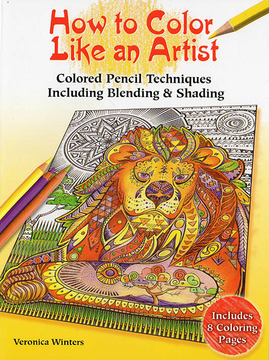
This is a page from my coloring book titled “How to color like an artist“, in which I explain basic color theory as well. My art instruction book, titled “The Colored Pencil Manual” has the entire chapter devoted to color theory for advanced artists.
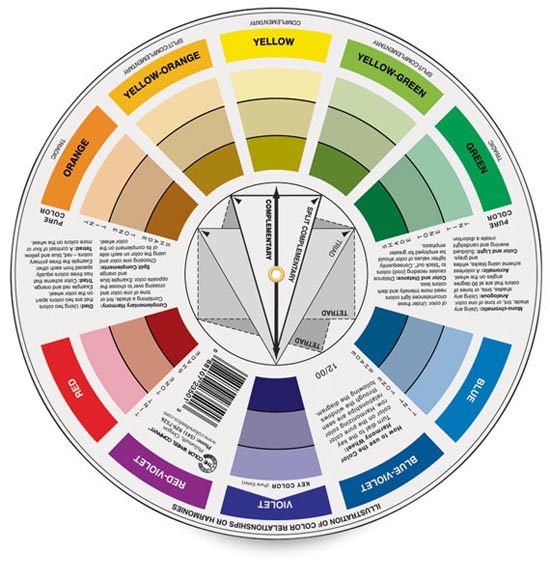
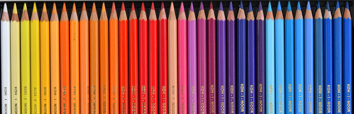
I know it’s difficult to remember all the definitions, and I strongly recommend buying a color wheel because it’s visual. You can rotate the dial to see complementary colors, triads, etc. I still use it every time I design my colored pencil drawings. You can buy it at any art supply store or on Amazon.
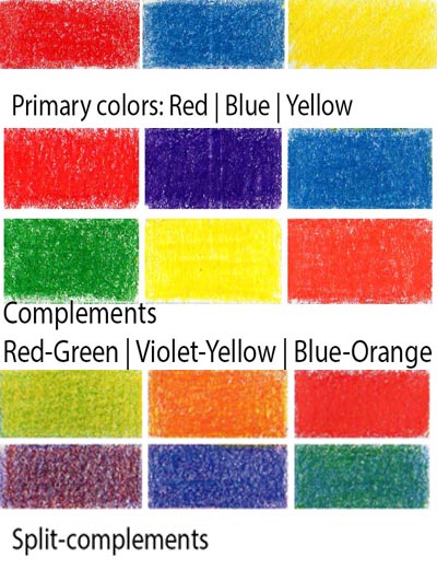
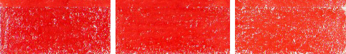
Primary colors are red, blue, and yellow. If you put all three primary colors (making them equal in intensity), your colored pencil drawing will be screaming with too much color.
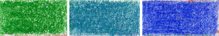
Secondary colors are orange, violet, and green. They’re mixed with two primary hues.
Complementary colors in colored pencil drawing are opposite each other on the color wheel. Complements intensify each other. You don’t want to have all the complements in one drawing for that reason. Red-Green, Violet-Yellow, Blue-Orange.
Analogous colors in colored pencil drawing are hues adjacent to one another on the color wheel.
Split complementary colors in colored pencil drawing – are the colors on either side of a color’s complement. For instance, if your primary color is blue, your split-complementary colors would be yellow-orange and red-orange. Violet’s complementary color is yellow, and its split-complementary colors are yellow-green and yellow-orange. Blue-purple and red-purple are split complementary colors. Red and green are opposite each other on the color wheel, so red-orange and blue-green are split complementary colors. Split-complementary colors seem to be less color-intense.
Tetradic colors in colored pencil drawing are a color scheme that uses four colors that are equally spaced around the color wheel. The four colors are made up of two sets of complementary colors, which are also known as double complementary colors. To be honest, I don’t think this color scheme is very useful, although you can try it, of course. I think it’s too many bright colors competing for attention unless you use a single dominant color in this color scheme.
monochromatic color harmonies- colors composed of variations of the same hue but different in color intensity and value. Red is a hue. Its monochromatic variant is pink and maroon.
Color wheel & Color intensity: Color Intensity – the saturation or purity of a color. Neutral colors are mostly browns, but Neutralized color is any color with less intensity that’s either grayed down or mixed with its complement.
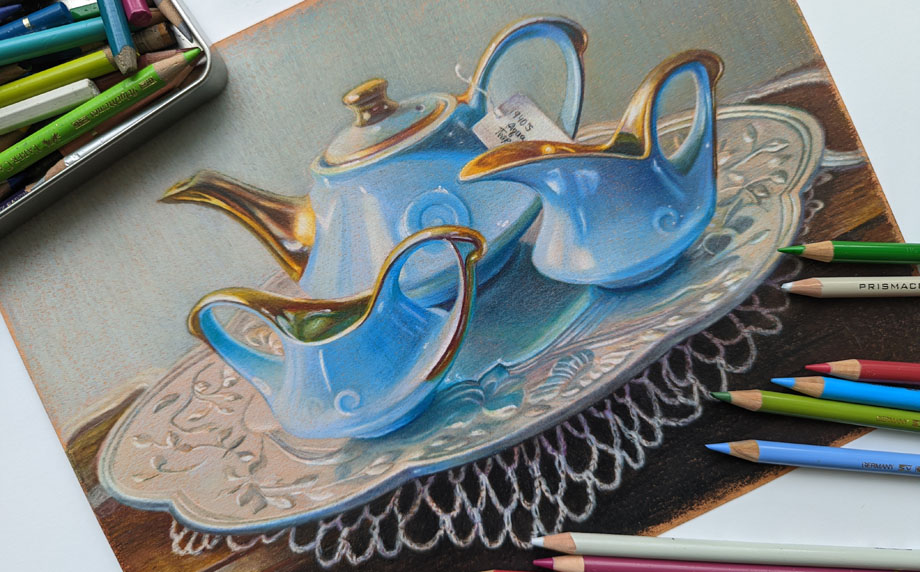
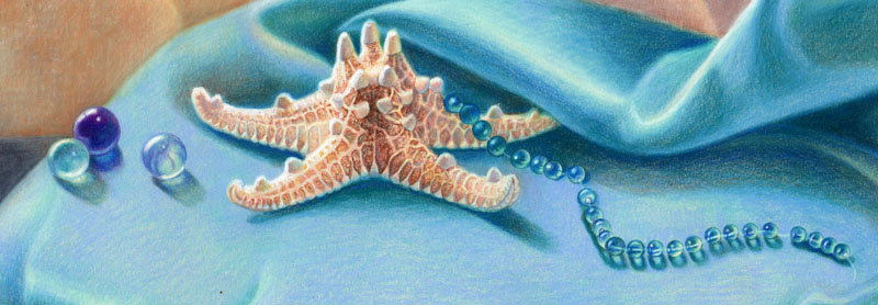
Colored pencils don’t mix to grey unlike oil, acrylic and watercolor paint. Therefore you need to use grey colored pencils to neutralize the color so that there are 1-3 dominant colors in the picture, and the rest are neutralized. By using the grey colors you create selective focus as well as beautiful, subtle color variations and texture. In the closeup drawing below you can see grayed down fabric. I shaded with some bright hues first and then added light greys over them.
Blue lily dream, 20×30 inches, colored pencil on art board by Veronica Winters
How to use color harmony to create mood and atmosphere in colored pencil drawing
I’d like to share 5 drawing tips on using color harmony to make your colored pencil drawings more realistic.
1. Consider overall color harmony design in your colored pencil drawing
Decide on the overall color theme of your colored pencil drawing. Is it light or dark? Is it monochromatic or in full color? How do you decide? Look at your main reference to see the dominant color. Make that particular color your main focus in colored pencil shading. Everything else should be less color intense to support the dominant color. The color harmony you decide on may not be unique to you, but you make it unique by choosing the unusual point of view, stroke, or subject. Your choice of a dominant color(s) and contrast determines the mood in the drawing. For example, light blues and pinks look serene, while deep reds and blacks make us feel very different.
If you look carefully, the only dominant color here is light blue-turquoise. Everything else is grayed down using colored pencil shading in greys and less bright hues. The overall theme is light. The dominant color is present throughout the composition. It’s reflected in the silver plate. It’s noticeable in the background and crochet.
2. Test your colors to decide on the best color harmony
Once you decide on your leading colors for your drawing, look at your colored pencils to pick the colors from that color family.
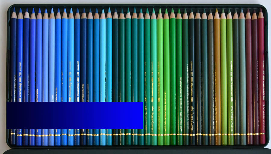
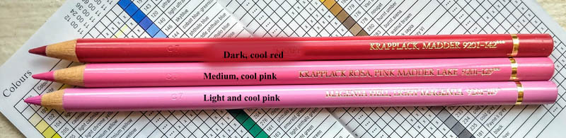
Test your colored pencils on your drawing paper to have consistent color harmony and shading. If you see lots of blue in your reference, test all your blues to see which ones look similar to your picture. Start testing these colors right next to your reference, and you’ll notice that some colors are off and don’t look right as your main hue. If you have a big box of colored pencils, you have many similar colors. You don’t need to use them all in one drawing because you can adjust your pencil pressure drawing in one blue to get a range of blue tones that’s similar to several various colored pencils.
If you’re testing dark blue colored pencils based on your reference, do you see that not all of them fit that particular color range? Many blue colored pencils are too light or too greenish to be considered for the dark blue range.
3. Keep it simple to create consistent color harmony
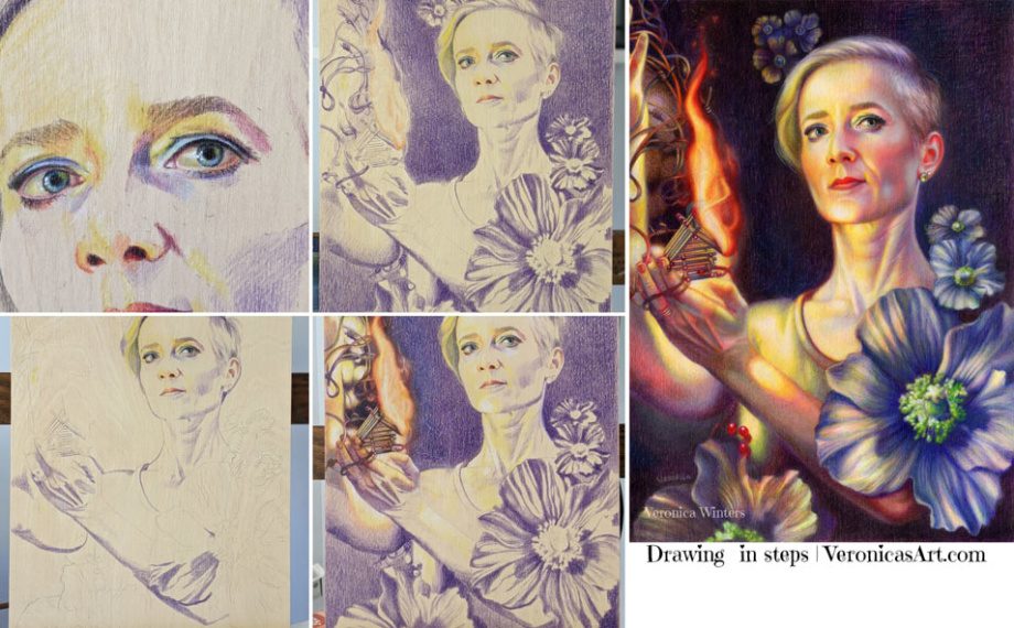
Shade all shadows in one color first. Students love to jump around the picture, using all possible colored pencils to draw the portrait. Instead, pick one color to shade all your shadows first. Colored pencil shading in one color is key to creating volume in portrait drawing.
In this example, you can see that I picked a single purple colored pencil to shade the deepest darks first. When I’m done with basic underpainting in one color, I shade with other colored pencils, layering them one by one.
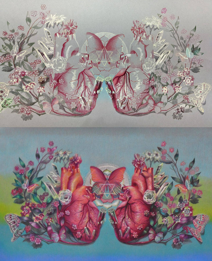
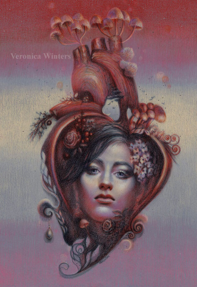
You can make personal colored pencil drawings by focusing on a familiar subject that has unique story line or idea. For example, we all know how the human heart looks like but by designing my own composition and color scheme, I make my colored pencil drawing look different from everyone else’s.
Here you can see that I used one dominant color – red for the shading of the heart and another one – dark green for the leaves. Because I created this colored pencil drawing on a light grey paper I also marked the highlights with white not to lose them by accident.
4. Add more tested colors to develop contrast in your color harmony
Most colors are warm and cool. This includes reds, greens, blues, and even greys. Some are neutral, like browns. You must consider how light or dark they are. You can’t create a very dark shadow using light pink. You can’t shade around the highlight with a dark blue ( because dark blue is too dark for shading in the light).
Build contrast by having a range of tones in your colored pencil drawing going from very light colors to very dark ones. Of course, not all references call for it but keep it as a guideline for your art and colored pencil shading.
Most colors are warm and cool. This includes reds, greens and blues. Some are neutral like browns. You also must consider how light or dark they’re to build contrast in shading.
5. Look at your colored pencil drawing from a distance!
You lose all the details by looking at your art from a distance. You do see the inconsistencies in color, awkward shapes, weak shadows and highlights, or undefined edges.
If you consider all 5 rules, you will be able to draw a photorealistic colored pencil drawing that has unity in color.
On using color harmony to create unique and personal colored pencil drawings
I’d like to share my approach to using color harmony to create unique and personal colored pencil drawings. I think it may be useful for advanced artists interested in colored pencil art.
#1 Start with a good idea
Have a good idea in mind of what colored pencil drawing you want to create. The idea is a visual story in color, subject, or light. It doesn’t have to be the figure. It could be one object displayed in a unique light, rotation, or point of view in the artist’s drawing. This is the artistic vision and interpretation of a “boring” object that becomes fun to look at because of your unique interpretation of it. You can train yourself to see the world more creatively by improving your photography, reading, looking at art masterpieces, and contemporary art.
I have a folder where I save art to learn from done by other artists. I study unique color choices, composition and subject. Sometimes, the subject isn’t new but the approach to drawing it is totally unique.
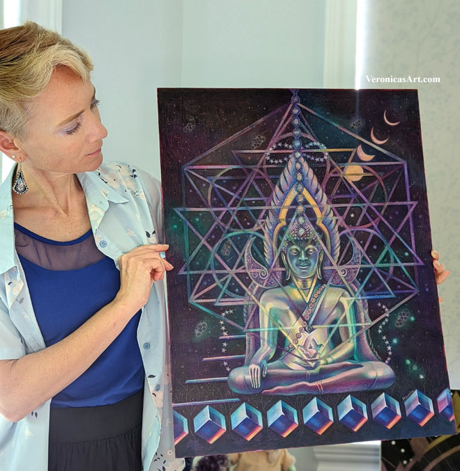
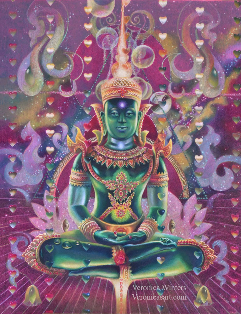
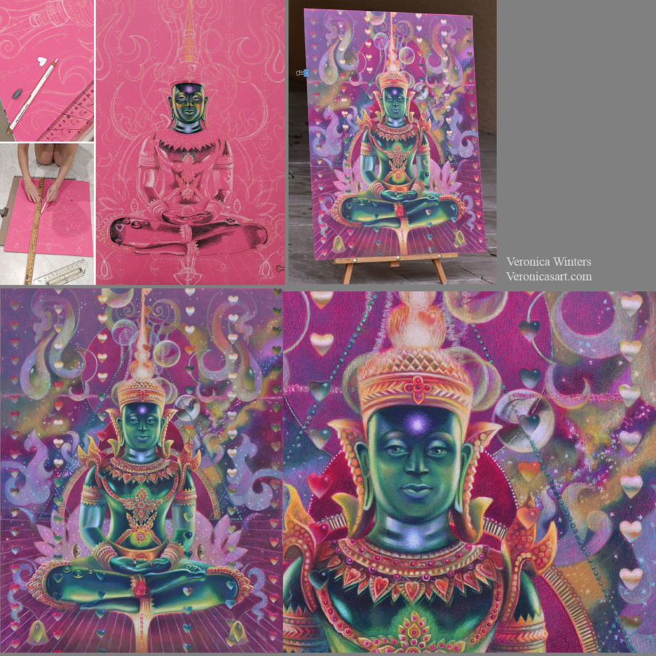
My idea starts from my imagination, reading, travel, emotions and thoughts. One day I imagined a seated figure with light passing through his body. I also imagined a rain of hearts above the figure. I made notes of this idea on my phone…I wanted to depict energy, chakras and the colors of the Universe in this colored pencil drawing of Buddha. I came home and started thinking of my references to illustrate this concept.
#2 Pick high-quality references for realistic colored pencil drawing
At first I wanted to paint a real person but I had no references of the pose. So I browsed pictures from my Thailand trip folder. I saw so many beautiful Buddhas and palaces there…And this green Buddha was made of semitransparent stone that looked like glass.
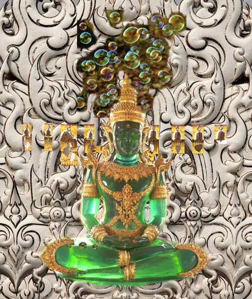
You need to pay attention where your references come from. Sometimes you can’t enter competitions drawing from someone else’s photo. Other times, you don’t have an emotional connection to the picture which is not yours. Or you need to get a photo release that takes time and effort. Personally I try to use my references but when it’s impossible to do, I go to Pixabay to find inspiration and you can too! Pictures are of high-quality and free for commercial use. The only problem with them is that they’re Photoshoped heavily. You must see if you have enough information to draw from as most filters remove warm/cool contrast from pictures.
This is my original idea, designed in Photoshop. I used a combination of my pictures to illustrate the visual reference to draw from. As you can see, I made considerable changes to the final drawing.
Picking the right references is not enough. They need to “connect” with each other in light and color temperature.
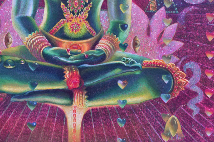
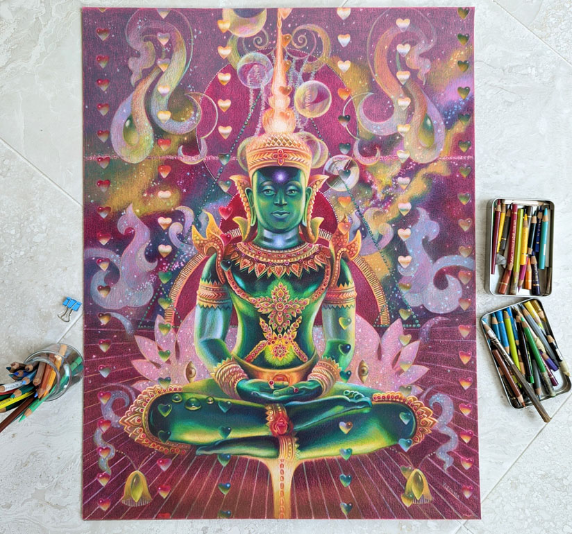
I always design my images around the main subject. I place it first and put smaller shapes around it. In this example, the largest shape is Buddha’s image, and my design revolves around the figure. I used the ruler to make straight lines and place the hearts. I cut a heart-shaped template to have a consistent shape in my colored pencil drawing. I use Photoshop to plan the design as much as possible by layering and moving elements around the main figure to arrive at a perfect composition.
step-by-step drawing on Canson Colorline paper
#3 Decide on your color harmony in colored pencil drawing
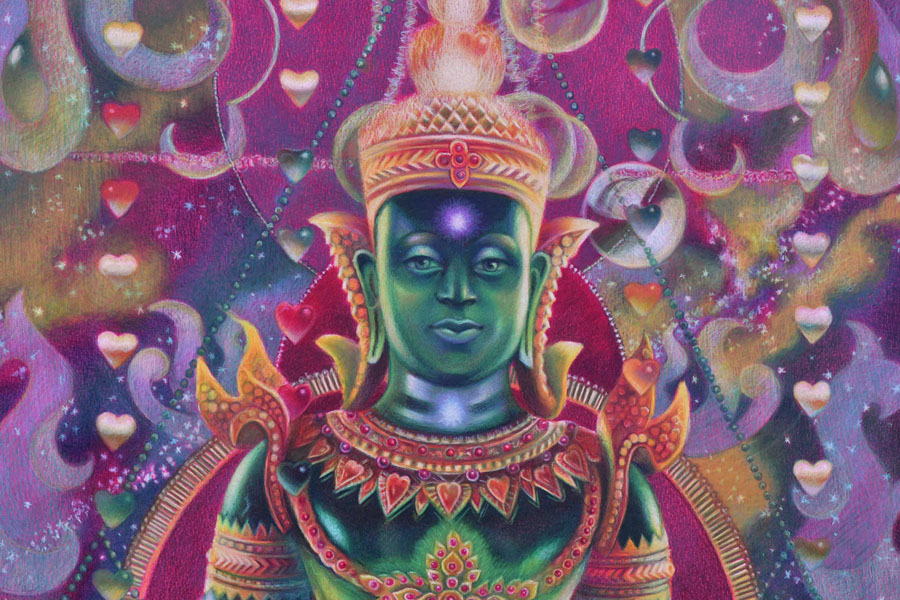
This drawing has quite a sophisticated color scheme. My color harmony is a combination of cool red, green, and cool, bluish white.
My tip is to focus on picking 1-2 main colors in your color harmony. It doesn’t mean that you use just two colored pencils for that. It means that you pick the basic scheme, say, ‘yellow-purple’ and design your colored pencil drawing in these colors. The rest of them should be grayed down or become less prominent to support the main hues.
#4 Pick the right toned paper for your specific color harmony
I love drawing on Canson Colorline paper because it comes in a variety of bright colors. The texture is not overwhelming, and colored pencils become very vibrant when drawing on this paper. (I’m linking to this paper on Amazon, but I find that DickBlick Art Materials online store has much better choices. Amazon sells a lot of fake products positioned as real ones. Be careful. Buy your art supplies from established shops. Read one-star reviews to understand if the products are fake or not. I bought several art supplies that were listed with professional images, yet the received supplies were knockoffs from China.
Once you have picked your main color scheme, say ‘yellow-purple’, look at the color of your drawing paper. In general, don’t draw on yellow paper if your main color is ‘yellow’. Don’t draw on a purple drawing paper if your main color is ‘purple’. Pick the opposite color of paper (like green or orange) and test the colored pencils on it. Test a few colored pencils on it to see how vibrant or dull they are. Some colors may disappear on colored paper, and others would be super bright.
#5 Have consistent shading in your colored pencil drawing
Begin shading the shadows first using one color. Don’t jump around the picture with many colors. Pick one color and shade all the darks with it. Mark the highlights with white colored pencil (or reserve the space for your highlights if you draw on white paper). Lastly, shade the middle tones connecting the darks with the lights.
Shade with the softest colored pencils, filling in large areas. If you start working with harder colored pencils like Polychromos, it might be frustrating to fill in a large space. I save a lot of time and hustle for myself by drawing with the softest pencils like Prismacolor Premier and Luminance or Pablos, and then switching to harder pencils like Polychromos to work on the details in my colored pencil drawing.
Have fun creating your super vibrant colored pencil drawings with beautiful and unique color harmonies!
You can learn a lot more about color and color harmonies by taking my video course, where I explain the properties of color and how you can design your images around color. I share my secretfor picking a perfect color scheme for my colored pencil drawings every time.
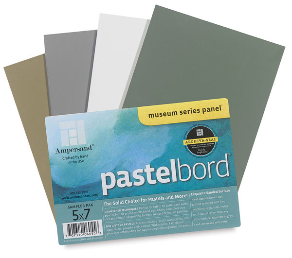
This board could be an alternative to drawing on colored paper, but you must consider the disadvantages of working on it with a colored pencil.
I like to experiment with different surfaces drawing in colored pencil, searching for the most archival support for my art. Since most people find the colored pencil work inferior to oil painting and even pastel painting, finding the right, archival surface takes the fear away from your clients who wish to buy your artwork otherwise.
This slightly sanded, colored pastelbord by Amersand is similar to the 800 grit Uart paper, which is great for soft pastel painting. Just like the Uart paper, the pastelbord has similar advantages and disadvantages to using it in colored pencil drawing.
Advantages:
Ampersand offers a nice variety of colors: sand, dark green, white, gray, and other neutral colors. It takes much less time to shade on a colored surface rather than on white.
Artworks look vividly drawn on this board.
This archival surface is durable. It doesn’t bend or crumble, stays flat at all times.
It offers easy display without a glass. Just make sure you fix your art beforehand with 3 layers of final fixative. Now you have neither glass reflections nor fear of transporting the art!
The Ampersand pastelbords come in standard sizes that make it super easy to frame them!
Disadvantages:
Colored pencil shading on pastelbord is limited. It accepts a few layers of pigment.
It “eats” my colored pencils. If you buy expensive, lightfast pencils, they don’t last long drawing on this surface, and you’d have to replenish them quite often.
It’s best to use harder pencils on these boards. I use Pablo’s to fill in all the details.
The boards cost more than the average drawing paper, of course.
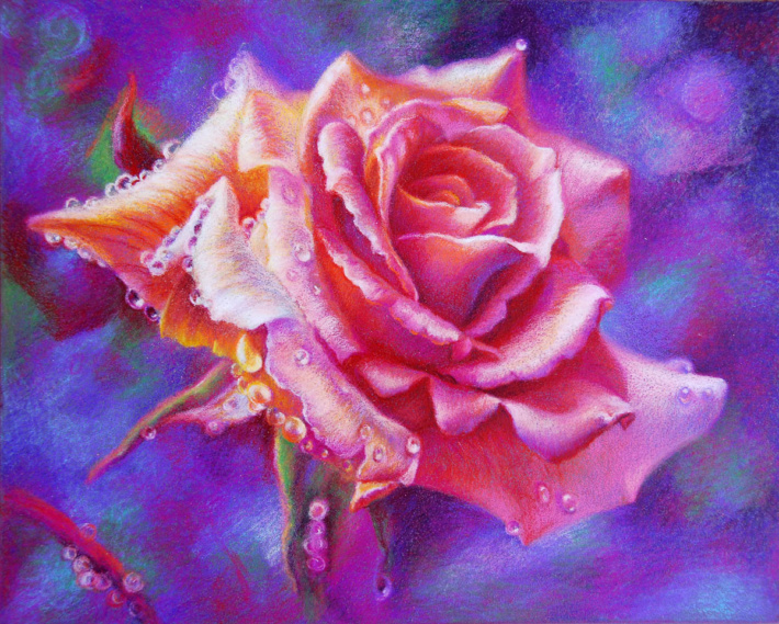
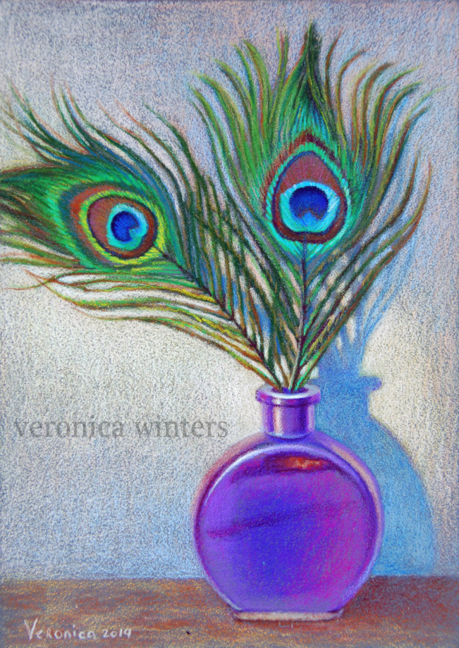
Pink rose, 9×12 inches, lightfast colored pencils on pastelbord, in private collectionPeacock feathers, 5×7 inches, lightfast colored pencils on pastelbord, in private collection
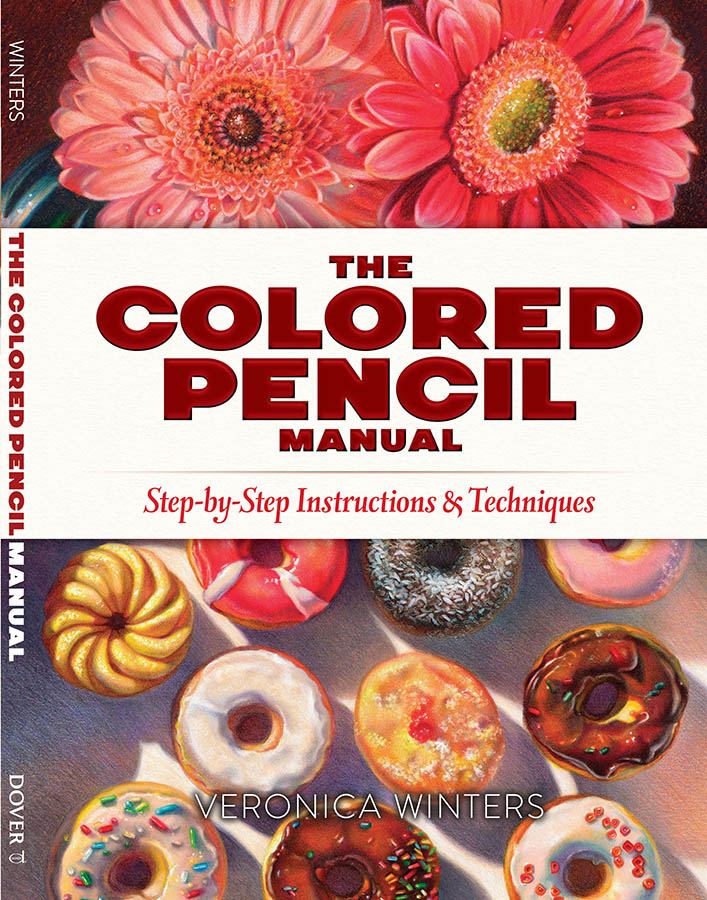
These art instruction books are on sale on Amazon!
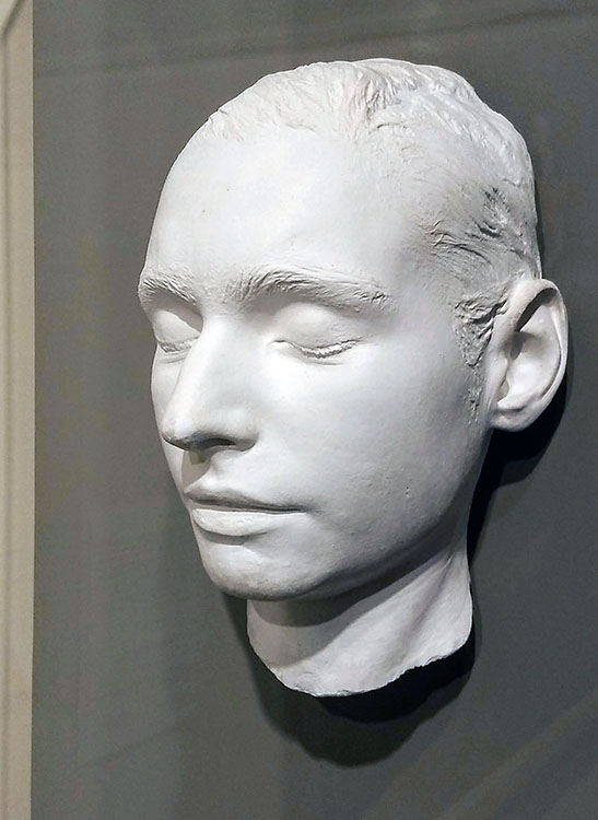
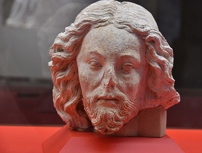
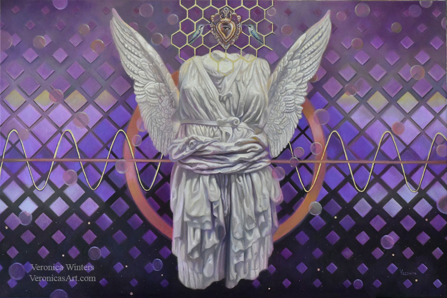
What is the color white? Is it the titanium white in oil painting? Or is it the color of your skin, feather, cream, silk, snow, kitty, pearls, chess, lace, car, flowers, crystals, swans, wall paint, clouds and the moon? Or is it the white of a happy smile, hope, or the light of your soul? Is it the blinding sunlight, the whiteness of an angel’s wings or purity and innocence of a child? It seems that white represents no color. Yet, it means so much to us. The bride’s wedding gown. The white glow of the sublime. The ethereal beauty of a white Greco-Roman marble sculpture. White light. White face. White lilies. White room. White staircase. White dove. White snow. It’s either a clean start or cold emptiness. We see unity in the symbolism of white across many cultures but not all. White can mean either a wedding or a funeral.
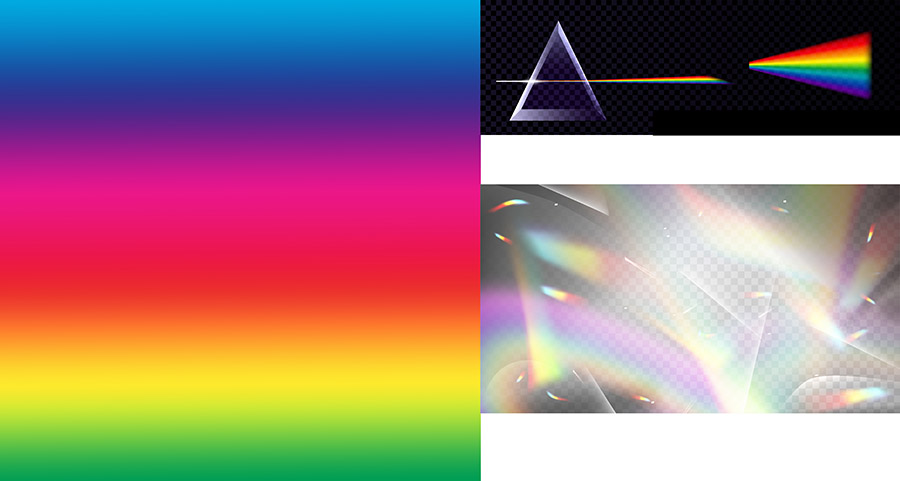
Technically, white isn’t a specific “color” like red or blue. When all the wavelengths of visible light are present and reflected by an object, we perceive it as white. In simpler terms, white is “all colors of the rainbow combined.”
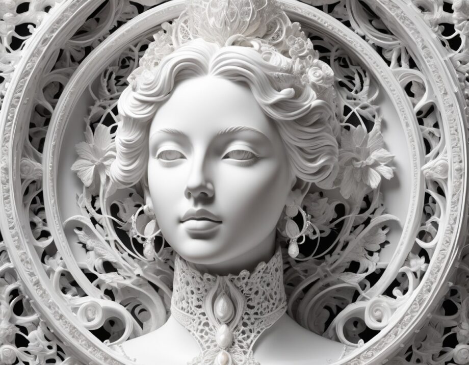
Ai-generated female face in neutral white hue.
What is the color white technically?
The color spectrum & white
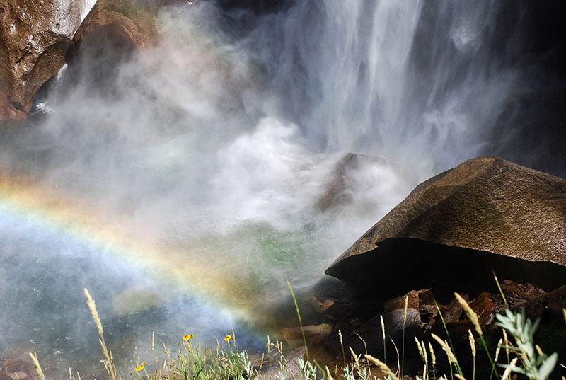
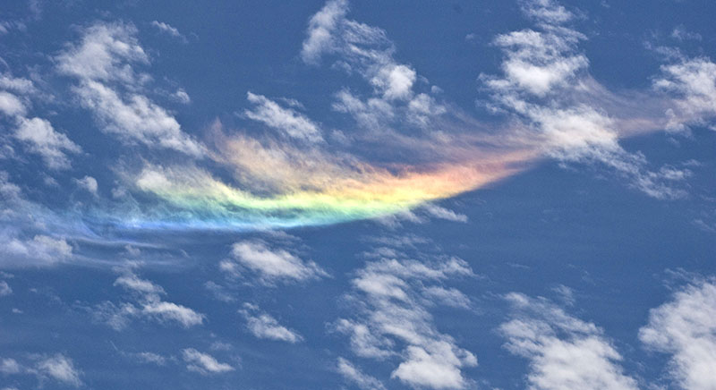
Rainbow. What is the color white? | photo: Veronica WintersColor spectrum | Images https://www.freepik.com/ and https://pixabay.com/
All the colors we see exist on the visible light spectrum, a range of wavelengths our eyes can perceive. Each color corresponds to a specific wavelength of light. White is an achromatic color, which means it lacks a “hue.” White light is “all colors combined.” We perceive black when an object absorbs all wavelengths of light instead of reflecting them. An opposite to white, black is the absence of reflected light.
What is the color white? | photo: Veronica Winters
What is the color white in oil & acrylic painting?
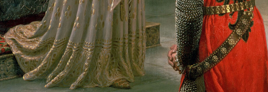
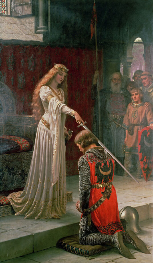
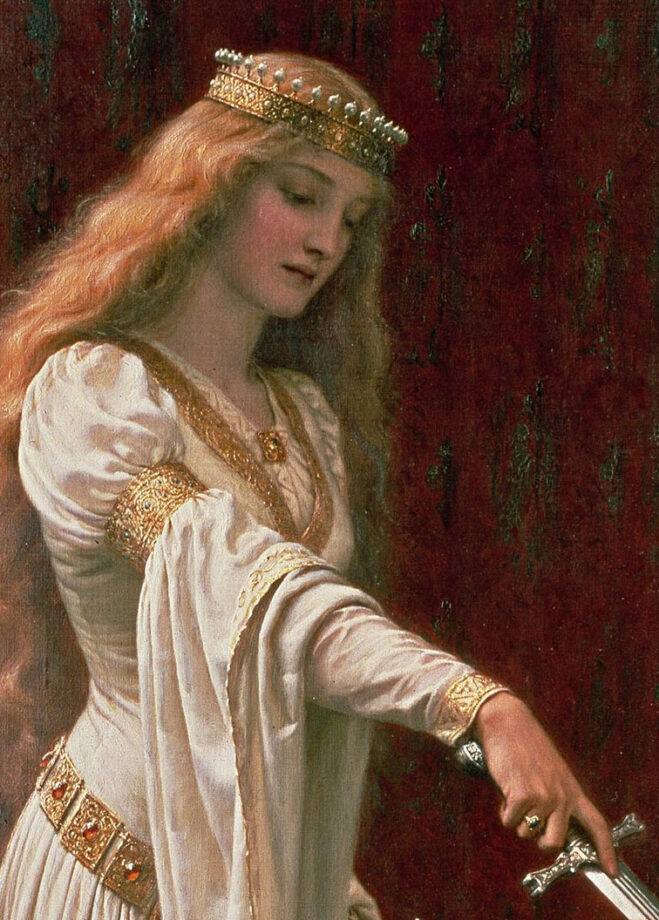
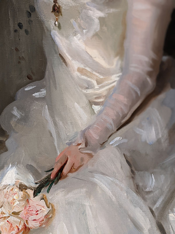
Closeup of a white gown and metal from the Accolade, Edmund Blair Leighton (1852–1922), oil on canvas, 1901, height: 182.3 cm (71.7 in); width: 108 cm (42.5 in), private collection
While prehistoric art got created with a white chalk made of the mineral calcite, white oil paint has a different composition and history. In oil painting, the ideal opaque white is neither warm nor cool. For generations artists painted with lead white until the 19th century when everything changed. Companies began to mass-produce art supplies including watercolor and oil paint. No more hand-grinding of pigments!
White comes from substances like titanium dioxide, lead carbonate, calcite or zinc oxide. Zinc white has zinc pigments. Flake white is a softer, warmer white that used to have lead in it. Flake white is found in early Chinese painting. Kremnitz white, Venetian white, French white, and Dutch white were also based on lead carbonate and lead hydroxide. Flemish white is based on lead sulfate. Cool color, the Titanium white is the strongest and most opaque white used by most contemporary artists today. A vast majority of the manufactured white pigments don’t have toxic lead in them. However, such paint is a lot more brittle and susceptible to the environmental changes, especially if it’s mixed with the safflower oil and not the linseed oil.
A modern invention, acrylic white is a chemical-based paint that’s made of pigment suspended in an acrylic polymer emulsion. It’s also made of plasticizers, silicone oils, defoamers, stabilizers, or metal soaps. Unlike oils, it’s water-based and dries super quickly. Used in house painting, acrylic paint dries to be water-resistant. Some artists love painting with acrylics while others don’t. Unique properties of each paint fit different creative personalities.
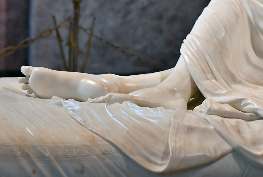
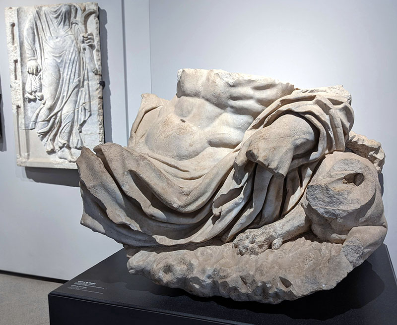
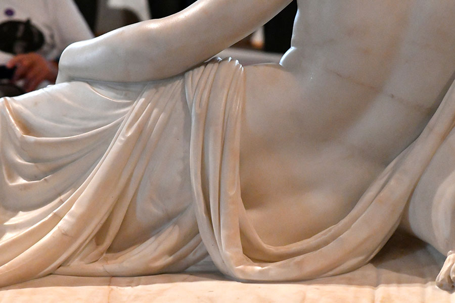
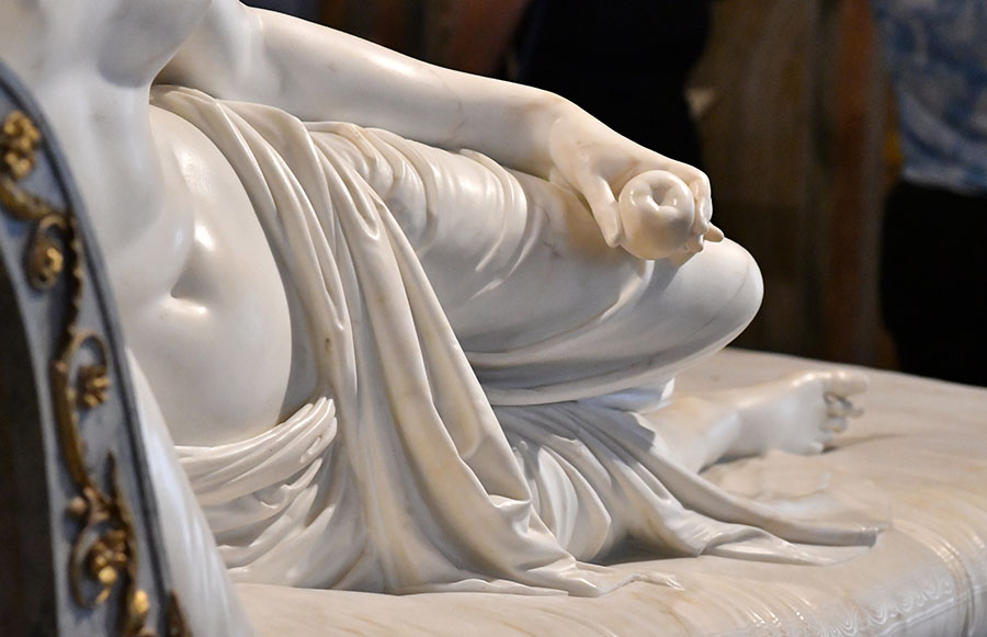
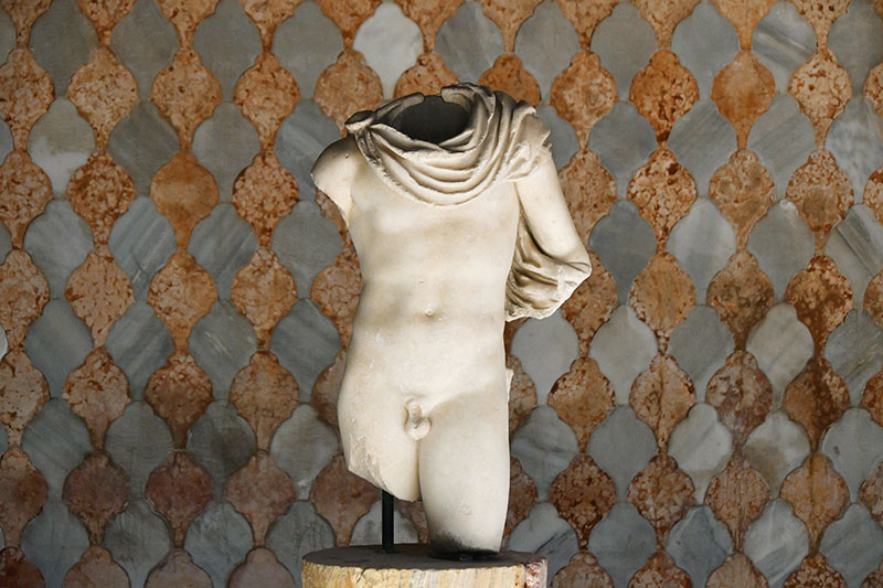
“Torso of river” statue fragment at the Palatine museum in Rome | Photo: Veronica WintersCanova, Napoleon’s sister, closeup of fabric in marble, Borghese gallery, Rome, Italy
What are the shades of white?
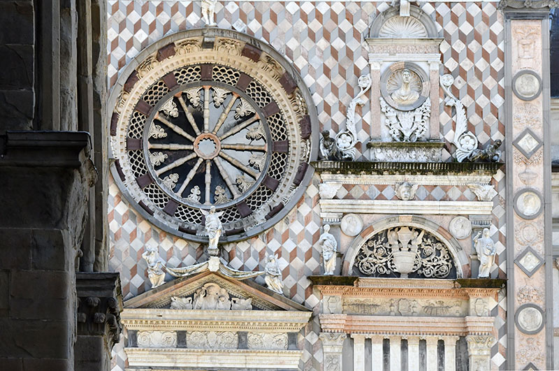
Duomo di Bergamo cathedral rose window wall. Near Milan, Italy. | look at all these shades of white! I absolutely love the use of color marble here. Also there are several different patterns and textures that describe the ornamentation of this cathedral. Beautiful!
While most people don’t think of white having shades, artists and creatives perceive a wide range of subtle variations of white while creating their art. Normally, we don’t see the difference between the shades of white unless we choose a wall paint in a hardware store or look at the neatly stacked rows of clothes in a shop.
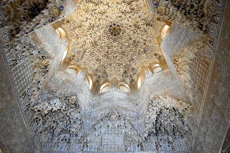
Shades of white seen in the Alhambra Palace in Granada, Spain
White should be neutral, but it’s often either warm or cool. Warm whites have a hint of yellow to create a sense of warmth and coziness. Ivory, eggshell, cream, antique white, vanilla, and beige are the shades of warm white.
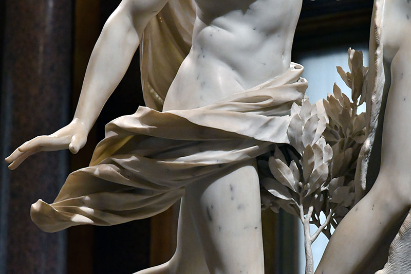
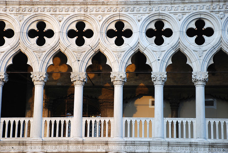
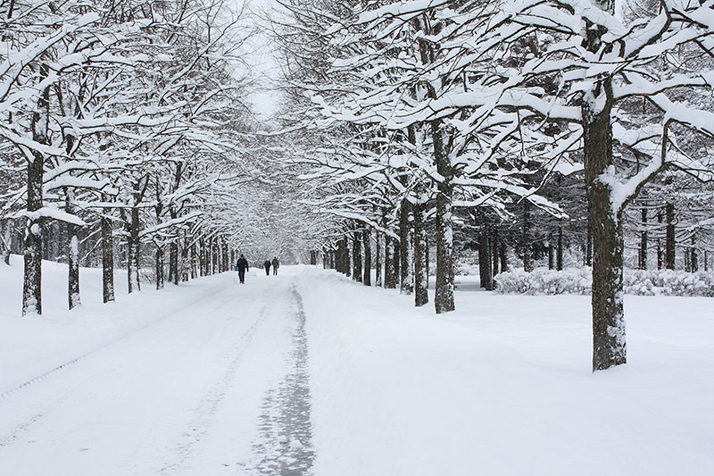
Bernini, Apollo and Daphne, closeup of fabric and hand, 1625, Rome, Italy. This white marble has a warm tone because of warm light. The dodge’s palace in Venice, Italy. Here the white marble has a warm cast on the left side and a bluish color on the right.Neutral color of the white snow in Russia.
Cool whites have a bluish-grey undertone giving a sense of timeless airy feel. Alabaster, pearl, white smoke and snow come to mind describing cool whites. But not all snow scenes are created equal. Some snow scenes have warm, yellowish color and bluish shadows seen under the sun.
Shades of white could also lean towards a specific color like pink, peach or green. Seashell white is a soft, pinkish-white reminiscent of the delicate hues of seashells.
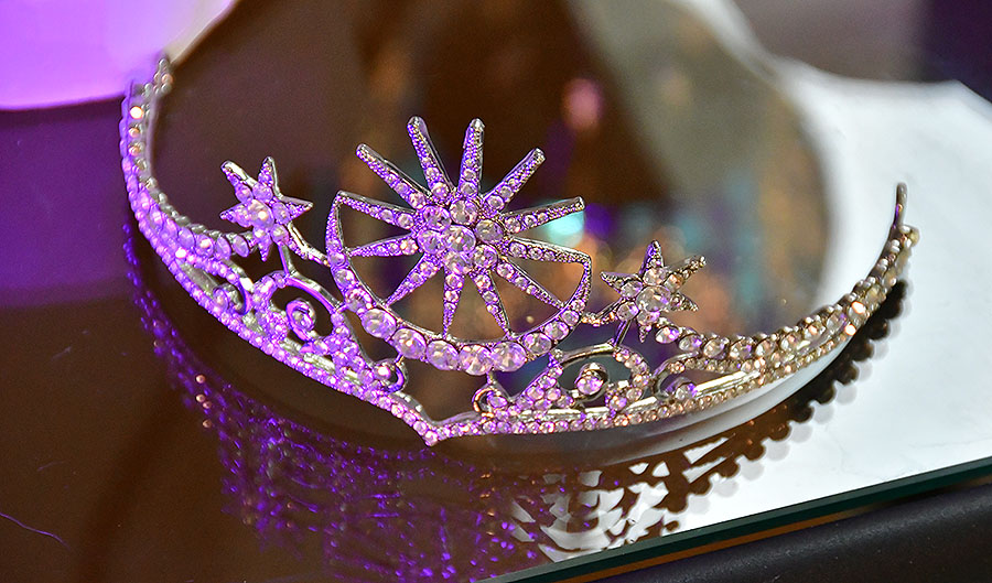
The crystal white tiara could literally be any color of the light projected onto it. Here it ranges from a purplish white to warm white.
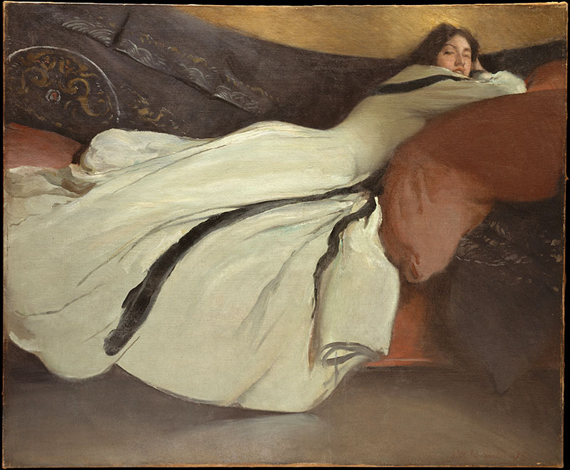
One of my favorite artists is John Singer Sargent. I love his use of bold brushstrokes, color and richness of paint he achieved in his large-scale canvases.
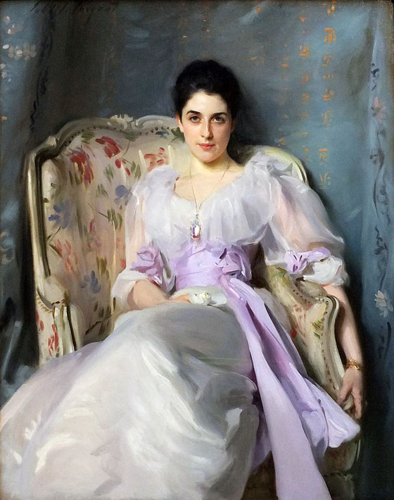
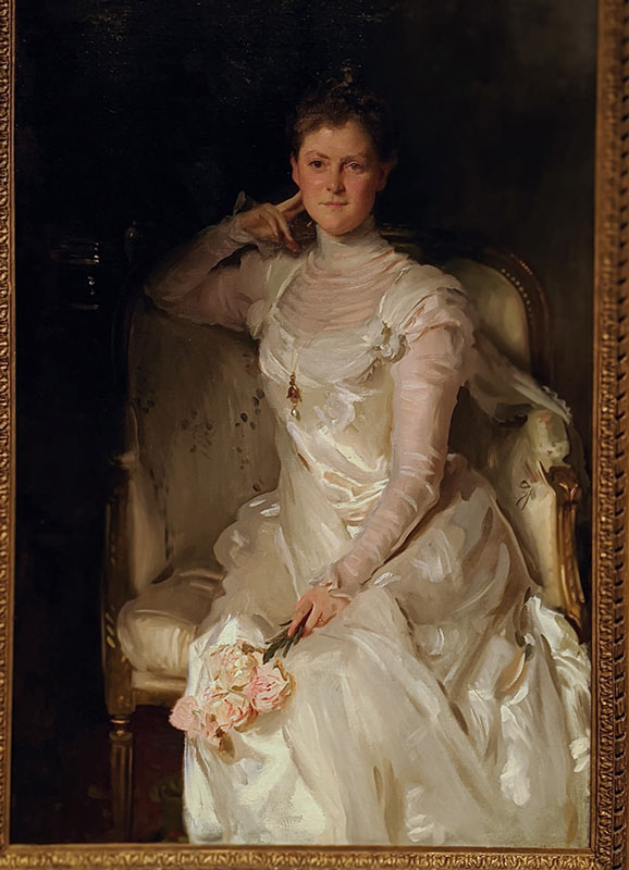
John Singer Sargent, Lady Agnew of Lochnaw (1864-1932), 1892, 127.00 x 101.00 cm, oil on canvas, National Galleries of Scotland.https://www.nationalgalleries.org/art-and-artists/5396/0?overlay=download I’ve seen this painting hanging at the entrance to the art museum in Edinburgh, Scotland. The artist painted ultra wealthy individuals and often participated in the arrangement and choice of gowns on his models. According to the museum’s notes, living a lavish lifestyle, Gertrude had to sell several paintings including this one to the National Gallery of Scotland in 1925!
Regardless, I love how fluid and beautiful the white fabric is here. Look at all these shades of white!
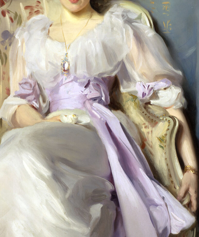
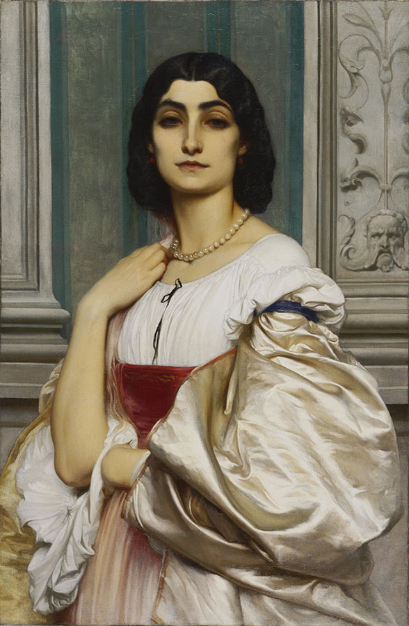
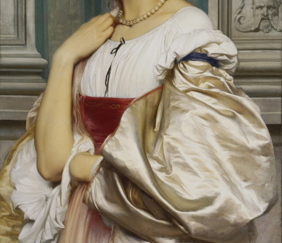
John Singer Sargent, Lady Agnew of Lochnaw (1864-1932), a closeup of the painting revealing beautiful shades of white shifting from warm to neutral to cool white.Sir Frederic Leighton, Portrait of a Roman Lady (La Nanna), Oil on canvas Dimensions: 31 1/2 x 20 1/2 inches (80 x 52.1 cm), 1859, Philadelphia Museum of Art While her face appears artificial lacking life and character I love how the artist painted all these different white garments! They range from neutral white in her robe to a warm white of silk cover to a pinkish white skirt. Also, a single string of white pearls matches the warmth of the silk. The background has some white elements that are greyed down and subdued to bring the figure forward.Sir Frederic Leighton, Portrait of a Roman Lady (La Nanna), Oil on canvas
Dimensions: 31 1/2 x 20 1/2 inches (80 x 52.1 cm), 1859, Philadelphia Museum of Art
The Symbolism of White across Art History
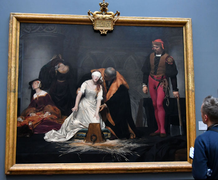
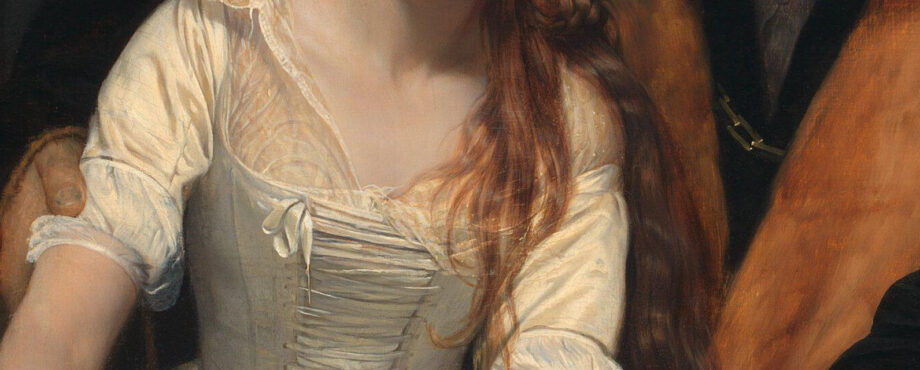
Paul Delaroche, The execution of Lady Jane Grey, 1833, National Gallery, London, a closeup of hands and white gown. Photo: Veronica Winters | Here the white fabric is warm while the “grey” shadows are neutral and warm somewhat as well.Antonio Canova, Napoleon’s sister, Venus Victrix, 1805-08, closeup of fabric in marble, Borghese gallery, Rome, Italy | The light is warm hitting the marble casting bluish-grey shadows.
The symbolism of the color white is quite astonishing if we think about it. There are universal associations with this color as well as the nuanced meanings of white depending on culture or context. One color. Two opposite associations.
Positive associations with the color white
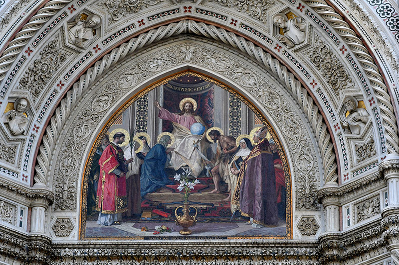
In Christianity, white represents purity, innocence, and divinity.
Think of the white angels, white robes of monks and heavenly figures, a white dove or the white lilies of the Virgin Mary.
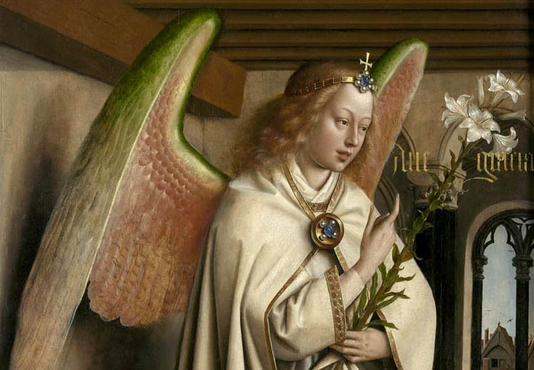
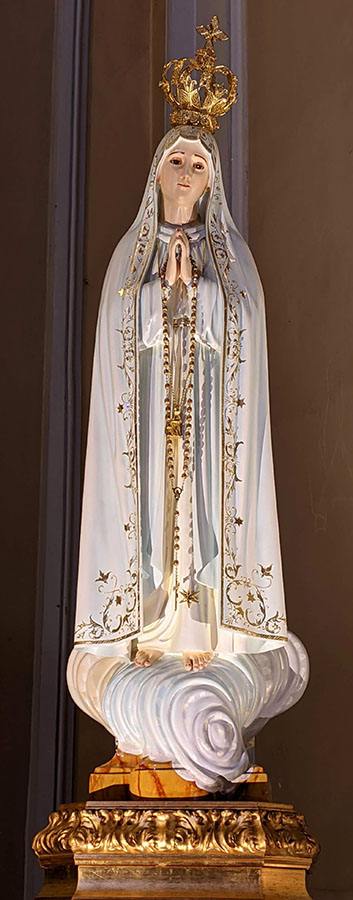
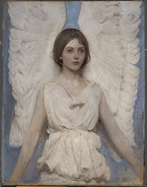
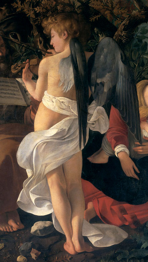
The Ghent Altarpiece. Adoration of the Mystic Lamb: The Archangel Gabriel, 1432. Here, Gabriel brings the white lilies to Mary in the annunciation. These flowers mean purity and virginity. The archangel wears a white robe with beautiful pearls decorating the fabric.Dressed in a beautiful white gown, the heavenly figure of Mary soars on a white cloud. This is one of the most beautiful religious sculptures I’ve seen in the European churches.Abbott Handerson Thayer, Angel, 1887, oil on canvas, Smithsonian American ArtMichelangelo Caravaggio, a closeup of a painting “Rest on the Flight into Egypt”, 1597. We see an angel playing music wrapped in swirling white fabric.
While the white clothing is ceremonial of passing into another world or Heaven, the ethereal glow of white light represents heaven and the divine, spiritual purity, enlightenment and truth.
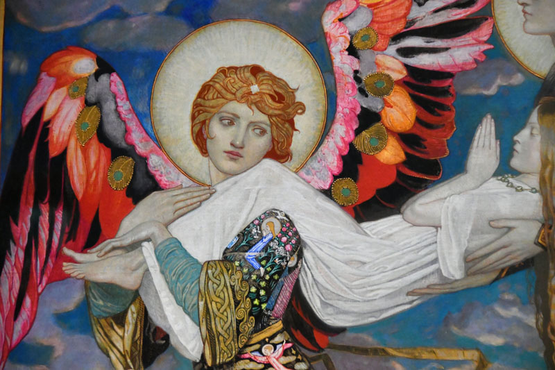
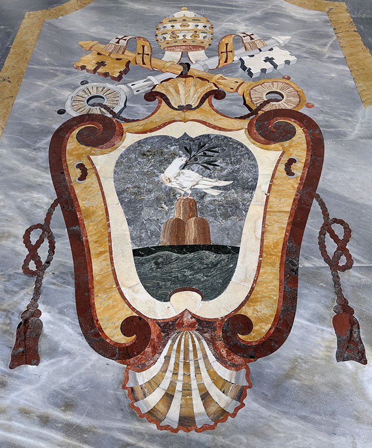
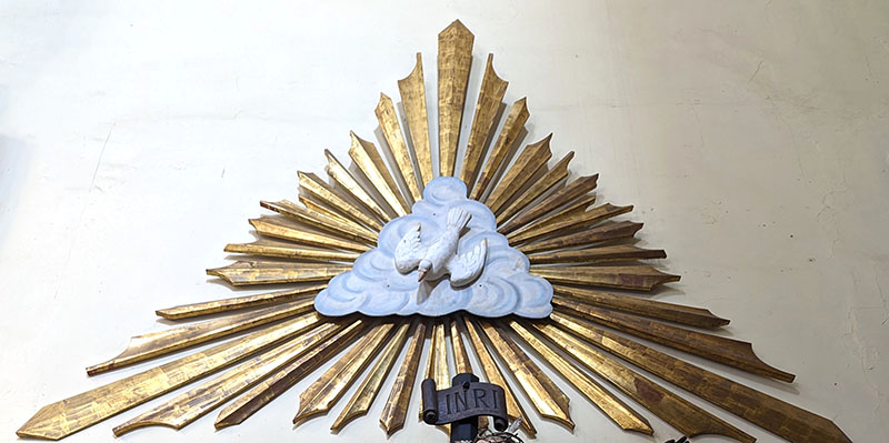
John Duncan, 1866-1945, Scottish, St.Bride, 1913 detail | Scottish National Gallery | White clothing is ceremonial of passing into another world or Heaven. It’s the color of the ascension into the Heavens.This is the official emblem of the pope with a dove or the Holy Spirit depicted in the center of it. I think I saw it in the Vatican, Italy. I love how Italian artists used colored marbles and stone to decorate the churches, placing the material on the floor and walls.A closeup of the Pope’s emblem showing the Holy Spirit
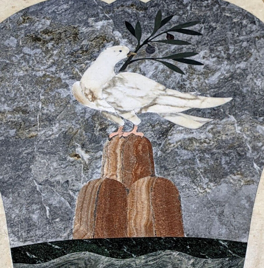
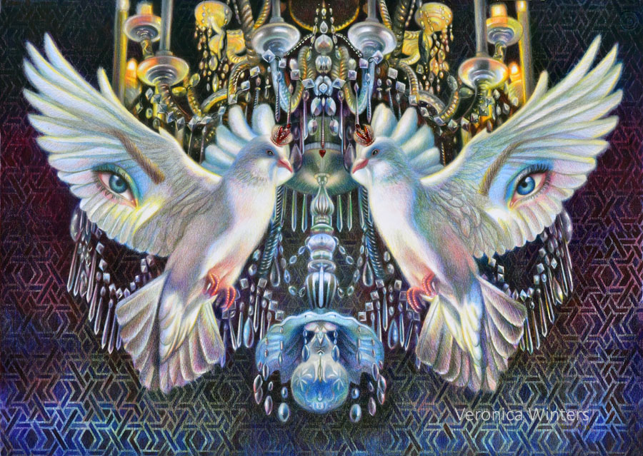
White dove or the Holy Spirit is a symbol of peace, forgiveness, hope, and love. In art, it forms the Trinity and flies in rays of sunlight with an olive branch in its beak.
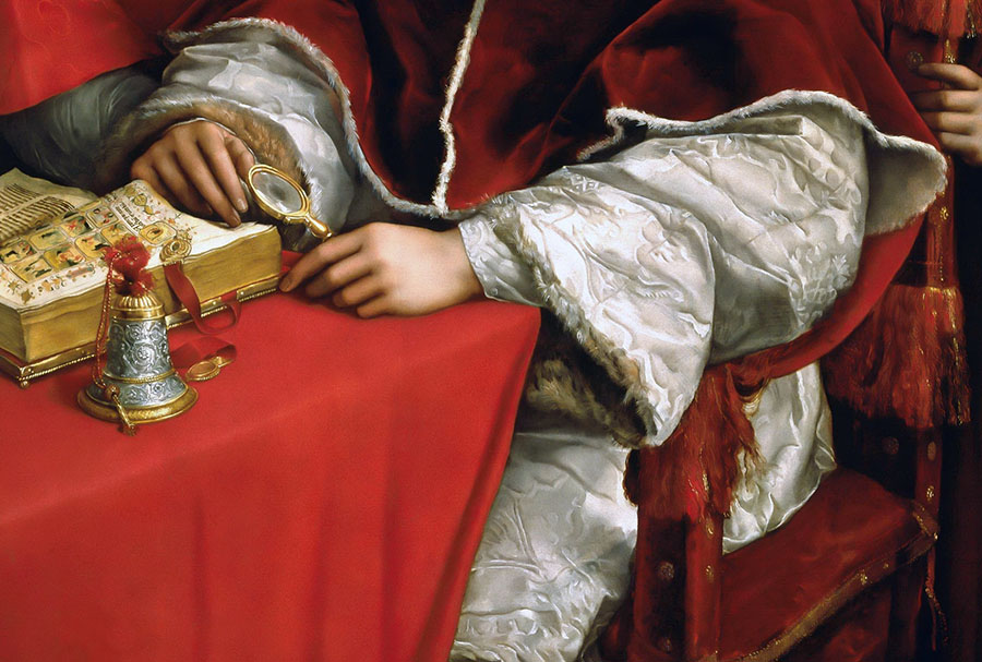
Mexico City, MexicoPortrait of Pope, Leo X and his cousins, cardinals Giulio de’ Medici & Luigi de’ Rossi. Closeup detail of the white garment of the pope. Raphael, c. 1518-1520, oil on wood, 154 cm × 119 cm (61 in × 47 in), Uffizi, Florence.
White can symbolize hope, innocence, and royalty in ceremonies.
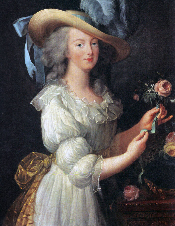
A white wedding gown means innocence and pure perfection especially of a young bride. White is the color of light and white pearls communicate similar symbolism.
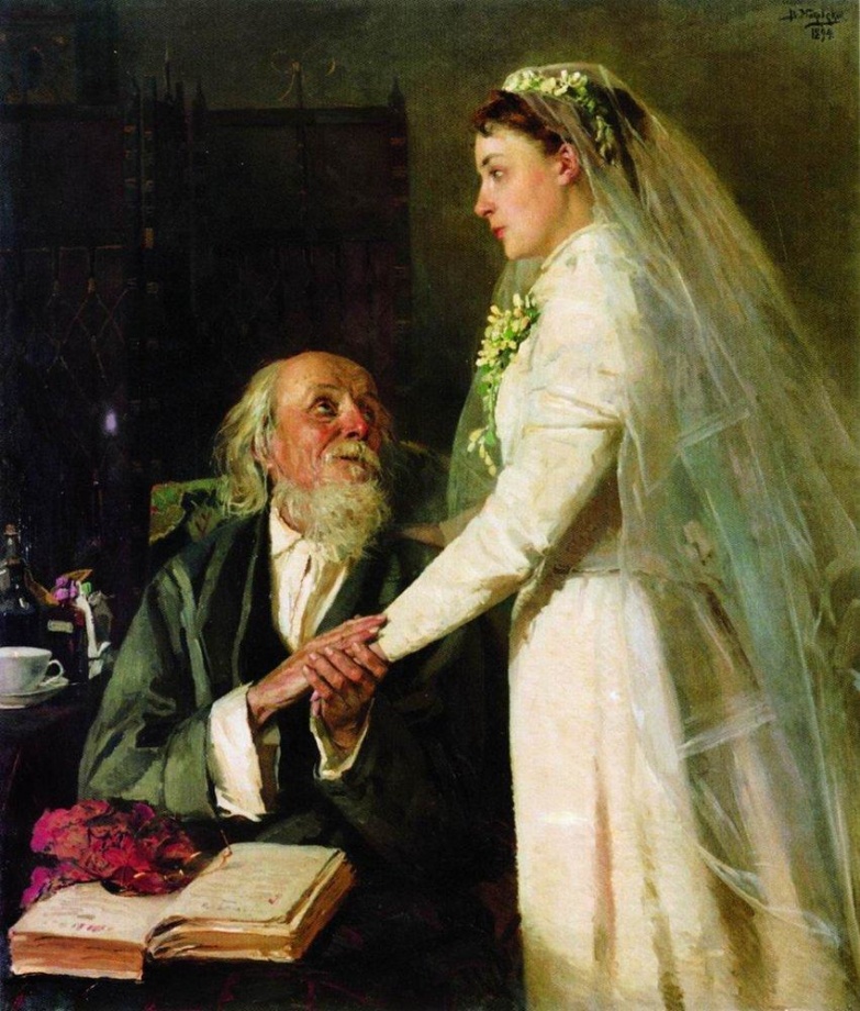
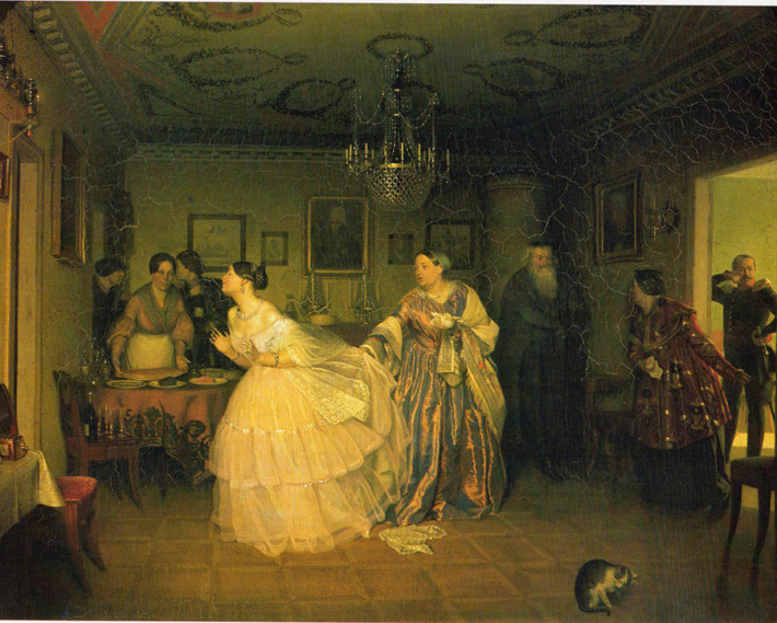
Vladimir Makovsky, to the marriage (farewell), 1894; Russian Federation, oil on canvas, Samara Regional Museum of Fine Arts, Samara, Russia, Dimensions: 115 x 99 cm. | Here, although the bride wears a white gown and is about to get married, she is devastated by the normally joyful event. The artist commented on the common practice of parents giving their daughter to marry at a young age to fix the family’s financial situation.Fedotov, Matchmaking of a major, 1848 | This famous Russian painting carries similar symbolism where a young bride doesn’t want to marry an old man for money.
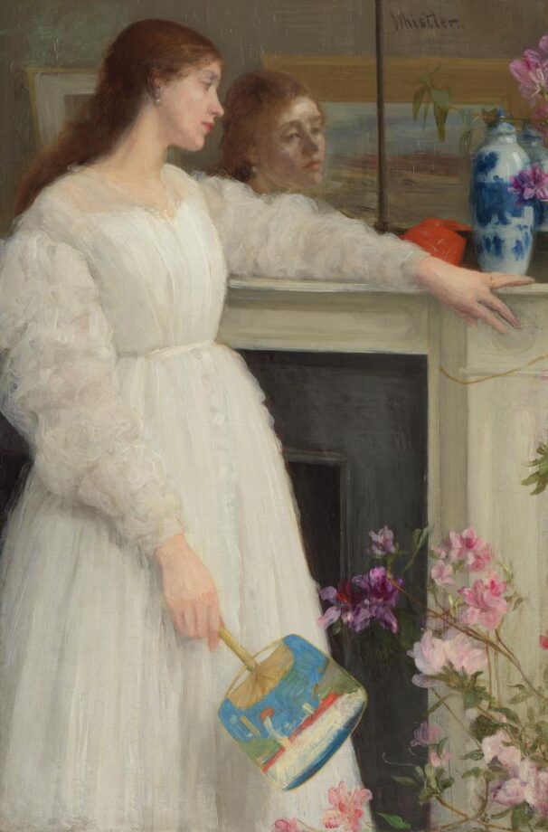
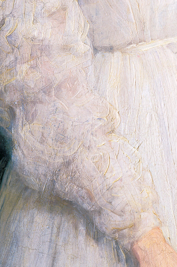
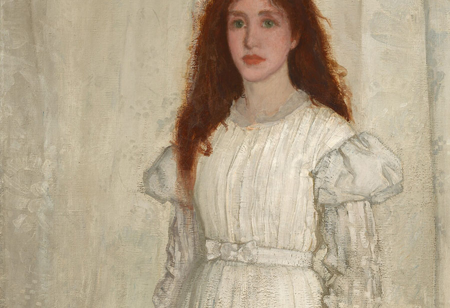
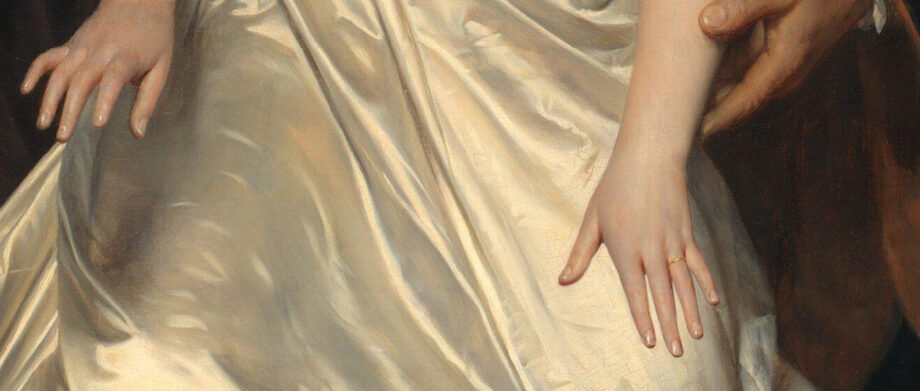
James McNeill Whistler (1834–1903), Symphony in Flesh Colour and Pink: Portrait of Mrs Frances Leyland, Image source: Frick Collection, NY., Henry Clay Frick Bequest, 1916.1.133
Accolade, Edmund Blair Leighton (1852–1922), oil on canvas, 1901, height: 182.3 cm (71.7 in); width: 108 cm (42.5 in), private collectionCloseup of a white gown and jewelry pieces from the Accolade, Edmund Blair Leighton (1852–1922), oil on canvas, 1901, height: 182.3 cm (71.7 in); width: 108 cm (42.5 in), private collection | White is the color of light, divinity, nobility and purity of the heart. White pearls also symbolize purity, wisdom, and sincerity. And let’s just say that these beautiful pearls make a great visual statement in paintings like this one!
White can represent royalty.
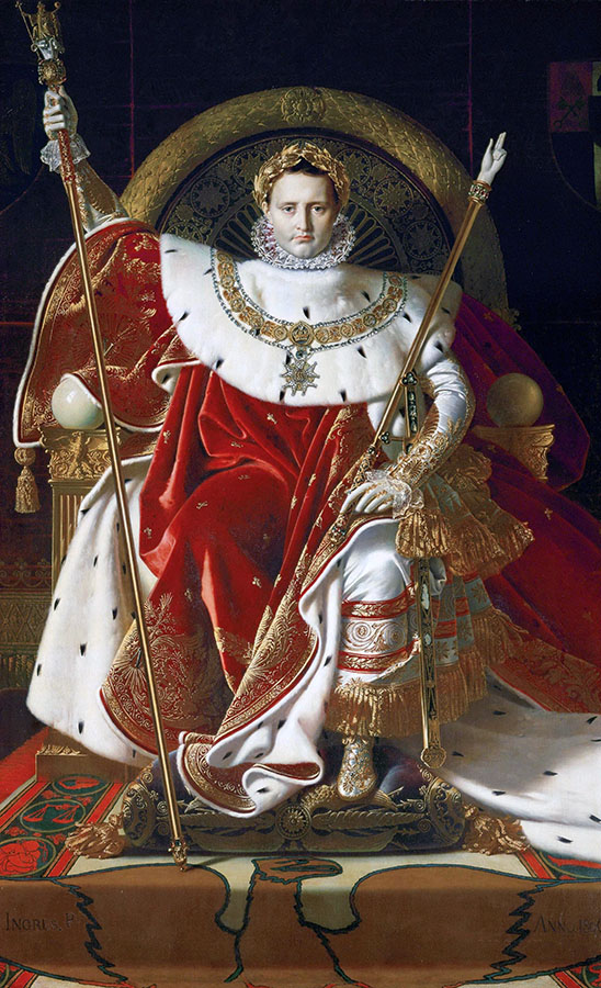
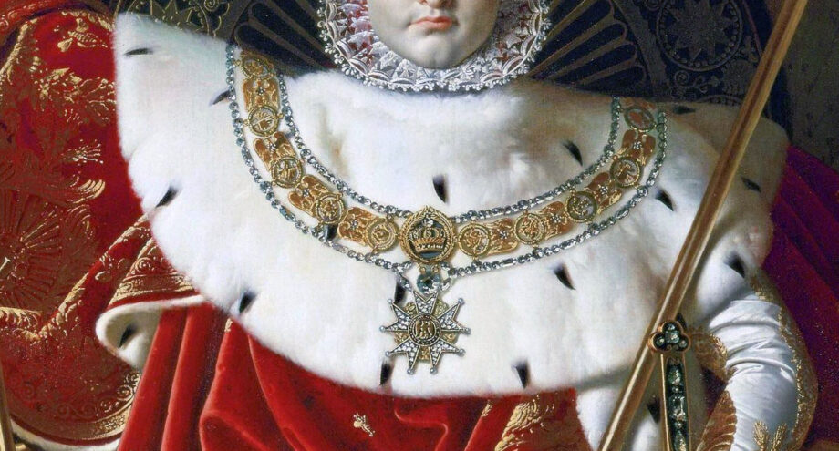
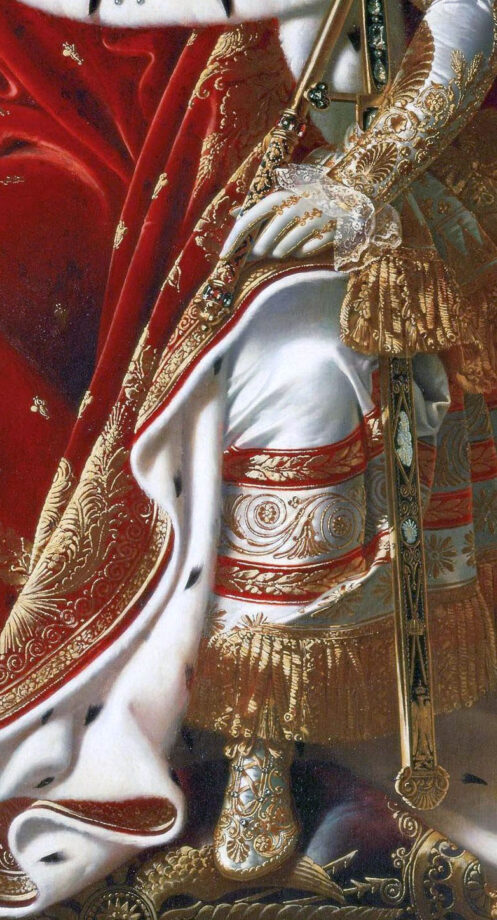
Jean-Auguste-Dominique Ingres, Napoleon on his Imperial Throne, 259 cm × 162 cm (102 in × 64 in), oil on canvas, 1806, Musée de l’Armée, Paris. | You’d be surprised, but this artwork wasn’t popular at the Paris Salon when he exhibited this monumental painting. It received vitriolic criticism mainly because Napoleon looked too artificial and Gothic. However, if you know other paintings by Ingres, this is the most elaborate one! Just like another French artist – Poussin, Ingres often received poor reception for his art at the Salon. Moreover, in the middle of his career he got so fed up with the criticism and poor receptions of his work that he began to exhibit his art in his studio and private apartments. A student of famous neoclassical painter David, Ingres took a different road in his vision of art than the contemporaries and critics didn’t get. In this painting you can certainly admire a perfect balance of color, lines, objects, textures, and symbols captured in one painting. The artist’s composition is a reversed triangle. Both composition and realistic textures are reminiscent of Jan van Eyck’s painting.
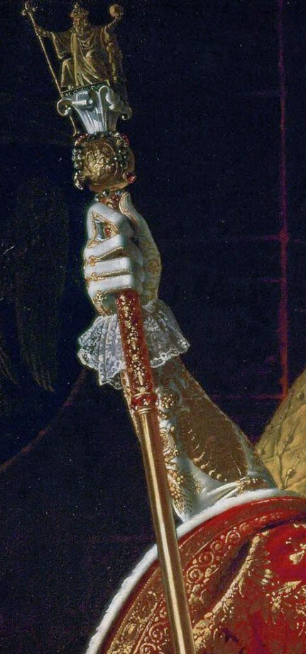
French artist, Ingres puts a lot of symbolism into this painting depicting Napoleon as a ruler blessed by God. Napoleon looks like a religious icon. The artist bestows a Roman-like golden laurel crown onto his head and paints a circular-shaped throne behind him to suggest the divine power of the ruler. White ermine fur encircles Napoleon’s neck – the symbol of royalty. The emblem of bees seen throughout the Vatican can be noticed on this lush, red cloak. The golden bees represent immortality and resurrection, while the Eagle represents military might. You can read about the life and work of the artist in a concise book titled “Ingres” by Karin H. Grimme.
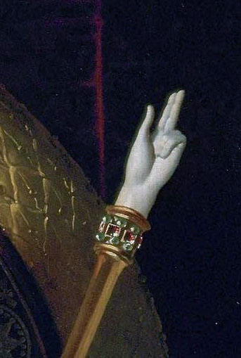
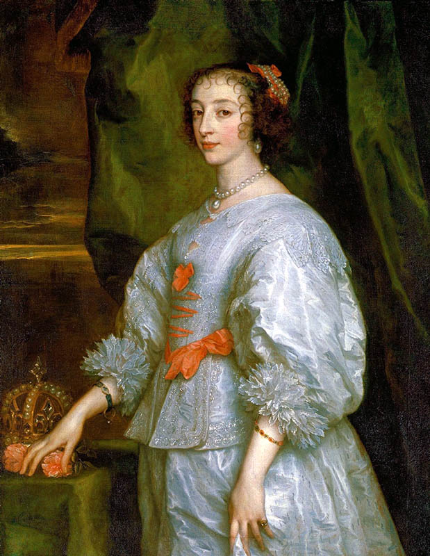
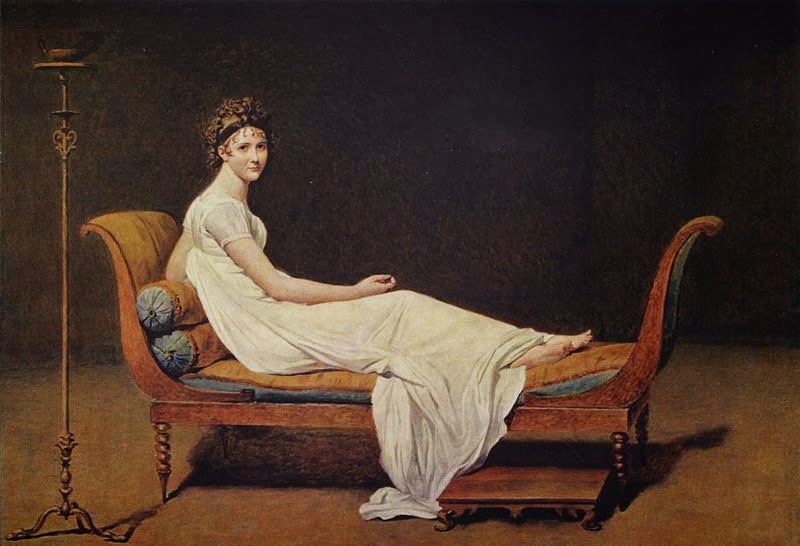
The sword represents the military power of French kings.The painting detail shows Charlemagne’s golden scepter – the symbol of the executive power.Jean-Auguste-Dominique Ingres, Napoleon on his Imperial Throne, 1806, detail of the Hand of Justice ( in white).Anthony van Dyck, Henrietta Maria of France.Marie-Antoinette, oil on canvas, 92.7 × 73.1 cm (36 1/2 × 28 3/4 in.), after 1783, unknown artist, at the Smithsonian National GalleryJacques-Louis David, madame Recamier, 1800, the LouvreSargent, Mrs. Joshua Montgomery Sears, a closeup of white gown at The museum of fine arts, Houston, 1899, Canvas or panel: 58 1/8 × 38 1/8 in. Sargent, Mrs. Joshua Montgomery Sears, The museum of fine arts, Houston, 1899, Canvas or panel: 58 1/8 × 38 1/8 in. John White Alexander, Repose, oil painting, 1895, American, the Met, New York | Similar to Sargent and Chase, Alexander loved to capture wealthy women in gowns at rest. This beautiful white dress stretches from left to right forming a diagonal, which is one of the ways to create a dynamic composition.
White is Heaven.
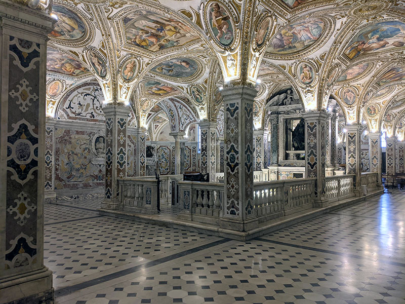
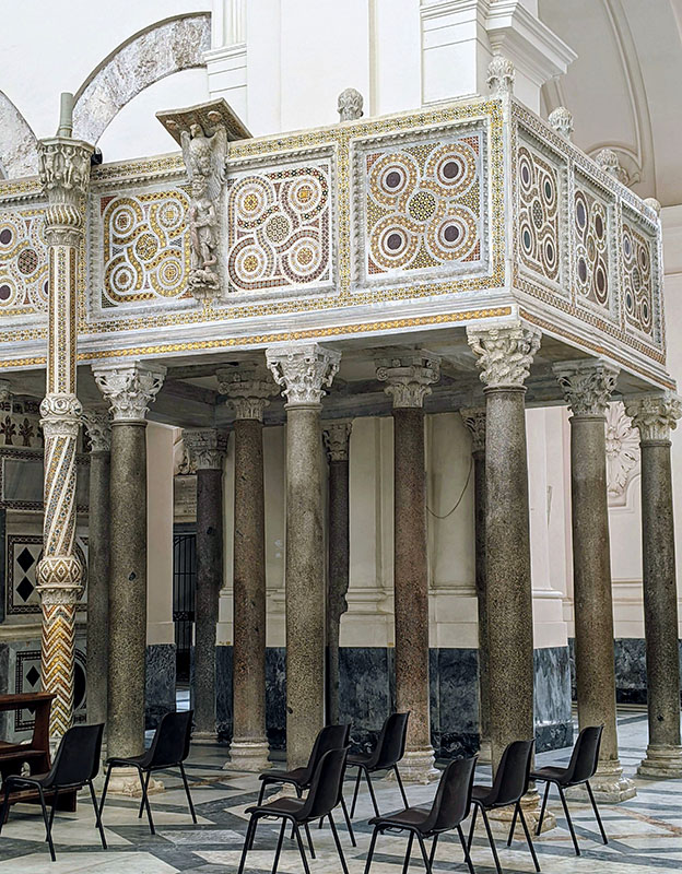
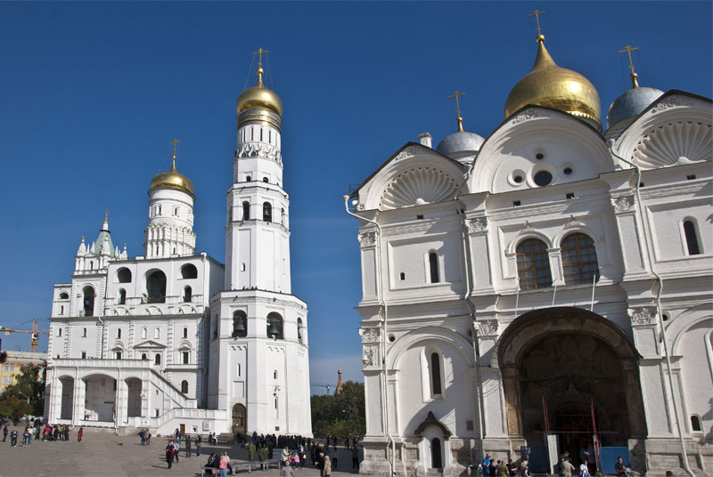
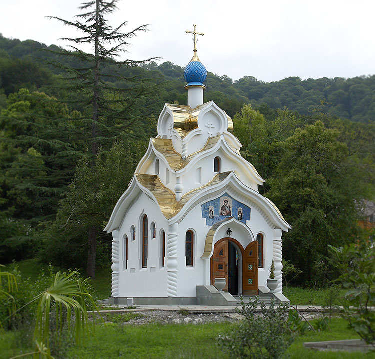
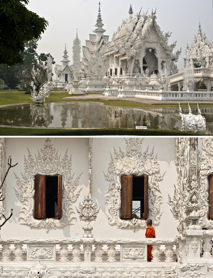
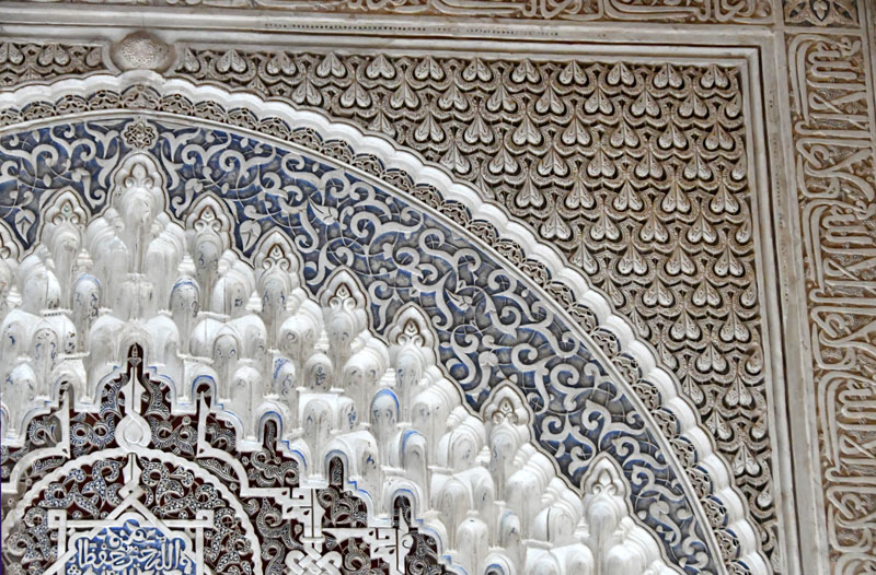
The Cathedral of Salerno inside. Italy.The Cathedral of Salerno inside, Italy. The Cathedral of Salerno was built between 1080 and 1085 on the ruins of a Roman temple.Ivan the Great Bell Tower at the Kremlin, image by Veronica Winters. | We can enjoy seeing the white stone cathedrals bathing in the warm sunlight. The Kremlin was built between the 14th and 17th centuries. The first white-stone walls and towers were built in 1367-68. The existing walls and towers were built by Italian masters from 1485 to 1495.Wat Rong Khun – the White Temple in Thailand. Photos c Veronica Winters | This looks like heaven on earth. Famous contemporary Thai artist, Ajarn Chalermchai wanted to build a temple that’s different from other wats. Normally, Thai temples are golden and the artist wanted to emphasize the Buddha’s purity who achieved Nirvana. Ajarn considered gold having a negative connotation about human behavior like lust. He put myriads of small mirrors into the white sculptures that beautifully reflect the light of the temple. These mirrors are the symbol of Buddha’s wisdom that shines throughout the universe according to the artist. He amassed a team of artists to build this beautiful site that represents heaven on earth. Wat Rong Khun is expanding as new elements are added to the wat. The admission is free for people to enjoy the garden feeling peace and joy. Isn’t it wonderful?The Alhambra was built between 1238 and 1358, mainly during the reigns of Ibn al-Aḥmar and his successors. Located in Granada, Spain, the Alhambra is one of the world’s finest examples of Islamic architecture that served as inspiration for many artists including Escher. This elaborate geometric design shows heavenly colors of white and blue. Image by Veronica Winters
White in mythology:
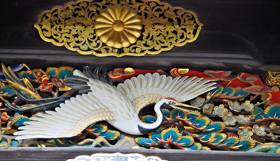
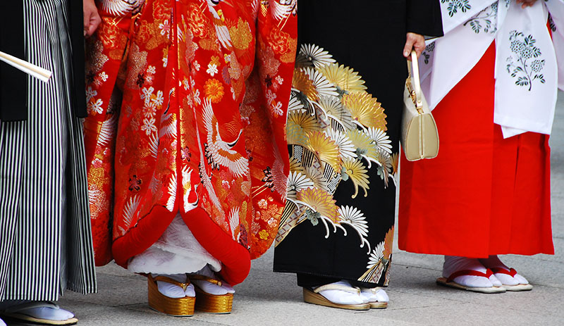
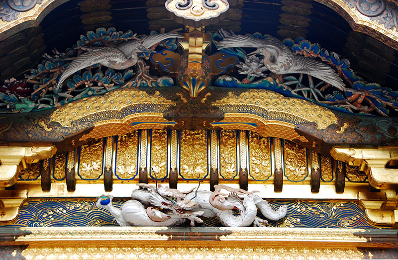
White crane, a closeup of a Japanese temple decoration. Photo: V.Winters | In Japanese culture, the white crane, or tsuru, is a national treasure and symbol of good fortune, longevity, and peace. It is also associated with loyalty, wisdom, fidelity, and beauty. The crane is depicted in art, literature, and mythology, and is said to live for 1,000 years. It is also associated with the Shinto god of happiness, and it is said that the god will come to a person who folds 1,000 cranes. Recently, the crane has become a symbol of peace, hope, and healing.Look at these beautiful patterns of gold, blue and white! We can see the white dragon in the center of the decoration. Two white cranes create symmetry in this elaborate decoration seen in Japan.
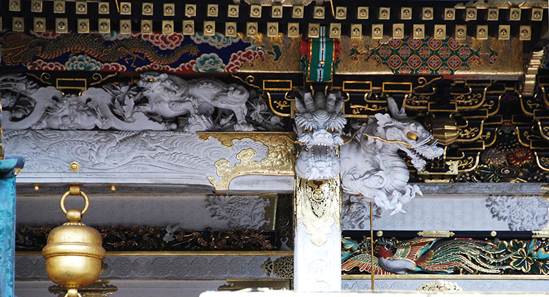
In Japanese culture, dragons are guardians of the Buddhist temples and their meaning varies depending on their color. The white dragon, or Hakuryuu, is a water god that controls rainfall and water. White dragons are also associated with great wealth and blessings in marriage.
The white dragon decoration, Japan.
White as a force in duality of nature:
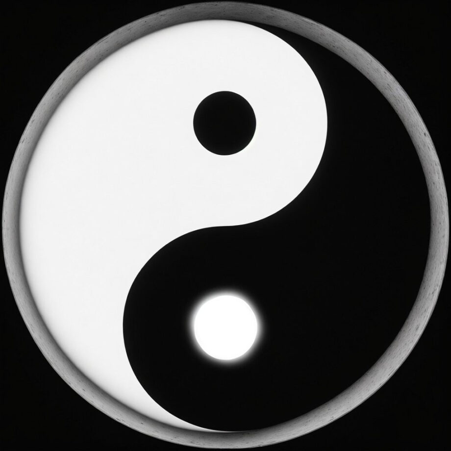
Yin and Yang is a core concept in the Chinese philosophy that describes two opposing yet interconnected and complementary forces that are believed to underlie all of reality. They represent intertwined aspects of a whole in a dynamic balance within the universe. Famous symbol of yin and yang is the taijitu, a circle divided into two halves, each containing a swirl of the opposite color. The swirl within each half represents the seed of the other force, signifying their interdependence. In art, it often means balance, where white can’t exist without black, just like the sun doesn’t exist without the moon.
Among Neolithic jades of ancient China are bracelets (huan), penannular rings (chüeh), half-rings (huang), a flat disc with a hole in the centre (pi) and a ring or short tube squared on the outside (tsung). In later historic times these shapes acquired a ritual or ceremonial function, the pi and tsung, for example, symbolizing respectively heaven and earth.
(From the book: the arts of China, 3d edition, Michael Sullivan)
White often represents all the light in the world, opposing the black of the darkness.
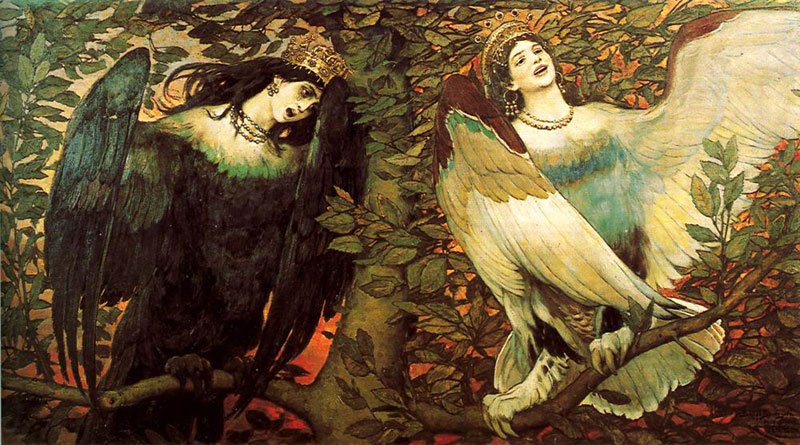
Viktor Vasnezov, Sirin and Alkonost. The song of happiness and sadness, 1896, The Tretyakov Gallery, Moscow
In this oil painting, “Sirin and Alkonost,” also referred to as “The Birds of Joy and Sorrow,” depicts two beautiful, half-bird, half-woman creatures from Slavic mythology. Sirin, on the right, is typically associated with joy and enchantment, while Alkonost, on the left, brings sorrow and mourning. Their contrasting melodies intertwine, creating a complex and evocative harmony that reflects the duality of human experience. The painting itself is a masterpiece of the Russian Romanticism expressed in symbolism that invites contemplation of life’s emotional range.
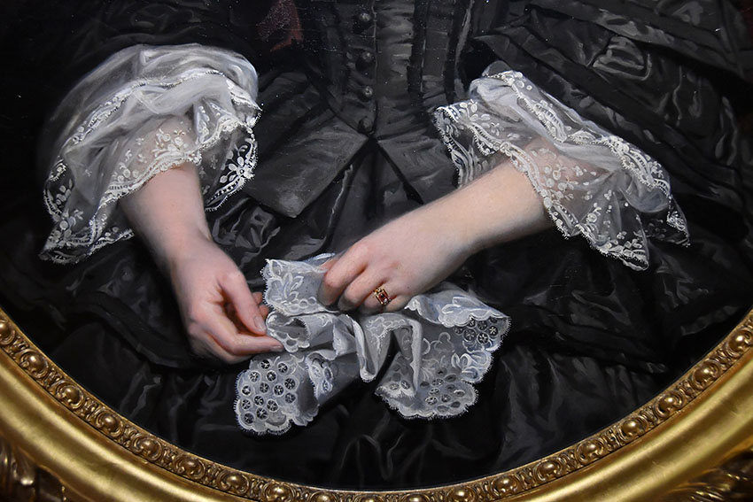
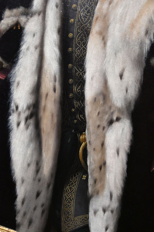
A close up of hands and lace in oil painting, Metz, France. Photo: Veronica WintersHolbein, The Ambassadors, an oil painting’s closeup of fur. London
The calming power of white:
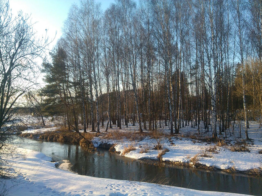
The calming effect of white is obvious in snowy landscapes, white clouds or cashmere sweater that bring us feelings of peace. Tranquil nature relaxes our mind. Soft, white fabric evokes serenity. And white swans and snowflakes seem magical floating in water.
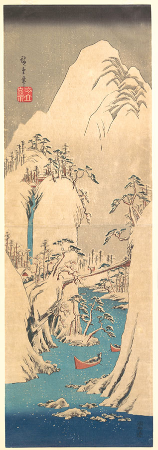
Snowy Gorge, Utagawa Hiroshige, Japanese, Edo period (1615–1868), the Met
White can carry a special meaning in objects we often see. For instance, symbolic of new life, a white egg represents birth. Moreover, we can read the Chinese ancient legend about the origins of the world.
“Once upon a time, the universe was an enormous egg. One day the egg split open; its upper half became the sky, its lower half the earth, and from it emerged P’an Ku, primordial man. Every day he grew ten feet taller, the sky ten feet higher, the earth ten feet thicker. After eighteen thousand years P’an Ku died. His head split and became the sun and moon, while his blood filled the rivers and seas. His hair became the forests and meadows, his perspiration the rain, his breath the wind, his voice the thunder-and his fleas – our ancestors.” This legend expresses a Chinese philosophy, that man is not the culminating achievement of the creation, but a relatively insignificant part in the scheme of things; an afterthought. By comparison with the beauty and splendor of the world itself, the mountains and valleys, the clouds and water- falls, the trees and flowers, which are the visible manifestations of the workings of the Tao, he counts for very little.
(From the book: the arts of China, 3d edition, Michael Sullivan)
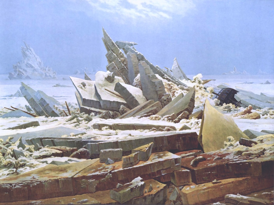
http://www.metmuseum.org/art/collection/search/68969 Rank Badge with Leopard, Wave and Sun Motifs Period: Qing dynasty (1644–1911), late 18th century, China, silk, metallic thread, 10 3/4 x 11 1/4 in. (27.31 x 28.57 cm), Textiles-Embroidered, Credit Line: Bequest of William Christian Paul, 1929Caspar David Friedrich, the polar sea or the sea of ice,1823–1824, oil on canvas, 96.7 cm × 126.9 cm (38 in × 49.9 in). This is one of my favorite Romanticism artists who painted the power of Nature to show its spiritual dominance over men.
White hue can also be a symbol of cleanliness. Healthcare facilities have white rooms, corridors, and doctors’ coats.
Contemporary architecture loves the color white. Both interior and exterior spaces have white paint and decorum seen across Florida’s new construction to amplify the light in the region.
White can also represent neutrality or fairness, negotiation or surrender – the white flag of surrender.
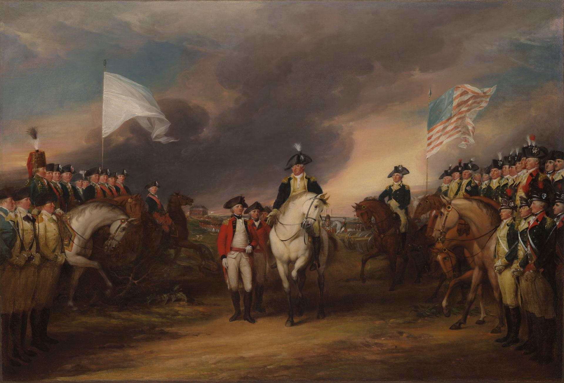
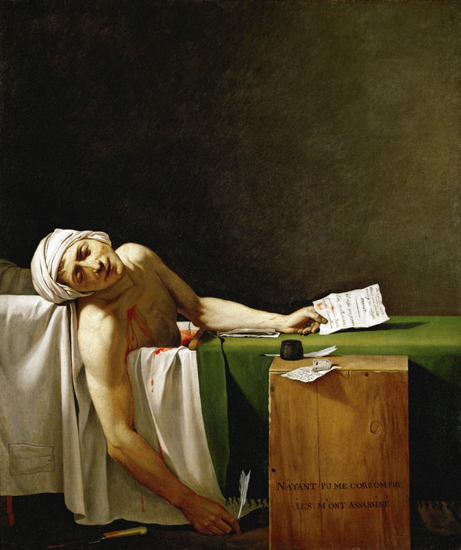
John Trumbull, The Surrender of Lord Cornwallis at Yorktown, oil on canvas, 1826,21 × 30 5/8 × 3/4 in. image from the Yale University Art Gallery. It can also be seen in a 12′ x 18′ size at the US Capitol Rotunda. This painting illustrates the surrender of the British army at Yorktown, Virginia, in 1781, which ended the last major campaign of the Revolutionary War. https://www.aoc.gov/explore-capitol-campus/buildings-grounds/capitol-building/rotundaJacques-Louis David, the death of Marat, 1793–1793, in the collection of the Royal Museums of Fine Arts of Belgium. This neoclassical painting has a very careful, classical design both in color and lines. Marat was a revolutionary in France and a friend of the artist. David was also a radical thinker and revolutionary who was once an official court painter to Napoleon but ended up in prosecution and escape from France to Belgium closer to the end of his life. Marat’s skin condition made him take long baths to soothe the pain where he got assassinated. This painting represents the ideals of neoclassical art and politics- simplicity, heroism, idealization, classicism, neutrality and stoicism. Color white helps communicate these virtues.
In modern art, white can symbolize a fresh start, an open canvas, or a space for interpretation. White is neutral, blank canvas. Artists like Robert Rauschenberg and Agnes Martin explored this potential in their monochromatic white paintings. Rauschenberg first painted his white canvases in 1951 in six variations, one to seven panels. Martin spent her 40-year career exploring the perception of stillness.
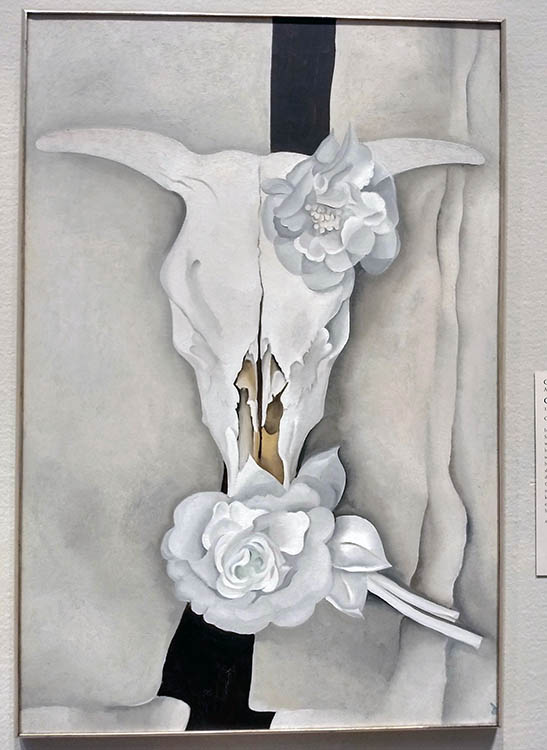
Georgia O’Keeffe (1887–1986), the white skull, Chicago Art Institute. O’Keeffe often painted the bleached white bones and skulls of the animals in New Mexico. She associated the skulls with strength of an American spirit.
White means innocence.
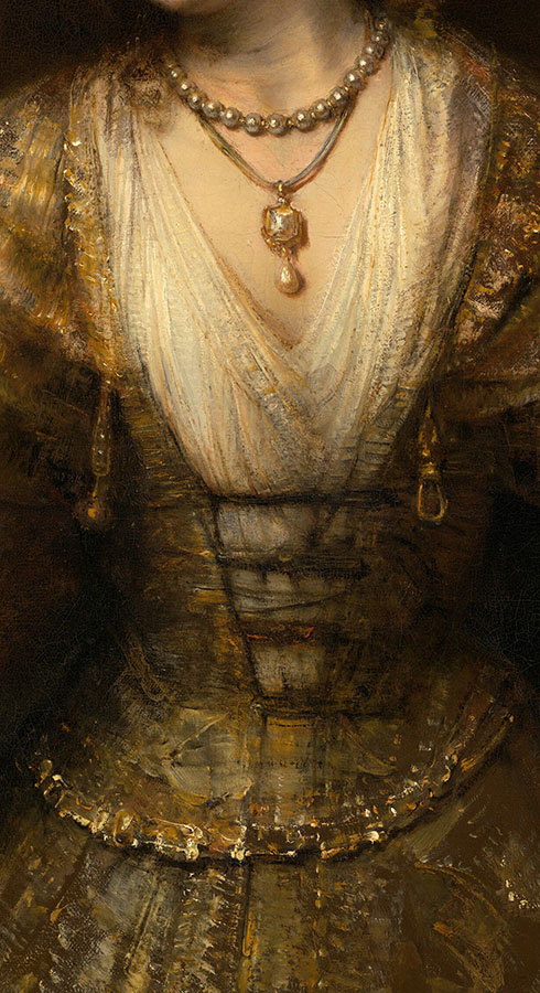
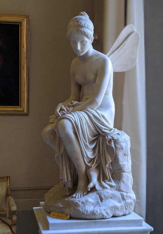
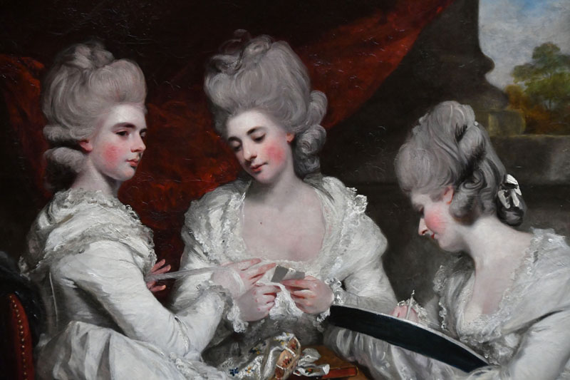
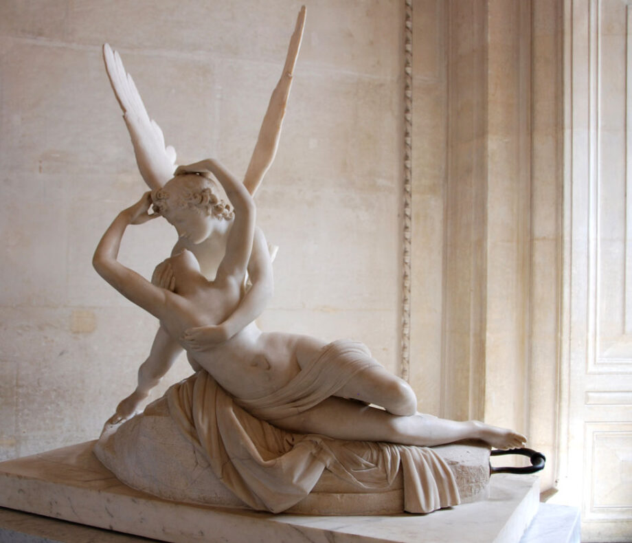
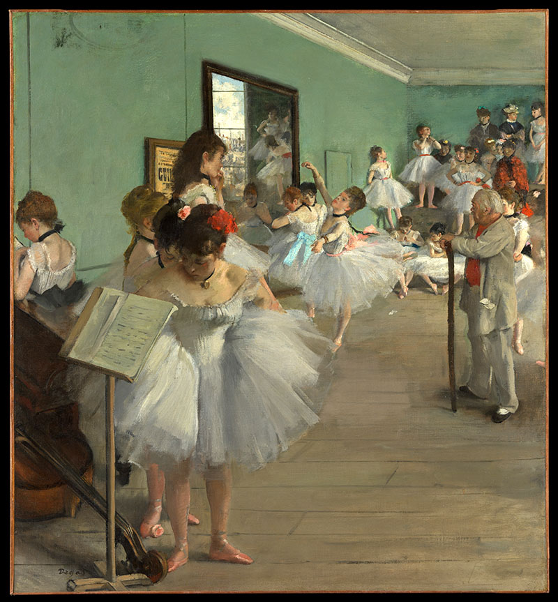
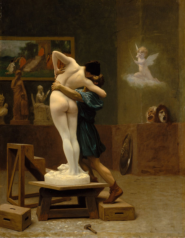
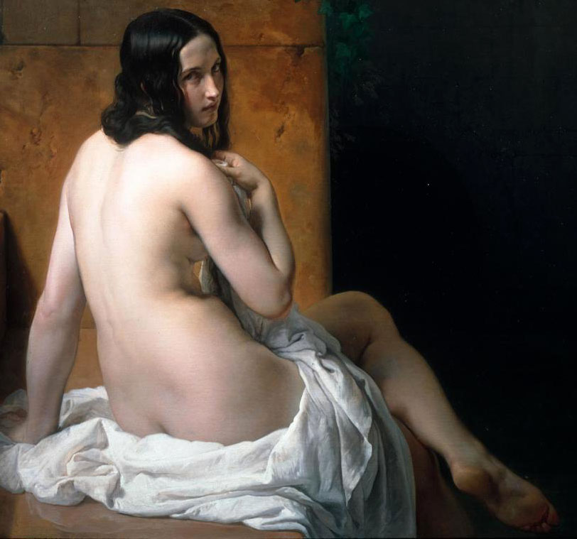
William Sergeant Kendall, art interlude, 1907, oil on canvas, American Art Museum at the Smithsonian Institution, Washington D.C.Rembrandt van Rijn, Lucretia, oil on canvas,(47 1/4 x 39 3/4 in.), 1664, closeup of fabric and pearls. National Gallery of Art, the Smithsonian, Washington, DC. Rembrandt depicts the suicide of Lucretia happening in Rome in the 6th century BC. She signifies virtue, loyalty and honor wearing white and pearls. You can read the full story here: https://www.nga.gov/collection/art-object-page.83.htmlPsyche Abandoned by Pietro Tenerani, Pitti palace, Rome, Italy. Image by Veronica WintersPaul Delaroche, the execution of Lady Jane Grey, National Gallery London. The only person dressed in white – Jane Grey symbolizes innocence.Paul Delaroche, the execution of Lady Jane Grey, National Gallery London, Photo by Veronica WintersSir Joshua Reynolds The Ladies Waldegrave 1780, closeup, Scottish National Gallery. The dresses in Joshua Reynolds’ “The Ladies Waldegrave” are a striking feature of the painting. All three sisters are clad in garments of a singular color: white. The material is most likely muslin, a popular choice for fashionable gowns in the late 18th century. White evokes purity, innocence, and a sense of classical elegance and timeless quality Reynolds appreciated in ancient art.Canova, Cupid and Psyche, marble sculpture, 1793, Louvre. Photo: Veronica WintersEdgar Degas, The Dance Class, oil painting, 1874, the Met, NY | Degas created a series of paintings devoted to the theme of dance. He captured white ballerinas in rehearsals sketching in pastels and painting in oil.Gerome, Pygmalion and Galatea,1890, oil on canvas, 35 x 27 in. (88.9 x 68.6 cm), the Met. “Between 1890 and 1892, Gérôme made both painted and sculpted variations on the theme of Pygmalion and Galatea, the tale recounted in Ovid’s Metamorphoses. All depict the moment when the sculpture of Galatea was brought to life by the goddess Venus, in fulfillment of Pygmalion’s wish for a wife as beautiful as the sculpture he created. This is one of three known versions in oil that are closely related to a polychrome marble sculpture, also fashioned by Gérôme (Hearst Castle, San Simeon, Calif.). In each of the paintings, the sculpture appears at a different angle, as though it were being viewed in the round.” The MetFrancesco Hayez Suzanna at her Bath, National Art Gallery of Scotland. A classical painting in many ways, the white fabric forms a circle around the nude communicating innocence of youth.
White as the representation of timelessness & memory
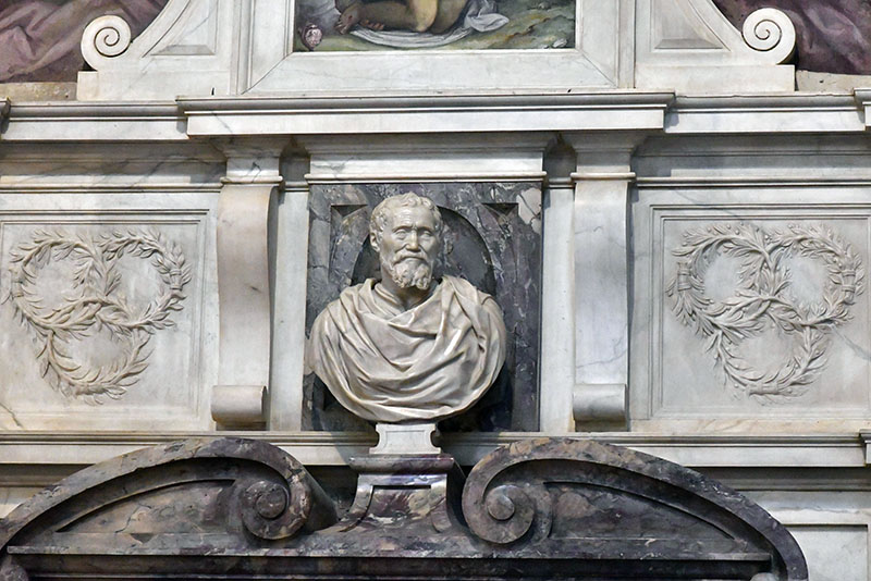
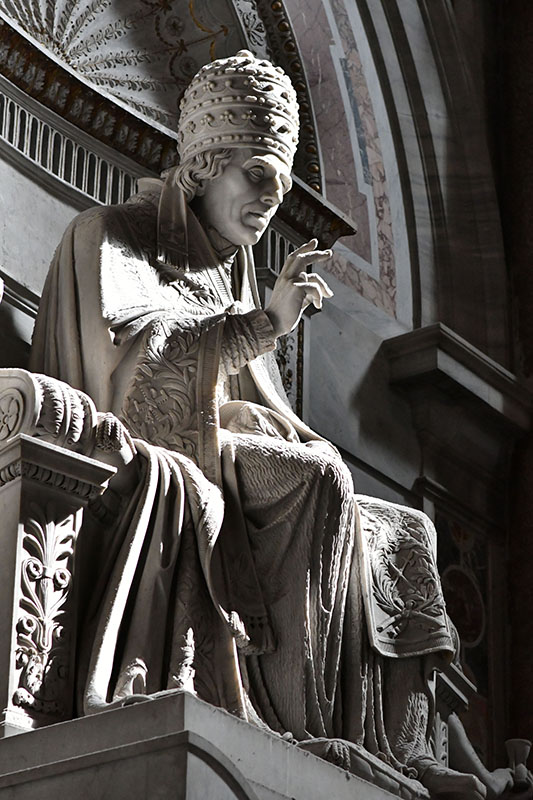
The marble sculpture at the CA’ d’ ORO Palace in Venice, Italy.Michelangelo’s tomb, detail, ItalyI love how lifelike this sculpture looks. It shows a pope blessing the crowd and wearing his crown. The light hit it so beautifully. It’s in St. Peter’s Basilica in Vatican City, Rome, Italy.
Negative white
Depending on our view of the world, specific events or cultural differences we can see the color white as cold, empty and artificially sterile. This kind of emotionless, stark white can trigger feelings of isolation, and emptiness. Moreover, white can be associated with mourning and death in some countries.
White ghosts scare us, representing the supernatural and death.
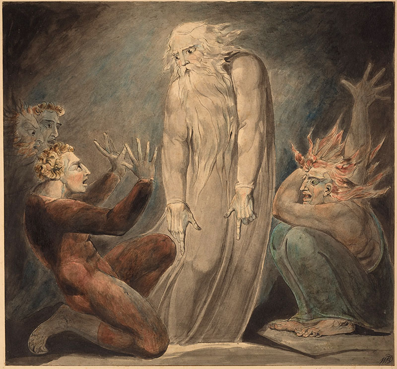
William Blake, The Ghost of Samuel Appearing to Saul, c. 1800, pen &ink, watercolor, National Gallery of Art, the Smithsonian, Washington DC
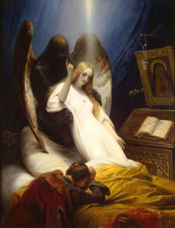
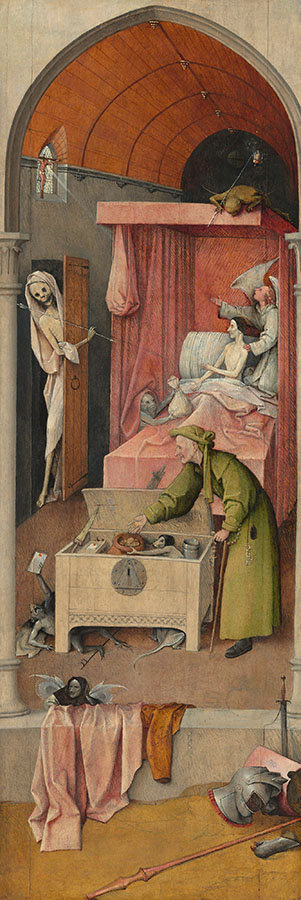
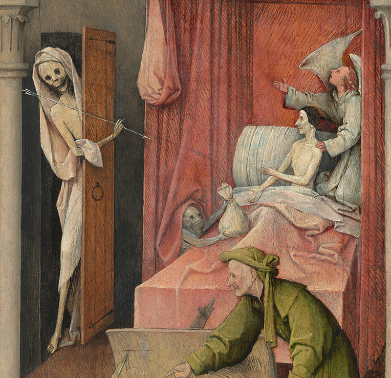
White can also represent death. White shroud symbolizes death, mourning, and loss.
Vernet, Horace. Angel of death, 1789-1863, the HermitageHieronymus Bosch, Death and the Miser, c. 1485/1490, oil on panel (other panels lost), 93 × 31 cm (36 5/8 × 12 3/16 in.), National Gallery of Art, Washington DCHieronymus Bosch Death and the Miser, c. 1485/1490, oil on panel (other panels lost), 93 × 31 cm (36 5/8 × 12 3/16 in.), National Gallery of Art, Washington DC. “In this panel Bosch shows us the last moments in the life of a miser, just before his eternal fate is decided. A little monster peeping out from under the bed–curtains tempts the miser with a bag of gold, while an angel kneeling at the right encourages him to acknowledge the crucifix in the window. Death, holding an arrow, enters at the left. Oppositions of good and evil occur throughout the painting. A lantern containing the fire of Hell, carried by the demon atop the bed canopy, balances the cross which emits a single ray of divine light. The figure in the middle ground, perhaps representing the miser earlier in his life, is shown as hypocritical; with one hand he puts coins into the strongbox where they are collected by a rat–faced demon, and with the other he fingers a rosary, attempting to serve God and Mammon at the same time. A demon emerging from underneath the chest holds up a paper sealed with red wax — perhaps a letter of indulgence or a document that refers to the miser’s mercenary activities. This type of deathbed scene derives from an early printed book, the Ars Moriendi or “Art of Dying,” which enjoyed great popularity in the second half of the fifteenth century. The panel may have been the left wing of an altarpiece; the other panels — now missing — would have clarified the meaning of some aspects of the scene, such as the discarded and broken armor and weapons in the foreground.” Taken from the gallery’s page https://www.nga.gov/collection/art-object-page.41645.html
Empty white rooms can feel lonely and even scary.
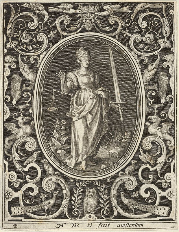
Blindfolded figures often represent ignorance, inability to see, and vulnerability, but the blindfolded Lady Justice has a different meaning. The blindfold represents that justice is unbiased and should not be influenced by a person’s appearance or other factors.
Justice, from the Cardinal Virtues, Nicolaes de Bruyn Netherlandish, Publisher Frederick de Wit Dutch 1648–56, the Met, New York. http://www.metmuseum.org/art/collection/search/423841
Whitewashing is a term denoting the covering up of unpleasant truth, describing censorship.
art museum, Metz, France
As you can see the color white carries several meanings and rich symbolism in art history and our life. What do you think of white?
PS If you see a mistake in this article, please know it’s not intentional. Reach out with the suggested correction to nika@veronicasart.com
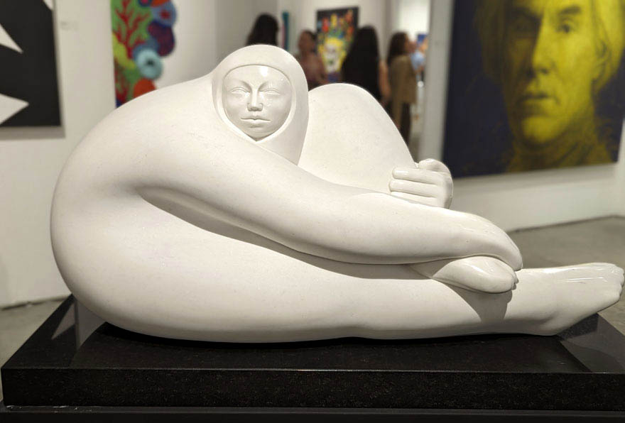
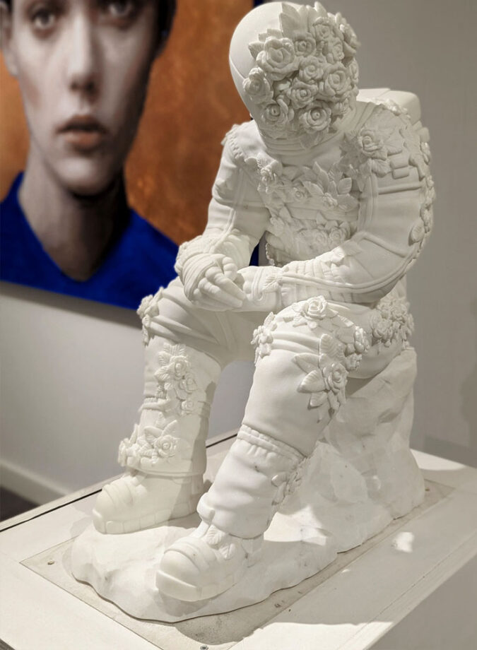
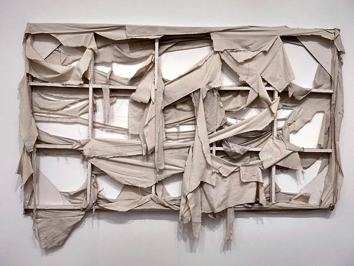
The Color White in Contemporary Art
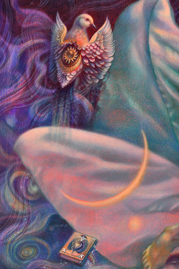
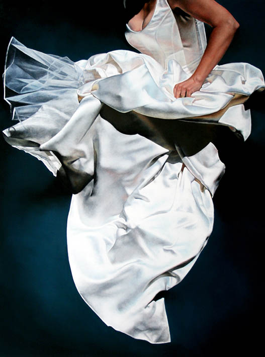
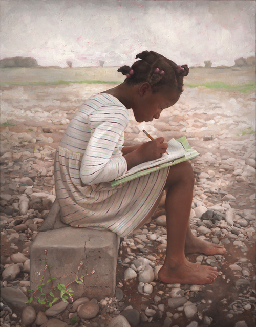
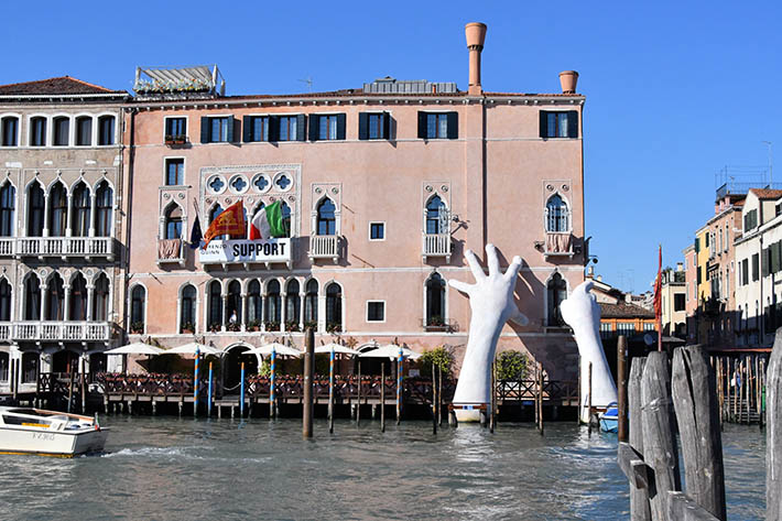
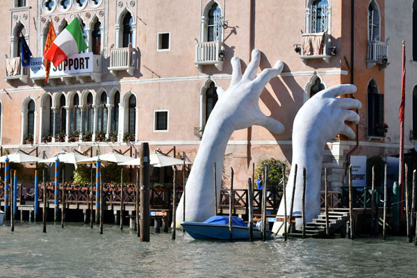
Ann-Marie Kornachuk, oil painting, copyright of the artistG Mortenson, Homework, copyright of the artistLorenzo Quinn, Hands, sculpture, Venice. Photo by Veronica Winters, 2017Lorenzo Quinn, Hands, sculpture, Venice, Italy. Photo by Veronica Winters, 2017Jorge Jiménez Deredia, capullo, marble sculpture-contessa gallery-art wynwood 2023Filippo Tincolini, Spacesman seat, Marble, exhibited in Miami Art Context 2023Michael Buthe, white painting at Tate Modern, 1969, London. I snapped a picture of this painting in 2019. A carefully constructed composition with white stretcher bars, Buthe blurs the line between the canvas and its support, emphasizing the artwork’s physical construction.Freedom, 22x30inches, colored pencil drawing by Veronica Winters
Gallery Tour—We Live in Painting: The Nature of Color in Mesoamerican Art
jascencio
Mon, 04/28/2025 – 15:05
Join a LACMA for a gallery tour of We Live in Painting: The Nature of Color in Mesoamerican Art.
Mesoamerican artists held a cosmic responsibility: as they adorned the surfaces of buildings, clay vessels, textiles, bark-paper pages, and sculptures with color, they (quite literally) made the world. The power of color emerged from the materiality of its pigments, the skilled hands that crafted it, and the communities whose knowledge imbued it with meaning. Color mapped the very order of the cosmos, of time and space. By engineering and deploying color, artists wielded the power of cosmic creation in their hands. We Live in Painting: The Nature of Color in Mesoamerican Art explores the science, art, and cosmology of color in Mesoamerica. Histories of colonialism and industrialization in the “color-averse” West have minimized the deep significance of color in the Indigenous Americas. This exhibition follows two interconnected lines of inquiry—technical and material analyses, and Indigenous conceptions of art and image—to reach the full richness of color at the core of Mesoamerican worldviews.
Please be aware that these tours are volunteer-led and subject to cancellation. Ask a member of our team on the day for details.
All education and outreach programs at LACMA are underwritten by the LACMA Education Fund and are supported in part by the Judy and Bernard Briskin Family Foundation, The Rosalinde and Arthur Gilbert Foundation, the William Randolph Hearst Endowment Fund for Arts Education, Alfred E. Mann Charities, The Ralph M. Parsons Foundation, Gloria Ricci Lothrop, the Flora L. Thornton Foundation, U.S. Bank, and The Yabuki Family Foundation.