WOULD LOVE FOR YOU TO JOIN US THIS SUMMER!!!
You will need to check with your district if it will count for your PD hours. I will provide a certificate that says you completed 18 hrs of PD.

I’ve been talking about overlapping and showing “space” in your work with my second graders. We created fish tanks that had a defined corner to create a bottom, side, and back to the tank. I was not looking for mastery as this is a new concept to them. I was just introducing the idea. We used watercolor pencils to finish the work.
YOU ARE GOING TO NOTICE IN SOME OF THE PICTURES THE VERTICAL LINE IS VERY CURVED. THAT IS BECAUSE THE PAPER CURLED WHEN IT DRIED & I DIDN’T FLATTEN IT OUT BEFORE SNAPPING THE PICTURE! ha ha


Your first year of teaching is never “easy”. People have all kinds of stories from their beginnings in education. Some funny, some embarrassing, and some are just plain cringey.
My first year of teaching ended in disaster. This is not an exaggeration. There literally was a natural disaster. A tornado(s) went right through Nashville. Growing up in Appalachia in the middle of the forest, I had no idea a tornado could hit a city. It can. It did. I had left 15 min. before it hit, and had been in my classroom till six at night the whole week until the day of the tornado. Everyone thought I was still in there, and had the police dogs search my portable to see if I was still in there underneath the debris. I finished the year on a cart and working from the stage of the cafeteria. I learned a lot about myself & what a wonderful community can do in the face of adversity.


This summer my family (all five of us) went to Mexico to work in an orphanage for a week. My main “job” was to paint a mural. Having seen pictures of grounds/facilities, I knew it was mostly white & grey. I’m a huge believer in art being transformative visually & emotionally. I had asked prior to going if that was something they would like. They said yes, but wanted some sketches to select from. One of which was done in the style of Mexican embroidery. This is the one they wanted. I was fine with it because the design was similar to Pennsylvania Dutch Hex Signs (my mom’s side is from a Pennsylvania Dutch background). I brought in few teenagers each day to help me with painting of the mural.
Our first day I took about four hours to draw out the mural. The wall is kind of stucco “ish”, and wasn’t the easiest to draw upon.


On the second day, I had three high school students from the Texas team helping me paint. We focused on the blues & greens. It was a real “learning” day for me. The surface was so bumpy, and had to figure out what way of painting worked best.


On the third day three of the youth from our church helped me start adding in the other colors. I also started seeing some “holes” in the design that needed “MORE”. I added more leaves, butterflies, hearts, and flowers to fill out the design more. I worked on that and doing some larger blended flowers. My amazing crew filled in with solid color.


On the last day, my daughter (blue shirt) & her best friend helped me out on the last day. One of the wall texture “issues” was pitting in the paint. Little white “holes” that would appear after the paint started to dry. So the girls helped me for about an hour, and then I spent the next 7 1/2 blending colors, adding details, adding highlights…and other assorted things.


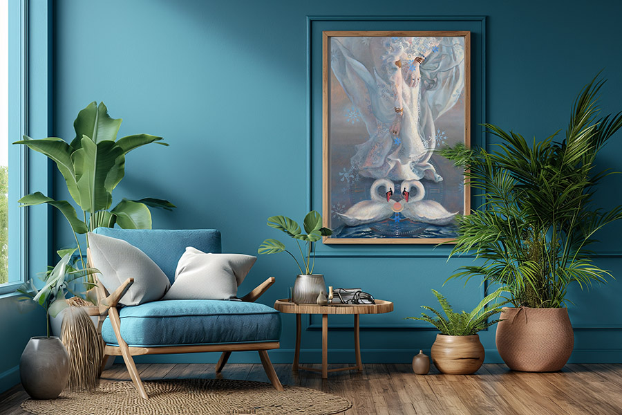
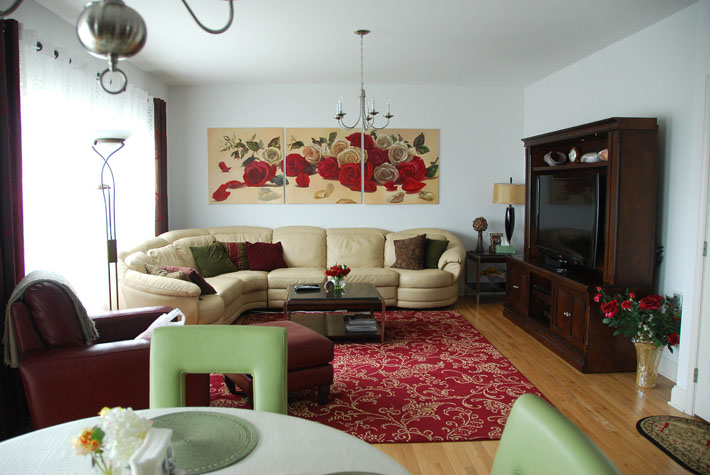
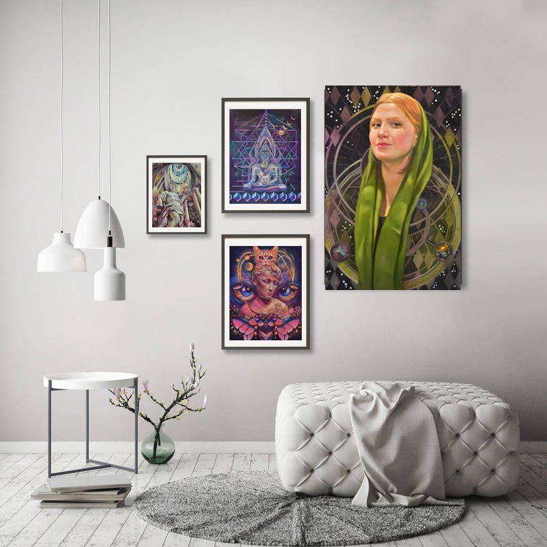
The right art display can transform an ordinary room into a personal museum. Whether you’re showcasing family photos, collected paintings, or your creative works, a well-planned home gallery adds character, style, and mood to your living space. But how exactly do you create the right space for a gallery? Do you need a room with many windows, or is artificial light better? What should the layout of the room look like? Let’s break down the essential steps to create an impressive art display that fits your home, lifestyle, and budget.
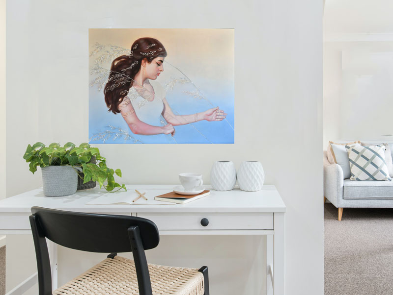
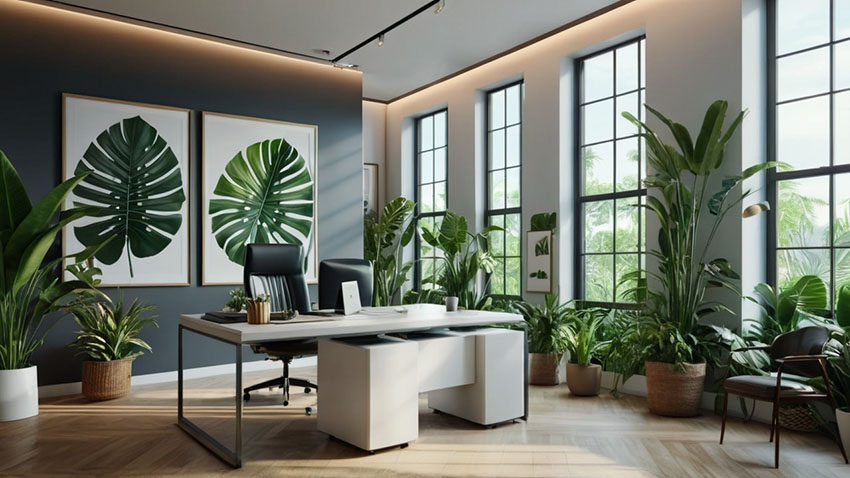
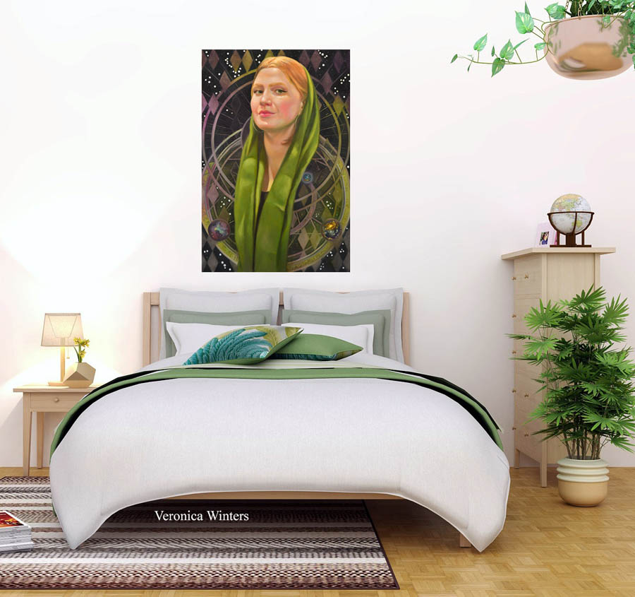
The first step is choosing the right location for your gallery. While many homeowners automatically think of the living room, consider other spaces that could work better. A wide hallway, home office, or even a dedicated spare room can serve as an excellent gallery space. Your bedroom could have a large, empty wall. The office space might have a long, narrow wall that’s grey and boring unless you put art into it. The key is finding an area with enough wall space and natural traffic flow.
Look for rooms with minimal furniture and clean sight lines. To display art beautifully at home, you need to make it possible for viewers to focus on the art without visual distractions. Also, consider how people move through the space — a gallery shouldn’t block normal traffic patterns or create awkward bottlenecks where you bump into the art with your shoulders.
Don't hang big art where is not enough space between art and the viewer to see it properly. Don;t hang art too close to the kitchen's oven or cooking stove as hot vapors may damage the art in the long run.
Before you start hanging artwork, assess the walls. Older homes often need wall repairs or fresh paint. Fix any cracks, holes, or uneven surfaces. Color your walls in a light, neutral hue like light grey or beige. A smooth, clean wall surface makes your art look more professional and protects your pieces from damage.
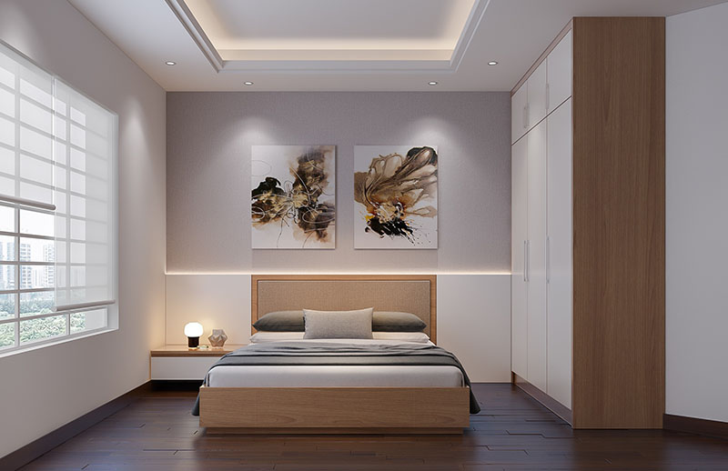
Proper lighting can make or break a home gallery. Natural light is beautiful but can damage artwork over time. UV rays fade colors and can crack canvas art. If your chosen space has large windows, consider installing UV-protective window film or light-filtering shades. In general, it’s best to display the art under diffused light that has minimal UV impact. I’m not a big fan of direct, artificial light that leads to uneven fading of any art.
For artificial lighting, you have several options:
The color temperature of your lights matters too. Aim for bulbs rated between 2700K and 3000K for warm, natural-looking light that shows true colors. LED options now offer excellent color rendering while staying cool and energy-efficient.
If you display drawings (art on paper including watercolor), I strongly recommend the UV-protective, non-reflective plexiglass to protect art from damage. The thicker the plexiglass, the more exponential the protection is for art.
Before making any holes in your walls, plan your layout. Many professional installers use the paper template method: cut paper sheets to match your artwork sizes and tape them to the walls. This lets you experiment with different arrangements without damaging walls or artwork.
Consider these layout principles:
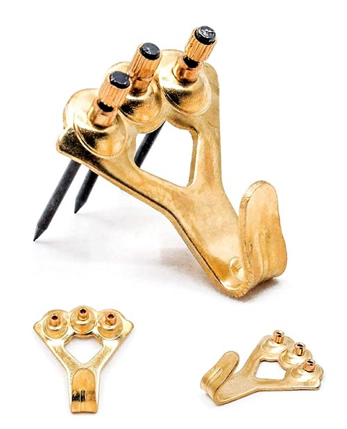
Most home walls can support small framed art (under 16 inches long and light frame), but heavy pieces need special attention. Locate wall studs with a stud finder and use appropriate anchors for your wall type. In older homes, plaster walls may need different hardware than modern drywall. If you don’t do this, your heavy art may fall off of the wall, break the frame, and damage both its surface and the floor or furniture below it.
If you’re planning an extensive gallery, consider these structural updates:
Your home environment affects artwork differently than a museum setting. Consider these factors:
You might need to upgrade your home’s climate control system or add a dehumidifier to protect valuable pieces. Installing quality air filters helps reduce dust and other airborne particles that can damage artwork over time.
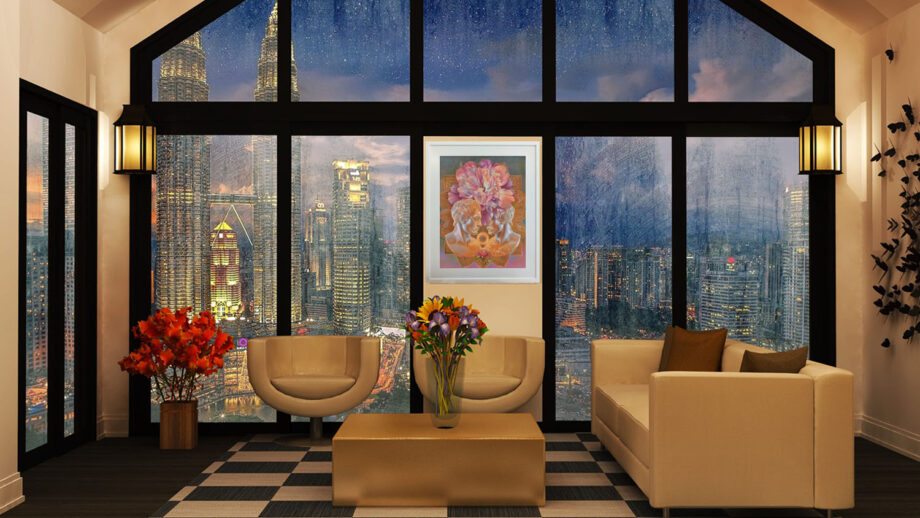
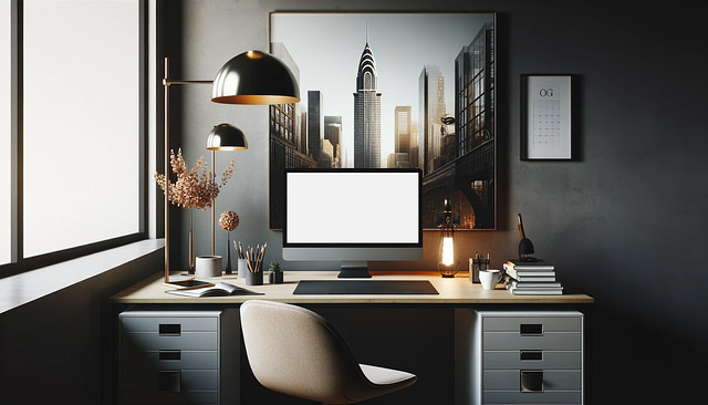
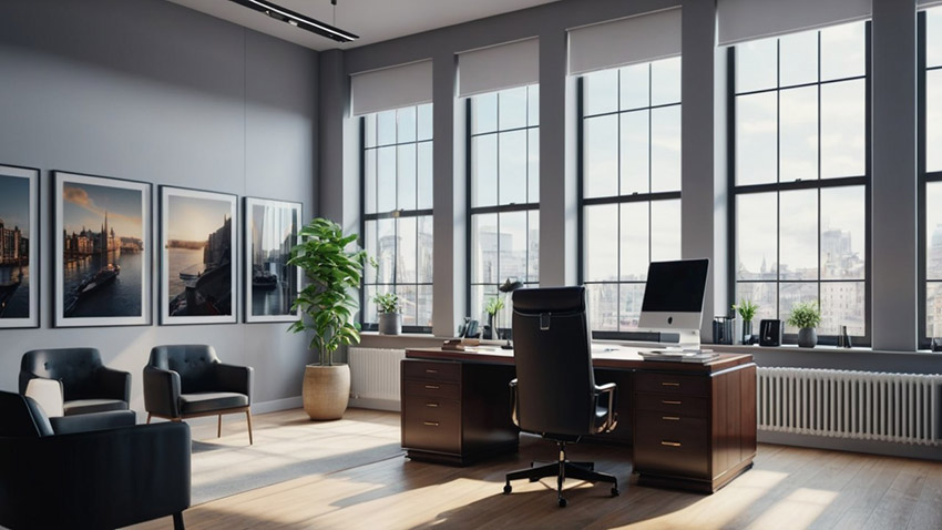
Besides creating a wonderful art collection at home, you can also become a trendsetter by displaying art in your office. If you’d like to create a unique environment in your business space, consider the following details.
Your art collection can make your brand and space different from millions of boring office spaces. You can attract new clients by showcasing your unique, luxury space that sparks conversations and makes you and your business memorable! Many offices looks the same having no clear direction or authenticity. Contemporary art can help you stand out from a crowd.
Describe your company using visual language so we can understand it without words. Bring art that relates to your business and matches in color. If you sell flowers, have floral art on the walls. If you’re in the real estate business, art with local scenery well. If you sell cars, have excellent, high-quality art or photos of rare cars on your walls. If you’re a law firm, you have many options keeping it either conservative or contemporary.
You can create a soothing productive environment with light and art pieces that distress workers. Office employees can improve focus by resting their eyes on art. It creates a positive energy flow. Art can make offices a safe and comforting space you want to come back to. Pay attention to how psychologists decorate their offices because their art often creates inner comfort and warmth. Art with green plants can match your interior or canvases with blue landscapes may be a perfect fit for your space. Think of a feeling you want to elicit, colors help you communicate that feeling.
Your art wall displays can become an inspiring space your clients will want to come back to. Art encourages positive emotions, creative thinking, and a light or fun atmosphere in an otherwise boring workspace.
Give people more chances to talk about your business for free! Without buying expensive ads, a great art collection speaks for itself. Be the leader in your business by displaying memorable, high-quality art that gives people more chances to talk about your business! Invest in art that inspires us and holds value long-term.
Finally, let’s talk about the most important and practical aspect of your art collection for office space. Before rushing to your local art fair to buy paintings, think of all 5 points I mentioned earlier: brand positioning, color, visual comfort, feelings you want to create, and trendsetting. Here are a few more things to consider.
A home gallery will grow with you. Leave space to add new pieces, and don’t feel locked into your initial arrangement. Professional galleries regularly rotate their collections — you can do the same at home. This keeps the space fresh and lets you highlight different pieces throughout the year.
Consider practical matters like cleaning and maintenance. Leave enough space between pieces to dust effectively. Think about how you’ll reach higher artwork for cleaning or rearranging. If you’re installing track lighting, make sure you can access it for bulb changes.
If you hang art in office space, strongly consider foot traffic around your art. Some artsy hotels display original art in glass cases, large wall spaces can have canvas art displays in groups that have no direct reach to it. In other words, your customers shouldn’t bump into wall art displays constantly.
To sum up, creating a home gallery or a business space decoration takes planning and often some home modifications, but the result is worth the effort. A well-designed gallery space showcases your collection, adds personal character to your home, and lets you feel joy. Take time to consider all aspects — from wall preparation to lighting to preservation — and you will create a display space that works beautifully for years to come.
Welcome to a new school year! Not a lot has changed in my room.
I always tweak little things here and there.

I’ve been in this classroom for over 20 years, and feel very blessed to have this space.


Please feel free to ask any questions you might have as you look through
my pictures (or any post on my blog).


I have a nice big reading area. I start every kindergarten class with a story. I love children’s books, and feel it is important for children to have people read to them. I believe it truly helps to ignite creativity.


Chris Burden’s Metropolis II is an intense kinetic sculpture, modeled…
Perhaps the most dominant art form of the last 100 years, film has an important…
Tuesday Matinees
Enjoy concerts featuring leading international and local ensembles in programs o…
Art & Music,Jazz at LACMA,Latin Sounds
LACMA offers in-person art classes for kids, teens, and adults, offering the cha…
Random International’s Rain Room (2012) is an immersive environment of…
Rain Room
Artist Robert Irwin’s work in the last five decades has investigated perception…
Barbara Kruger’s Untitled (Shafted) features her distinctive use of advertising…
Band (2006) may qualify as Richard Serra’s magnum opus, representing the fullest…
LACMA’s Modern Art collection features primarily European and American art from…
LACMA’s Acquisitions Group and Art Council members share a deep affinity for the…
Art Councils,Acquisition Groups,Art of the Middle East: CONTEMPORARY,Asian Art Council,Costume Council,Decorative Arts and Design Council,LENS: Photography Council,Modern and Contemporary Art Council,Prints and Drawings Council
Welcome to the employment page of the Los Angeles County Museum of Art. To see a…
Jobs,Careers,Internships,Volunteer
Join museum educators, artists, curators, and experts for artist talks, virtual…
Create+Collaborate
In Golden Hour, over 70 artists and three photography collectives offer an aesth…
Established in 1967, the Conservation Center at LACMA supports the museum’s comm…
painting conservation,paper conservation,object conservation,textile conservation,conservation science,conservation imaging
Barbara Kruger: Thinking of You. I Mean Me. I Mean You. is a major exhibition de…
Featuring Ai Weiwei, Huang Yong Ping, Wang Guangyi, Xu Bing, Yue Minjun and more…
Beyond the concrete materials of ink and paper, there is an intangible spirit un…
To complement the presentation of The Obama Portraits by Kehinde Wiley and Amy S…
From the moment of their unveiling at the Smithsonian’s National Portrait Galler…
(Los Angeles, CA—January 13, 2022) – The Los Angeles County Museum of Art (LACMA…
(Los Angeles, CA—December 14, 2021) The Los Angeles County Museum of Art (LACMA)…
Mixpantli: Contemporary Echoes showcases the lasting impact of Indigenous creati…
LACMA marks the 500th anniversary of the fall of the Aztec capital Tenochtitlan…
Since the mid-20th century, California has been a beacon of both inventive desig…
Revealing insights about family life and the quotidian in the 21st century, Fami…
One of the most significant contributors to fashion between 1990 and 2010, Lee A…
Comprising approximately 400 works, including an unprecedented number of loans f…
Archive of the World: Art and Imagination in Spanish America, 1500–1800 is the f…
Scandinavian Design and the United States, 1890–1980 is the first exhibition to…
In the work of American artist Sam Francis (1923–1994), Western and Eastern aest…
I have been a HUGE fan of Crayola’s # 2 pencils since I first came across them at Dollar Tree several years ago. They last longer than the former best pencil out there (which has really become one of my least favorite pencils because of the quality & price!). I looked at ordering more after running out at the end of last year, but did not see them. After looking at several places, I decided to write Crayola and see what was going on. They said they actually discontinued them fall of 2023! AHHH!!!!!! Heart broken!


This is a fun winter art project that allows students to use their creativity to make matching mittens, exploring symmetry and balance! I have been doing this art project for years and years and I keep returning to it every year because I think it’s great for fine motor skills and spatial awareness. It also strengthens their attention to detail as they work to make both mittens match perfectly.
I’m not sure where I originally learned about this art project, but it had to have been about 15-20 years ago. So many of these ideas floating around social media and the internet have been around forever! This is a good one and maybe you haven’t seen it yet. I like to do this with Kindergarten, but I think Pre-K could do a simpler version and older kids could make more detailed mittens.
Objectives:
● Students will develop observational skills by carefully replicating patterns and lines in reverse.
● Students will explore symmetry and balance in art by creating matching mittens.
● Students will practice fine motor skills through tracing, drawing, and pattern-making.
● Students will explore creativity by making unique patterns and designs.
In this art project, students will make a pair of mittens that match. First, the students will design one mitten with patterns and lines. Then, they will copy that design onto the second mitten, but in reverse—like a mirror.
“If you draw a heart on the left side of one mitten, you will need to draw the same heart on the opposite side of the other mitten.”
“If you put a wavy line in the top of one mitten, the wavy line needs to go in the same spot on the other mitten.”
● Print the mitten template onto card stock (thicker paper). (Amazon Affiliate links have been used for art supply links at no extra cost to you. The small commission earned goes towards maintaining this website.) You can use this as the drawing surface, or you can make them into reusable templates for your students to trace. I have one set of templates and reuse them every year. To do this, trace your mitten on to thicker poster board (I use “railroad board.”). Trace as many templates as you will need and cut them out. Students will then use these to trace on to their larger paper. They will trace it once, flip over the template and trace the other mitten. I do this step, because it is a good skill for practicing fine motor skills. But if you want to save time, you can just have the copies printed out.
● Trace the mitten on to construction paper (I like Tru-Ray Construction Paper– 12” x18” paper). Flip the mitten over and trace the other mitten.

● Draw designs on one mitten, using markers or crayons. Emphasize coloring neatly and carefully.
● Then, copy the designs and patterns on to the other mitten, but in reverse, like a mirror. Some students may want to do one shape at a time, going back and forth between each mitten, which is totally fine! Others might like to finish one whole mitten first.
● Some kids might get stuck on the fact that it is very difficult to make an exact mirror image. Explain that they should try the best they can, but it’s okay if it’s not perfect! We are aiming for doing our best and it’s still going to look beautiful even if it’s not perfect.

● Cut out the mittens and glue to a piece of colored construction paper.
● Unroll a cotton ball and spread out on the bottom of the mitten to look like fur.
● Add snowflake punch shapes (I like these and this one) to the background or draw on designs with construction paper crayons or metallic markers.


If you have any questions, feel free to leave a comment! Also, does anyone have any good book suggestions (besides the book The Mitten) that can go along with this project?
Subscribe to get the latest posts sent to your email.
It’s no secret that Dollar Tree is one of my favorite places!! Recently I found these Christmas gnomes that I thought were super cute. However, I saw the potential in using them at school with a little transformation. The image is printed on(except the gloves and boots are extra wood pieces added on top of the image. The snow flake and present were on the beard of the gnomes, and I knew I could easily paint over that area, and change things up a bit. I have them flanking a board in the hall where I hang students work they make me outside of class. They have become the art gnome guardians.


