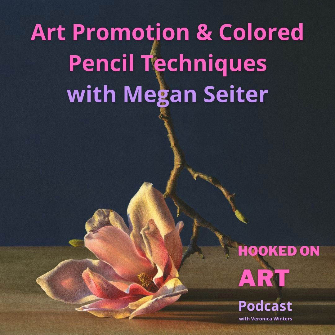
Learn art promotion and colored pencil techniques with Megan Seiter
Megan Seiter is an accomplished, contemporary hyperrealist artist working in colored pencil. A winner of many prestigious awards, Megan creates beautiful floral paintings with a twist. Using the pan pastel and watercolor she draws realistic still life paintings with amazing precision and vibrancy. In the interview she shares her colored pencil techniques, art supplies and gives us valuable tips on art marketing, presentation, networking, gallery representation, and so on. You don’t want to miss this episode!
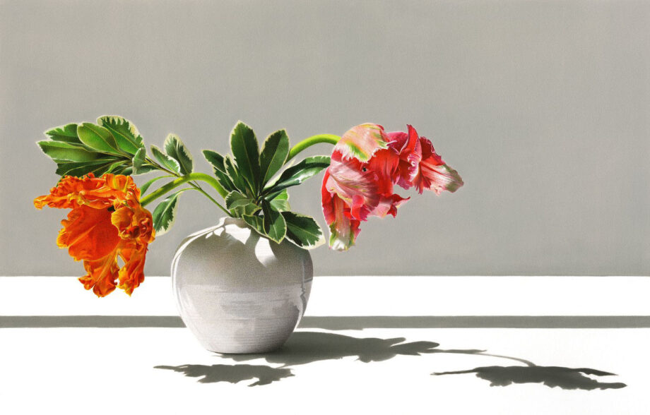
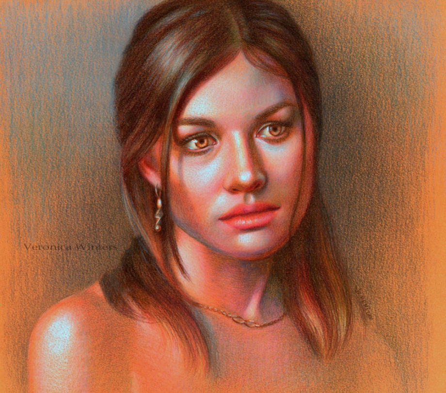
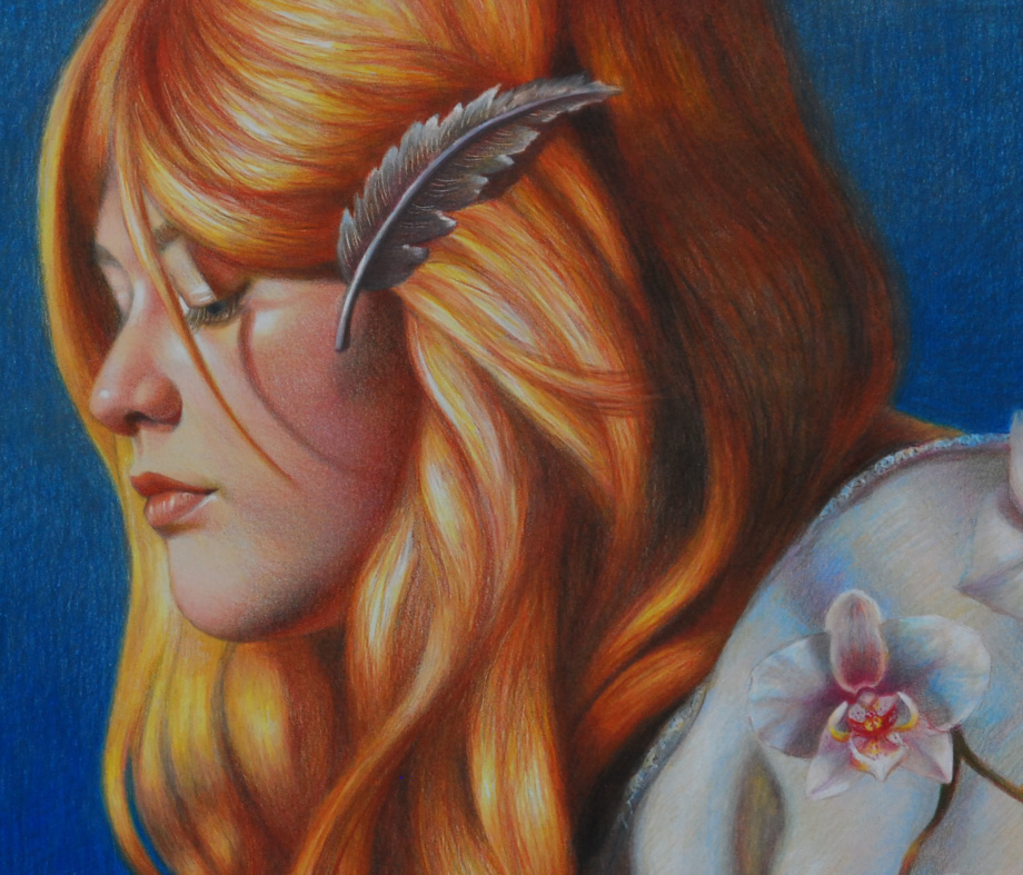
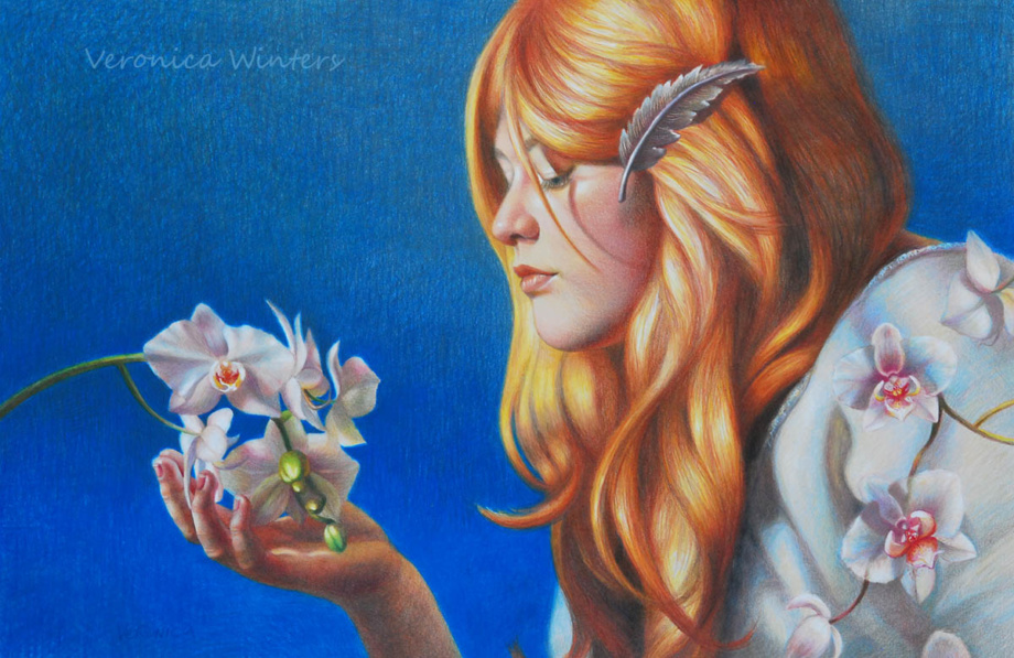
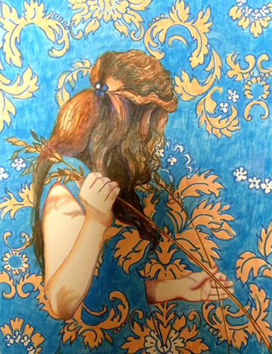
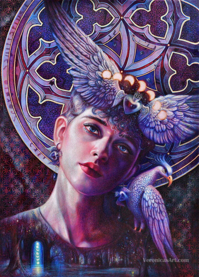
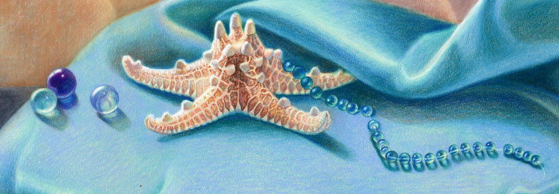
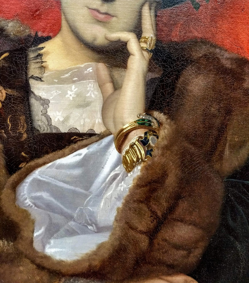
Parrot Tulips by Megan Seiter, colored pencil drawing
In this comprehensive colored pencil drawing guide you’ll learn about photography, shading, tools, art supplies, colored pencil techniques, realistic colored pencil portrait drawing, mixed media drawing and more. While I closed the comments section under each article because of spam and bots, you can email me your suggestions at nika@veronicasart.com or message on Instagram for videos and topics you want me to cover in the future.
Explore related articles in colored pencil drawing tips:
Drawing daily is essential to advancing an artist's skills. I used to struggle with the depiction of human form, drawing stick figures. It was difficult to get classical art education over 25 years ago, but it is available today in a number of atelier schools popping up throughout the country. They didn't exist back in 2001. It took me many years to "learn" how to draw, studying here and there without the backbone of a complete system that is now offered by the Grand Central Academy of Art in New York. Over the years I learned some important drawing principles that I'd like to share with you here.
HOW TO USE COLORED PENCILS FOR BEGINNERS: art supplies & techniques
If you’re new to colored pencil drawing, please learn about the basic colored pencil techniques and art supplies I mention in this video. Colored pencil portrait drawing is the second step. Master the first step by drawing simple objects from life.
In this video you learn everything you need to know about the colored pencil drawing for beginners. I cover the art supplies, major colored pencil techniques I use all the time. I also show several common mistakes artists make drawing in colored pencil and I explain how to fix these mistakes.
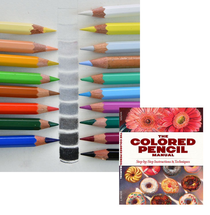
My art instruction book “The Colored Pencil Manual” covers the basics of colored pencil drawing. You can buy it on Amazon at a great price here: https://amzn.to/3fRpoEb
How to Color like an Artist, art coloring book gives artist’s tips and techniques to become great at shading, color choices, texture drawing and much more! https://amzn.to/2LtH0Iq
Colored pencil portrait drawing is infinite fun. There are numerous ways to be creative, capturing unique personality of people. To create beautiful portrait drawings artists study more than the human anatomy. Artists aim at painting the human soul. In this article I’d like to share my basic colored pencil techniques as well as some colored pencil portrait drawing ideas and inspiration you can use in your art.
Limit your color palette
One of drawing ideas is to start a male portrait drawing in one or two colors only. In my portrait drawing video course you’ll learn to do just that!
To see the values (or tones) on your model convert your pictures to grey scale using any software you have. I use Photoshop Elements. By removing color, you focus on values only.
Take a light grey drawing paper for your portrait drawing.
Use two colored pencils -black and white. Everything that’s dark is shaded with black colored pencil and the highlights are marked with white. By controlling your pencil pressure, you adjust the brightness or darkness of your values.
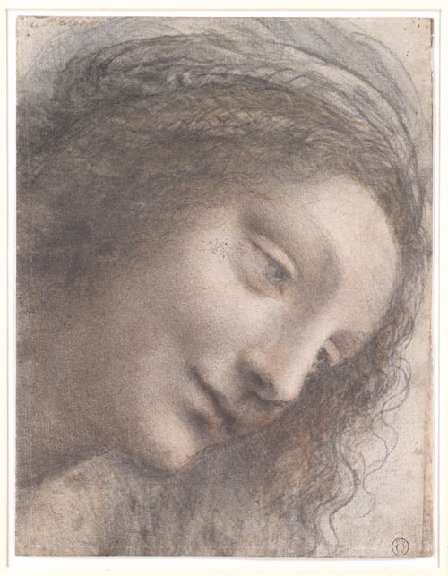
I learned this colored pencil technique up by looking at the old master figure drawings.
Image source: http://www.metmuseum.org/art/collection/search/337496 | | This is a drawing study done by da Vinci in early 16th century. Here you can see how he drew on toned paper in 2-3 hues only.
Follow your favorite artists on Instagram and study their drawing for composition, design, color. etc.
If you just start out pick in portrait drawing, pick the reference photo with a face looking straight at you. Eliminate the head's rotation for now that complicates things.
Reserve your highlights in a colored pencil portrait drawing
When you draw on white paper, you must think of your highlights in advance. Reserve wider space for the highlights that you might need. Later you’ll shade around those highlights with very light colored pencils to have soft transitions in the light. The highest lights MUST stay free of any shading on white paper to have impact.
In this video you’ll learn the basics of color theory, color mixing and shading explained with real life examples.
Control the light, color & values in a colored pencil portrait drawing
Light
All three parameters – light, color, and values are important to understand to create realistic colored pencil drawings. Study the light direction. When the light is directional, one side of the face is much brighter than another. The shadows are strong.
When the light is soft, diffused, and not directional, it gets more challenging to see the changes in skin tones and shapes of the shadows. Although such light gives gorgeous skin tones, it’s much easier to start drawing portraits in colored pencil when you can see definite lights and shadows! In my colored pencil drawing video course, you get ideas and tips on how to pick the pictures, pose models, and photograph them in various lighting conditions. I also complete demonstrations, picking pictures that have good color, clarity, subject, and composition.
Color
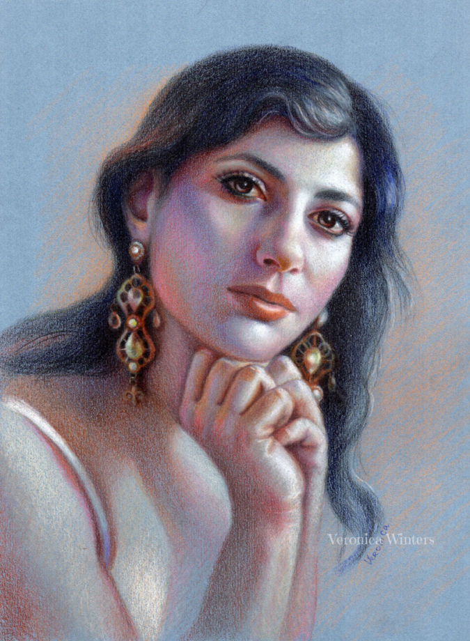
Portrait study in colored pencil, 9×12 in, Veronica Winters
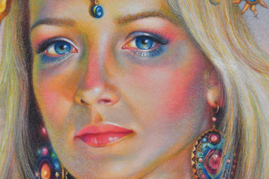
To understand how the color works, limit your colored pencil choices to 15-20 at the most. Study how one color (red) can have lots of variations in color tone (very light to very dark) and color temperature (warm/cool). Because we shade in layers with various pencil pressure we can use 2-3 reds to describe a variety of tones in different parts of the drawing. For instance, in this portrait I used 2 reds – light cadmium red and pink carmine, and 2 pinks – dark flash, light flash (Polychromos). I placed red in the ear, mouth, cheeks, neck, and even the hair. I adjusted my pencil pressure to get a variety of tones.
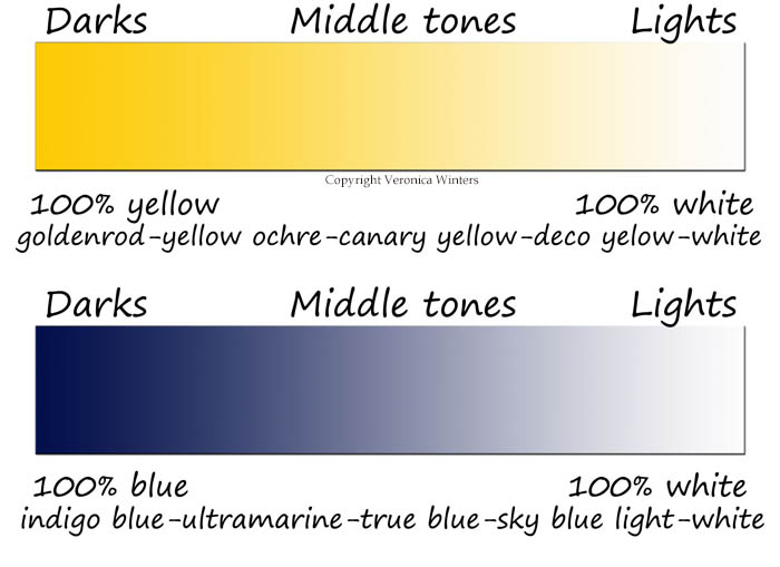
In this picture you can see how certain colors correspond to certain values on the value scale. As an artist, you learn to see these shifts in color to convert to tones. | In this art book I devote the entire chapter to color theory and how to use it in art.
This is the value scale ranging from the purest black to the purest white. Artists can see correct values in colors. They pick and layer colored pencil hues following tones seen in the picture to create contrast and volume.Every color has its value range. Light colors like Yellow can’t have a wide value range as opposed to Blue.
To get a better understanding of values, do this fun exercise every time you start a new project. Step back from your reference photo to see it from the distance. You don’t look at the details anymore. It’s like looking at objects without glasses when it gets a bit blurry. Find the strongest lights, darks and middle tones. These are abstracted shapes on the face, not the features like eyes or lips. Most students shade portraits with many colors, arriving at the image with no contrast. Begin by defining at least 3 values: highlights, deepest darks, and midtones. Leave the highlights uncolored if you draw on white paper.
If colored pencil portrait drawing is your passion, consider following these tips to improve your colored pencil portrait drawing:
Light quality on your subject
Anatomical accuracy
Paper’s smoothness
Colored Pencils’ softness
Colored Pencil Shading
Let’s look at every principle in greater detail.
1. Tips to capture the light on a model in colored pencil portrait drawing
The light quality on your subject, people in this case- is crucial to your success in colored pencil portrait drawing. Since most colored pencil drawing is done from photographs, you must become a good photographer to catch the light on a person with your camera. If you don’t take pictures and use other references instead, you still need to understand the light to create realistic colored pencil drawings.
In this picture I catch the evening light with a beautiful contour on her face and hair. I love this glowing evening light. It’s pinks, golden yellows and purples make the skin look fresh. The shadows are much softer and don’t cut into the face as much as in the afternoon light.
Study other artists and photographs to see how the light turns the form.
Don’t use flash to observe natural shadows.
Let’s look at some art examples.
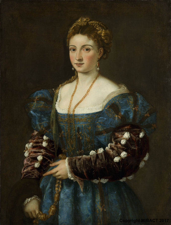
Portrait of a Lady -La Bella, Titian, 1536, Pitti Palace | This portrait has soft shadows on her face. However, the background and gown are dark creating strong contrast.
Shadows:
Take pictures of people and faces at different times of the day to understand how the light changes shadows on the face. Remember, that the portrait must look exciting to you. Spend some time arranging and posing people to capture light and shadows. When you use strong contrast between light and shadow, your portrait drawing will look more realistic and three-dimensional.
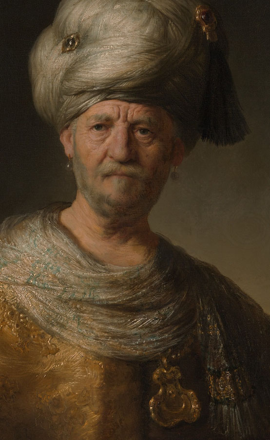
“Man in a Turban,” Rembrandt (Rembrandt van Rijn) Dutch, 1632 | Here we see a strong directional light coming from left to right illuminating one side of the face.
High contrast:
To create high contrast in your colored pencil portrait drawing you need to use the Rembrandt lighting. It’s easy to set up in a small studio. All you need is a single light source, like a table lamp or a floor lamp, to create an abstract pattern of strong light and shade on a person. Set the person up against a plain background, put the light on one side of the face and shoot.
Here I used a single light source with a red filter covering the lamp to illuminate the model in a dark studio.
Vary your point of view, taking pictures:
Besides having good lighting conditions, consider your model’s personality. There is a reason why you want to draw people. Find a special angle that sharpens the character, makes him or her look attractive. Zoom in to the face and crop it on purpose with your camera. Stand up or look down, don’t just take pictures at an eye level.
2. Tips in human anatomy for colored pencil portrait drawing
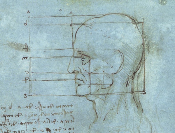
This is Leonardo’s anatomical study of the head. It shows basic proportions of the face.
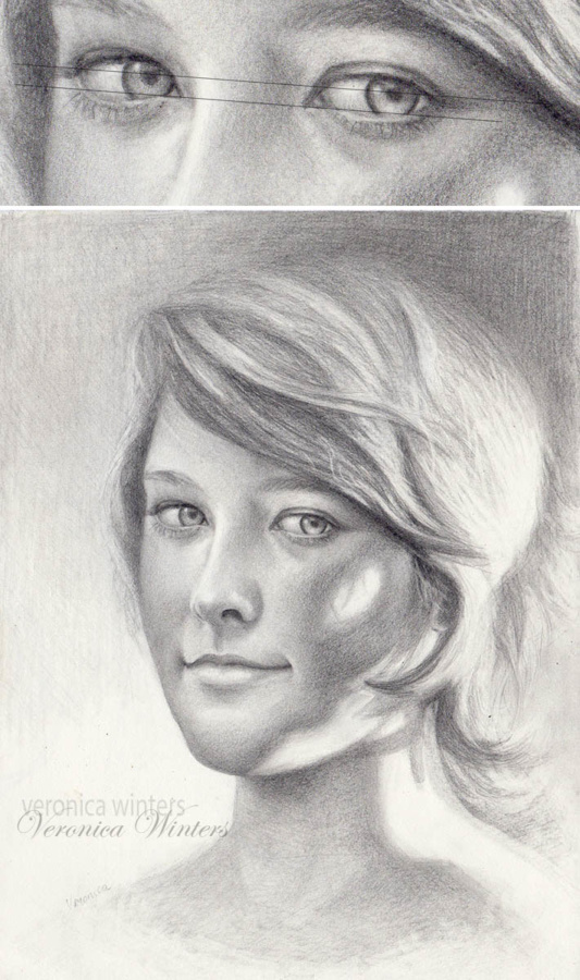
If your aim is to draw realistic faces, you need to catch the unique features of a person. Begin with a basic anatomy drawing of the face. These lines show you basic face proportions. Always check the face proportions and the tilt of the head that determines the line up of all features. I make light lines to place the eyes, nose, and mouth on those lines.
Colored pencil portrait drawing of eyes
I place a line at a diagonal first and then draw the eyes on that line, keeping a one-eye distance between the eyes. This way both eyes are placed on the face correctly.
I always draw the eyes first. I make a straight line to line up the eyes on it, and then strive to make the eyes of the same size and shape, so they appear identical. For that I draw equal circles first and then partially cover the circles by the eyelids. The upper eyelid has a different shape from the lower eyelid. Both eyelids don’t make a corner, like you see in the Egyptian eyes. It’s a very common mistake to draw the eyelids of the same size and shape converging in a corner. Always keep a one-eye distance between the eyes.
I draw the face on a sketch paper and then transfer the outlines either using the window light, or transfer paper. When you shade in colored pencil, the surface must be clean of any residue or excessive graphite lines. Shading over the graphite makes the color look dirty and flattens out the space. So either use a kneaded eraser to clean up the lines or the transfer paper. I tap the lines with a kneaded eraser to get rid of the extra graphite that shows through light colored pencils during shading.
Here you see the steps drawing the eyes. Using the darkest brown, I draw the eyelids and leave space for the highlight in the eye. The color of the iris is lighter at the bottom and much darker at the top because the upper eyelid always casts a shadow on it.
Stand in front of a mirror and look at the colors around your eyes. Do you see light purples, pinks or greens? Look at the area around your nose. Is it warm or cool? Most of the time the nostrils are warm. What’s the color of a shadow on the neck?
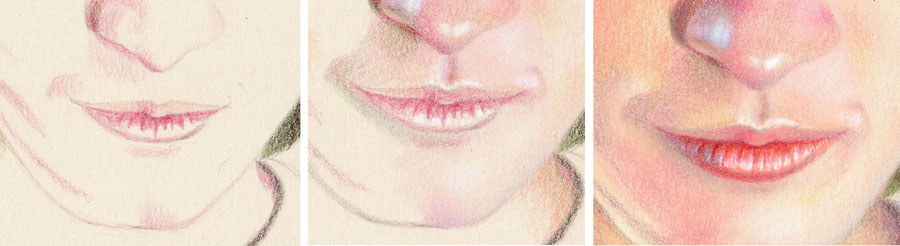
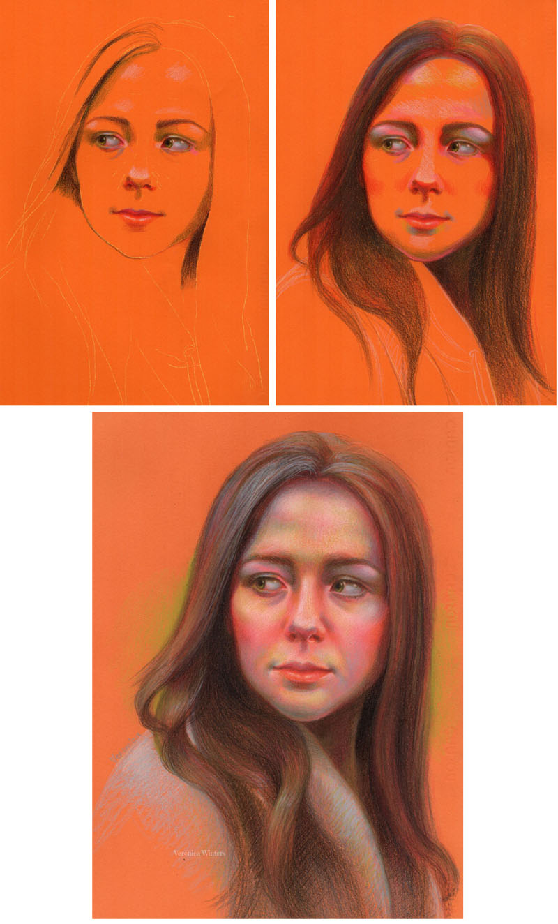
This drawing was done on light grey Stonehenge paper. Step 1: I begin by using Light Peach to shade the upper lip. Then I map out the shadows on the lips with a light touch of Pablo Carmine. Step 2: I mark the highlights on both lips with White. If I drew on white paper, I would leave these spaces free of any shading. I add very light shading to the upper lip with Pablo Carmine. Next, I shade skin tones around the mouth with Carmine, Light Peach, and Olive Green (or Prussian Green). Step 3: I add more color to give the mouth dimension using the same hues. The upper and lower lips never look the same. They differ in tone, shape, and color. Usually the upper lip is darker than the lower one, but here it’s in reverse! The texture of the lower lip is unique to this model. I add Burnt Ochre to the lower lip. With the Periwinkle, I add a touch of grey-blue on the bottom left side to create a shadow. I also shade the skin tones carefully around the mouth with soft strokes and overlapping.
Although I’m liberal with my colors, you can see that my drawing palette is limited to a few colored pencils. The trick is to use the same colors in different combinations throughout the colored pencil drawing for unity. Here I don’t blend the colors with a blender because I draw on smooth paper.
One mistake that most beginner make is shading the lips roughly. They make definite corners and sharp contours in an attempt to define the mouth. Keeping everything soft and remembering that the lower lip doesn't end in a sharp corner makes all the difference. I also pay attention to the size of the mouth in relation to the nose and the eyes. For that you can use a grid method as a beginner. I keep the grid in my mind, constantly measuring and comparing distances to make features of the right size and place.
I spray the colored pencil portrait drawing with a final fixative outside in low humidity. I usually do 3 layers of spray, allowing each layer to dry completely for half an hour.
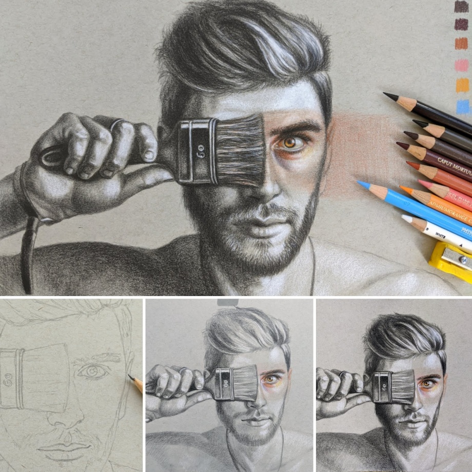
Colored pencil portrait drawing tutorial: how to draw an eye in colored pencils on colored paper
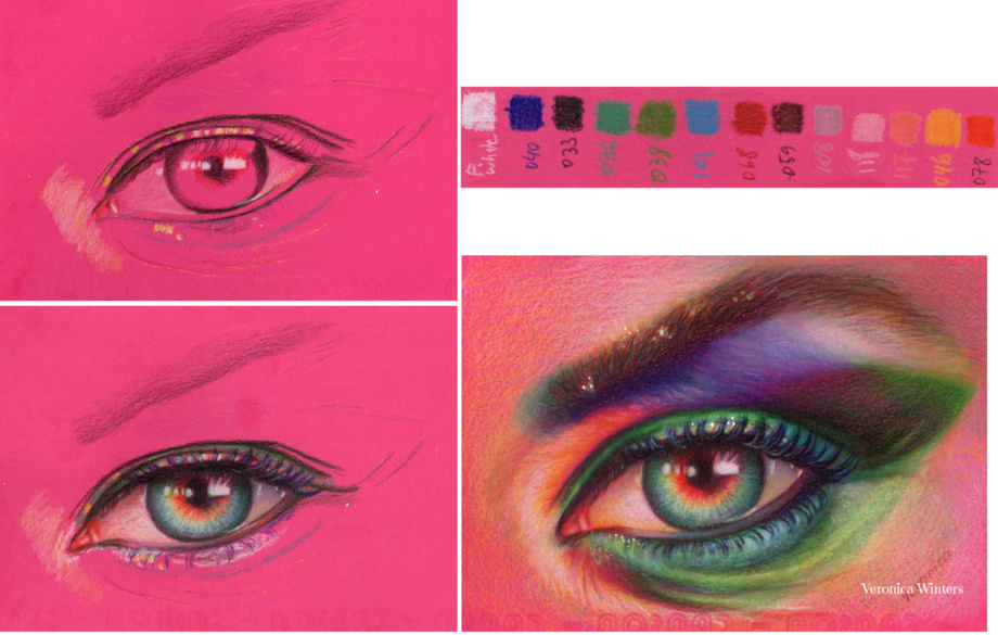
It’s difficult to draw the entire portrait at once. So to practice, you can start drawing facial features separately to understand how light turns the form. Draw the eye, nose, lips, ear separately many times. Below you’ll find an example of me drawing the eye in colored pencil. I often use colored paper because it speeds up the process and lets me create super vibrant colored pencil drawings. A lot of greys look like blues on bright drawing paper.
Here I used Canson Colorline Fuschia drawing paper, Prismacolor white+ Cezanne colored pencils. I don’t think you should buy a specific brand of colored pencils, rather use the color chart to see and match your colored pencils to mine. White colored pencil must be very soft to give strong highlights ( I often use Prismacolor & Luminance whites). Beware that cheap colored pencils have very weak whites… These are basic colors and a few more hues may have been used in this colored pencil portrait drawing tutorial.
I took a free reference from Pixabay and cropped the portrait to the eye area.
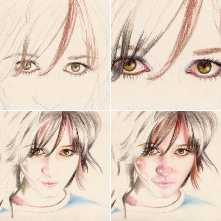
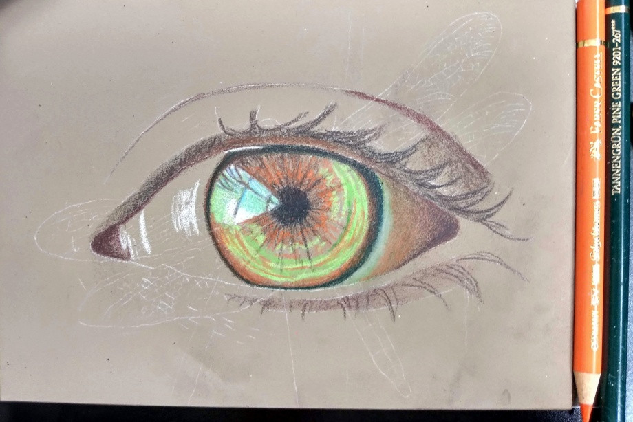
Step 1: Transfer the image using your favorite method. I never sketch my outlines on colored or drawing paper because it needs to be very clean to retain color. I use a semi-transparent sketch paper to do my sketching and then I transfer the perfected outline onto my drawing paper. I decided to rotate my reference photo to draw it with a different direction. I map out the shape with black and place the highlights.
Step 2: I draw the pupil & iris. The pupil must be in the center of the eye and not super black. So I add some brown to it. I use radial strokes to shade the area inside the iris. The top part of the eye always has a shadow cast from the upper eye lid. If you don’t place this shadow, the eye is going to stare at you.
Step 3: I look at my reference and push contrast. I take a mix of dark green and brown to place the darkest values in the eye creases first. The eyebrow consists of flat shading in brown first. I add greens and grays over this flat shading with short, directional strokes, following the eyebrow’s rotation.
I hope that this short portrait drawing tutorial of an eye encourages you to draw on colored paper!
Colored pencil portrait drawing tutorial for advanced artists: how to draw an eye in colored pencils on pastelbord with resin
This colored pencil drawing tutorial is for advanced artists who would like to experiment with colored pencils or need to try some new colored pencil drawing ideas.
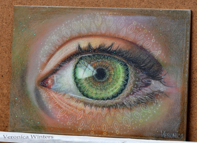
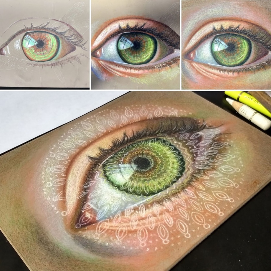
Green galactic eye, mixed media, 5×7″ | Green Galactic Eye manifests love and higher consciousness existing in all of us. In this drawing I layered a white mandala over the eye to depict the divine spirit of our universe.
Art supplies used in this colored pencil drawing tutorial:
The greatest challenge working on Ampersand pastelbord is the limited layering in colored pencil. Hard pencils work much better on this surface because the board feels like a fine sanded paper. It “eats up” soft colored pencils. The greatest advantage of working on pastelbord is its archival surface. It’s thick, durable and doesn’t require mounting before framing like any drawing paper does. I also love working on colored surfaces because colors “pop” when drawing on them. Ampersand pastelbord also comes in several neutral colors.
Step 2
Once I have the outline in place, I begin colored pencil shading of the darkest darks and highlights. My colored pencils are super sharp to keep the finest point possible. I fill in the eye watching my values (how light/dark each area is).
Step 3
I wanted to create a magical feeling in my colored pencil drawing of the eye. To achieve this, I made an overlay of a simple white mandala over the green eye. I used white transfer paper to place the design where I wanted it to be. (It would be very hard to draw such complex geometric design freehand). I reinforced faint outlines with Polychromos Cream colored pencil. The color is off-white and doesn’t “compete” with the highlight in the eye. Also, I decided to add some extra sparkle with fine glitter (next step).
Step 4
Before proceeding to the next step I use acrylic fixative to seal the surface of my drawing, even though Polychromos are water-resistant colored pencils. Resin can move the pigments and change the color of the surface. Sealing it is necessary to create a barrier. I use the Golden Mediums GAC-100 acrylic polymer. I’m sure there are plenty of other sealants out there. It’s just the one I have in my studio. It dries out very fast, so I brush it with a wide soft brush quickly, not to make streaks. It dries glossy and clear, but may look uneven if you’re not quick doing it.
It takes time and practice to learn how resin works. It’s tricky to work with it, and you should watch a bunch of videos on YouTube before getting into this. Also, the quality of resin plays a big role in the end result. Inexpensive resin products produce lots of bubbles, a smell and give headaches. They may be toxic and sticky. No matter what resin you get, I strongly suggest not to use your “first-time experiment” on your finished drawing. Seal the drawing with multiple layers of final fixative or acrylic sealant. Also prepare a cover to protect the art from dust and hair while it cures for 24 hours. I wait for the resin to cure for 24 hrs before proceeding to resin pouring. I mixed fine glitter into the resin mix and poured it over my sealed drawing. I let it rest for 24 hrs. The result is a glass-like finish with a touch of magical sparkle!
Colored pencil portrait drawing of hair with markers on white paper
If you work in colored pencil, you know how long it takes to complete one drawing. To speed up the process, many artists use watercolor pencils, neocolor crayons, or markers. If you feel open to some experimentation drawing hair or large backgrounds, using permanent markers may be your thing.
I sketch out the face using HB pencil on Strathmore drawing medium paper. This paper has a very slight texture that becomes somewhat problematic later. If you want to try out this technique, draw on Stonehenge paper or Bristol papers that are smoother and thicker.
Step 2
My pigment markers include just a few colors. Therefore I didn’t use black or brown on the hair. Instead I used a combination of sap green and red to get the darkest hue possible in the beginning. Usually, wax-based black colored pencil gives a lot of wax bloom and therefore underpainting the darks in markers is a good idea.
I also use yellow to fill in the background.
Underpainting with markers: Here you can see how crazy these colors look. Because it’s just an underpainting, I’m not worried about the fine details as I blocked in main waves of color in the hair.
Step 3
Once pigment markers are dry, I do some colored pencil shading over them. The underpainting gives me new, surprising color combinations. This is the step where I understand that smoother paper would work better with this drawing, simply because layering over the markers in colored pencil still reveals the paper’s texture, which I thought would be eliminated by now.
When I’m done filling in the hair, I blend the colored pencil with the colorless pencil blender, and create the highlights with some flyaways, using the Sakura Pen-touch marker that has a thin, sharp point.
I fill in the face in colored pencil only.
Italian girl, 9×12″ colored pencil and markers on paper
Step 4 In my final step I spray the fixative lightly, let it dry, and adjust minor things, like edges and details. A light coat of spray fixes the paper and allows me to work on areas that become too waxy and don’t accept pigment anymore.
This is one of my older colored pencil portrait drawings that illustrates colored pencil shading in steps. It shows how to layer colors in a slow progression to build up color and contrast. I positioned the model under a single light source to give me definite shadows on her face and figure.
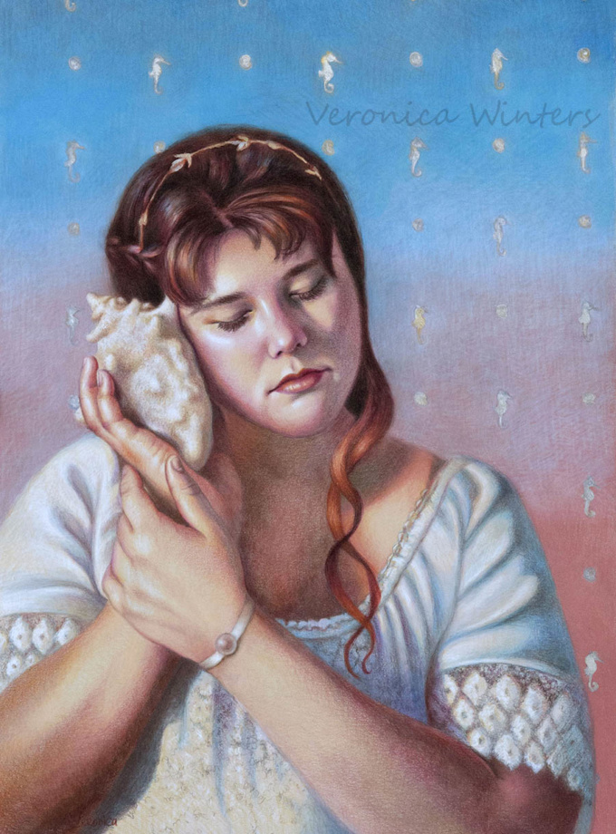
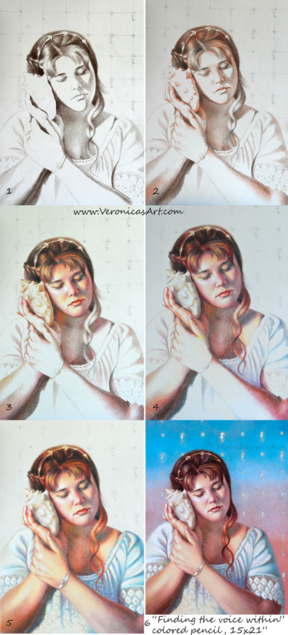
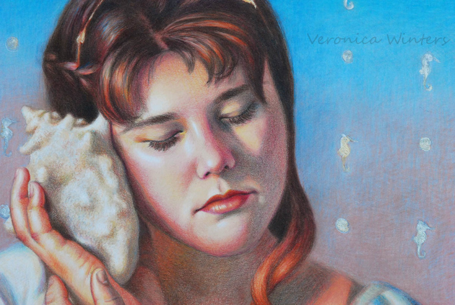
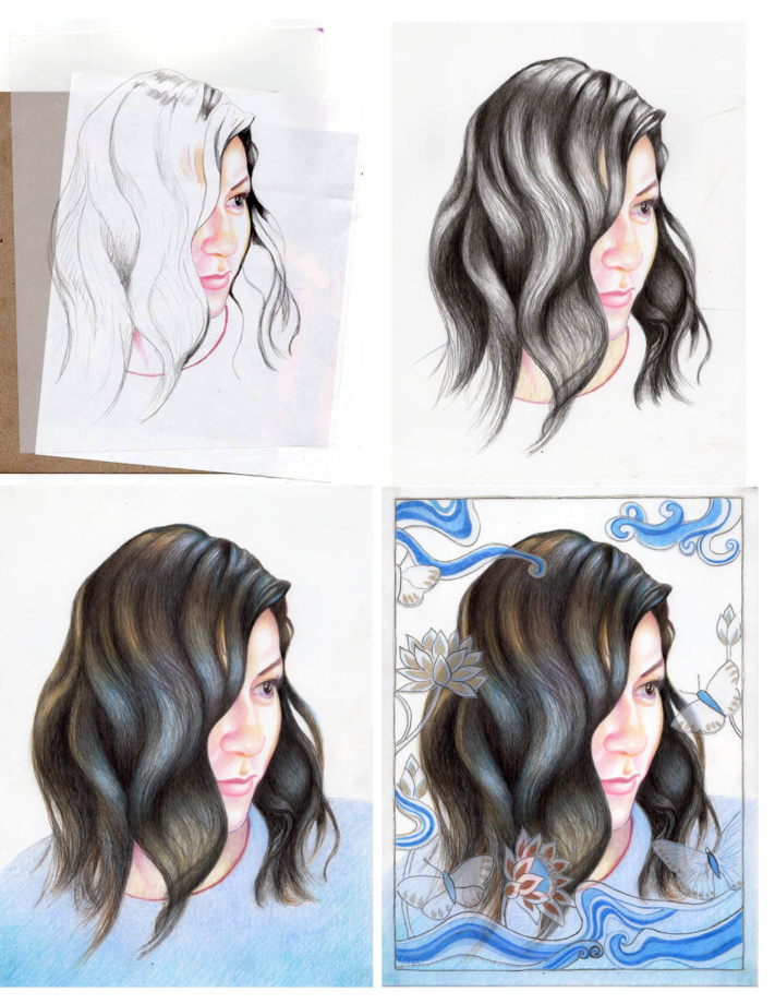
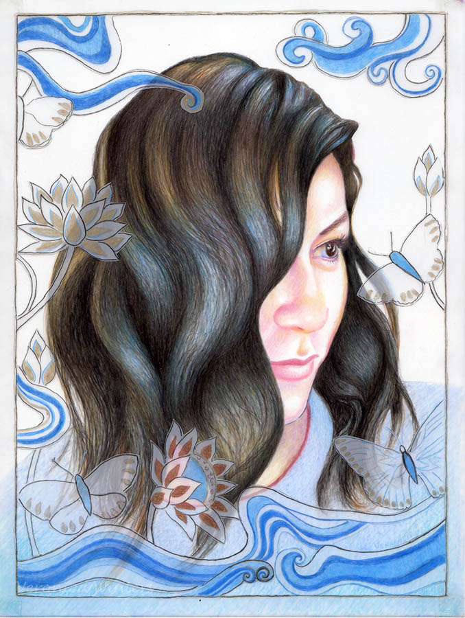
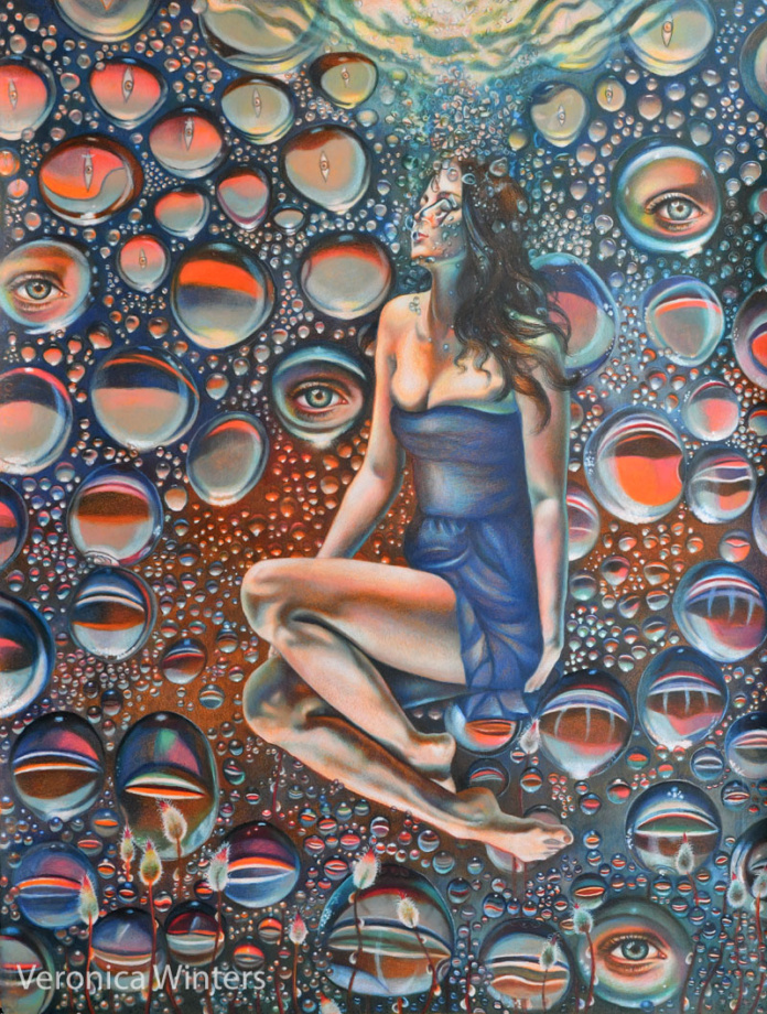
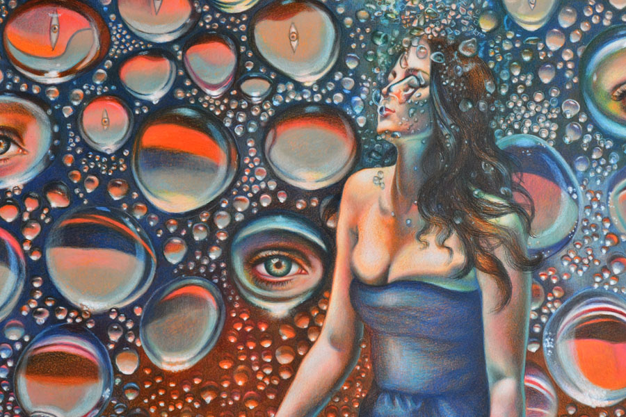
15×20 inches, lightfast colored pencils on paper, available | “Finding the voice within” is a colored pencil drawing inspired by the healing energy and colors of the ocean that’s symbolized in a female form.
In this colored pencil drawing tutorial I use a very light grey, smooth, printmaking paper, the surface of which is similar to Stonehenge paper pad. I used the Prismacolor Premier colored pencils, Luminance, Gamsol and Caran d’Ache full blender for blending.
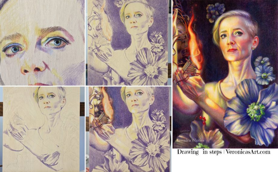
Colored pencil portrait drawing tutorial Step1: I work on the outline of my drawing on a sketch paper, and then transfer it to my high-quality drawing paper. It’s crucial to get the anatomy right at this step. I check for mistakes by looking at my drawing in the mirror. I keep fixing the outlines until the portrait looks good to me. Next I create the underpainting in one dominant color – dark brown. I focus on shadows only to block them in with the consistency needed to develop a sense of light and shade. Step2: I introduce the second color and slightly overlap it over the first one to create softer transition into the light. Step3: I focus on shading on the face. I add warmer colors -yellows and pinks to create the middle tones. I use the same colors to shade the neck, arms and even hair. This is important to do for color unity, so that everything ties in. This is the main reason why I work from general to specific, and don’t draw one area from start to finish, ignoring the rest of the picture. Step 4: I introduce the blues and lilacs into her shirt. I shade the darkest folds first, then add the middle tones and finish up with the lights. Please see below how I approach drawing highlights on colored paper. Step5: I work on the background that complements my subject. Here I’ve experimented quite a bit. I added silver acrylic paint to paint the seahorses, so they change their color slightly, depending on the viewer’s position to the drawing. I didn’t use any Gamsol on the face because it would make the darks appear too harsh. I fixed the drawing with a final fixative for dry media, spraying it twice outside.
Background
Background is important. Never draw your subject without considering the color and value of the background because it determines contrast and edges. You must have enough color on the page to do the blending with Gamsol. Otherwise, there is not enough pigment to dissolve the colors. Be conservative in your solvent application, and never allow your solvent to run like water. Use a small brush to have a controlled application. Let the first layer dry completely.
In my drawing, I painted the seahorses with the acrylic paint after the blending. You need to have a fine-point brush. I didn’t use any water to spread the paint around, but used it for cleaning up the brush periodically, because acrylic paints dry super fast. Then I shaded the background again using the same colors with heavy pencil pressure. In my third layer I added light grays and blues to make softer transitions and to achieve an effect of “soft fuzziness”. I also shaded with grays to neutralize the brightness of the colors so that the background doesn’t “compete” with the figure.
Shading white fabric and highlights
I shaded the highlights with Prismacolor white over previously applied light colors using heavy pencil pressure.
Colored pencil blending techniques
There are two basic colored pencil blending techniques. One requires blending with a solvent (Gamsol) and another with a colorless blender that looks like a pencil. Sometimes one technique is better than the other. While the solvent dissolves the pigment and moves it around fast, making the color much smoother and darker, some colors may look too harsh after the application. The Caran d’Ache full blender blends all the colors equally, but the process is very time-consuming, especially if you work large, and requires a very heavy pencil application to achieve even blending.
In this 1-minute video I show the basics of colored pencil blending with Gamsol. You can substitute Gamsol for another solvent like Turpenoid Natural. You must have wax-based colored pencils like Prismacolor Premier or Luminance for this technique to work well. Blending with a solvent works well on dark to medium colors. I use a different technique for blending the lights, using the colorless blender – Caran d’Ache full blender.
Step-by-step colored pencil portrait drawing tutorial II
This is a variant of the previous demonstration drawing on the same light grey printmaking paper using a high-contrast photo reference.
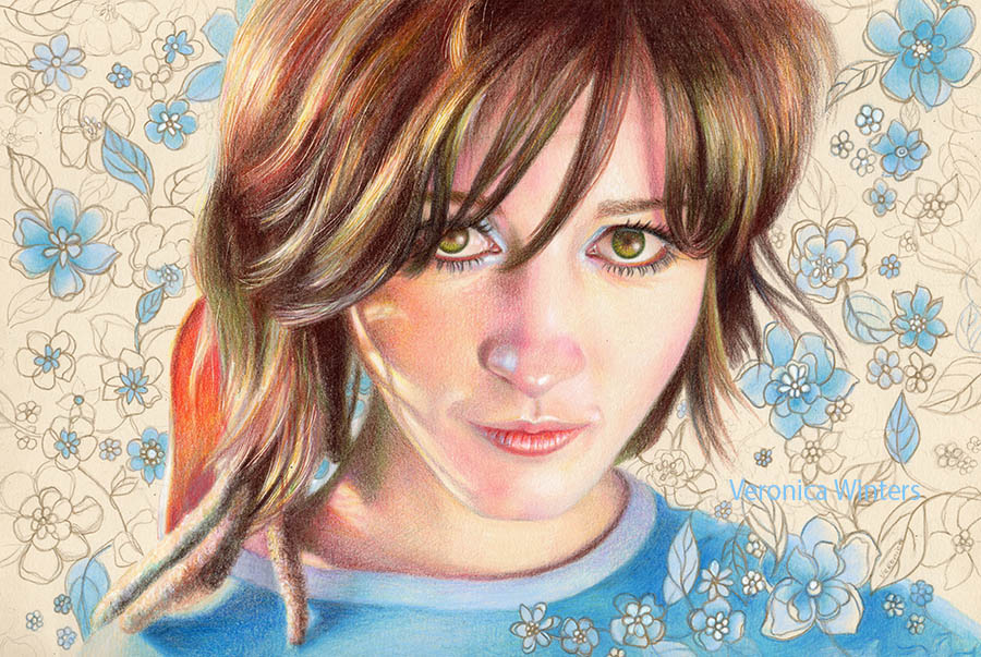
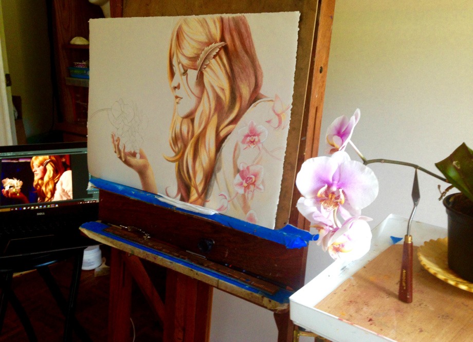
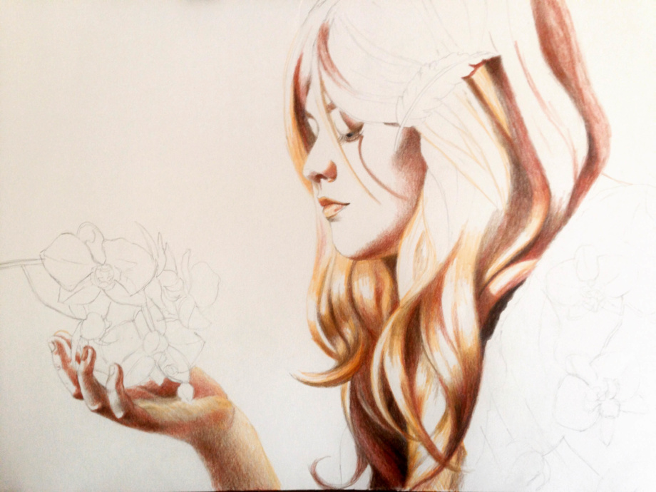
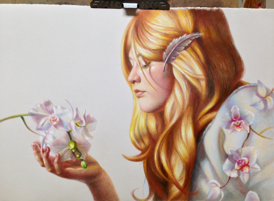
I take pictures of a model and then draw direct from my monitor. I often add additional elements to my drawing that are not photographed. Here you see me referencing the orchids. Usually, I create colored pencil drawings as my studies with some of them becoming future oil paintings.Step 1: I focus on blocking in the shadows, using dark brown and sienna brown.Step 2: I shade the middle tones.Step3: In my experience, drawing larger is faster than drawing small. Since colored pencil is a very slow medium, we tend to draw small. But I figured that I spent more time shading the 9×12″ pieces that had less detail and more problems working small. So I increased the size of this drawing to 15″ x 22″ and it made a big difference for me. I didn’t have to force and cramp every detail in the picture, yet it looks complete.As love grows, 14×20 inches, colored pencil drawing on printmaking paper | Love is a complex feeling that begins with loving yourself. Love moves and helps us grow. Sometimes it’s hard to find love: it can be as elusive and fragile as feeling similar to these beautiful orchids.
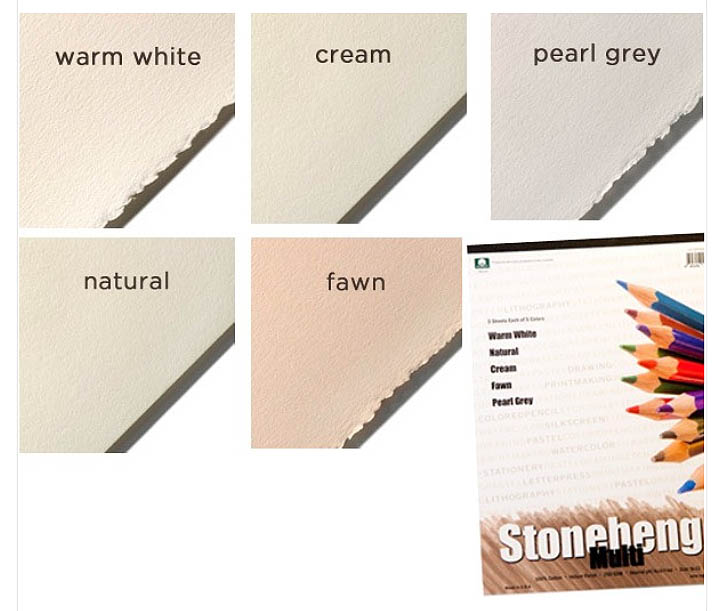
3. Picking the right paper for colored pencil portrait drawing
Never draw on a textured paper with colored pencils! Textured surface “eats up” the colored pencils, and the colored pencil blending becomes a real nightmare. Pick the drawing paper that’s smooth to the touch, and avoid using sketch paper as your primary drawing paper. Sketch papers are too thin to layer the pigments, and are not archival to work on. There is very little burnishing needed to achieve the desired colored pencil blending effect, if you draw on a smooth surface.
The best colored pencil drawing paper
I often draw on:
Stonehenge colored paper pad
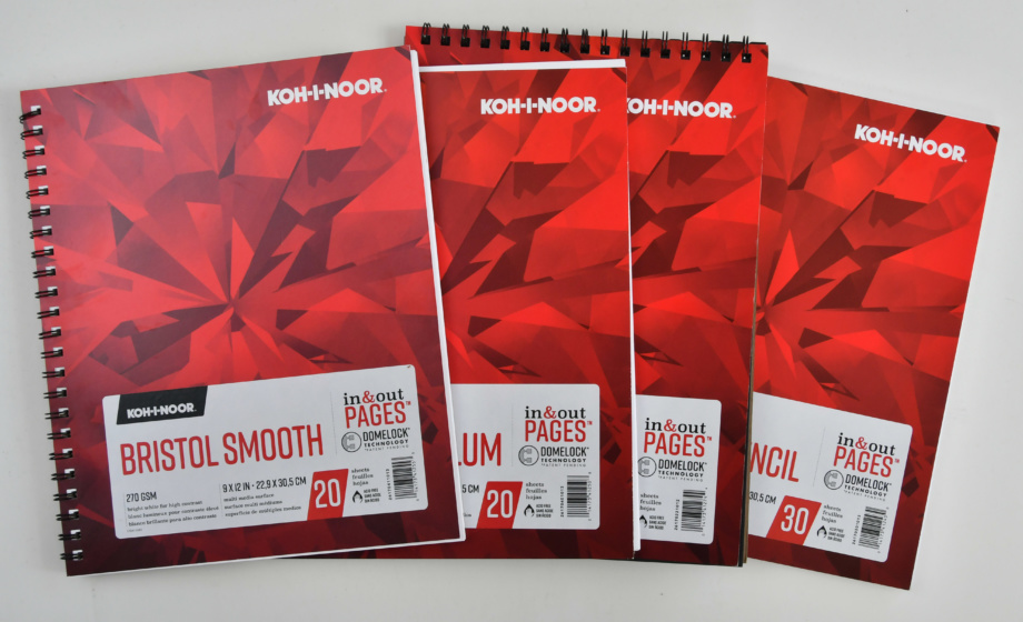
Bristol Vellum drawing paper by Koh-I-Noor
Canson Art Board Bristol Vellum
Canson Colorline sheets
Some printmaking papers that have similar properties to Stonehenge.
Many artists use mat boards because they are archival, very thick and smooth.
In general, the drawing paper has three properties that affect the quality of colored pencil drawing:
the paper’s tooth or texture
the paper’s weight or page thickness
the color
Let’s look at each property in detail.
Texture
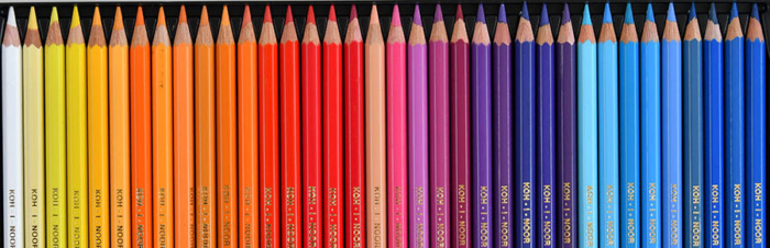
It’s very hard to draw on the textured surface in colored pencil. Blending can be a nightmare even if you blend with a solvent. Therefore, I highly recommend drawing on smooth paper. These include the Koh-I-Noor Colored Pencil Drawing paper, Strathmore Drawing paper, Bristol smooth paper, or Stonehenge papers. If you are a beginner, go to a craft store like Michael’s and simply touch the pages of various papers to understand the difference in texture among them.
Weight
The weight of the paper affects how thick your paper is. If you use a solvent for colored pencil blending, don’t work on paper that weighs below 80 lb. It’s just too thin to withstand washes of any solvent as it crumbles. Sketch paper is too thin and shouldn’t be used for fine drawing at all.
Regular drawing paper is 80 lb., but some printmaking papers and pastel papers are over 98lb. The Bristol smooth drawing paper has the greatest smoothness and 100 lb. thickness. However, some artists find it hard to shade on it, because it doesn’t accept as many layers of color as less smooth papers do. Some artists use mat boards to draw because of their extreme thickness and velvety smoothness.
The Stonehenge paper pads are my favorite because of their thickness and the velvety surface that is almost perfectly smooth yet has enough tooth to layer more colors. They also come in various light colors.
Colored Pencil Portrait Drawing on Canson Colorline drawing paper
This colored pencil portrait was drawn on Canson Colorline paper, Clementine hue.
In this section, I’d like to share what drawing paper I use most often to create my colorful colored pencil drawings. I rarely draw on white paper because I love how colored pencils “react” to the bright surfaces and I’m able to create colorful drawings with very few colored pencils.
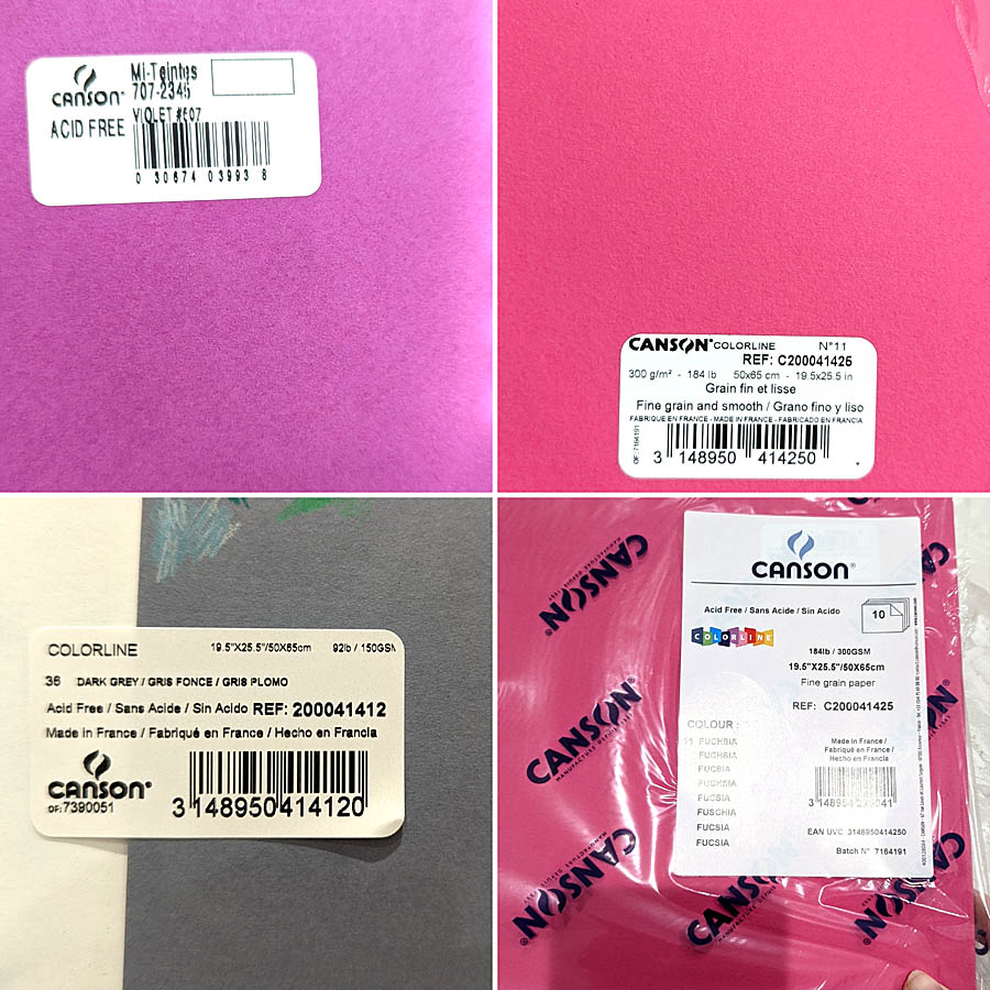
I used to draw on Canson Mi-Teintes pastel paper, using various paper colors they have (violet paper at the top left corner of the image). Their paper comes in both multi pads and large sheets. I used to draw on Violet hue a lot. I loved the paper’s color and the color boost it gave to my colored pencil drawings. What I don’t like about this paper is how much texture it has. Even the “smooth” side has too much texture for my liking. It becomes very frustrating to fill it in. A time sucker of all sorts… SO I was thrilled to stumble upon a different kind of paper also made by Canson.
Canson Colorline comes in many bright hues and at least two thicknesses I’ve been using so far. Maybe, they have more variety in paper thickness. I don’t know. What I do know is that 184lb. is a very thick paper which I love because it’s not flimsy and can withstand a lot of layering and spraying with a fixative. It has a lot less texture than the pastel paper but can still present work for some artists to fill in the grooves.
Canson Colorline dark grey, 92lb. is a much thinner paper. So I’m more careful with my choice of a fixative for it or how I layer colors. However, I think it’s a perfect surface for colored pencil drawing!! It’s smooth but not too smooth. Also this grey is a middle-toned grey. It means that it’s perfect to mark the highlights with white, mark the shadows with a dark colored pencil and then create a range of values in between the two poles.
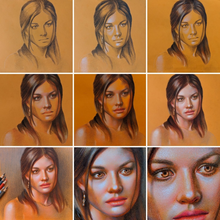
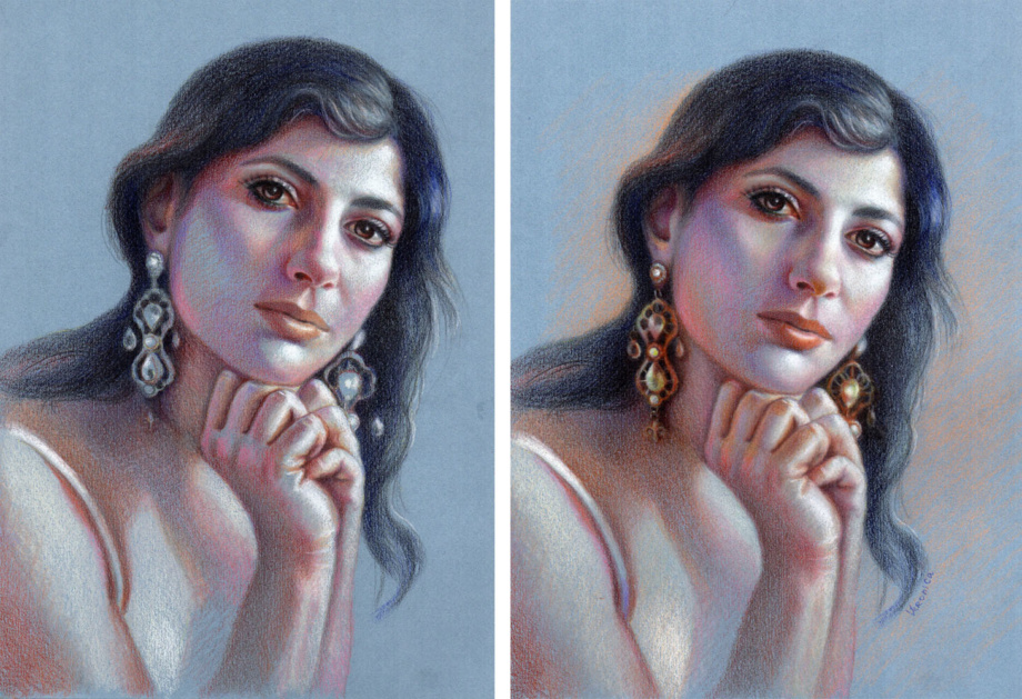
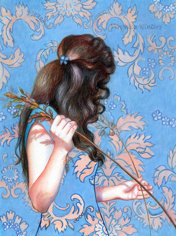
Portrait on blue paper, color study, 9×12″ colored pencils on paper, Veronica Winters | This portrait drawing demonstration is available in my portrait drawing in colored pencil video course. I often draw on colored paper instead of using the white one. Main reason is that it takes much less time to shade everything because colored pencil drawing is a very time-consuming. My second reason is that I love to push colors to the extreme using few colored pencils. The result is always surprising even to me.
Art supplies for this demonstration:
While I used Cezanne colored pencils, I don’t endorse this brand. Rather use my basic color chart to match your colors with mine. I used Sarah Transfer paper to transfer the image. I used Canson Mi-Teintes Pastel drawing pad, 9×12, assorted colors pad. I used blue sheet of paper, smooth side. I strongly recommend to buy a range of colored papers from Canson Colorline brand instead. These are 19×25 sheets of paper that can be subdivided to many pieces to create drawings. They’re much smoother and more vibrant than the pastel paper.
This image shows the first steps of drawing on a pastel paper that has considerable texture.
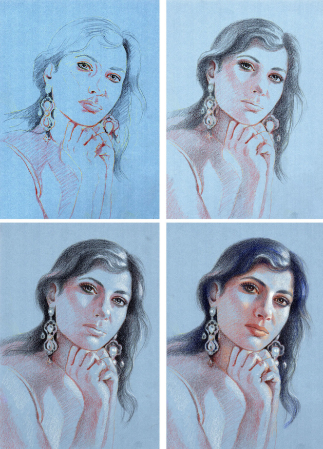
Step1: Transfer the image onto your drawing paper. Don’t sketch with graphite pencil on your drawing paper because the surface must be very clean to accept colored pencils. If you have lots of pencil work on drawing paper and layer colored pencils over it, the colors look dirty and lose luminosity, especially when you work with light colored pencils. So I like sketching on my sketch paper and then transfer the outlines onto my colored paper using white transfer paper. In this image you can still see the transfer lines. After that I place the darks or shadows. Step2: I work on the division of space between light and dark using just two colored pencils. I create volume by placing shadows first. Step3: I mark the highlights with white colored pencil (Prismacolor premier). Step4: I begin to introduce color, shading the hair and eyes with deep blue hue. I also find the light color to shade light areas around white highlights.
Step5: This is the fun part. I add variations in hues by finding subtle differences in color, temperature, and tone. I always overlap colored pencils considerably. Step6: I didn’t use a solvent or blender. Rather, I used a very heavy pencil pressure to get rid of the paper’s texture. I used the same colors, shading the earrings as I used on her skin. What’s different is the pencil pressure that makes colors look much darker. Also, I outlined some of the edges in the earrings, which I didn’t do shading the skin (trying to keep it soft and smooth). I worked on the face the most making it a focal point, so everything else has a sketchy look.
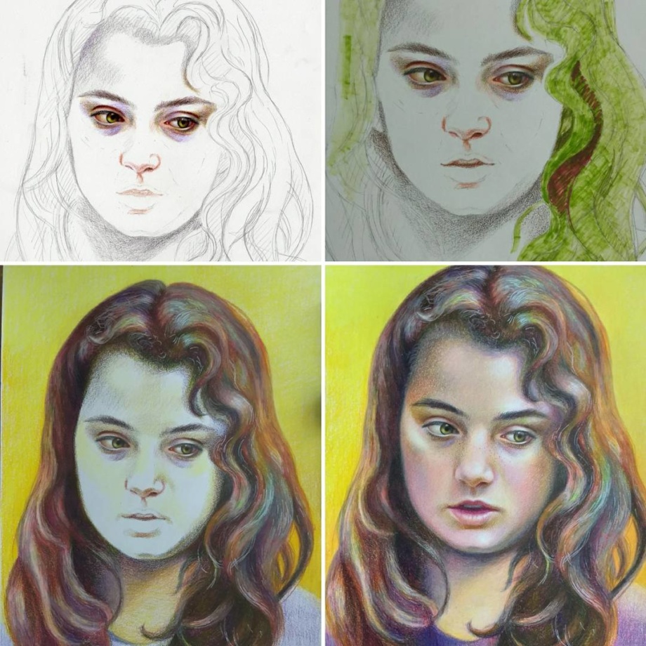
To create emotional portraits in colored pencil drawings requires a bit of magic. Pick the photo reference of a person that will keep you motivated to draw him or her for many days of work. You can be attracted to certain features such as light or color, or texture. Intensify one of your favorite features to get a unique colored pencil portrait drawing. I often play with hues drawing on toned paper. I also make a big emphasis on the expression I see in the model’s eyes.
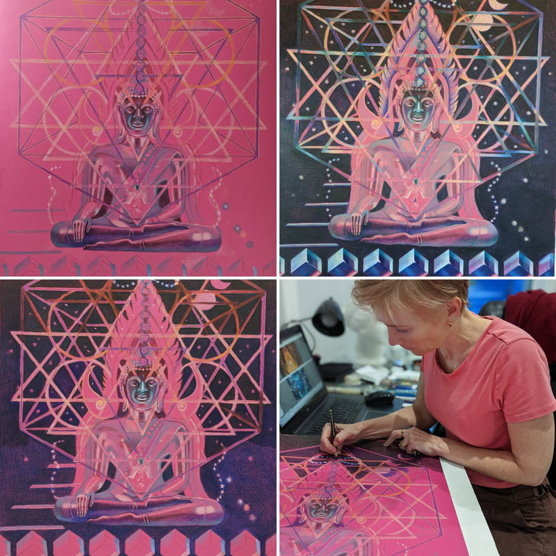
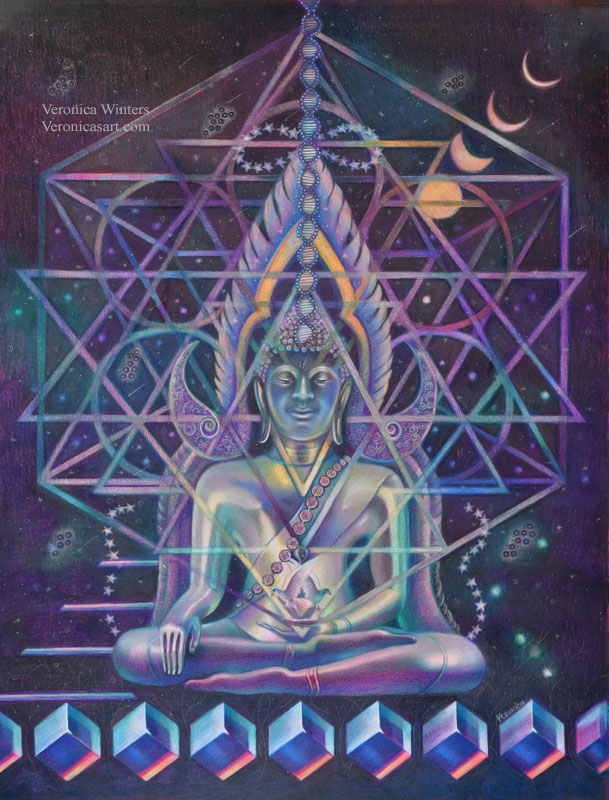
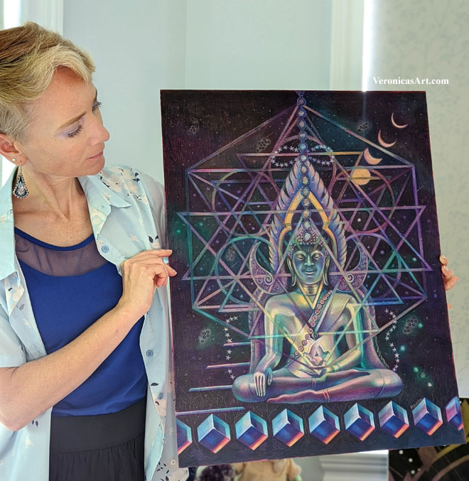
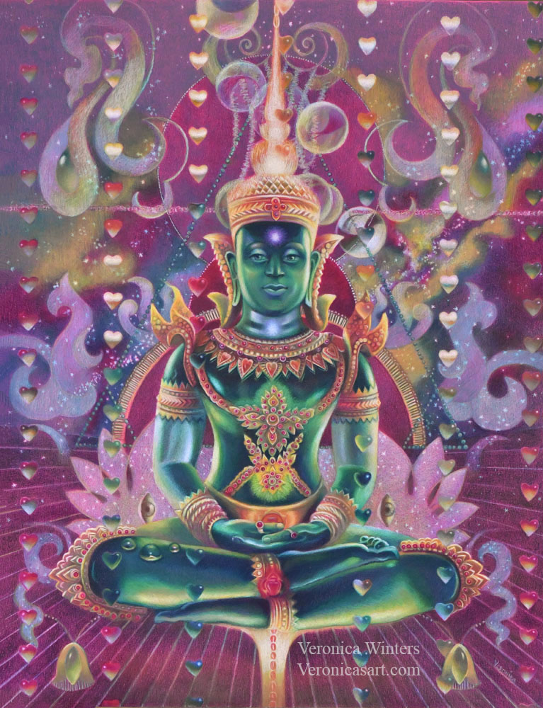
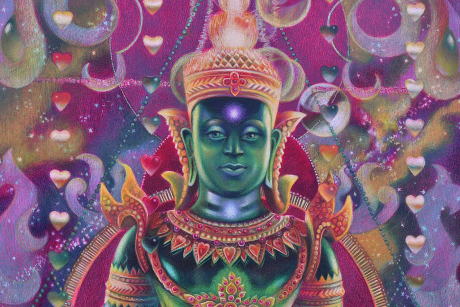
Cosmic Buddha, colored pencil drawing, 19×25 inches, drawn on Canson Colorline, fuchsia hueOmnipresent mind, colored pencil on paper, 19×25 inches, drawn on Canson Colorline, clementine hue
Step-by-step colored pencil portrait drawing tutorial: drawing on matboard
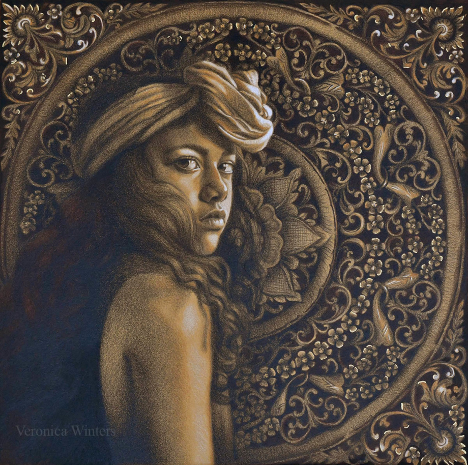
I’d like to share my thoughts behind this portrait drawing inspiration. To create this drawing I got inspired by two very different pictures. When I saw a photo of this girl, I knew I would love to draw her because of her intense gaze and beauty reminiscent of the Vermeer’s girl with the pearl earring. I wanted to create a beautiful, high-contrast portrait drawing with personality. I think Ameli’s confidence attracted me the most to draw her gaze. I was so happy when Angelika let me use her photo! Angelika Kollin is a professional photographer who shoots poetic portraits of diverse women. See her portrait photography here: https://www.instagram.com/angelikakollin/
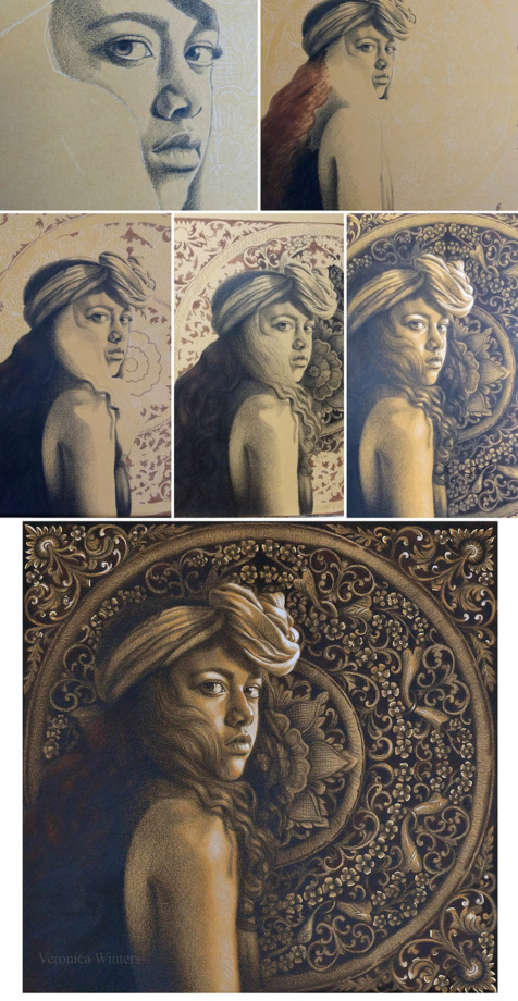
I also love rich patterns found in woodcarvings in Asia. My trips to Japan and Thailand let me see a very different side of spirituality and creativity. I love combining mandalas as a samsara symbol in my art. I like how the floral circle in the background almost repeats itself in her headscarf. Elaborate design in the mandala complements curving shapes in her headpiece.
Black Rose, colored pencil and gold pen on matboard,15″ in private collection
Materials:
Colored mat board (warm beige hue), Faber-Castell Polychromos black, burnt umber, brown ochre, white & Prismacolor Premier white. W&N pigment marker, medium brown. Permanent marker, gold. Grumbacher final fixative for dry media.
Step 1: Most work was done in black colored pencil only. I used the Polychromos one because it’s harder and much less waxy, which gives me higher detail and no wax bloom. The idea is to draw the deepest shadows in black first. Then mark the highlights in shades of white, and touch up the drawing with two other colors where necessary in the end. While I shaded the entire face in black, I made some underpainting using the marker. I shaded the model’s hair, jacket, and mandala in flat strokes to build up darker hues fairly quickly. While nothing was quick about this drawing, this underpainting saved me some time. Step 2: I worked on the figure, shading everything in black. My pencil was very sharp to produce refined crosshatching strokes. Step 3: While I left the face unfinished, I began shading the flower in the background because its values determined how light/dark I should have shaded the face. Shading the background also lets me work on edges, making softer transitions. I made the background with less detail on purpose, so it didn’t overwhelm the viewer, taking the focus away from the model. Also, my photo of this wood carving had lots of highlights I omitted placing because of the same reason. Step 4: I analyzed the light direction. Coming from the right, the face received lots of light. I used Polychromos white to mark the highlights and to create shades of white on her shoulder and headscarf. I strengthened the strongest lights with Prismacolor Premier white afterwards. I also used a gold marker to place very few accents in the background. Unfortunately, it’s impossible to photograph gold shimmer as it reflects at different angles not seen in photography. I fix all my drawings with professional fixative spray. I love Grumbacher mat fixative for dry media. (Don’t buy Krylon brand. It gives uneven coverage and white bloom in humid climate!)
4. Using soft, professional colored pencils
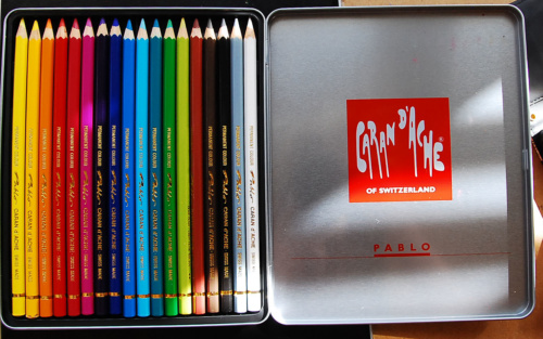
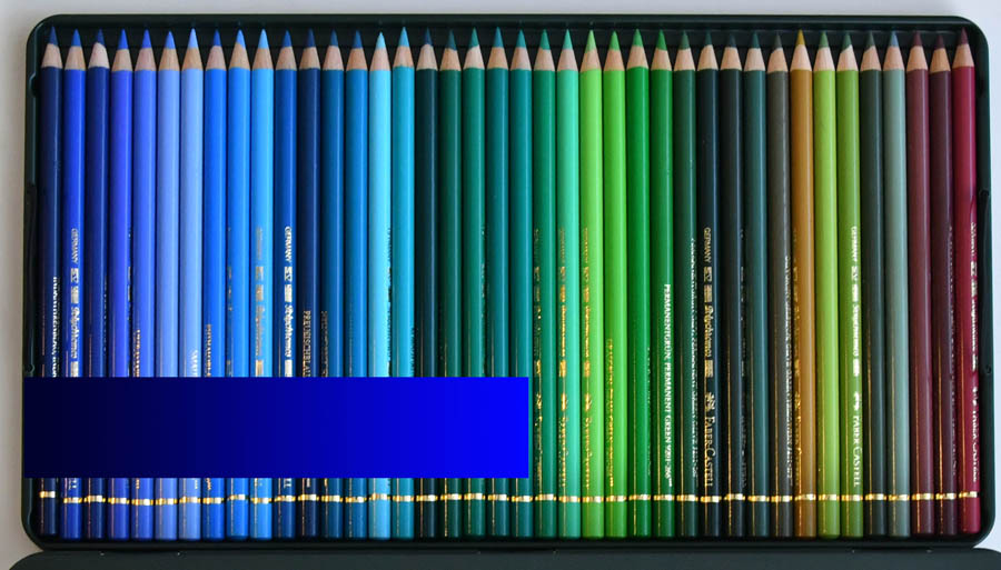
You will achieve a much better result, if you draw with professional colored pencils. What makes them different is their softness, lightfastness, and durability. In general, I use 3-4 brands of colored pencils: Prismacolor Premier, Caran d’Ache Pablo and Caran d’Ache Luminance, Derwent Lightfast, Derwent Colorsoft. I also use Polychromos that are harder.
I pick the colors based on their lightfastness rating, buying them as open stock. I & II are known to be lightfast. Avoid using III & IV because they’re fugitive colors that fade off the page within very few years even when protected by the varnish. Prismacolor’s blue-violets, some reds and greens are fugitive colors. I substitute those hues with Luminance. Luminance is the most expensive brand of colored pencils out there, running at about $4 per pencil. It is the Cadillac of colored pencils in quality and softness. I also have a basic set of 18 Pablo colored pencils that are great for detailed work, but again not all of them are lightfast. Beware that many artists encounter problems with Prismacolor Premier colored pencils since they’ve relocated their manufacturing facility to Mexico. While I have never had any problems with this company, many artists claim that these pencils break easily these days.
There is no predetermined formula drawing the skin tones. I don’t use the same palette of colors from one drawing to the next. The skin tone of each person depends on his/her general skin color, the reflected light, and the color temperature. Students often feel timid about color, and try to pick them based on the tutorial’s directions, instead of studying the color by looking at a real person and paying attention to subtle shifts between warm and cool hues.
Instead of shading one area with all the colors you have, try to layer your colors slowly, mainly one at a time throughout the picture. This way you pay more attention to values and shadows as opposed to random shading all over the place without consistency.
Finally, just have fun with it! Not every drawing is a masterpiece, but every drawing brings you closer to your success. 🙂
Mixed media expressive colored pencil portrait drawing ideas
This section of the article introduces you to some experimental colored pencil drawing techniques, with the addition of some other materials. I share how I combine colored pencils with markers, resin, acetate, etc. These mixed media drawing ideas are for advanced colored pencil artists.
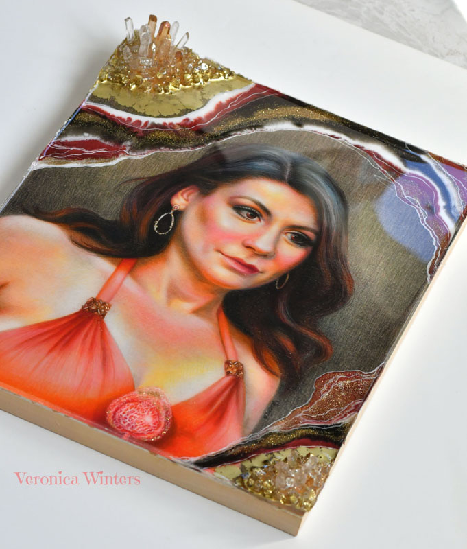
Colored pencil drawing and resin
Materials: Faber-Castell Polychromos colored pencils, Koh-I-Noor Bristol Vellum Paper, Winsor & Newton white pigment marker, Painters gold metallic marker, Grumbacher final fixative for dry media, resin, crystals, glass and glitter.
Colored pencil drawing with markers
Invisible II, 9×12″ colored pencil and markers on paper, private collection | Materials: Prismacolor Premier colored pencils, Winsor & Newton pigment markers, W&N pigment marker heavy weight paper, Grumbacher final fixative for dry media.Here you see the first layer shading in markers only. Using the markers helps me cover the surface quickly, but the refinement is achieved through regular colored pencil shading over the first layer.
This W&N pigment marker heavy weight paper is designed specifically for the W&N markers. It doesn’t bleed through and its smooth surface is very good for colored pencil drawing in general. But you have to get used to it too because layering feels different than on other drawing papers. Also test different markers. These dried out too quickly.
In this drawing Invisible I I went back and forth shading in colored pencils and markers, creating the first layer with the markers and then layering colored pencils on top, blending them with the markers and layering again. I didn’t use the markers drawing the skin tones. The hair, however, have layers of markers only. I find that these markers don’t layer evenly and I have to shade with colored pencils over them a lot. The main reason for me to try layering with the markers is the speed of covering the background space.
Pay attention to the markers’ lightfastness rating. If your materials are not lightfast, they tend to fade off the page quite quickly. Various pigments have different lightfastness ratings and you may see some pigments fade much faster than the others.
The W&N heavy weight paper is much better for colored pencil drawing than their lightweight paper. The lightweight paper is just too smooth and too thin to accept the colored pencil. That’s why I don’t buy it unless you plan on drawing with the markers only. It’s great for drawing with the markers exclusively.
Colored pencil drawing with graphite pencil
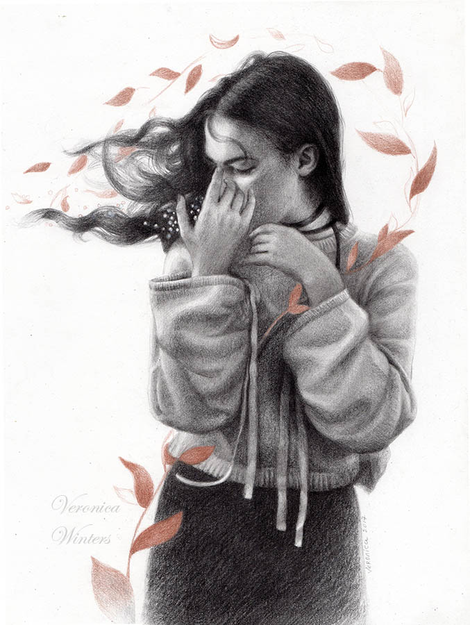
The Silent One, 9×12″, drawing, private collection | Materials: Tombow graphite pencils, 4-6B, 2H, Koh-I-Noor Bristol Vellum Paper, Prismacolor Premier bronze metallic colored pencil, Grumbacher final fixative for dry media. In this drawing I shaded the figure to completion first because graphite smudges and it’s important not to smudge it over the colored pencil areas to keep the color clean. Once the figure was complete, I sprayed the drawing lightly, let it dry, and used metallic colored pencil to draw the leaf design to create the movement. The fixative prevented smudging. I sprayed it one more time once the drawing was complete. For graphite work, I usually shade the darks with soft pencils (4-6B) but switch to the hard ones to develop the skin tones (2H). The only eraser I use is the kneaded eraser. It leaves no residue and lifts out the highlights beautifully. If I need to get into tiny details and erase there, I love the Tombow Mono eraser that I order on Amazon from a store in Japan.
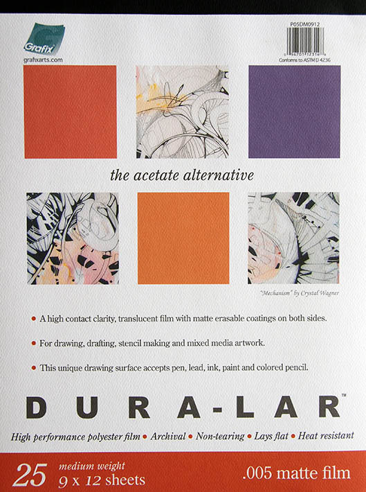
Colored pencil drawing on dura-lar paper
Dura-Lar is a .0005 matte and archival film that’s translucent and non-tearing. This is the acetate-like paper that’s quite transparent and therefore needs some backing to show the drawing in full. Either white or color acid-free backing is necessary to begin drawing because you can’t really see the colors unless you put something underneath your artwork. In the first image you can see how translucent it is where both white paper and brown paper show through. I didn’t use white pencil to draw the highlights, rather they show as white because of my white paper placed underneath the drawing.This is the most experimental surface I drew on. In the second image you see me layer the hair pattern drawing with Faber-Castell Polychromos colored pencils. Because this paper is very smooth, it basically accepts a couple of color layers, making it difficult to create subtle transitions in tones. I’ve tried to use Prismacolors with this paper before, and found it even harder to shade. However, the very effect of transparency can be explored a lot more, in my opinion. It’s possible to place different backgrounds and photographs underneath the drawn image, creating a different sense of depth and realism. In the third image at the bottom you see me layer as much color as possible. I must say that I was interested in drawing the hair more than the face.
In the last image you see the second layer of this transparent paper placed over the portrait drawing. I tried to cut this paper with a scalpel, but preferred working with small scissors cutting out the shapes. Paper cutting was a very laborious process, just like the drawing on such a smooth surface, resulting in much struggle to finish the work. I connected all three pieces of paper with the archival, double-sided tape in the corner, although other alternatives could have been explored.
As always feel free to share this post with your colored pencil fanatic!
These art instruction books are on sale on Amazon!
Art supplies:
13 ways to improve your drawing skills:
Draw daily from life, even if it’s a small sketch that looks insignificant.
Study great works of art. Yes, studying, not just looking at art. How does the artist solve a problem of the movement, composition, contrast, and color?
Embrace positive attitude and acceptance of failure as part of the learning process.
Consider Mentor’s help. (It’s worth your buck to pay a well-known, practicing artist to learn the tricks of the trade. Don’t expect those artists to guide you for free. There is a reason why they’re successful and their time and knowledge are valuable.
Be passionate and consistent working on your art.
Have fun drawing!
Choose the right school to study drawing. Follow your favorite artists and figure out where they studied or study with them. Some great art schools that give classical education are GCA, Studio Incamminati, Ani Art Academy, the Ryder Studio and many more!
Draw from plaster casts or classical sculptures at the museums. This is one of the cheapest and best ways to study the human anatomy before drawing a real person.
Study the complex subjects separately. Draw one object at a time before combining them together.
Sign up for free business newsletters /webinars written by practicing artists and crafters that will guide you how to set up and handle the art sales.
Some good art books to have in your library: Anthony Ryder, “The artist’s complete guide to figure drawing,” J.D.Hillberry “Drawing realistic textures in pencil,” Jane Jones “Classic still life painting,”
Some good business books that are worth your time are by Jack White who is an amazing marketer and a practicing artist: http://www.jackwhiteartist.com/pages/books.htm. I also recommend “Making it in the art world” by Brainard Carey. He lists some unconventional strategies he employed in his art career.
Join groups on Facebook to keep yourself motivated and to receive quality feedback. (The Atelier Movement is one of the groups for oil painters, Colored Pencil Artist League is one of many colored pencil groups).
What doesn’t work:
A fixed mindset where you believe that you can become great in a couple of lessons. There is no point in starting out on this venture, if you don’t have realistic expectations. It takes at least a year of consistent work to see permanent results.
Inconsistency or a lack of work ethic.
Trying to learn the material from someone whose artwork doesn’t represent the art style you are trying to learn.
The absence of motivation. No one will make you successful, unless you work on it!
Moonlight, 22x30in, colored pencil on art board, Veronica Winters
The art world’s enigma: highlights from Context Art Miami 2023
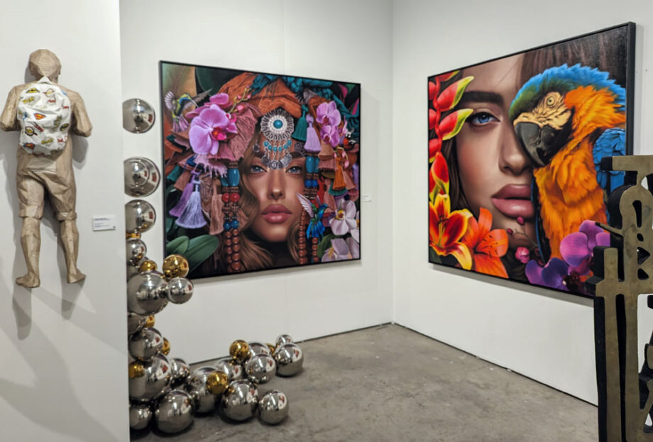
CONTEXT Art Miami takes place every December alongside the Art Miami in downtown Miami. This upscale, glitzy art fair is the 33rd Edition of Art Miami and 11th Edition of CONTEXT Art Miami. It features emerging and mid-career artists presented by more than 240 International art galleries. CONTEXT also showcases commissioned art made for the fair.
Due to some nudity in the art this full-version video is available to some audiences on YouTube: https://youtu.be/brV6c_UVo1g
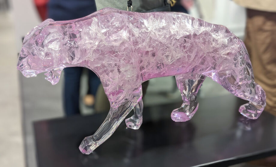
Contemporary art sculpture at the Context Art Miami
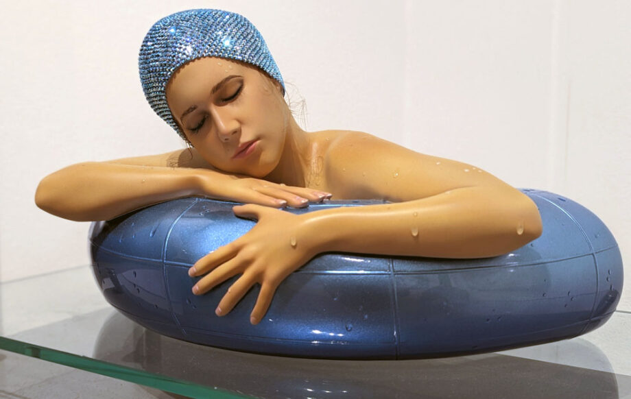
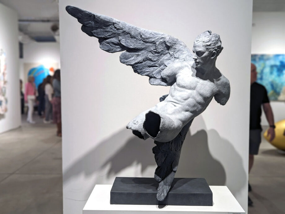
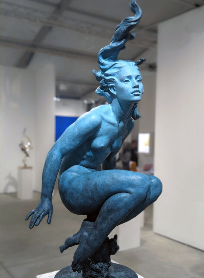
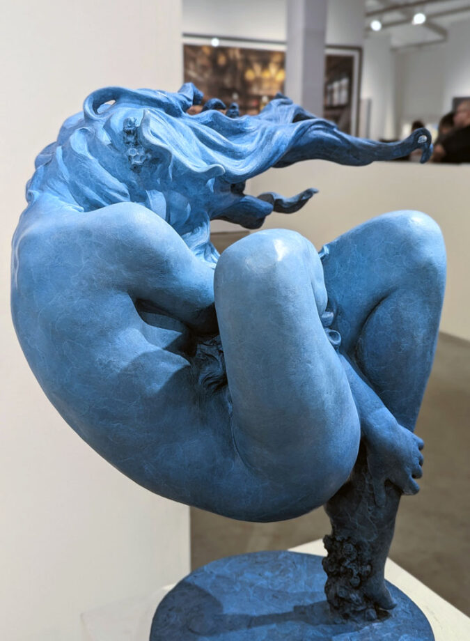
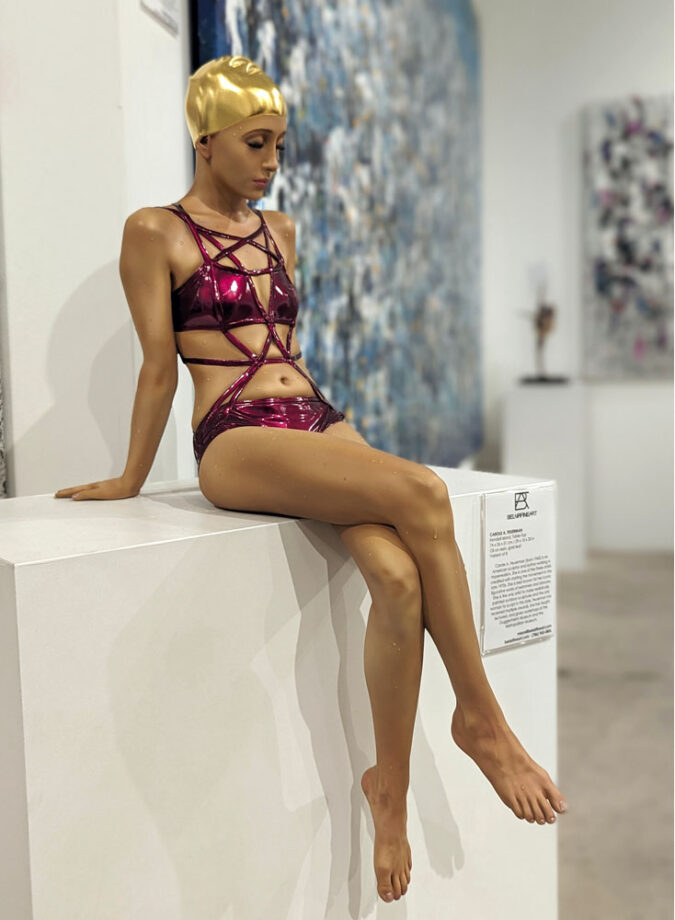
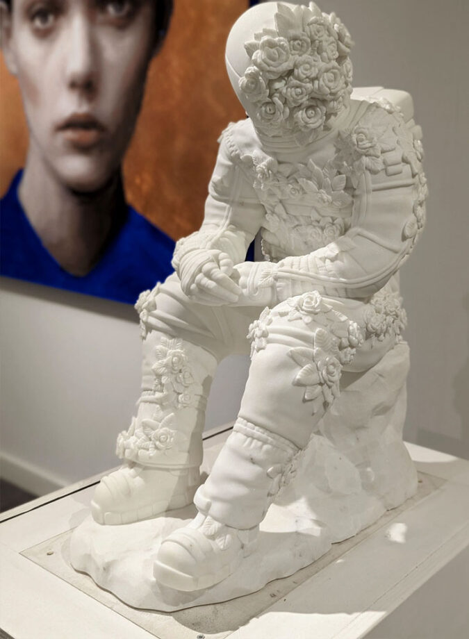
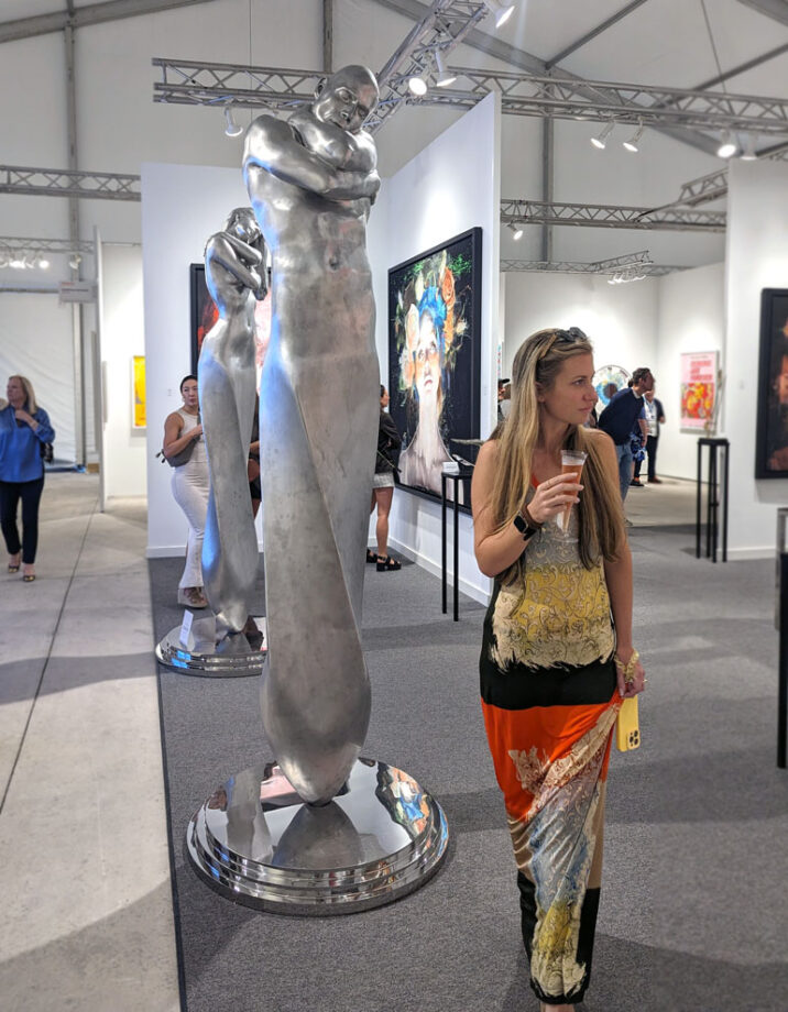
Coderch and Malavia-ALIS VOLAT PROPRIIS-sculpture-CONTEXT art fair Miami 2023Coderch and Malavia-Galene-bronze sculpture-art fair Miami. Incredibly talented Spanish artists, Joan Coderch and Javier Malavia began creating art together in 2015. They create contemporary figurative realism sculptures together by modeling the pieces and casting them in bronze. Joan Coderch was born in 1959 in Castellar del Vallés, Barcelona, and he graduated from Barcelona’s Faculty of Fine Art in 1984. Javier Malavia was born in 1970 in Oñati, Guipúzcoa, and he graduated from Valencia’s San Carlos Faculty of Fine Art in 1993. Once they met, they discovered their artistic similarities, which led to their undertaking this new project that follows in the footsteps of masters of figuration such as Maillol, Rodin, Marini and Bourdelle.Coderch and Malavia-Kymo-bronze sculpture-CONTEXT ART Miami 2023Carole A. Feuerman (born 1945) is an American hyperrealist artist-sculptor. The artist is best known for her figurative art of swimmers and dancers. Feuerman is the only artist to make realistically painted outdoor sculptures and the only woman to sculpt in this style.Filippo Tincolini, Spaceman seat, marble
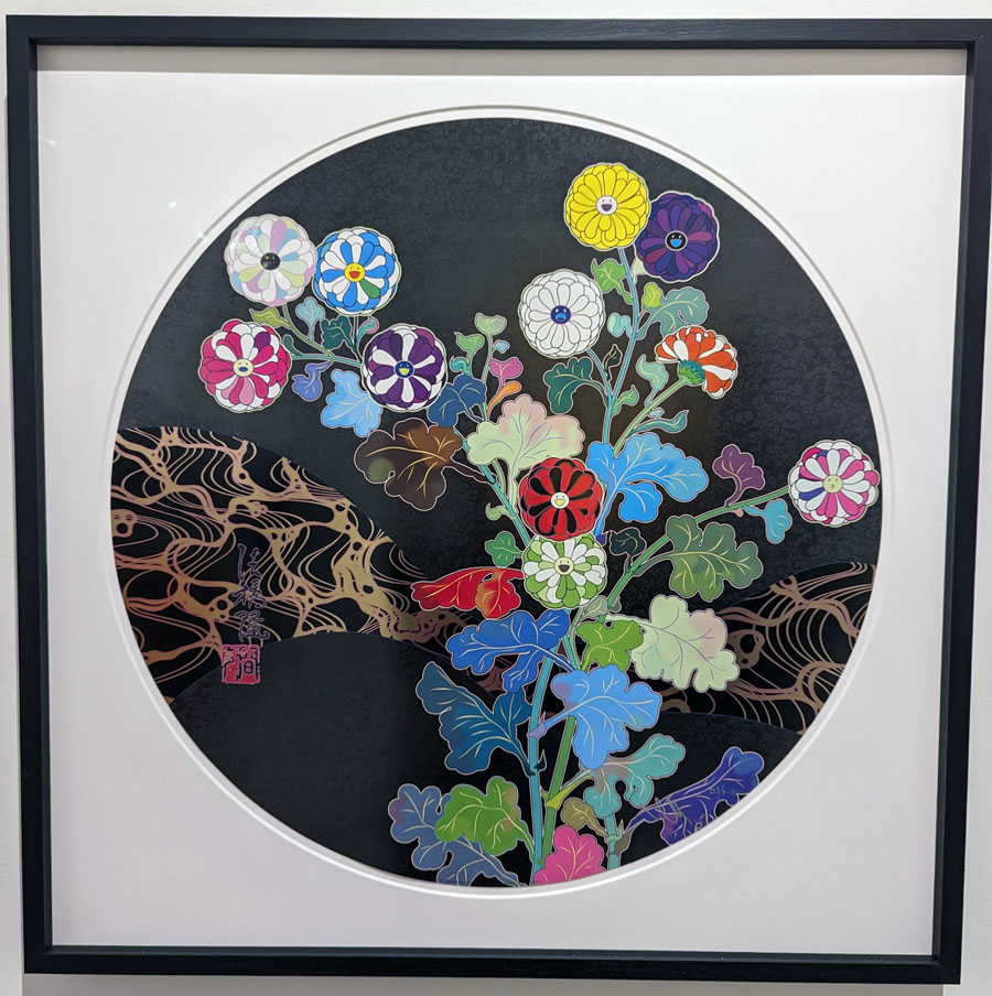
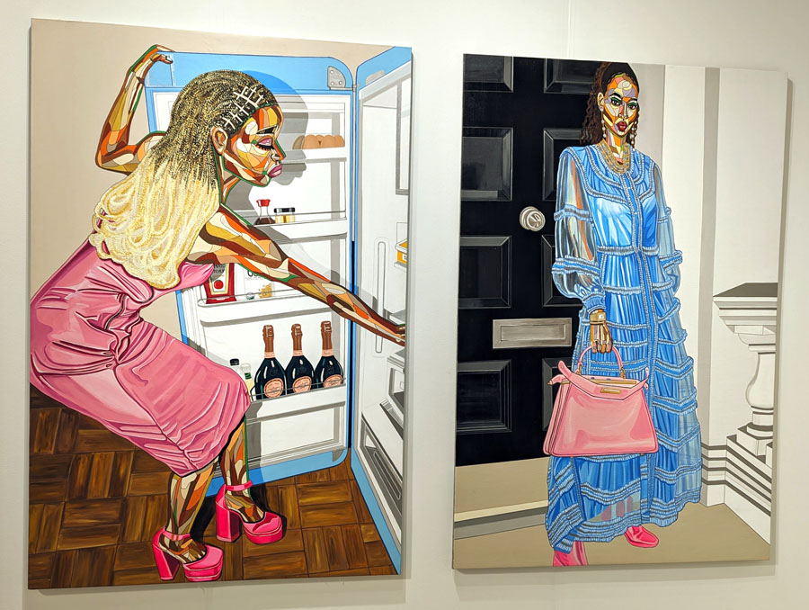
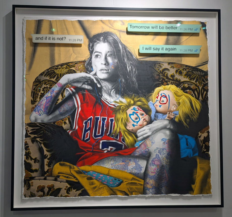
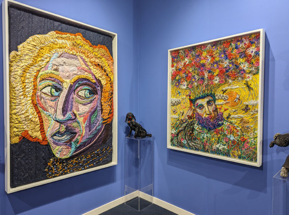
Contemporary painting & wall art at the Context Art Miami
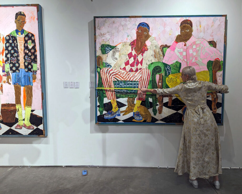
Takashi Murakami context artGabriel Moreno, Epistolary relationship Nº3, 150 x 180 cm, pencil, Bic blue pen, charcoal, on paper 320 gr. with finished in gold leaf. Context Art Miami 2023Alvaro Petritoli, Art Movement Gallery, London, Context Art Miami. Ink on watercolor paper.
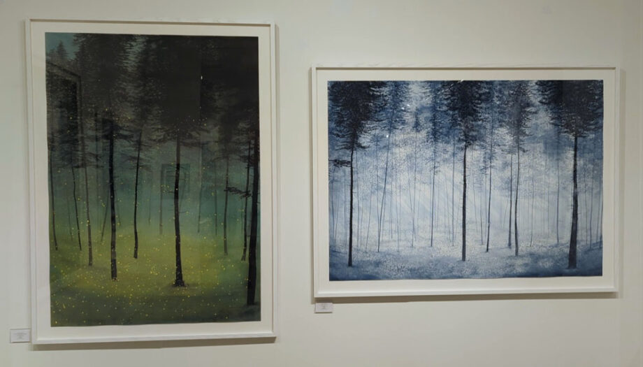
“Fireflies in the forest and stars in the night sky connect us with the wonders of childhood and fairytales. As creatures of mystery and magic, fireflies invite the viewer to follow their luminous trail in the delicate dance between light and dark. About stars, they define a nocturnal atmosphere where the microcosm turns into a macrocosm and vice versa. As human beings, we naturally find ourselves at the crossroads between these two dimensions. Apart from the sea and the sky, blue is the rarest color in nature. It is linked with eternity, supernatural beauty, religious transcendence, and the beyond.
I paint forests from my imagination. They are not a representation of specific geographical locations. However these places exist as a manifestation of inner spaces. In relation to stars, they define a nocturnal atmosphere wherethe microcosm turns into macrocosm and vice versa. As human beings we naturally found ourselves at the crossroad between these two dimensions. The forest as a threshold symbol into the unconscious was the conceptual starting point for these ink paintings. I’m drawn to this archetype loaded with symbolic connotations: a place of loneliness, healing, regression, entanglement, growth and self discovery.”
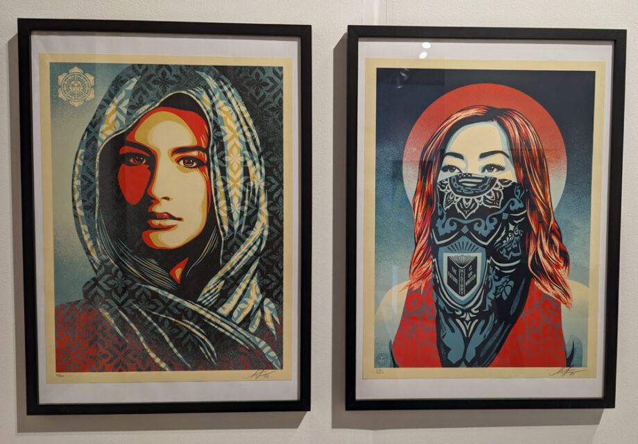
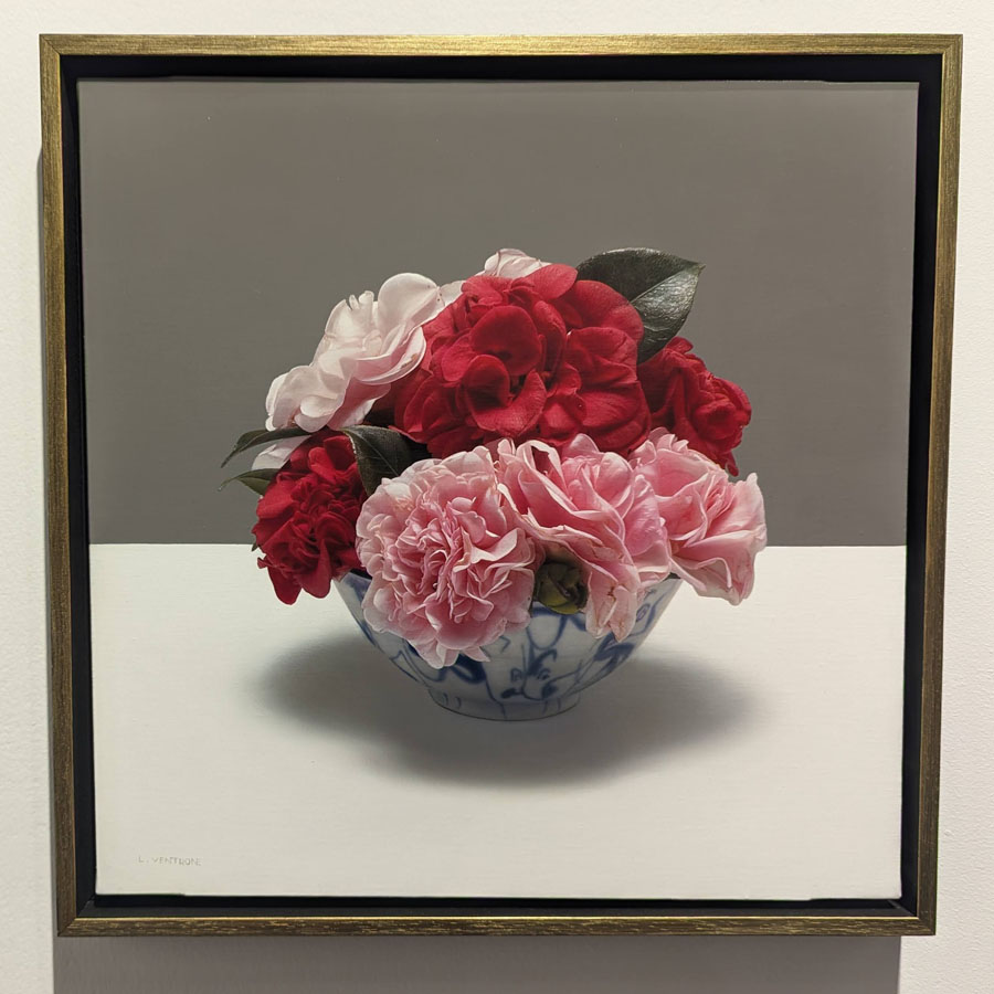
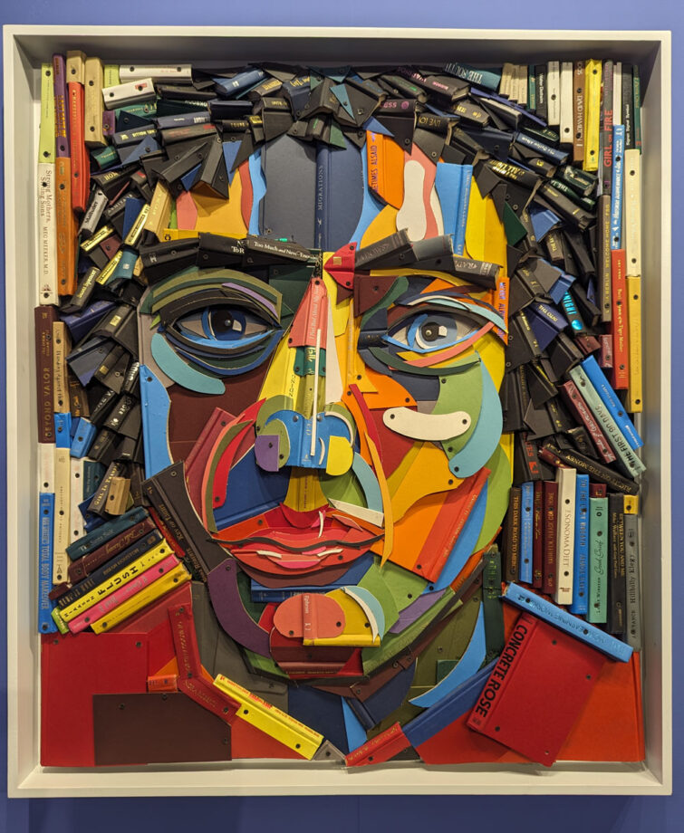
Shepard Fairey, exclamation, 2019, silkscreen and collageLuciano Ventrone, Occasion, oil on canvas. stefano forni gallery-context art MiamiContext art Miami 2023- blink groupFederico Uribe art-Adelson Galleries: Born in Bogota, Colombia, Federico Uribe lives and works in Miami. He studied art at the University of Los Andes in Bogota, and in 1988 left for New York to pursue a master’s degree in fine art under the supervision of Luis Camnitzer. In 1996, he abandoned his paintbrushes and began creating his sculptures out of everyday objects, whose beauty is often overlooked. Uribe constructs and weaves his sculptures in curious and unpredictable, repetitive and almost compulsive ways, yet still with reference to the history and tradition of classical art.
Uribe’s work has become prominent in the United States over the past decade, and has been collected by multiple museums, and featured in several museum exhibitions across the country. He has most recently created installations for the Hudson River Museum (NY), Mass MoCA (MA), the Montgomery Museum of Fine Art (AL), and the Montclair Art Museum (NJ). Federico Uribe currently has an exhibition at the Madison Museum of Contemporary Art (WI) on view through June 2024.
Federico Uribe art-Adelson Galleries
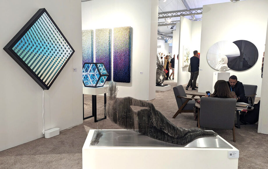
Contemporary 3-D art at the Context Art Miami
HOFA gallery, JULIAN VOSS-ANDREAE, RECLINING WOMAN, 2022. Stainless steel (316L) Weight: 230 lbs (110 kg) 26 x 57 1/8 x 21 1/4 in
Julian Voss-Andreae, a German sculptor based in Portland (Oregon, USA) produces large-scale public and private commissions often blending figurative sculpture with scientific insights into the nature of reality. Voss-Andreae’s work has been featured in print and broadcast media worldwide and videos of his sculpture have gone viral with tens of millions of views. Prior to his art career, Julian Voss-Andreae studied quantum physics and philosophy at the Universities of Berlin, Edinburgh and Vienna and did his graduate research in the lab of 2022 Physics Nobel Prize laureate Anton Zeilinger, participating in a seminal experiment in foundational quantum physics. His expertise in diverse fields of science and a deep passion for the mysteries of the world have been a continual source of inspiration for his work.
Ai Weiwei-context art miami 2023BREAKFAST: Brooklyn, Est. 2009, Flashbacks, Blue Lines, Edition 1/8, 2023, Flip-discs, software, camera, computer, 38 x 38 in (96 x 96 cm) “Flashbacks” is the latest series from the artist BREAKFAST, which explores the fusion of art and memory. This interactive artwork records a brief clip of each individual who interacts with it, subsequently replaying a selection of these clips from the artwork’s memory. The piece is constructed using Flip-Discs, a medium BREAKFAST has been perfecting since 2012. Each disc is intricately flipped using electromagnets.
BREAKFAST is celebrated for their digitally-driven kinetic sculpture. At the core of their work is a dedication to crafting advanced artworks that harmoniously blend software and hardware. These creations not only provide interactive experiences that transcend physical boundaries but also convey the poignant narratives of our dynamically evolving world.
Patrick Hughes: (British, b. 1939) Patrick Hughes’ first solo show was in 1961 in Mayfair, London. The catalogue introduction was by the critic David Sylvester. He has since held one-person exhibitions in Los Angeles and San Francisco, Chicago, Boston and New York, and in France, Germany, Italy, Holland, Belgium, and Switzerland, one hundred and fifty-four so far. Patrick made his first reverse perspective, or reverspective, relief painting in 1964 and has refined his technique since. These artworks are constructed of wooden pyramids in perspective but the wrong way round, with the furthest point of the space represented being closest to the viewer. The result is an optical illusion. As the viewer looks and moves near the painting it seems to change seamlessly, giving an illusion of movement in three dimensions. Patrick Hughes received an honorary degree of Doctor of Science from the University of London in 2014 for his contribution to the study of the psychology of perception. Hughes wrote a book titled “Paradoxymoron” that gives insight into his thought process and ideas. His 3D art is in many private and public collections including art museums internationally. Miss Bugs, Algorithm sunny day, context art Miami 2023
Most of you know that we can blend colored pencils with solvents or the colorless blender. In this article I’d like to share some other blending techniques that don’t require blending with Gamsol. While these blending techniques may not be brand new, I discovered these methods by experimenting with my colored pencil drawing.
Because blending with solvents may look harsh on drawing paper, not every drawing is a good candidate for it. I think solvents help a lot when you draw on the textured surface, or the size of your drawing paper is very large, and you want to cover and build the tones in the background. Not every artist likes blending with the solvents. So here is the alternative to that.
Colored pencil blending without the use of solvents
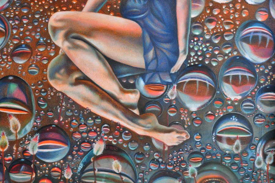
In this drawing titled “Plunge” 19×25″, I used both blending techniques discussed below.
Finesse Colored Pencil blender pen is formulated to blend wax-based colored pencils like Prismacolor Premier and Caran d’Ache Luminance. It won’t do much blending for harder pencils like Polychromos but you’ll still see some blending occurring because all colored pencils have some wax in them.
This pen is very convenient because it has two tips, and you can’t spill it like solvents. It’s also non-toxic and easy to carry around or store in a colored pencil box.
I find that it dries out quite quickly, however.
I blend large areas in the background using Finesse. I continue drawing over the blended areas after that to make the colors even more vibrant.
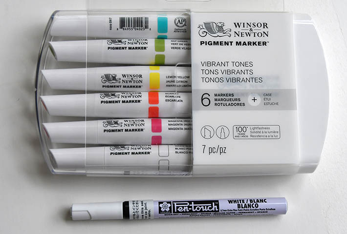
Winsor & Newton Pigment marker, white blender is a very soft white. It’s not suitable to make strong, white highlights, but what I discovered working with it is more useful. Once I’ve done some colored pencil shading, I can blend everything with this marker. It does give some white tint to the surface, but it also blends colored pencil well. So I use it when I want to both blend and lighten up the area. I think it could be replaced with a different brand to have the same effect, but you need to always TEST your art materials on a separate piece of paper.
Although I’m not a fan of these markers, a similar alcohol markers will do the same job. They can blend colored pencils. You can also underpaint the surfaces with such markers. Pay attention to the lightfastness of markers. Don’t buy fugitive colors because they’ll fade quickly off of your paper!
This video shows my colored pencil drawing process, combining various markers with colored pencils.Winsor & Newton permanent markers and sakura pen | You can buy the W&N white blender separately. Also, you can try using the Sakura pen gives very strong white highlights. I don’t like it much because the highlights look too strong and different from the colored pencils themselves, but the Sakura pen might work well in some cases depending on the art style and drawing subject.I use a W&N white pigment marker to blend and lighten up the entire area seen at the bottom right. I also blend some of the bubbles here.
Always test your ideas on a separate piece of paper before committing to actual drawing! It’s very frustrating to ruin your colored pencil drawing testing something new right on it.
When you begin realistic drawing in colored pencil, the artistic aim is to copy what you see in front of you or your reference. Beginners in colored pencil drawing pay attention to small things like details and textures, and they’re important. However, they become truly important only when the basic drawing is in place. If you begin shading one spot and forget about the rest of your composition, you might end up having a colored pencil drawing that has no consistency or unity in color harmony and composition. In this article, I’d like to share a few strategies I often employ using color harmony to create mood and atmosphere in colored pencil drawing. Let me give you some ideas on how to use color harmony in colored pencil drawing so you can discover your unique approach to drawing.
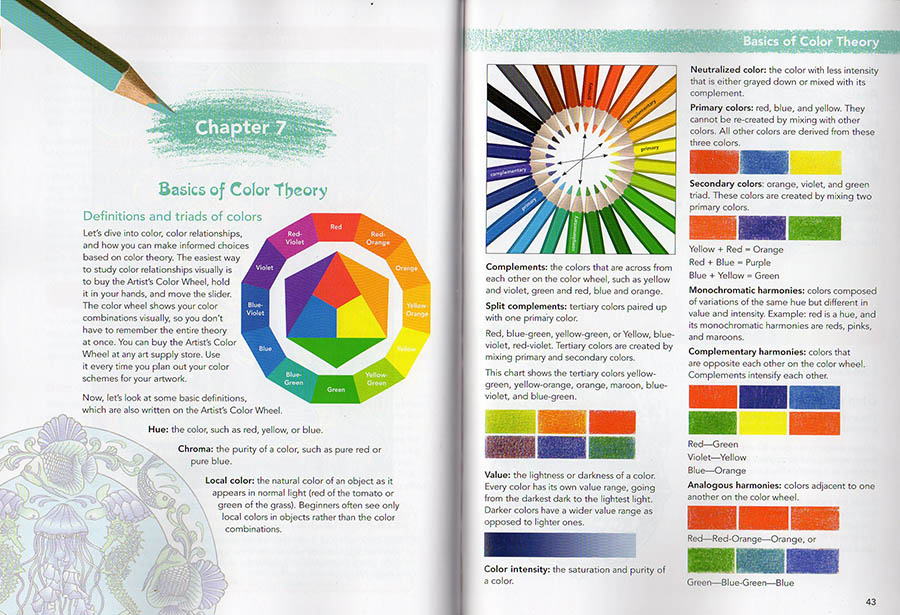
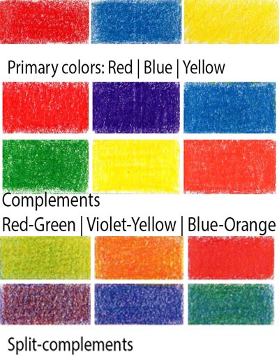
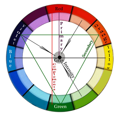
While the color wheel isn’t everything for colorful pencil drawing, you do need to know these basic definitions and color triads.
Definitions:
Hue – means color. Red, green, yellow, etc.
Value – means how light or dark the shading is.
Chroma – is the color’s strength or color intensity. Colors can be super intense or muted.
Value – the lightness or darkness of a color.
Color Intensity – the saturation or purity of a color.
Neutralized color – the color with less intensity that’s either grayed down or mixed with its complement.
Local color – the natural color of an object as it appears in daylight (green of the cucumber or blue of the blueberries). Art students see only local colors in objects rather than the colors of light and reflections.
This is a page from my coloring book titled “How to color like an artist“, in which I explain basic color theory as well. My art instruction book, titled “The Colored Pencil Manual” has the entire chapter devoted to color theory for advanced artists.
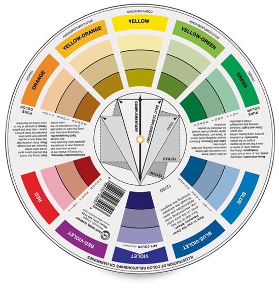
I know it’s difficult to remember all the definitions, and I strongly recommend buying a color wheel because it’s visual. You can rotate the dial to see complementary colors, triads, etc. I still use it every time I design my colored pencil drawings. You can buy it at any art supply store or on Amazon.
Primary colors are red, blue, and yellow. If you put all three primary colors (making them equal in intensity), your colored pencil drawing will be screaming with too much color.
Secondary colors are orange, violet, and green. They’re mixed with two primary hues.
Complementary colors in colored pencil drawing are opposite each other on the color wheel. Complements intensify each other. You don’t want to have all the complements in one drawing for that reason. Red-Green, Violet-Yellow, Blue-Orange.
Analogous colors in colored pencil drawing are hues adjacent to one another on the color wheel.
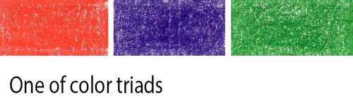
Split complementary colors in colored pencil drawing – are the colors on either side of a color’s complement. For instance, if your primary color is blue, your split-complementary colors would be yellow-orange and red-orange. Violet’s complementary color is yellow, and its split-complementary colors are yellow-green and yellow-orange. Blue-purple and red-purple are split complementary colors. Red and green are opposite each other on the color wheel, so red-orange and blue-green are split complementary colors. Split-complementary colors seem to be less color-intense.
Tetradic colors in colored pencil drawing are a color scheme that uses four colors that are equally spaced around the color wheel. The four colors are made up of two sets of complementary colors, which are also known as double complementary colors. To be honest, I don’t think this color scheme is very useful, although you can try it, of course. I think it’s too many bright colors competing for attention unless you use a single dominant color in this color scheme.
monochromatic color harmonies- colors composed of variations of the same hue but different in color intensity and value. Red is a hue. Its monochromatic variant is pink and maroon.
Color wheel & Color intensity: Color Intensity – the saturation or purity of a color. Neutral colors are mostly browns, but Neutralized color is any color with less intensity that’s either grayed down or mixed with its complement.
Colored pencils don’t mix to grey unlike oil, acrylic and watercolor paint. Therefore you need to use grey colored pencils to neutralize the color so that there are 1-3 dominant colors in the picture, and the rest are neutralized. By using the grey colors you create selective focus as well as beautiful, subtle color variations and texture. In the closeup drawing below you can see grayed down fabric. I shaded with some bright hues first and then added light greys over them.
Blue lily dream, 20×30 inches, colored pencil on art board by Veronica Winters
How to use color harmony to create mood and atmosphere in colored pencil drawing
I’d like to share 5 drawing tips on using color harmony to make your colored pencil drawings more realistic.
1. Consider overall color harmony design in your colored pencil drawing
Decide on the overall color theme of your colored pencil drawing. Is it light or dark? Is it monochromatic or in full color? How do you decide? Look at your main reference to see the dominant color. Make that particular color your main focus in colored pencil shading. Everything else should be less color intense to support the dominant color. The color harmony you decide on may not be unique to you, but you make it unique by choosing the unusual point of view, stroke, or subject. Your choice of a dominant color(s) and contrast determines the mood in the drawing. For example, light blues and pinks look serene, while deep reds and blacks make us feel very different.
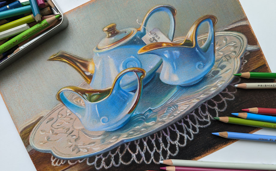
If you look carefully, the only dominant color here is light blue-turquoise. Everything else is grayed down using colored pencil shading in greys and less bright hues. The overall theme is light. The dominant color is present throughout the composition. It’s reflected in the silver plate. It’s noticeable in the background and crochet.
2. Test your colors to decide on the best color harmony
Once you decide on your leading colors for your drawing, look at your colored pencils to pick the colors from that color family.
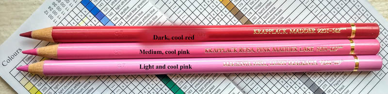
Test your colored pencils on your drawing paper to have consistent color harmony and shading. If you see lots of blue in your reference, test all your blues to see which ones look similar to your picture. Start testing these colors right next to your reference, and you’ll notice that some colors are off and don’t look right as your main hue. If you have a big box of colored pencils, you have many similar colors. You don’t need to use them all in one drawing because you can adjust your pencil pressure drawing in one blue to get a range of blue tones that’s similar to several various colored pencils.
If you’re testing dark blue colored pencils based on your reference, do you see that not all of them fit that particular color range? Many blue colored pencils are too light or too greenish to be considered for the dark blue range.
3. Keep it simple to create consistent color harmony
Shade all shadows in one color first. Students love to jump around the picture, using all possible colored pencils to draw the portrait. Instead, pick one color to shade all your shadows first. Colored pencil shading in one color is key to creating volume in portrait drawing.
In this example, you can see that I picked a single purple colored pencil to shade the deepest darks first. When I’m done with basic underpainting in one color, I shade with other colored pencils, layering them one by one.
You can make personal colored pencil drawings by focusing on a familiar subject that has unique story line or idea. For example, we all know how the human heart looks like but by designing my own composition and color scheme, I make my colored pencil drawing look different from everyone else’s.
Here you can see that I used one dominant color – red for the shading of the heart and another one – dark green for the leaves. Because I created this colored pencil drawing on a light grey paper I also marked the highlights with white not to lose them by accident.
4. Add more tested colors to develop contrast in your color harmony
Most colors are warm and cool. This includes reds, greens, blues, and even greys. Some are neutral, like browns. You must consider how light or dark they are. You can’t create a very dark shadow using light pink. You can’t shade around the highlight with a dark blue ( because dark blue is too dark for shading in the light).
Build contrast by having a range of tones in your colored pencil drawing going from very light colors to very dark ones. Of course, not all references call for it but keep it as a guideline for your art and colored pencil shading.
Most colors are warm and cool. This includes reds, greens and blues. Some are neutral like browns. You also must consider how light or dark they’re to build contrast in shading.
5. Look at your colored pencil drawing from a distance!
You lose all the details by looking at your art from a distance. You do see the inconsistencies in color, awkward shapes, weak shadows and highlights, or undefined edges.
If you consider all 5 rules, you will be able to draw a photorealistic colored pencil drawing that has unity in color.
On using color harmony to create unique and personal colored pencil drawings
I’d like to share my approach to using color harmony to create unique and personal colored pencil drawings. I think it may be useful for advanced artists interested in colored pencil art.
#1 Start with a good idea
Have a good idea in mind of what colored pencil drawing you want to create. The idea is a visual story in color, subject, or light. It doesn’t have to be the figure. It could be one object displayed in a unique light, rotation, or point of view in the artist’s drawing. This is the artistic vision and interpretation of a “boring” object that becomes fun to look at because of your unique interpretation of it. You can train yourself to see the world more creatively by improving your photography, reading, looking at art masterpieces, and contemporary art.
I have a folder where I save art to learn from done by other artists. I study unique color choices, composition and subject. Sometimes, the subject isn’t new but the approach to drawing it is totally unique.
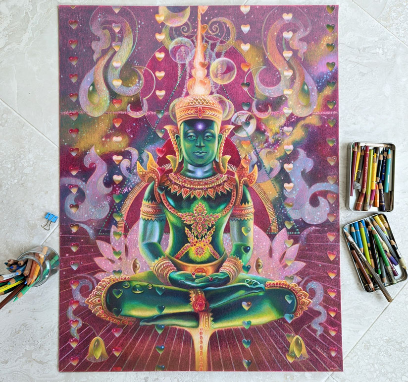
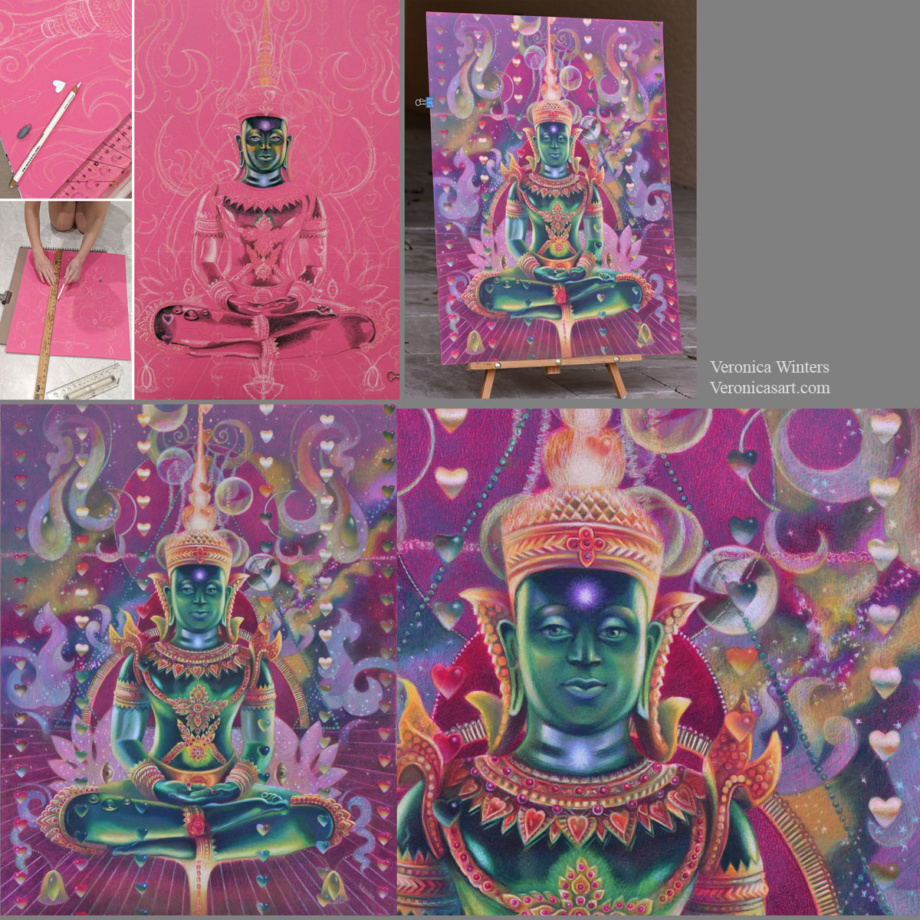
My idea starts from my imagination, reading, travel, emotions and thoughts. One day I imagined a seated figure with light passing through his body. I also imagined a rain of hearts above the figure. I made notes of this idea on my phone…I wanted to depict energy, chakras and the colors of the Universe in this colored pencil drawing of Buddha. I came home and started thinking of my references to illustrate this concept.
#2 Pick high-quality references for realistic colored pencil drawing
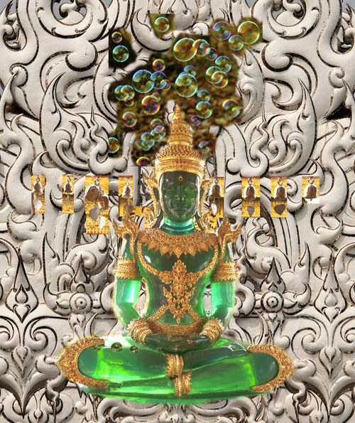
At first I wanted to paint a real person but I had no references of the pose. So I browsed pictures from my Thailand trip folder. I saw so many beautiful Buddhas and palaces there…And this green Buddha was made of semitransparent stone that looked like glass.
You need to pay attention where your references come from. Sometimes you can’t enter competitions drawing from someone else’s photo. Other times, you don’t have an emotional connection to the picture which is not yours. Or you need to get a photo release that takes time and effort. Personally I try to use my references but when it’s impossible to do, I go to Pixabay to find inspiration and you can too! Pictures are of high-quality and free for commercial use. The only problem with them is that they’re Photoshoped heavily. You must see if you have enough information to draw from as most filters remove warm/cool contrast from pictures.
This is my original idea, designed in Photoshop. I used a combination of my pictures to illustrate the visual reference to draw from. As you can see, I made considerable changes to the final drawing.
Picking the right references is not enough. They need to “connect” with each other in light and color temperature.
I always design my images around the main subject. I place it first and put smaller shapes around it. In this example, the largest shape is Buddha’s image, and my design revolves around the figure. I used the ruler to make straight lines and place the hearts. I cut a heart-shaped template to have a consistent shape in my colored pencil drawing. I use Photoshop to plan the design as much as possible by layering and moving elements around the main figure to arrive at a perfect composition.
step-by-step drawing on Canson Colorline paper
#3 Decide on your color harmony in colored pencil drawing
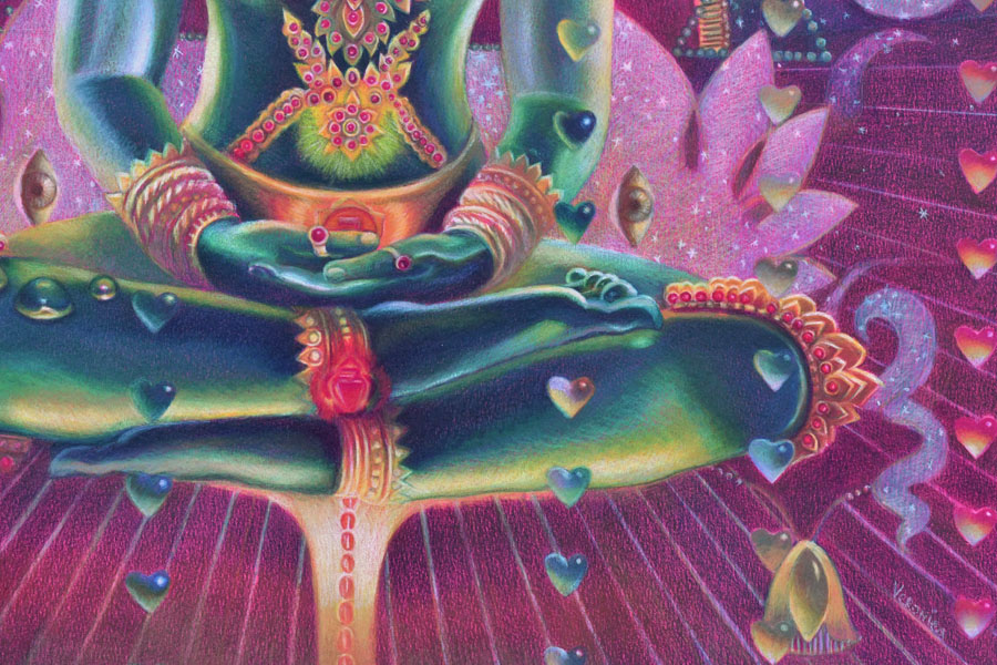
This drawing has quite a sophisticated color scheme. My color harmony is a combination of cool red, green, and cool, bluish white.
My tip is to focus on picking 1-2 main colors in your color harmony. It doesn’t mean that you use just two colored pencils for that. It means that you pick the basic scheme, say, ‘yellow-purple’ and design your colored pencil drawing in these colors. The rest of them should be grayed down or become less prominent to support the main hues.
#4 Pick the right toned paper for your specific color harmony
I love drawing on Canson Colorline paper because it comes in a variety of bright colors. The texture is not overwhelming, and colored pencils become very vibrant when drawing on this paper. (I’m linking to this paper on Amazon, but I find that DickBlick Art Materials online store has much better choices. Amazon sells a lot of fake products positioned as real ones. Be careful. Buy your art supplies from established shops. Read one-star reviews to understand if the products are fake or not. I bought several art supplies that were listed with professional images, yet the received supplies were knockoffs from China.
Once you have picked your main color scheme, say ‘yellow-purple’, look at the color of your drawing paper. In general, don’t draw on yellow paper if your main color is ‘yellow’. Don’t draw on a purple drawing paper if your main color is ‘purple’. Pick the opposite color of paper (like green or orange) and test the colored pencils on it. Test a few colored pencils on it to see how vibrant or dull they are. Some colors may disappear on colored paper, and others would be super bright.
#5 Have consistent shading in your colored pencil drawing
Begin shading the shadows first using one color. Don’t jump around the picture with many colors. Pick one color and shade all the darks with it. Mark the highlights with white colored pencil (or reserve the space for your highlights if you draw on white paper). Lastly, shade the middle tones connecting the darks with the lights.
Shade with the softest colored pencils, filling in large areas. If you start working with harder colored pencils like Polychromos, it might be frustrating to fill in a large space. I save a lot of time and hustle for myself by drawing with the softest pencils like Prismacolor Premier and Luminance or Pablos, and then switching to harder pencils like Polychromos to work on the details in my colored pencil drawing.
Have fun creating your super vibrant colored pencil drawings with beautiful and unique color harmonies!
You can learn a lot more about color and color harmonies by taking my video course, where I explain the properties of color and how you can design your images around color. I share my secretfor picking a perfect color scheme for my colored pencil drawings every time.
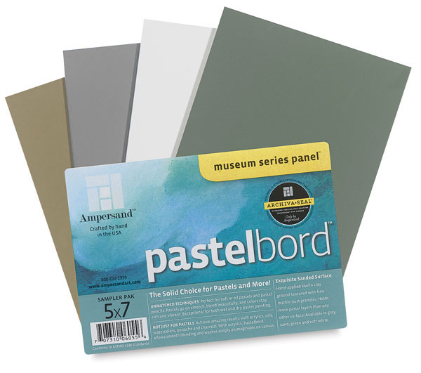
This board could be an alternative to drawing on colored paper, but you must consider the disadvantages of working on it with a colored pencil.
I like to experiment with different surfaces drawing in colored pencil, searching for the most archival support for my art. Since most people find the colored pencil work inferior to oil painting and even pastel painting, finding the right, archival surface takes the fear away from your clients who wish to buy your artwork otherwise.
This slightly sanded, colored pastelbord by Amersand is similar to the 800 grit Uart paper, which is great for soft pastel painting. Just like the Uart paper, the pastelbord has similar advantages and disadvantages to using it in colored pencil drawing.
Advantages:
Ampersand offers a nice variety of colors: sand, dark green, white, gray, and other neutral colors. It takes much less time to shade on a colored surface rather than on white.
Artworks look vividly drawn on this board.
This archival surface is durable. It doesn’t bend or crumble, stays flat at all times.
It offers easy display without a glass. Just make sure you fix your art beforehand with 3 layers of final fixative. Now you have neither glass reflections nor fear of transporting the art!
The Ampersand pastelbords come in standard sizes that make it super easy to frame them!
Disadvantages:
Colored pencil shading on pastelbord is limited. It accepts a few layers of pigment.
It “eats” my colored pencils. If you buy expensive, lightfast pencils, they don’t last long drawing on this surface, and you’d have to replenish them quite often.
It’s best to use harder pencils on these boards. I use Pablo’s to fill in all the details.
The boards cost more than the average drawing paper, of course.
Pink rose, 9×12 inches, lightfast colored pencils on pastelbord, in private collectionPeacock feathers, 5×7 inches, lightfast colored pencils on pastelbord, in private collection
These art instruction books are on sale on Amazon!
Casa Azul, the Frida Kahlo’s house in Mexico City: is it worth the visit ?
Located in the Xochimilco district, Coyoacán neighbohood of Mexico City, the Blue House is the home and studio of famous surrealist female artist – Frida Kahlo. She is the most known Mexican painter promoted across numerous art museums in the US. Frida Kahlo was an amateur surrealist painter, a feminist icon, and a wife of famous Mexican muralist – Diego Rivera whom she married in 1929.
Frida’s courtyard: a cobalt-blue house pulsates with the vibrant spirit of Frida Kahlo.
The Casa Azul (Blue House) was built in 1904, long before Frida was born. It became her childhood home, a witness to her joy, pain, and unwavering passion for art. Here, amidst splashes of cobalt blue and Mexican folk art, the house became a shared haven for the artist’s tumultuous yet creative partnership with Diego Rivera. The Casa Azul museum doesn’t display famous art by Frida but mostly exhibits personal objects, small art, photography, pre-Columbian sculptures, documents, books and furniture of the artist.
The museum is a living space, infused with the echoes of Frida’s presence. Temporary exhibitions inside the house weave narratives around her life and art, while well-maintained lush garden, once Frida’s sanctuary, invites quiet contemplation.
Stepping into Frida’s World: the studio
Stepping into the museum is like stepping into Frida’s soul. Her studio, one of the rooms in the house, displays art supplies, objects, easel and inspiration of the artist. The windows bath the studio in warm light and provide the views into green-blue courtyard. It’s impossible not to notice that this house with a studio is modest in contemporary terms but it was definitely specious and cozy for that time period.
In the “Studio” room the easel takes a prominent space, which was given by Nelson Rockefeller to Frida Kahlo. This picture also captures the artist’s table with art supplies, books and pictures.
A Tangled Triangle: Frida Kahlo, Diego Rivera, and Leon Trotsky
Both Frida and Diego Rivera were fascinated with the socialist ideology and supported its ideals via art. Rivera painted several murals with political messages. They both had a very close relationship with Leon Trotsky whose house was just a few steps away from theirs.
Frida Kahlo and Diego Rivera had a tumultuous relationship. Although they shared passion and love for each other, Frida weathered many infidelities by her husband, and entered into extramarital affairs herself. In 1937, Leon Trotsky, the exiled Russian revolutionary, found refuge in Mexico, courtesy of Diego Rivera’s political leanings. He and his wife Natalia Sedova moved into Casa Azul, creating an unorthodox mix. As Diego became increasingly disillusioned with Trotsky’s political stances, Frida and Trotsky were known to have a short-lived affair, fueled by intellectual connection and perhaps a desire for revenge against Diego’s infidelity. When Trotsky and Natalia moved out, the friendship between Frida and Diego fractured, and Frida poured her emotional turmoil into her art, most notably the poignant “Self-Portrait Dedicated to Leon Trotsky.”
“Casa Azul” presents a collection of personal mementos, books, pictures, traditional Mexican crafts, pottery, etc. There is a display of medical corsets and costumes that reveal the depth of her struggles. Further down in the museum you’ll find a wall display of Frida’s crutches, corsets and medicines the artist used after her numerous surgeries.
The Artist’s Bedroom
The artist’s bedroom is modest with the mirror that her mother had put into her room after the accident. Unable to move for almost a year, Frida began to paint in her bed.
Kitchen
Kitchen space at the Frida’s house-museum. While the rooms are specious, you can see modest furniture, pottery, artifacts, folk art and personal items of the artists reflecting Mexican culture of that time period.
Frida’s dresses
A collection of Frida Kahlo’ dresses. Saint, muse, lover, victim and survivor. Frida Kahlo is the very model of the bohemian artist.
“Writer Carlos Fuentes described how Frida’s arrival at the Palacio de Bellas Artes would be announced by the sound of her jewellery and how the architectural grandeur of the palace, its paintings and the captivating music of its concerts would be instantaneously outshone by her striking presence. Some of her closest friends have described how Kahlo would take special care in choosing each one of her garments, styling herself from head to toe, with the most beautiful silks, lace, shawls and skirts, some of which can be admired in this gallery. On the street, children would ask her “Where is the circus?” and she would just smile graciously and continue walking.
October 1937 marked a major step for Frida’s future influence in the fashion world, when Vogue featured her for the first time in the pages of the magazine. Later, in 1939, André Breton organized Kahlo’s first exhibition in Paris. It was called Mexique and her Tehuana dress became an instant sensation among European elites. It is said that star designer of the day Elsa Schiaparelli created a dress in her honor that was named ‘La Robe Madame Rivera.
It was the Tehuana dress that Kahlo chose as her signature dress; to define her identity and to portray her cultural heritage and political beliefs. Her wardrobe is mostly composed of Mexican traditional pieces from Oaxaca and other parts of the country. Nonetheless, there are also ethnic garments from Guatemala and China, as well as an interesting collection of European and American blouses. Kahlo used to combine these pieces to style herself and her favorite colors were red, green, blue, black and white. The development of her distinctive style as a blend of traditional Mexican and European fashion, as well as the fundamental effects of her disabilities, is represented through this selection of Kahlo’s most iconic looks. Kahlo as a bohemian artist, a Tajuana, a hybrid – representing her own mixed European and Mexican blood.”
1. Carlos Fuentes, introduction to The Diary of Frida Kahlo, New York, Abrama, Ine, 1995, p. 7. 2. Hayden Herrers, preface to Frida: A Biography of Frida Kahlo, United States, Harper Perennial, 2002, p. X
Transforming Grief into Legacy:
Frida Kahlo is a symbol of female empowerment and artistic defiance in art history of the West. Her story, whispered through the cobalt-blue walls, continues to inspire artists and dreamers alike. Frida died in 1954. Grief-stricken, Diego Rivera set about creating a lasting tribute to her life and work. He transformed the house into a museum, officially inaugurating it in 1958. It was his way of keeping her spirit alive, sharing her story with the world.
Is it worth your visit?
While the museum has a historic value of course, it’s rather small in today’s terms, crowded, and doesn’t have as much art as you may think could be found there. It also requires advanced purchase of tickets stamped with day and time. So if you plan to visit it, you must purchase the tickets before traveling to Mexico. Personally, I didn’t find the house fascinating but the Rivera’s Pyramid- museum was really interesting and definitely worth your visit! The Blue House ticket price includes the visit to the Anahuacalli. Be aware that it’s located in a different part of town and we used Uber to go there.
Anahuacalli: A Temple of pre-Hispanic art rising from Diego Rivera’s passion
Diego Rivera pyramid museum or ANAHUACALLI MUSEUM in Mexico City. The Museum houses more than 45,000 pieces, 2,000 on permanent display. In 1941, Diego began building the Anahuacalli, an architectural blend of modern art and pre-Columbian culture. The artist bought the land to build a cultural destination for artists and art enthusiasts alike. Each corner of the building has four elements – the goddess of corn and earth- Chicomecóatl; the god of wind and air- Ehécatl; the god of fire-Huehuetéotl, and the god of water and rain – Tláloc.
The eruption of Xitle, in the year 400 BC, created a landscape of layers of lava that, when solidified, formed an ecosystem of desert plants. The architecture of Anahuacalli was integrated into this biosphere, thought by Diego as a sacred receptacle in connection with the underworld.
from the museum’s website
Rising from volcanic rock, the Anahuacalli’s name, derived from the Nahuatl language, translates to “house surrounded by water”. Throughout his life, Rivera amassed a vast collection of pre-Hispanic artifacts, captivated by the history, wisdom and beauty of ancient Mexican cultures. He dreamt of a space to house these treasures, not just as a collector, but as a storyteller, an educator, and an artist himself.
One of the halls inside the museum displaying sketches done by Diego Rivera.
In 1943, Rivera began translating his vision into reality. He designed the Anahuacalli, drawing inspiration from Mayan and Aztec pyramids, using volcanic rock and concrete to create a sense of permanence and power. The building’s façade features sculptures reminiscent of pre-Hispanic iconography, hinting at the treasures within. The building consists of different levels with a varied amount of natural light, symbolizing a journey from the underworld to the sun. As a collector, Diego Rivera amassed over 45 thousand pieces of pre-Columbian art – comprising Jalisco, Colima, Nayarit and Michoacán.
Inside, the museum unfolds like a journey through time. Dark rooms showcase Rivera’s collection of over 6,000 pre-Columbian artifacts – terracotta figurines, masks, ceremonial objects – each whispering stories of forgotten civilizations. Rivera carefully arranged these pieces, not as mere exhibits, but as characters in a grand narrative, weaving together threads of mythology, ritual, and daily life. Ancient figurines are fascinating to look at as they are varied and represent different time periods. This museum is as interesting as the Archeological museum in Mexico City.
The Anahuacalli was envisioned as a cultural space, a “City of Arts,” where artists of all disciplines could find inspiration and collaboration. He designed studios, gardens, and courtyards, dreaming of a vibrant hub where creativity could flourish across generations. Unfortunately, Rivera’s ambitious vision for the Anahuacalli remained largely unrealized. He passed away in 1957, leaving the project incomplete. His wife, Frida Kahlo, ensured the museum’s completion and official opening in 1964, though Rivera’s dream of a bustling “City of Arts” never materialized.
Diego Rivera Museum: soviet star built on the floor’s terrace of the museum. Don’t forget to step out to see the views of the lava sea and rugged nature of the region in Mexico City from the rooftop of the museum. The Anahuacalli terrace offers views that inspired the artist to create this place.
The Anahuacalli stands as a testament to Rivera’s legacy. It’s a well-organized, yet underrated art museum and an architectural marvel! Its pre-historic art collection is inspirational and educational for us to learn about the ancient wisdom and artistic spirit of the peoples of Mexico. It is a unique temple of Mexican art that you must see in person!
Anahuacalli museum of Diego Rivera is showing a vast collection of pre-Hispanic figures. Throughout his lifetime, Diego Rivera collected numerous sculptures and objects of pre-Hispanic art. Later in life, he built the space to house his collection and for others to enjoy the archeological collection today.
The ticket to the Frida Kahlo Museum includes admission to the Diego Rivera-Anahuacalli Museum! More information:https://museoanahuacalli.org.mx/
Leon Trotsky’s Turbulent Exile in Mexico City: a story of defiance and assassination captured inside the house-museum
Trotsky house-museum is situated very close to the Blue House and is worth your visit! It doesn’t require advanced reservations as it’s half-empty and obviously not as known to the West as Frida Kahlo’s art.
View from the street of Leon Trotsky’ house
Leon Trotsky, a towering figure of the Russian Revolution, found himself ostracized and hunted after falling out of favor with Joseph Stalin. His exile in Mexico City from 1937 to 1940 was a period of immense personal struggle, marked by intellectual defiance, political isolation, and ultimately, a brutal assassination.
From Revolutionary Hero to Exiled Pariah:
Trotsky’s early life was a whirlwind of revolutionary fervor. A brilliant orator and organizer, he played a pivotal role in the 1917 Bolshevik Revolution, becoming Lenin’s right-hand man. However, ideological clashes with Stalin led to his expulsion from the Communist Party and the Soviet Union in 1929. He embarked on a nomadic journey, bouncing from Turkey to France, Norway, and finally, Mexico, desperately seeking refuge.
One of rooms in a spacious Trotsky house-museum
Finding Solace in Coyoacán:
Mexico City’s Coyoacán neighborhood offered Trotsky a temporary haven. He and his wife Natalia Sedova settled in a fortified compound, dubbed “Fortress Trotsky.” Despite the constant threat of Stalin’s assassins, Trotsky remained intellectually active. He wrote prolifically, criticizing Stalin’s regime and advocating for a global proletarian revolution. His magnum opus, “The Revolution Betrayed,” became a scathing indictment of Stalinism.
House library at the Trotsky residence in Mexico CityBathtub at the Trotsky house
A Beacon for Leftists, a Target for Stalin:
Trotsky’s exile attracted a motley crew of supporters, including painters Diego Rivera and Frida Kahlo. His home became a hub for leftist intellectuals and revolutionaries, who saw him as a beacon of hope against Stalin’s tyranny. However, this notoriety also made him a prime target for Stalin’s agents. Assassination attempts became a grim reality, culminating in the tragic events of August 20, 1940.
Leon Trotsky & Diego Rivera, one of many photographs displayed at the house-museum
A Brutal End to a Tumultuous Life:
Ramón Mercader, a Spanish communist recruited by Stalin’s secret police, infiltrated Trotsky’s inner circle. Gaining Trotsky’s trust, Mercader struck with an ice axe. While Trotsky initially survived, he succumbed to his injuries the next day. His assassination silenced a major critic of Stalinism and marked a tragic end to a life defined by revolutionary zeal and relentless pursuit of his ideals.
Mexican police showing the ice axe used by Mercader in the crime killing Trotsky.
Trotsky’s Legacy: A Complex Tale of Revolution and Exile
Trotsky’s legacy remains complex and contested. He is revered by some as a champion of socialist democracy and a tireless fighter for the working class. Others condemn him for his role in the Bolshevik Red Terror and his unwavering commitment to a revolution that ultimately paved the way for Stalin’s dictatorship.
His exile in Mexico City, however, stands as a testament to his unwavering defiance and intellectual commitment. Though ostracized and hunted, Trotsky remained a thorn in Stalin’s side, his voice echoing through his writings and inspiring future generations of revolutionaries. Trotsky’s story is a cautionary tale of the dangers of political idealism and the dark undercurrents of revolution. Yet, it also serves as a reminder of the power of dissent and the importance of fighting for one’s convictions, even in the face of seemingly insurmountable odds.
In this episode I list 4 different surfaces for colored pencil drawing I use the most often. There are many more drawing papers of course. Share your ideas in the comments on YouTube or in messages on Instagram
Imagine this. We can feel confident and inspired by looking at bold brushstrokes of Sargent. Or, perhaps, we can find solace in Vermeer’s quiet portraits. Maybe, the gaze of Frida’s self-portraits can reflect our own inner strength. Visual art, in its myriad of forms and styles, is a keepsake of our emotions. Art is open to everyone, regardless of age, culture, country or education level thanks to art museums, books and the Internet.
A lady reading letters of Heloise and Abelard-1780 by Auguste Bernard d’Agesci, oil painting, Art Institute of Chicago
The Science of Art & Emotion
Ingres, Princess de Broglie, 1853, closeup, the Met, New York
When we go to an art museum to marvel at the technical skills of artists, research reveals a deeper magic at play. Studies have shown that engaging with visual art can trigger a cascade of positive effects on our emotional and mental well-being:
1.Reduced stress and anxiety: A 2019 study published in the Journal of the American Medical Association found that museum visits lowered cortisol levels, the stress hormone, in participants. Promoting relaxation, art can be a useful technique to lower your anxiety level without taking the prescription.
2. Enhanced mood and happiness: A 2015 study by the University of Westminster revealed that looking at art increased feelings of pleasure and excitement in participants.
3. Improved empathy and social connection: A 2020 study in PLOS One found that viewing art together fostered greater empathy and prosocial behavior among participants.
Federico Uribe art, Adelson Galleries, 2023, Miami Art
The Secret Weapon is Art Education
The impact of visual art isn’t just for art nerds; it’s an effective tool for nurturing well-being from a young age. Art education is often ignored in public schools giving more value to sciences or sports. However, we have many parts to us and we grow emotionally by incorporating many subjects and social cues into our life. Art isn’t about making pretty pictures; rather it’s about:
Building self-esteem and confidence: As children express themselves through art, they discover their unique creative voices, boosting their self-confidence and sense of accomplishment.
Enhancing cognitive skills: Studies show that art education improves critical thinking, problem-solving, and spatial reasoning skills, giving young minds a well-rounded workout.
Fostering emotional intelligence: Through art, children learn to identify and express their emotions, developing a healthy vocabulary for their inner world. I think this is the most overlooked, yet most powerful application of art in our daily experiences.
Creative thinking is not limited to arts. It often influences our business and social decisions.. Creativity is essential in problem solving, science exploration and personal life growth. Some super creative personalities like Steve Jobs and Elon Musk have revolutionized our understanding of and interaction with technology. Creative thinking is about generation of unique ideas and solutions. It’s a skill that takes time to develop while we study arts and sciences in school. Sometimes students do need help with homework and assignments. There are many companies that offer quality service helping students succeed in learning. At homework help websites experienced writers help students understand difficult course topics, reducing stress and overwhelm. Students are able to complete homework on time and hone their creative skills. They show improved performance in grades and timely submission of assignments.
Gustav Klimt, Mäda Primavesi (1903–2000), Austrian, 1912–13, oil on canvas, 59 x 43 1/2 in.
Gustav Klimt despised government control and censorship in the arts, and as a result, revolutionized the art scene in Europe with his sensual, stylized art in early 20th century. He has influenced many modern and contemporary artists as well as art styles, including Art Nouveau, Bauhaus, and Russian Constructivists. According to the Met, The girl’s parents were banker-industrialist Otto Primavesi and his wife Eugenia, who were supporters of progressive Viennese art and design. This painting was seized by the Nazis from Jenny Pulitzer Steiner in 1938 in Vienna and restituted to her in 1951. http://www.metmuseum.org/art/collection/search/436819
Tips to Tap into Art’s Therapeutic Powerin You
Every person has the artistic side inside him. It may be dormant or not fully explored. As we nurture this part of our personality, we discover new ways of looking at the world. We become more creative in our jobs. We feel emotional connection to people. We engage with others with empathy. We see beauty in ordinary places. We become more connected to the source of our divine nature.
So if you’re in the mood to discover and process your emotions via visual art, here are some tips to get you started.
1. Visit an art museum or art gallery:
When you travel to another state or city, place the largest art museum and a few art galleries on your list. Not everything is going to look as art to you or become your favorite, but you learn to explore art beyond your comfort zone; you also understand what you really like or dislike. Sometimes, I go out and get disappointed in the shown objects promoted as ‘art’, but there are moments when I find paintings or sculpture that inspire me to create art or try new art materials or just look at the subject differently. I often study paintings by looking at unusual composition, color use or texture created in paint. Such visits cultivate my taste and appreciation of art.
OtherWorld, interactive space, Columbus, Ohio
Digital art and technology: I find this new realm of technology exciting. I’m not talking about the NFT scams or bitcoin-get-rich schemes. I think that the interactive, digital art installations are becoming more creative and exciting in comparison to contemporary painting. Some interactive installations can help you explore yourself and grow your understanding of reality by going to these virtual reality rooms. I like how some artists combine nature and technology to create moving exhibitions. My favorite artists in this field are: Studio Drift, Studio Olafur Eliasson, Kusama’ Infinity Rooms. You can also explore new interactive spaces like Other World, a 32,000-square-foot immersive art installation in Columbus and Philadelphia. It’s an interactive, multilevel playground filled with large-scale art, mixed reality playgrounds, and secret passageways. It’s a surreal mix art, technology and interactive experience.
OtherWorld, immersive space in Columbus, Ohio. Mushrooms changing color and sound.
2. Let your inner artist shine:
Grab a brush or a pencil and make a drawing of something in front of you. Sketch a tree outdoors or a flower on your table. Write a note next to your sketch about your feelings as you’ve been drawing it. It’s about finding joy in the process of creation.
3. Turn your home into a gallery:
Abbotsford house, Castle’s interior with a bookcase
Surround yourself with art that speaks to your soul. Photographs, paintings, small sculptures or even handmade coffee cups can create a nurturing environment that reflects your inner world. Sometimes I visit homes that have 100% white walls. These houses look empty of color and emotion. Lacking personality, such houses are generic and sterile. Every human being is unique and by exploring your emotions in art, you create beautiful and healing space for yourself and others around you.
4. Engage with art in everyday life:
Notice the beauty in the architecture you pass, the patterns in nature, the colors of a sunset, the texture in your friend’s bag. Collect those moments in a sketchbook or pictures because the world is your scrapbook of memories and emotion.
Church in Venice with mosaic floor design
5. Art therapy:
Art therapy is a profession and service that grew out of art-making. It’s about using visual arts as a tool for self-expression, emotional exploration, and healing. From trauma recovery to managing chronic illness, art therapy offers a powerful outlet for processing difficult emotions. If you think that drawing is not your thing, try making collage pieces out of magazines and postcards exploring your emotions. I find that I often make art and collages without any particular thoughts but the meaning reveals itself when the art is done… Just like writing or a combination of the two, such process can help you understand and process your painful past to move into the light.
Sometimes psychologists use projective tests to understand your psyche.
Deep Dive into Projective Tests:
Projective tests, like inkblots and incomplete drawings, offer a glimpse into unconscious thoughts, feelings, and conflicts. They often look like symmetrical blobs of paint juxtaposing negative and positive space. But how does it work, right?
The Projective Hypothesis: Imagine throwing a pebble into a still pond. Ripples emanate outwards, revealing the contours of the pond floor. Similarly, projective tests are thought to “disrupt” the calm surface of the mind, provoking responses that reflect our inner landscape. By presenting ambiguous stimuli, such as inkblots or unfinished sentences, psychologists encourage individuals to project their own interpretations and motivations, revealing facets of personality that might otherwise remain hidden.
Rorschach inkblot
Common Projective Tests:
Rorschach Inkblot Test: The Rorschach presents ten inkblots of varying shapes and complexity. Psychologists analyze the patient’s interpretations, focusing on content, location, and movement. A bat in the blot might indicate anxiety, while seeing multiple figures interacting could suggest interpersonal struggles.
Thematic Apperception Test (TAT): In this test, individuals tell stories about ambiguous pictures depicting people in various situations. The psychologist delves into the themes, emotions, and conflicts projected onto the characters, gaining insights into the patient’s underlying motives and needs.
Draw-a-Person Test: Simple as it sounds, this test can reveal volumes about self-perception and emotional states. The size, posture, and details of the drawing can offer clues about self-esteem, anxieties, and interpersonal relationships.
Evaluation and Interpretation: Projective tests are not designed to provide definitive diagnoses, but rather to offer additional information alongside other clinical tools. Psychologists consider contextual factors, compare responses to established norms, and analyze the specific details and patterns in the patient’s interpretations. Projective tests can reveal deeper dynamics:
Defense mechanisms: The way individuals cope with stress and anxiety can be evident in their interpretations, revealing defense mechanisms like denial, projection, or rationalization.
Unconscious conflicts: Underlying anxieties, fears, and desires can surface through projected themes and symbolism, helping psychologists get to the root of emotional struggles.
Relationship dynamics: Projective tests can shed light on how individuals perceive and interact with others, offering insights into potential relationship difficulties or attachment styles.
However, it’s crucial to remember that projective tests are not infallible and rely heavily on subjective interpretation with some cultural biases and individual quirks that can influence responses. While not perfect, they can be valuable tools for psychologists to gain a deeper understanding of their patients, their personalities, and the emotional forces that shape their lives.
6. Community art projects:
School building in Nicaragua
It’s often difficult to make yourself do something outside the house if you’re introverted or feel tired after a work week. However by going out and participating in collaborative art projects, you gain a sense of belonging, connection, and collective creativity that improves your mood and well-being. Imagine painting a mural for your community or taking an art class to learn the basics of pottery or sculpture. This activity can make you feel needed and appreciated by other members of the circle.
In conclusion:
Art is a valuable tool helping people express their emotions in a safe environment. Children benefit from doing art greatly by learning to explore their feelings and their relationship to the world around them. Art nurtures creativity, intrapersonal skills and grows emotional intelligence that becomes useful in a wide range of daily tasks. Art reduces stress and anxiety.
Remember, the emotional impact of art is unique to you. So, the more you explore, experiment, and record, the more your soul expands with empathy, love and curiosity. Art provides emotional connection to ourselves and the world while other activities may not have the same reach. Create healing space in your mind, home, relationships by developing your skills in painting, drawing, sketching, photography, pottery, etc. The world awaits your light.
This is why you have unique perception of reality, emotions & awareness
In this episode I share my thoughts and experiences outlining our unique perception of reality and how to expand on our awareness, understanding and love.
If you’re in Naples, Florida, stop by to see the retrospective exhibition of Victory Vasarely that displays over 100 serigraphs, lithographs, gouache paintings, drawings and a few small sculptures. Hosted by the Naples Art Institute, the art show offers a beautiful look at Op Art you can rarely see around here.
Hungarian-French artist, Victor Vasarely (1906-1997) is the leader of the Op Art (optokinetic art) movement, and his innovations in color perception and optical illusion had influenced numerous artists to come. Today his hand-pulled art prints sell for $4,000-30,000 a piece. Vasarely was 90 years old when he died in Paris, France.
Victor Vasarely, Op Art, The Absolute Eye exhibition, Naples, FL 2024
Better known as OP Art, Optokinetic art movement relies on mathematical principles to construct repetitive abstract shapes, stripes, grids or spirals to catch the involuntary eye movements we make when following moving patterns. In other worlds, this art stimulates the optokinetic response in us. Op Art takes this response as the basis to visually trick us but normally explores a wider artistic vision and techniques in art.
Victor Vasarely, Op Art, the Absolute Eye exhibition, Naples, 2024
5 Facts about Victor Vasarely and his Op Art:
1. From Medicine to Mastermind
Before becoming the father of Op Art, Vasarely actually pursued a career in medicine! He switched paths mid-study, drawn to the power of visual communication. Later, he studied graphic design at the private Műhely School in Budapest and in 1930, he moved to Paris to work in advertising and design.
“Vasarely’s early geometric abstract research was inspired by purely abstract elements in nature and urban spaces. In 1947 he spent the summer on a small island off the coast of Brittany, called Belle-Île-en- Mer. He observed the polished stones in the sand, examined the prismatic behavior of the sea, as well as the refraction and reflection of light, the effect of creating space by shifting the viewer’s point of vision on a flat surface and the contrast of light and shadow that generates a vibration in the sight. This would mark the beginning of a true abstract approach for Vasarely. Although he later referred to this time in his life as “the wrong path,” it resulted in an important evolution in his work. It added more rounded elements to his paintings. When he returned to his previous geometric style, it was with the inclusion of dynamic rounded forms that seemed to bulge outward from the painting or collapse inward from the surface. These forms tricked the eye into experiencing that the image was moving. That kinetic illusion, combined with the three-dimensionality of the images on Vasarely’s canvases, became the foundation for the iconic aesthetic we now call Op Art.”
Naples Art Institute
Victor Vasarely, Op Art serigraph at the Absolute eye show, Naples, 2024
‘The extreme variety of its form leads the advertising designer to mute his personality.’
Victor Vasarely
2. Architect of 3-D Perception
Vasarely didn’t just paint illusions; he aimed to engineer them. His works use geometry, repetition, and color play to manipulate how viewers perceive depth, movement, and even color itself. Thanks to his jobs in advertising and graphic design the artist learned enough about human psychology to understand how we process visual information.
“Our eyes are subjected to a constant flood of visual stimuli. In order to process and interpret them, the subconscious brain compares the images with memories and experiences. That’s what distinguishes personal perception from the actual physiological image. Large objects in the foreground, small objects in the back and lines converging at a vanishing point. As soon as the eye receives signals like these, it perceives even a two-dimensional image as spatial. That is why artists usually use so-called central perspective for their naturalistic depictions – not least of all in pictorial representations of cities. They work with lines that converge as they recede into the depths of space, just as they seem to do in the perception of reality. Vasarely, for his part, made frequent use of axonometric projection a geometrical method of constructing three-dimensional forms. The parallel side lines are drawn tipped over to one side at equal angles. This has a bewildering effect on visual perception: does the picture really depict a three-dimensional object?”
Naples Art Institute
His serigraphs depicting Zebras are considered the earliest examples of Op art. In the left corner we can see that this print is numbered and signed by the artist in graphite pencil.
3. Op Art for Everyone
Unlike much avant-garde art, Vasarely believed in democratizing art experiences. He embraced public art commissions and architectural integrations, bringing Op Art to everyday spaces like buildings and metro stations. Influenced by the Futurists, Constructivists and Dadaists, Op Art spread all over Europe and came to the US in the 60s.
Victor Vasarely, Op Art, The Absolute Eye exhibition, Naples, FL 2024
Vega Structures
“Vega Structures is one of the best-known and most emblematic series produced by Vasarely at the height of his career named after the brightest star in the northern hemisphere’s summer night sky. Inspired by contemporary news reports about mysterious signals received from distant galaxies, Vasarely named many of his works after stars and constellations. The Vega pictures rely on convex- concave distortions of a grid-like network, a sophisticated combination of the cube and the sphere, symbolically referring to the two-way motion of the light that emanates from pulsating stars, and to the functioning of condensing galaxies and the expanding universe.
Through works such as “Vega-Fel-VR” (1971) and “Trivega” (1981), Serigraphs, the artist seeks to evoke the elusive universe of the galaxies, the cosmic pulsations and the biological mutation of the cell. The common denominator in these works is Vasarely’s realization that two dimensions can be expanded into three simply by deforming the basic grid, and that, depending on the degree of enlargement or reduction, the elements in the deformed grid can be transformed into rhombuses or ellipses.” Naples Art Institute
Victor Vasarely, Op Art, The Absolute Eye exhibition, Naples, FL 2024
4. More Than Meets the Eye
Vasarely saw his art as a bridge between science and art. He incorporated mathematical principles and studied perceptual psychology to achieve the dynamic, almost psychedelic optical effects in his Op Art.
In 1955, Victor Vasarely published his thoughts about Op Art in the Yellow Manifesto. In his writing, the artist recorded his ideas that he called Kineticism. He believed that art should be based on scientific principles to create a sense of movement, energy, depth expressed in geometric forms and optical illusions, rather than copying nature.
5. Beyond Canvas
Op Art wasn’t just about grid-like paintings. According to Tate, Vasarely experimented with various mediums, including sculptures, tapestries, and even architectural facades, creating illusory, flickering effects of depth, perspective, and motion. There are a few small sculptures presented at the show illustrating his interest in other materials and techniques.
Victor Vasarely, Op Art, The Absolute Eye exhibition, Naples, FL 2024Check out this cool shop Custom Creative Custom Creative, where you can custom-design gifts for yourself, family, and friends. They offer custom-printed t-shirts, coasters, picture frames, tumblers, and more! Take a look!”
What is a serigraph?
In the ” Absolute Eye” the majority of art we see are vibrant serigraphs produced by the artist. A serigraph is a a stencil-based printing process normally called the silkscreen printing. Warhol is the most famous modern artist who used this printing method to create his art. Roy Lichtenstein comes in second.
Stencils: A separate stencil is created for each color used in the artwork. These stencils typically use a photo-sensitive emulsion on a fine mesh screen (originally silk, now often polyester or nylon). Areas left open on the stencil will allow ink to pass through moving it with a squeegee.
Layering Ink: Each stencil is placed on a frame and ink is pushed through the open areas onto the substrate (usually paper, but other materials can be used too). This process is repeated for each color, building up the image layer by layer, resulting in thick, vivid colors to complete the image. Each layer must align and print perfectly to create a finished artwork, which requires some skill and patience from the artist. The high-quality inks produce rich textures and colors.
Hand-Crafted Touch: While automated machines exist, silkscreens are usually made as limited editions because each layer is hand-pulled, each stencil is hand-made, and each full-color serigraph is numbered and signed by the artist. Therefore, such prints are limited editions by nature and have the appeal to art collectors. Subject wise, this latest form of printmaking is the easiest to learn and doesn’t usually have the refinement of image like lithography or intaglio do.
Victor Vasarely, Op Art, The Absolute Eye exhibition, Naples, FL 2024
After walking through the exhibition and getting to know the artist, I was impressed with Victor Vasarely’s ability and mathematical precision to draft geometric forms – this is something I find very difficult to do in my art. As I’ve done silkscreen and other printmaking methods, I can appreciate the artist’s attention to detail and precision with which he worked to produce his op art prints.
More importantly, his thorough understanding of geometry and mathematical perspective led him to discover his own ideal of beauty comprising the Universe. Instead of copying visual cues from Nature like trees or birds, the artist studied nature to see the underlying structure of everything living. While Op Art or geometric abstraction is not my favorite art movement, I can see how it can play its role in other artists painting including mine.