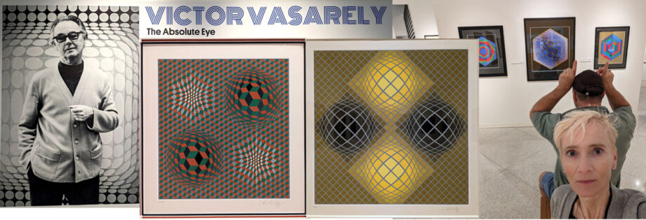
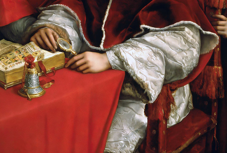
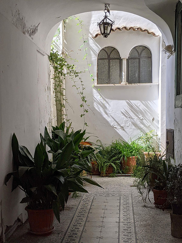
If you’re in Naples, Florida, stop by to see the retrospective exhibition of Victory Vasarely that displays over 100 serigraphs, lithographs, gouache paintings, drawings and a few small sculptures. Hosted by the Naples Art Institute, the art show offers a beautiful look at Op Art you can rarely see around here.
Hungarian-French artist, Victor Vasarely (1906-1997) is the leader of the Op Art (optokinetic art) movement, and his innovations in color perception and optical illusion had influenced numerous artists to come. Today his hand-pulled art prints sell for $4,000-30,000 a piece. Vasarely was 90 years old when he died in Paris, France.
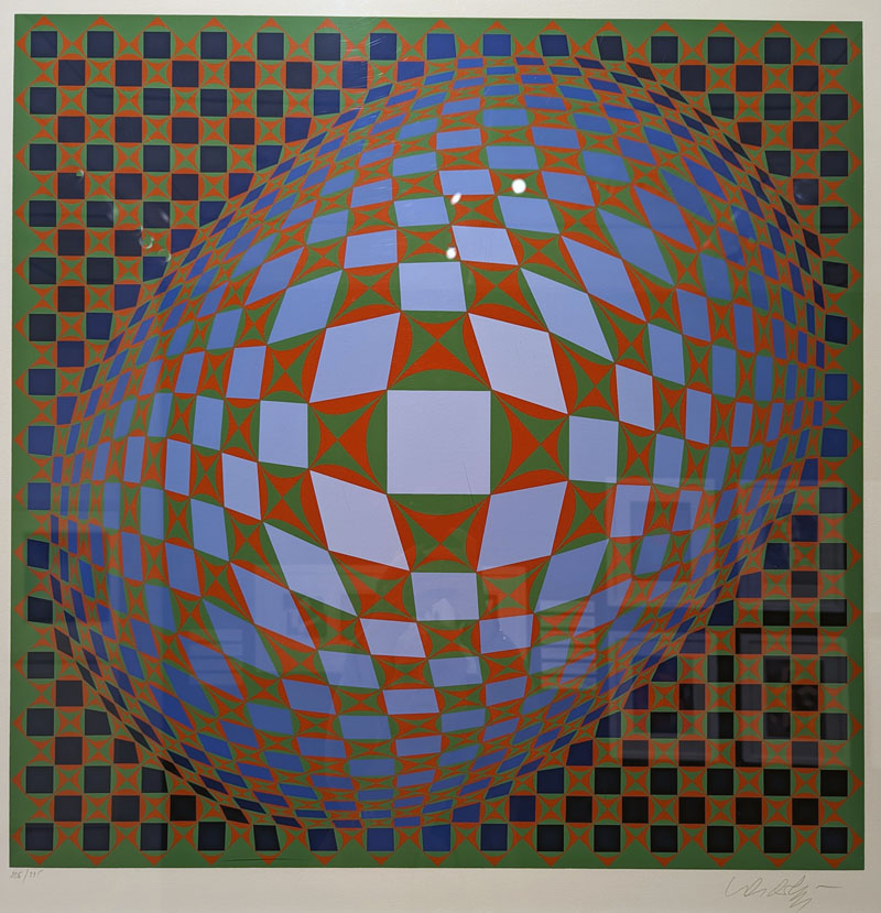
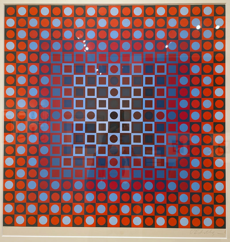
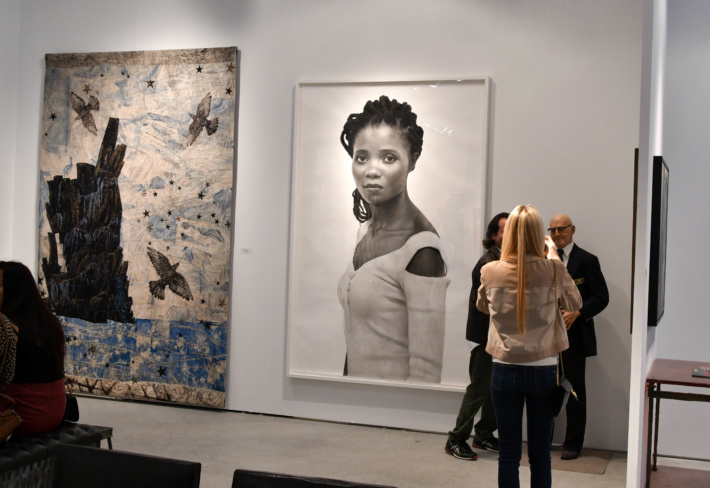
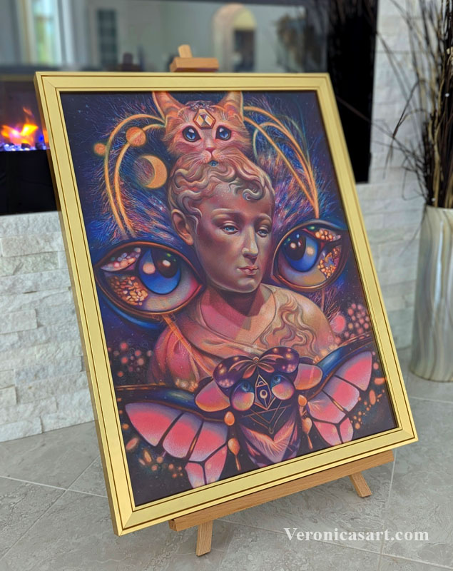
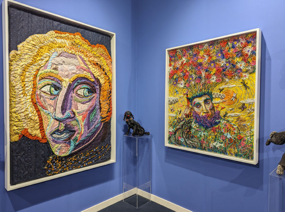
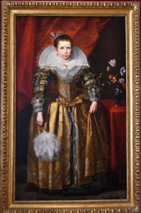
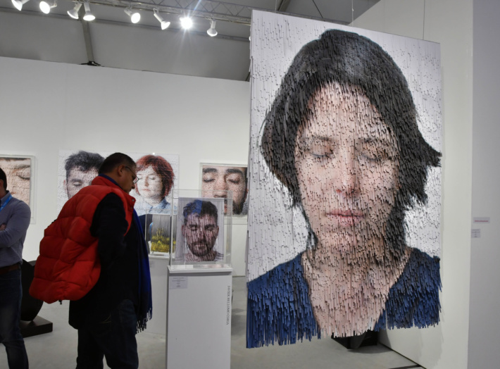
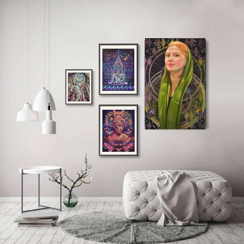
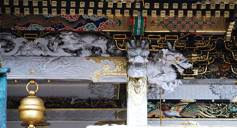
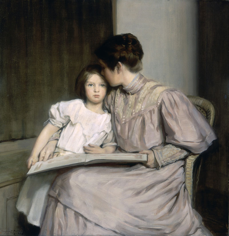
Victor Vasarely, Op Art, The Absolute Eye exhibition, Naples, FL 2024
Better known as OP Art, Optokinetic art movement relies on mathematical principles to construct repetitive abstract shapes, stripes, grids or spirals to catch the involuntary eye movements we make when following moving patterns. In other worlds, this art stimulates the optokinetic response in us. Op Art takes this response as the basis to visually trick us but normally explores a wider artistic vision and techniques in art.
Victor Vasarely, Op Art, the Absolute Eye exhibition, Naples, 2024
5 Facts about Victor Vasarely and his Op Art:
1. From Medicine to Mastermind
Before becoming the father of Op Art, Vasarely actually pursued a career in medicine! He switched paths mid-study, drawn to the power of visual communication. Later, he studied graphic design at the private Műhely School in Budapest and in 1930, he moved to Paris to work in advertising and design.
“Vasarely’s early geometric abstract research was inspired by purely abstract elements in nature and urban spaces. In 1947 he spent the summer on a small island off the coast of Brittany, called Belle-Île-en- Mer. He observed the polished stones in the sand, examined the prismatic behavior of the sea, as well as the refraction and reflection of light, the effect of creating space by shifting the viewer’s point of vision on a flat surface and the contrast of light and shadow that generates a vibration in the sight. This would mark the beginning of a true abstract approach for Vasarely. Although he later referred to this time in his life as “the wrong path,” it resulted in an important evolution in his work. It added more rounded elements to his paintings. When he returned to his previous geometric style, it was with the inclusion of dynamic rounded forms that seemed to bulge outward from the painting or collapse inward from the surface. These forms tricked the eye into experiencing that the image was moving. That kinetic illusion, combined with the three-dimensionality of the images on Vasarely’s canvases, became the foundation for the iconic aesthetic we now call Op Art.”
Naples Art Institute
Victor Vasarely, Op Art serigraph at the Absolute eye show, Naples, 2024
‘The extreme variety of its form leads the advertising designer to mute his personality.’
Victor Vasarely
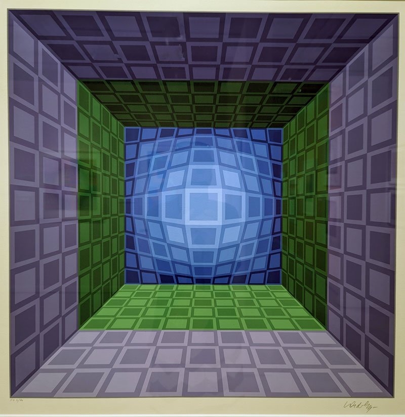
2. Architect of 3-D Perception
Vasarely didn’t just paint illusions; he aimed to engineer them. His works use geometry, repetition, and color play to manipulate how viewers perceive depth, movement, and even color itself. Thanks to his jobs in advertising and graphic design the artist learned enough about human psychology to understand how we process visual information.
“Our eyes are subjected to a constant flood of visual stimuli. In order to process and interpret them, the subconscious brain compares the images with memories and experiences. That’s what distinguishes personal perception from the actual physiological image. Large objects in the foreground, small objects in the back and lines converging at a vanishing point. As soon as the eye receives signals like these, it perceives even a two-dimensional image as spatial. That is why artists usually use so-called central perspective for their naturalistic depictions – not least of all in pictorial representations of cities. They work with lines that converge as they recede into the depths of space, just as they seem to do in the perception of reality. Vasarely, for his part, made frequent use of axonometric projection a geometrical method of constructing three-dimensional forms. The parallel side lines are drawn tipped over to one side at equal angles. This has a bewildering effect on visual perception: does the picture really depict a three-dimensional object?”
Naples Art Institute
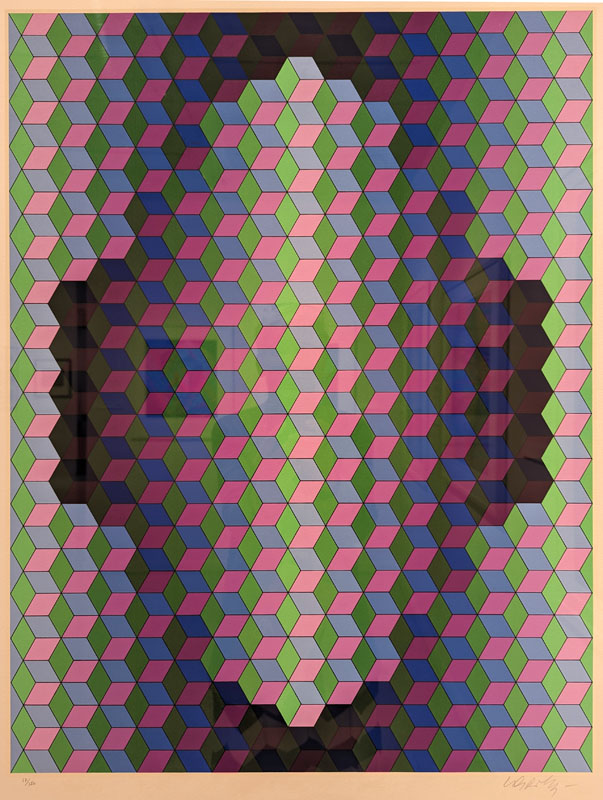
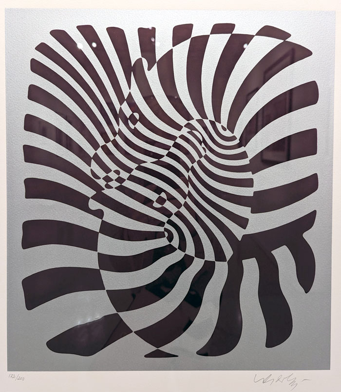
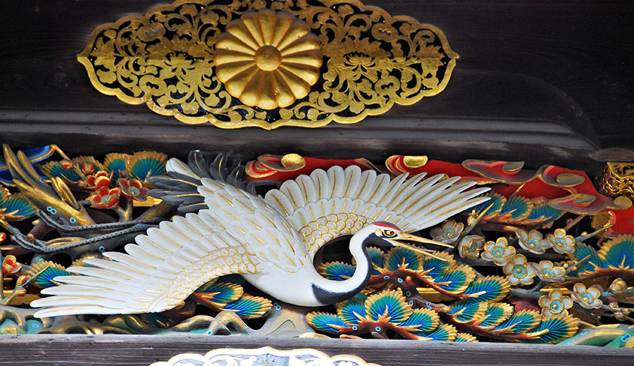
His serigraphs depicting Zebras are considered the earliest examples of Op art. In the left corner we can see that this print is numbered and signed by the artist in graphite pencil.
3. Op Art for Everyone
Unlike much avant-garde art, Vasarely believed in democratizing art experiences. He embraced public art commissions and architectural integrations, bringing Op Art to everyday spaces like buildings and metro stations. Influenced by the Futurists, Constructivists and Dadaists, Op Art spread all over Europe and came to the US in the 60s.
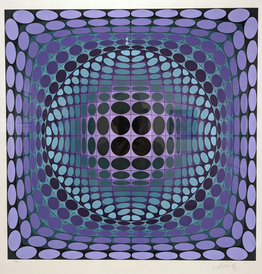
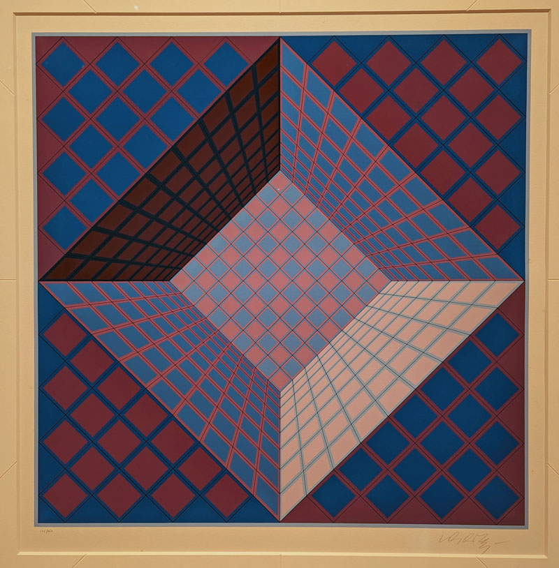
Victor Vasarely, Op Art, The Absolute Eye exhibition, Naples, FL 2024
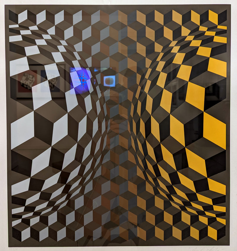
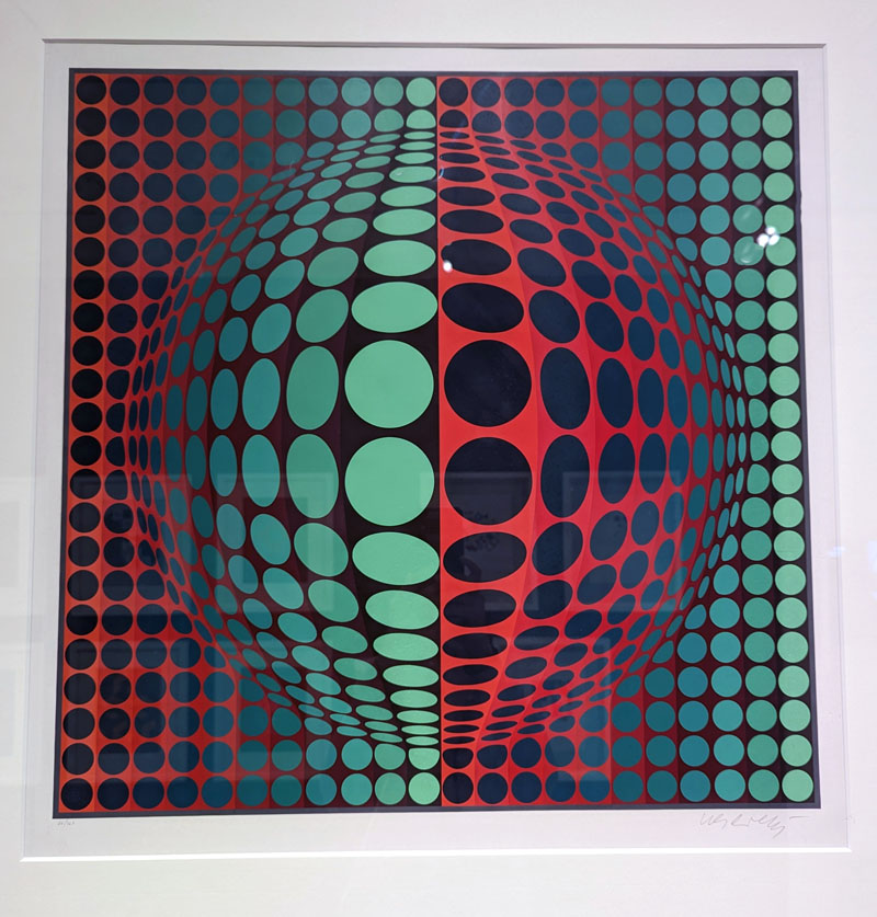
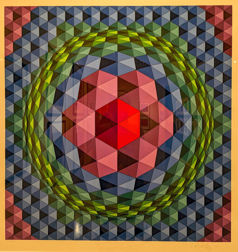
Vega Structures
“Vega Structures is one of the best-known and most emblematic series produced by Vasarely at the height of his career named after the brightest star in the northern hemisphere’s summer night sky. Inspired by contemporary news reports about mysterious signals received from distant galaxies, Vasarely named many of his works after stars and constellations. The Vega pictures rely on convex- concave distortions of a grid-like network, a sophisticated combination of the cube and the sphere, symbolically referring to the two-way motion of the light that emanates from pulsating stars, and to the functioning of condensing galaxies and the expanding universe.
Through works such as “Vega-Fel-VR” (1971) and “Trivega” (1981), Serigraphs, the artist seeks to evoke the elusive universe of the galaxies, the cosmic pulsations and the biological mutation of the cell. The common denominator in these works is Vasarely’s realization that two dimensions can be expanded into three simply by deforming the basic grid, and that, depending on the degree of enlargement or reduction, the elements in the deformed grid can be transformed into rhombuses or ellipses.” Naples Art Institute
Victor Vasarely, Op Art, The Absolute Eye exhibition, Naples, FL 2024
4. More Than Meets the Eye
Vasarely saw his art as a bridge between science and art. He incorporated mathematical principles and studied perceptual psychology to achieve the dynamic, almost psychedelic optical effects in his Op Art.
In 1955, Victor Vasarely published his thoughts about Op Art in the Yellow Manifesto. In his writing, the artist recorded his ideas that he called Kineticism. He believed that art should be based on scientific principles to create a sense of movement, energy, depth expressed in geometric forms and optical illusions, rather than copying nature.
5. Beyond Canvas
Op Art wasn’t just about grid-like paintings. According to Tate, Vasarely experimented with various mediums, including sculptures, tapestries, and even architectural facades, creating illusory, flickering effects of depth, perspective, and motion. There are a few small sculptures presented at the show illustrating his interest in other materials and techniques.
Victor Vasarely, Op Art, The Absolute Eye exhibition, Naples, FL 2024Check out this cool shop Custom Creative Custom Creative, where you can custom-design gifts for yourself, family, and friends. They offer custom-printed t-shirts, coasters, picture frames, tumblers, and more! Take a look!”
What is a serigraph?
In the ” Absolute Eye” the majority of art we see are vibrant serigraphs produced by the artist. A serigraph is a a stencil-based printing process normally called the silkscreen printing. Warhol is the most famous modern artist who used this printing method to create his art. Roy Lichtenstein comes in second.
Stencils: A separate stencil is created for each color used in the artwork. These stencils typically use a photo-sensitive emulsion on a fine mesh screen (originally silk, now often polyester or nylon). Areas left open on the stencil will allow ink to pass through moving it with a squeegee.
Layering Ink: Each stencil is placed on a frame and ink is pushed through the open areas onto the substrate (usually paper, but other materials can be used too). This process is repeated for each color, building up the image layer by layer, resulting in thick, vivid colors to complete the image. Each layer must align and print perfectly to create a finished artwork, which requires some skill and patience from the artist. The high-quality inks produce rich textures and colors.
Hand-Crafted Touch: While automated machines exist, silkscreens are usually made as limited editions because each layer is hand-pulled, each stencil is hand-made, and each full-color serigraph is numbered and signed by the artist. Therefore, such prints are limited editions by nature and have the appeal to art collectors. Subject wise, this latest form of printmaking is the easiest to learn and doesn’t usually have the refinement of image like lithography or intaglio do.
Victor Vasarely, Op Art, The Absolute Eye exhibition, Naples, FL 2024
After walking through the exhibition and getting to know the artist, I was impressed with Victor Vasarely’s ability and mathematical precision to draft geometric forms – this is something I find very difficult to do in my art. As I’ve done silkscreen and other printmaking methods, I can appreciate the artist’s attention to detail and precision with which he worked to produce his op art prints.
More importantly, his thorough understanding of geometry and mathematical perspective led him to discover his own ideal of beauty comprising the Universe. Instead of copying visual cues from Nature like trees or birds, the artist studied nature to see the underlying structure of everything living. While Op Art or geometric abstraction is not my favorite art movement, I can see how it can play its role in other artists painting including mine.
In this post, I’d like to share a few pages from my journal that I wrote in the past. These are thoughts and quotes that let me survive and grow as an artist. Being an artist is much harder psychologically than financially because we all can have a job to go by, but to nurture your gift, you must have time, passion, and dedication where the psychological state of your mind is crucial to success (no matter how you define it for yourself).
Life of an artist: thoughts that let me grow
Every portrait that is painted with feeling is a portrait of the artist, not of the sitter. Oscar Wilde
What keeps me sane makes me insane. A total contradiction of feelings and experience where I find beauty in solace few understand. I’m exhausted doing art no one needs where I fight with devaluing of art in a commercial market, where art reps and marketers scout for brand names and big bucks, where emotion is left out in favor of commercial success and quick judgment. There is a ceiling to my efforts, and networking becomes key to establish a lasting career. I used to think I’d be ok as an artist who has no fame. Yet, it’s so clear now that becoming a fashionable artist is necessary to achieve my vision. Getting in the zone to become a recognized artist becomes a gigantic goal to aspire to. (2014)
1. It’s a choice.
Who you become is your choice. What you do is your personal choice.
Life is like a river. If I don’t choose to swim upstream, I’m already in a slow-motion liquidation. Paddling deep waters becomes exhausting at times, yet the head is still sticking up above its cold edge.
I believe we are born with equal levels of happiness, courage, and talent. Yet, we differ so much in what we can accomplish in our lifetime. As children we adopt a mindset of beliefs that determines our future. Our parents play a profound role in this game… As adults we run on internalized habits and social conditioning that may work for us, while negative thinking may kill us. As a result, mindset is the only true determinant of luck and success, or a drama-ridden victimhood. Child abuse, neglect, or a very traumatic event in the past often overrides our Present because we live and feel a distorted reality, distorted in accordance with our beliefs and negative experiences of the past. Yet, just like making choices in food, we can make a different choice in thinking. The deeper the trauma, the harder it gets to part with it but when the goals, purpose and aspirations are clearly set, the mindset might have no choice but follow your intention as well.
Imagine you have your favorite shirt. You wear it often because it provides you with comfort. It’s soft and fits you well. You know you look good in it. One day you get tired of the same color, style, and fit. So you decide to get rid of it. Reasons unannounced, you lost interest in its comfort. And that’s how people are sometimes… (2014)
2. It’s focus.
The secret of genius is focus. Alan H. Kohen
Focus on what’s important to you and become tenacious at pursuing it. Most people get tired and quit before achieving their dreams. We all fail, but we are in charge of our fate. Swim or die.
Find a mission bigger than yourself. Step out of your bubble. It’s much bigger than you because giving makes your life meaningful. Find a role model to stay focused and committed to your passion and goals. I found my purpose from the deepest emotional pain that gripped me for decades. Art helped me survive to find enjoyment in painting. Everything else was a temporary fix for my broken heart.
Do what you love. Do what makes you happy regardless of circumstances, approval, or outcome. Find your passion or purpose that makes you excited to wake up in the morning, because success comes from trying many times over.
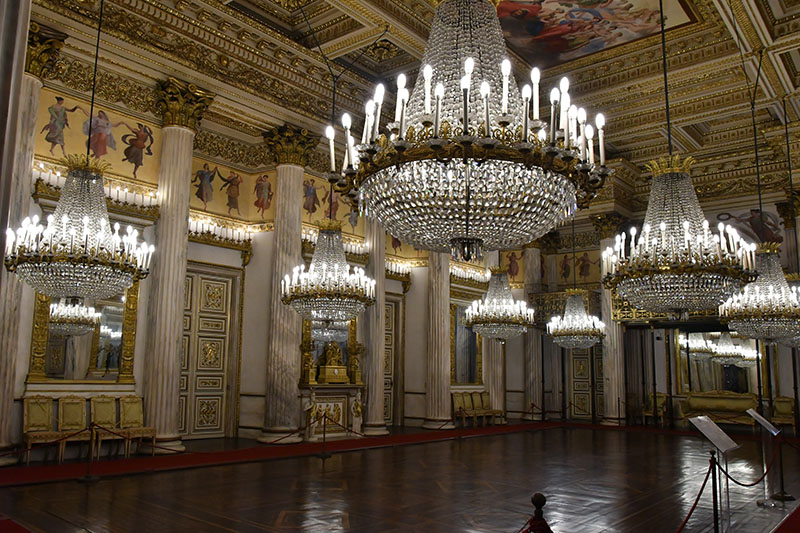
Rohan Palace, Strasbourg, France
3. It’s being comfortable in uncomfortable place.
“Life begins at the end of your comfort zone.” Neale Donald Walsch
You must find the courage to get out of your comfort zone. To do so, you must believe in yourself. Don’t say you can’t do this or that. Learn how to do ‘it’, whatever it may be. Finding excuses not to do something is a projection of your fear of failure. When you’re scared, choose to be brave. Understand the source of your fear to reduce it to zero over time.
Ambition is my fuel. Passion is my force. Love is my religion.
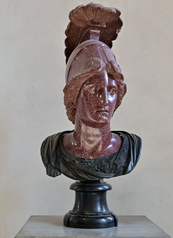
Minerva, the Louvre
Failure plays a big part in my life. Every finished painting has two more copies in the trash. I get rejected often. I fail in some relationships with people. I often fail to communicate my boundaries. Failure can be intense, frustrating, and hurtful. Failure is paralyzing, but eventually it doesn’t stop me from trying to achieve what I want. Failure is a signal to do things differently, to find a new approach. And finding this new way takes even more energy than often rivals my desire to let it all go in flames. However, my failures transform into a learning curve, not the result.
4. It’s taking the time.
What the wise do in the beginning, fools do in the end. -W. Buffett
If you don’t make the time, you’ll never find it. Everything you find is what you make.
The last stretch in painting is always the hardest. It takes 95 percent of my time. I chase the elusive sense of beauty that slips from my brush every time I finish work.
5. It’s dealing with & releasing judgment.
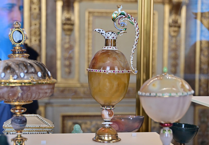
Hardstone vessels in Apollo gallery in the Louvre
People like to establish their self-worth by denouncing others around them, instilling their values and beliefs in someone else to feel good about themselves, or to fight for some idea or cause they believe in. We all do it at times.
But what’s truly rare is to meet a person who is accepting of others. It’s rare to talk to someone who is confident, yet not obnoxious, who is proud of his achievements, yet non-judgmental, who is encouraging and helpful, yet not overpowering. Every day I’m growing to this new standard of acceptance of others. I aim to become such a person although I’m far away from this goal, I’m trying as I become stronger inside.
A shattered sense of a new home, place, or belonging can either suppress our heart or open it up to a beautiful way of living. Our thoughts control and limit our perception of reality, creating a protective cocoon that’s both real and fake. While inner emotions are very real to us, they don’t represent the world, our perception of reality only. Fears and insecurities are so hard to break from and let go of. While a part of us may always stay home, letting ourselves go on a new adventure is truly liberating.
I’m broken glass on the inside. When a heart gets crushed, it seems to heal eventually. It expands for other experiences, although a ravaged part keeps living. A broken heart is a loving heart 💓.
It’s really interesting to see how you have a few valuable people in your life who can be important to you for years, whose opinion is a priority, who might love you, and who exercise great power over your mindset. You could miss them terribly and hope that they might miss you, too, in return. But one day the bubble bursts, and what’s left is true you, and all that matters is your own opinion, your outlook on life, and your actions. And all of a sudden, those people lose their unintentional grip over you, if they have not disappeared from your life already. ( October, 2014)
The worst part about being an artist is facing people’s indifference or a complete absence of art appreciation. Finding a unique art style or voice in art by artists is often overlooked in favor of bright colors, realism, or details. Finding your voice is a journey and one of the hardest tasks for artists to accomplish.
Moonlight, 22x30in, colored pencil on art board, Veronica Winters
6. It’s becoming optimistic.
Santorini island, Greece, hike to Oia
When the student is ready, the teacher will appear. Chinese proverb
Many artists are riddled with jealousy or a paralyzing fear of not being good enough or of not being able to achieve greatness. As a result, we draw endless comparisons and feel bad about ourselves. Release yourself from negative feelings. Cultivate gratitude inside yourself. The more light we, artists, create, the better our world becomes. Focus on the good things already happening in your life. Listen to motivational speakers like Tony Robbins, Jasmine Star, or whoever you find inspiring. Meet and learn from fun, interesting, and inspiring people who are ahead of you.
I hope my journal helps you create and shine. Our world doesn’t exist without beauty, and you, along with other artists, help create the most beautiful world filled with light!
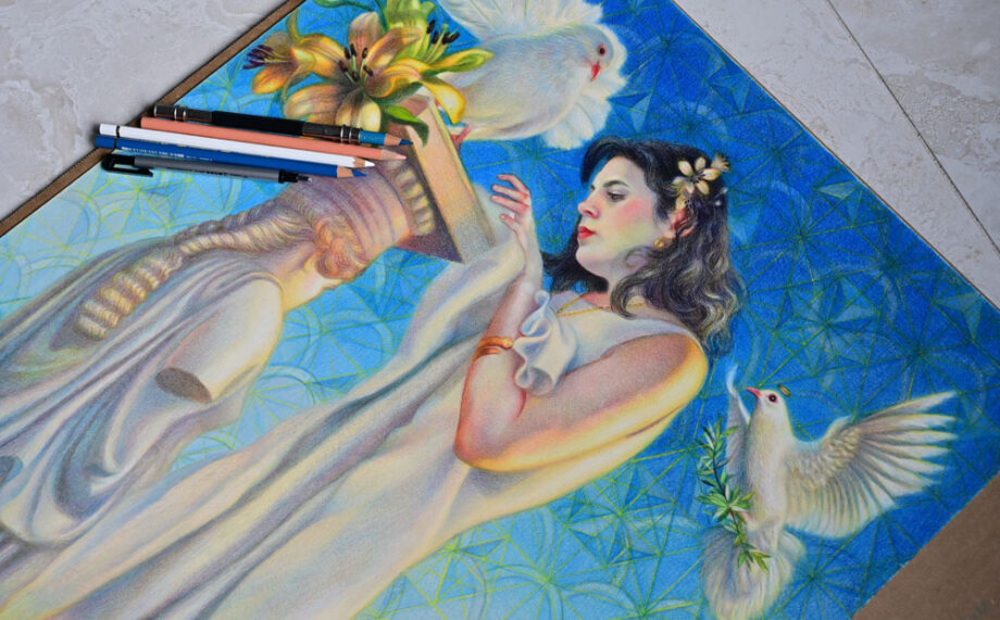
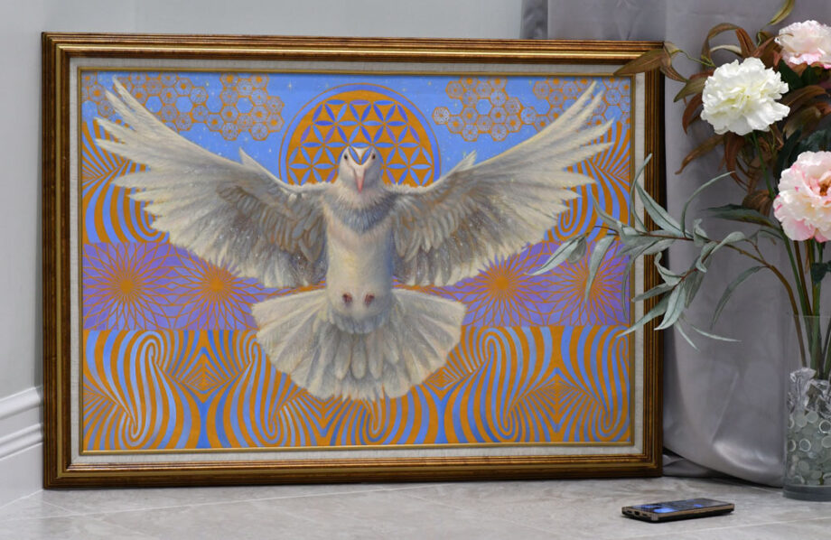
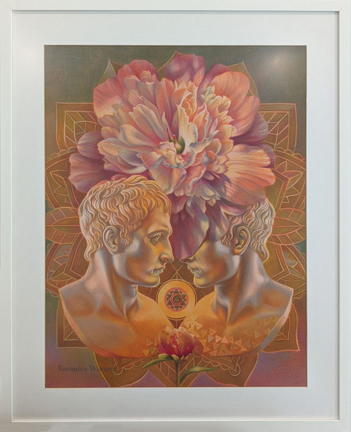
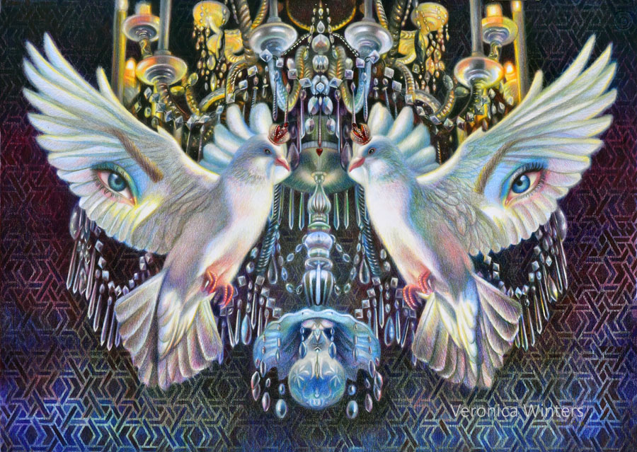
Dove of Love, 24×36 in, mixed media on canvas | The painting features the flower of life geometric symbol.
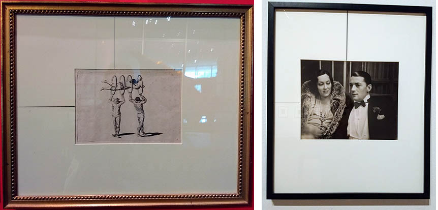
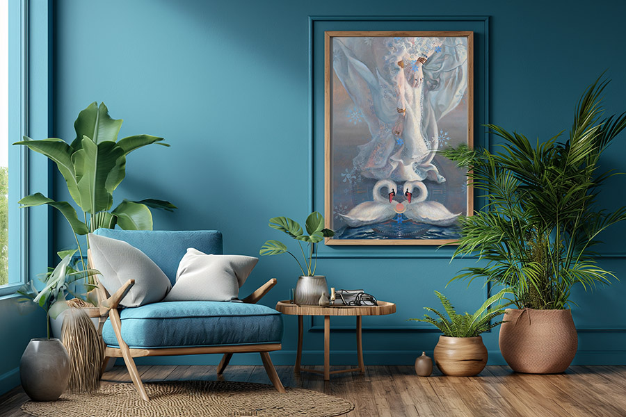
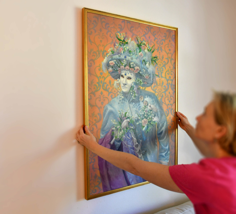
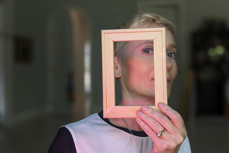
How to frame art on paper & canvas on a budget
In this article I’d like to share the basics of framing art on paper and how you can do it yourself inexpensively. Professional framing is your best option because it takes quite a skill to frame art on paper well. It also involves some understanding of color and color temperature to pick the right frame and mat that add beauty to the artwork and not subtract from it. Professional framing is expensive, and if you have to mount an entire solo show you know how draining that is financially, especially if you just begin showing your drawings in a non-commercial space. If you are not an artist, but you have just purchased an original drawing and want to frame it yourself, you’ll find your answers in this article below.
When I began drawing, I knew nothing about framing and I found it frustrating to frame a lot of art for a show. Even framing one piece seemed too difficult because I didn’t know what to look for in frames, why they differed in pricing, and what was best for my budget. And while I learned the ropes that I’m sharing in the article below, I find that every art collector has his/her taste and unique style, and while the frame must match the art, not the house, the interior design still plays a role in the collector’s mind. That’s the reason why I prefer selling art without the frame. However, a good frame dresses up a painting big time. It gives the art a finished appearance, enriching the artwork visually. So the ideal situation is to frame the art with a beautiful wood frame that complements the original painting in style and color.
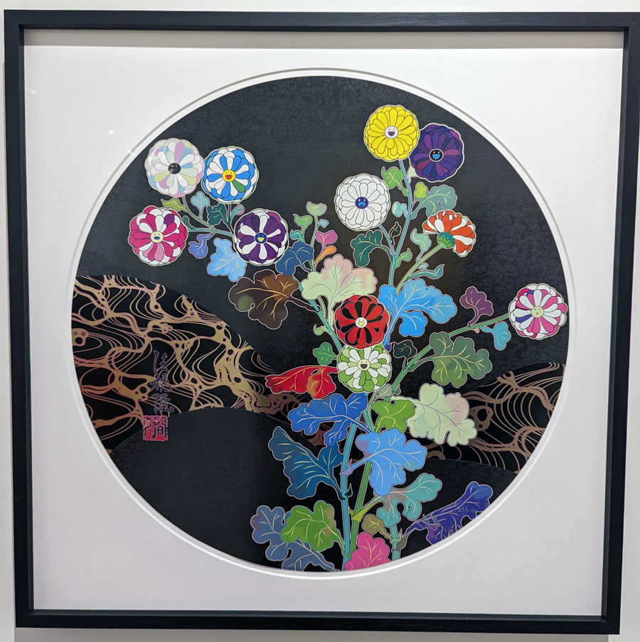
Takashi Murakami at Miami Art Context, photo: V.Winters
There are two types of framing choices you have to frame art on paper or canvas.
Art on paper must have a mat, plexiglass, backing and frame. Art on canvas/ panel/ wood needs a frame only.
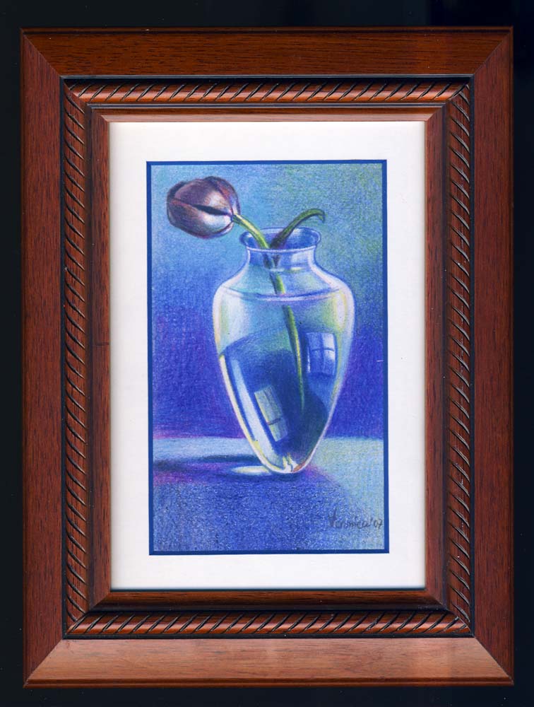
How to frame art on paper | This artwork has a golden metal sectional frame, white mat, plexiglass and backing that show budget framing of art on paper. However, this drawing would look much richer if it had a wide wood frame instead of the metal one you see here. Also, it would benefit from having a double mat. The inner mat could catch one of the colors in the drawing like purple or blue while the outside mat may remain off-white.
Framing supplies
Every drawing/print/photo should have:
Acid-free mat
Acid-free white backing (mounting board)
Non-glare glass or acrylic plexi-glass (plexi-glass comes in different formats)
Wood or metal frame
acid-free tape to attach the drawing to the backing (in the corners) + tape the mat and backing together
Mats: white vs. color
The majority of framed work on paper that includes photography has a white mat and a simple frame around it. If you go to a museum, you’ll see plenty of examples there. While you can pick a frame to your taste, playing with the styles and colors, the color of the mat should be reserved. And if you are not sure about the color, stick to a white or off-white mat.
A common mistake is to frame drawings with a black mat. While it may work for a specific, very dark artwork, most of the time it doesn't. When I'm not sure about the mat's color, I take my drawing to Michael's and start placing various, pre-cut mats over the drawing to see what color works best for my artwork.
If you are not sure about color and it’s your first time framing art, always pick an off-white mat as opposed to a color one because it won’t overpower your drawing or print. If you still want to play with color, consider framing art with a double mat. White or off-white never subtracts from your drawing, while color mats may overpower your artwork visually. I often see drawings framed with black mats, and most of them kill art. You end up looking at the mat, not the artwork. White mats come in different shades of white, and you need to pay attention to their color temperature.
Either warm white or cool white is fine as long as you match this color temperature with the color temperature of white in your drawing.
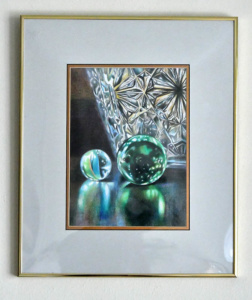
These are custom-framed colored pencil drawings. The one in the center has a metal sectional frame, while the other two drawings have custom-cut real wood frames and custom-cut double mats. Notice that while the color of each mat picks up on the colors found within each drawing, the mats are not too dark or too ‘heavy’ in hue.
A Single or a double mat?
This colored pencil drawing has a double mat. Gold is the inner color and light grey is the outer color. This light grey mat mimics the colors seen in the glass. Gold metal frame and regular plexiglass complete budget framing. This drawing would look much better if it’s framed with a wide, real wood golden frame having the same mat.
If you want to do a double mat, have a color mat as your inner layer and the off-white mat as the outer layer. So you have a quarter inch color stripe around the artwork but the overall color remains neutral or off-white. The hue of your color mat should pick up on one of the colors present in the drawing. This is where professional framers are good at. They have the talent to pick the right colors for your inner and outer mats and match that with a beautiful frame of the right hue and style.
Prints can be framed with frames without a mat to have a contemporary feel.
Tip:
Technically, any mat creates a barrier between your art and glass. Beware that photographs stick to glass eventually if they don't have that space between the glass and the photograph.If you decide to stick a picture into a ready-made frame without the mat, add corners that would maintain necessary space between the photo and glass.
Standard vs. custom cut mat
Here you can see that the distances between the frame and the image are not the same. On the left, the image has an equal width/distance maintained around the image. On the right you see a picture that has a varied width of the mat around the picture. It’s done to fit a non-standard mat opening into a standard-size frame. *The image was taken at the Ringling museum in Sarasota.
Standard mat has a 3-inch width on all sides of the drawing. It gives your drawing necessary space between the mat and the frame. This 3″ distance can be altered, however. A lot of times expensive artworks have mats with a much wider width that add richness to the art. Sometimes you see framed photographs that have mats with varied widths (right image) that allow for placing prints and photography into standard frames (minimizing costs of custom framing).
Backing & Tape
All materials must be acid-free, which include backing (mounting board/foam board/foam backing) and a double-sided tape. If it’s not the case, your drawing will yellow over time. The tape holds it all together but it also yellows the surfaces if it’s not acid-free.
Beware that the ready-made frames you find in craft stores and Walmart don’t sell frames with necessary acid-free backings. Therefore, they are not suitable for professional framing and your original art or print will yellow over time. It yellows a lot faster than you think!!
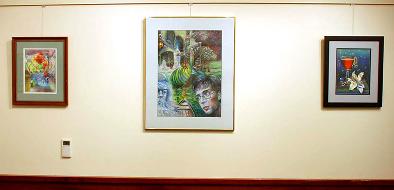
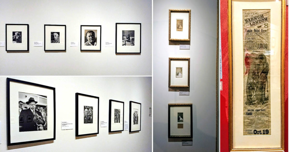
Consider how your artwork would look as a group. Consistency in mat color and framing helps unify displays of art on paper.
Mat Cutters
Logan 650 Framers Edge elite mat cutter model for professional framers
You are lucky if your drawing is completed on standard-size paper and you can buy all the supplies at any craft store to do the assembly. But what if your drawing has different proportions and is far from standard mat openings? Most of the time you have no choice but to go to a framer, so he can cut the right mat for you. However, if you do a lot of drawing and plan on selling your work, it’s a good investment to buy a professional mat cutter and learn how to cut mats yourself. Mat cutters give the greatest flexibility possible in mat cutting. You can cut mats to any size. You can also cut it to fit the overall dimensions to a standard frame, making a nonstandard opening. Logan mat cutters are not cheap, but they save you lots of money in the long run. You can buy large sheets of museum board in any color and cut them to size. It takes practice to learn how to measure and to cut mats, especially the mat openings, which have a beveled edge as opposed to a regular cut. Correct measuring and cutting of mat boards is a skill that demands practice and patience.
The quality of a mat is determined not only by its thickness, but also by the cleanness of the beveled corners. If a blade is not new or cutting is sloppy, the inner corner edges look uneven. I think it’s best to learn the basics of mat cutting at a framer’s shop, or perhaps to find a detailed video of the process shown online. I used to cut mats myself using the Logan mat cutter, and I found this process quite frustrating at times because you’ve got to be perfect every time doing it. After doing it myself for several years, I prefer going to a framer or buying pre-cut mats online.
Glass or acrylic plexi-glass?
Omnipresent Mind, drawing size is 19×25 inches. It’s framed with non-glare, UV plexiglass and white wood frame for contemporary appearance.
You can frame drawings with regular glass but consider the overall size of your piece. Glass is very heavy. It can shatter cutting into art. It’s also very reflective! So it depends where you are going to hang your artwork to minimize the reflections.
Plexiglass is light and durable. Many galleries require framing with plexiglass as opposed to glass to minimize possible damage during the transportation to a show. However, regular plexiglass scratches and becomes useless once even a tiny scratch is there. The cost of plexi often exceeds the price tag of glass. Another thing to consider is reflections.
Pick a non-glare glass vs. regular glass. So you can enjoy looking at art from any corner of the room. Or consider framing art with a non-glare UV-protective plexiglass. Tru Vue Optium Plexiglass is the best museum-quality conservation plexiglass available today at almost any framing store online, but beware that it's really expensive and can easily cost you more than the frame itself.
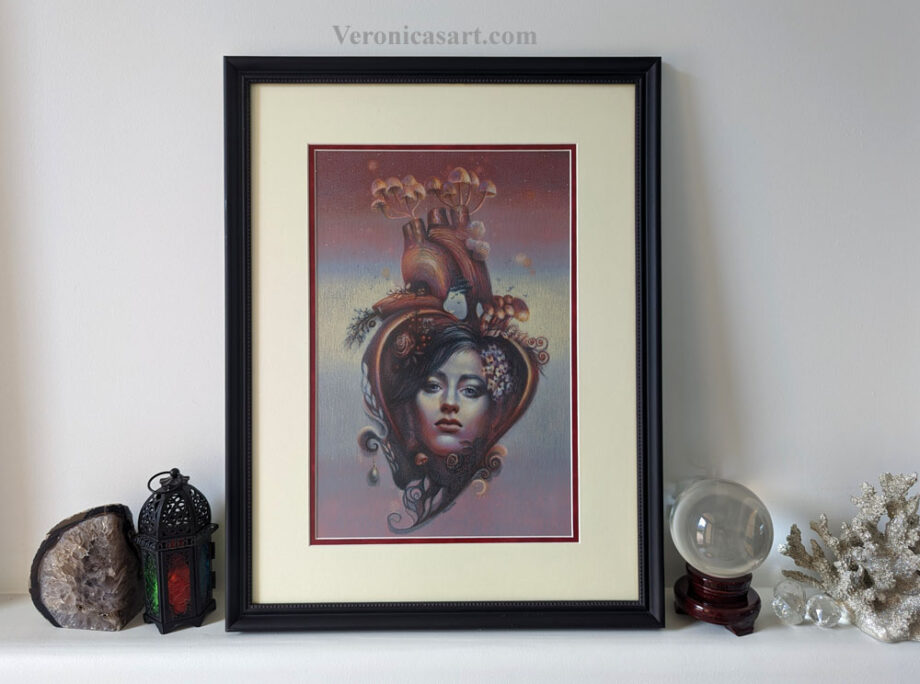
Mushroom heart, drawing on paper, 10×16 drawing size. It’s framed with a non-glare, UV plexiglass, double mat and black wood frameThis is a colored pencil drawing on a 1-inch, wood panel. It’s framed with a canvas depth wood frame (rabbit width is 1 inch to accommodate the wood’s depth), UV, non-glare plexiglass. The result is that it looks like a painting, not a colored pencil drawing.
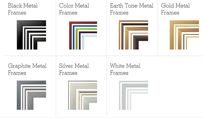
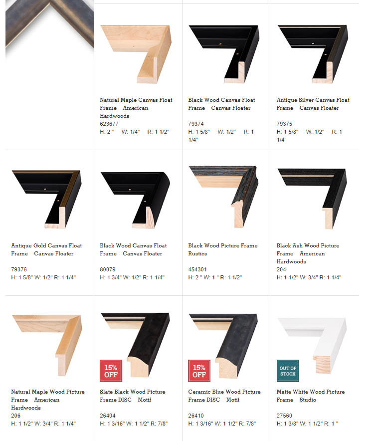
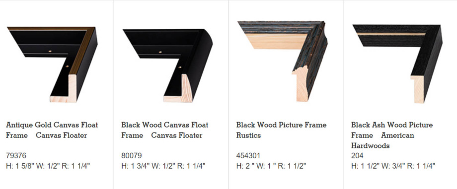
Metal or wood frames? Consider the lifespan of your display
There are three types of frames. Plastic, metal and wood. The choice is largely determined by your budget, but I strongly suggest not to give in to buying plastic frames or some craft-store frames that may look decent at first glance. Such frames don’t hold up well: they scratch, break and fall apart too quickly. They also don’t provide adequate support for big art in a hot and humid climate, bending and losing its original shape quickly. The frame’s surface may look like wood but it’s paper wrapped around the plywood. It comes off and scratches easily. The hanging wire and hardware are not there to support artwork larger than 11×14″. I always regret buying plastic frames because one scratch prompts eventual replacement.
Clio Newton, b.1989, Sarah, charcoal on paper 81x59in | Sometimes you can see contemporary drawings framed as posters because they don’t have the mat or space between the art and the frame. It works here because of the figure’s scale giving the impression of her walking off of the wall. It also mimics framing of art on canvas. The frame is made of either metal or wood. It can look very similar in white hue.
Metal Sectional Frames
Metal sectional frames at AmericanFrame.com
Metal sectional frames are a great alternative to plastic frames if you work on a budget. They last for years and don’t scratch that easily and don’t fall apart. Sectional frames come in a variety of colors and styles, assemble easily and hold up their shape for a very long time. The only drawback is that most frames have a small width and therefore provide economy framing, unlike the real wood frames. At the same time, metal sectional frames can be great for some contemporary art and photography. Many have canvas depth to frame canvas art as well.
In my experience, if the artwork is larger than 16x20" acrylic plexi-glass or glass may not hold up well within the metal sectional frame if the backing is not thick enough. Plexiglass tends to pop out of the frame in large drawings and large glass sheets are also too heavy for these frames.
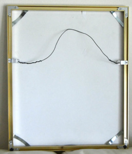
The back of an assembled metal sectional frame.
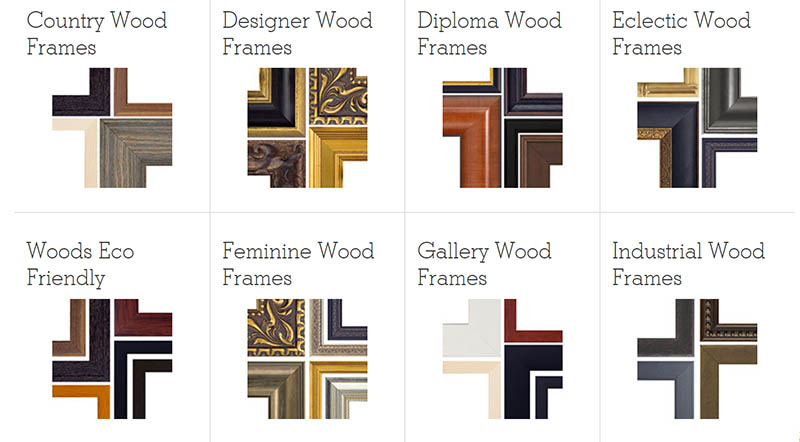
Wood frames
Real wood framesTanja Gant, Bacchus @ Sirona fine art, Art Palm Beach | This colored pencil drawing has a simple off-white mat and a wood frame.
Real wood frames come in a variety of styles. They are the most beautiful, durable and stylish. Wood frames have varied width and finish and the professional framer can really make it or break it picking the right frame for your piece. Usually the wider the frame, the richer your artwork would look in it. However, the style of the frame is more important than its width because it needs to complement your drawing. Well framed art always looks amazingly beautiful. I buy real wood sectional frames that are cut to my dimensions and then assemble them into finished frames. It’s not difficult, but requires some patience and care to do it right. I buy all the supplies in varied sizes at American Frame (frame samples of which you see in the images above). Frame destination is another company located in Texas that cuts custom frames. If the frame is standard size (8×10″, 16×20″, 18×24″ etc), you can buy these frames at any craft store. However, the variety and quality of ready-made frames is not great in comparison to those found online.
Shadow boxes and canvas floater frames
Sometimes canvas floater frames or shadow boxes may work better than traditional framing. Glass suspends the artwork in the middle and creates open space between the art and the frame.
9×12″ colored pencil drawing on 3 layers of acetate-like film. This drawing looks interesting in a white shadow box frame because the colored pencil drawing has the room to breathe.Peter Anton @ Art Miami 2017 | This simple shadowbox holds the pieces as one artwork.I framed this colored pencil drawing using a real wood frame without the mat. It also has a UV, non-glare plexi and acid free backing. It depends on your personal preference if you like to have a mat around the art or not, that usually adds to the art presentation.
Framing companies where you can customize any frame, mat, online:
American frame: https://www.americanframe.com/
Top quality, great customer service, limited free samples of plexi and frames.
Keeper, 36×48″ oil on canvas | Real wood black canvas-depth frame picks up on the color of the art.
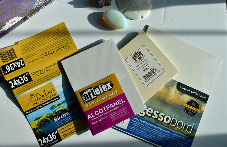
Here is a basic guide on how to frame art on canvas. Framing of oil/acrylic paintings is much easier because there are fewer moving parts involved. You’ve got to pick the right frame and assemble it, if it’s not a ready-made frame. Art on canvas, panel or wood doesn’t need glass for display. Oil and acrylic paintings look best without it. Also, remember that these paintings would need canvas-depth frames unless it’s a panel. Usually panels are thin, unless they are cradled.
Jeff Robb, lenticular photo at CONTEXT Miami 2017 | Here the photo has canvas depth and requires a canvas-depth frame.
Types of frames for paintings
Tenderness, oil on canvas, 24×36″, framed with custom-cut gold wood frame
Once again you have three choices: plastic, metal, and real wood frames. Go for the solid wood picture frames because they last the longest, look beautiful, and you frame it once. Metal sectional frames are a good choice for beginner artists, some contemporary paintings, especially abstract art. The style of the frame should add to your painting. Some paintings look beautiful in golden baroque frames, others in minimalist black frames. Canvas float frames give an interesting effect to some contemporary pieces (see below).
I find a very big difference in quality of wood sold at different framing stores online. If you see rather a cheap wood frames it means that they use soft, cheap wood that scratches and bumps corners very easily! I ended up re-framing such wood frames. It's better to frame art with metal sectional frames in such a case. Poplar wood and pine wood are very soft. Oak is very heavy and solid wood. Always ask a customer service rep what wood they use for framing!
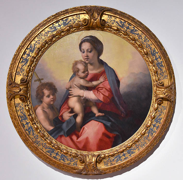
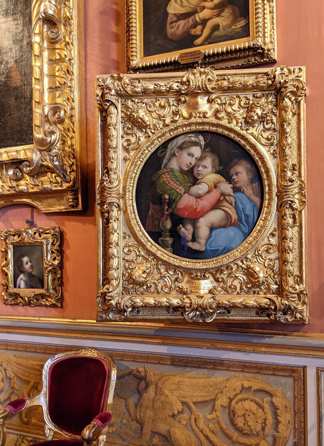
Lowe art museum, Miami university, artists in workshop of Andrea del Sarto, “Madonna and child infant with St. John | Classical gold/blue frame highlights the colors and theme of the painting.Art by Mary Jane Ansell @ Miami Art Context 2017 | White frame gives a lot of space around the painting and extends it beautifully.
Most people consider their interior space and style, picking frames. While it should harmonize with the rest of the space, always consider how a framed piece looks on its own. Pick the frame for the painting, not your sofa. If the artwork has some warm, golden tones, pick a golden frame. If the piece has silvery, blue-grey tones, a silver frame would be good.
Isabelle Scheltjens @ Miami Art Context 2017 | The color of the frame picks up on black hues in the artwork.
If the painting is standard size, you can find a ready-made frame in a craft store or online, but remember that canvases are between 3/4 and 1″ deep, and not every generic frame would work for framing of stretched canvas.
Federico Uribe art-Adelson Galleries, Art Context Miami 2023
Canvas-depth frame
Mike Dargas @ Art Miami 2017 | The side of this unframed painting shows the canvas depth you must consider when you pick the frame.
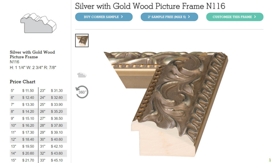
Image: American Frame
In this image taken from the AmericanFrame, you can see that the frames have three dimensions: H, height, W, width, and R, rabbet. Rabbet should be at least 1″ if you have a painting on canvas. Some canvases require even wider rabbet height.
Canvas floater frames
Brad Kunkle @ Miami Art Context 2017
Canvas floater frames “suspend” your painting inside the frame without the edge touching it. Most picture frames cover the edge of the artwork. Personal aesthetic plays a big part in picking the frame. In this image, you see a white floater frame that extends the whiteness of the canvas. The entire canvas floats within the frame.
White floater frame gives minimal appearance to the art that allows for a complete focus on the painting, not the frame. | Art by van Roos at King Woman art show in New York, 2017
Miss Bugs, Algorithm sunny day, Context Art Miami, 2024 | White canvas floater frame
In this screenshot taken from AmericanFrame you can see the difference in frame styles. Canvas floater frame has a deep opening to nest the canvas painting inside. These are the bars in the back to which the painting attaches. The frames to the right cover the edge of the painting where canvas slides into a channel. Most wood, plastic, and metal frames cover the painting’s edge by 1/4″ or less.
White wood canvas float frame completes the look of this beautiful colored pencil drawing
Standard vs. non-standard frames
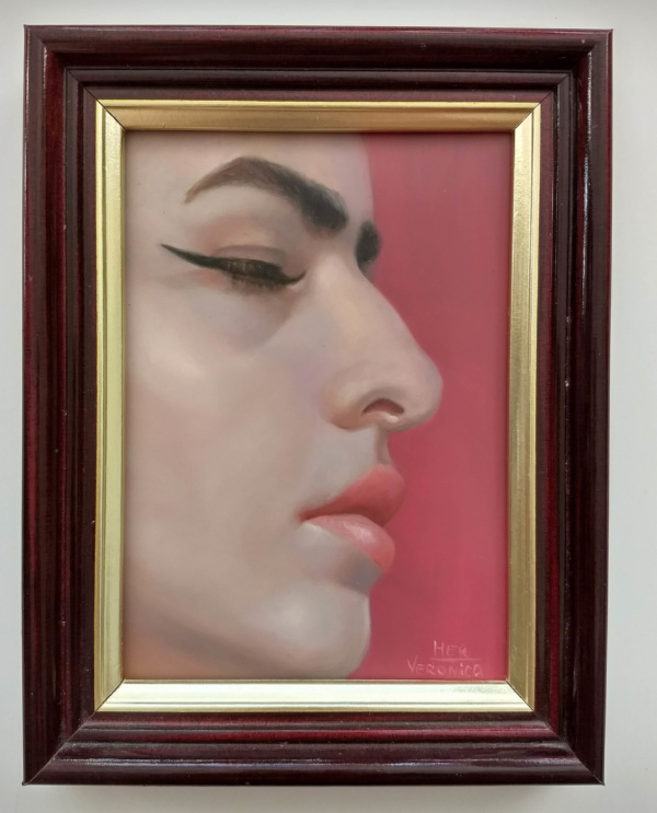
Venetian boy, 8×10″ oil on panel | Here this real wood silver frame is ornate. It complements the painting’s style.
Standard frames are 8×10, 9×12, 11×14, 16×20, 18×24, 24×36 and so on. If your painting is done on non-standard stretcher bars that don’t correspond to standard sizes, you have to order wood frames online to be cut to your specifications, and then assemble them at home if these are very large frames. If artwork is not very large, the shop does it. An electric screwdriver comes in handy, and you also need some hanging wire and hardware, which you can buy in a kit online or even at Walmart. AmericanFrame includes the kit with the purchase of custom-cut frames.
In this screenshot from the American Frame website, you can see how much the frame costs depending on its length. The great thing about this service is that you can order any frame cut to your specifications. You can also order samples and corner samples.
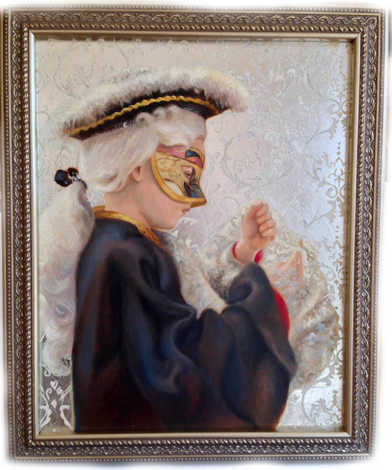
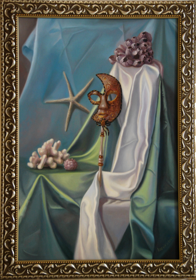
Still life with the corals and Venetian mask, oil on canvas, 24×36″, framed with custom-cut sectional real wood frame
Tip
Sometimes you can order samples of available frames and put them next to your artwork to see if the style of the frame works well with the painting. A lot of times it's difficult to say how a specific frame would look like unless you have a sample in your hands. Usually the wider the frame, the richer it looks. Although some abstract paintings would look the best framed with thin frames.
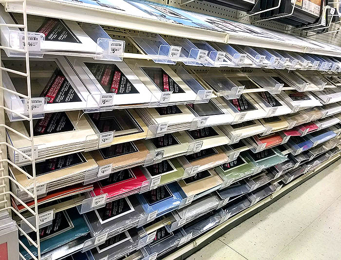
You can also buy standard frames at any craft or art supplies store.
This is a standard 5×7″ frame.
Framed oil paintings at art museums
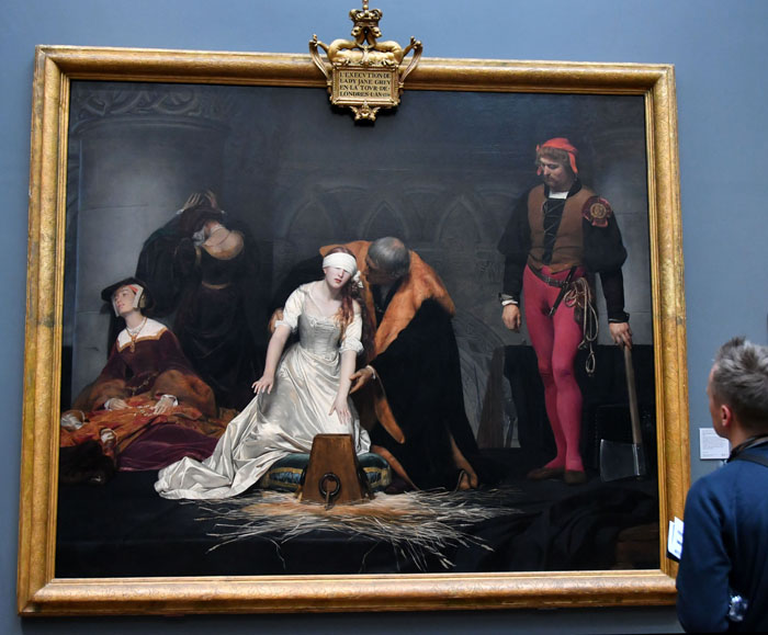
Paul Delaroche, the execution of Lady Jane Grey at the National Art Gallery, London
These are examples of framed masterpieces I took pictures of. All of them have gold frames but the style of each frame varies. The color of the frame picks up on prominent hues seen within each painting. If these paintings had silver/grey elements, they would benefit from a silver frame. Also, the complexity of the frame matches the exuberant details seen in the painting. For example, the second image of Magdalene has simplified shapes and color that’s supported by a plain gold frame. The exuberant golden jacket of the king seen in the last image matches the more elaborate frame.
Midnight Dream, 38″ oil on canvas, Veronica Winters
If you plan on having a show, exhibiting a large number of works, consider framing art with similar frames to have display unity. In my experience, I framed art at different times with varied frames and my paintings don’t always look consistent as a group. It makes it harder to present as a coherent body of work in a solo show. I have to get creative arranging art pieces to have a sense of unity.
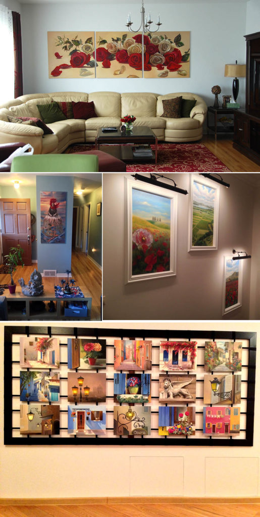
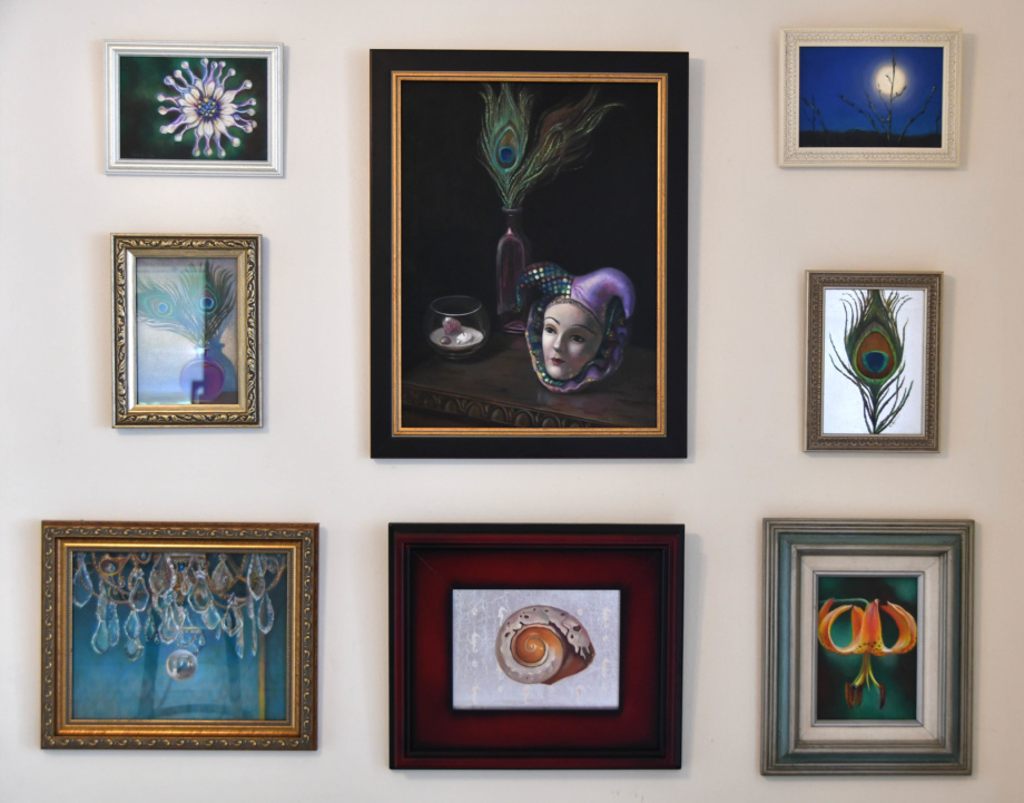
If you have a single piece of art, consider the size of your wall space and the artwork’s size. I often see small art displayed on a large wall where one picture gets lost and just looks too timid or “eaten” by a large wall space. If you have a large wall and small art, consider grouping small pieces on a wall to create a gallery. Below you’ll find several examples of art displays.
Here are some of the commissioned wall art pieces at the homes of my clients.These are various drawings and paintings that are arranged in a wall display. Some of them could be re-framed for better visual experience.
Framed pictures display @ Beverly hills hotel, Los Angeles
To Frame or not to frame?
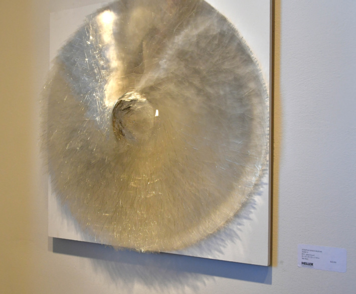
Some art doesn’t require framing. When canvas’s edge is wide and clean, it might not need a frame, especially if it’s a sculptural piece. It gives a contemporary, minimalistic appearance you might like more.
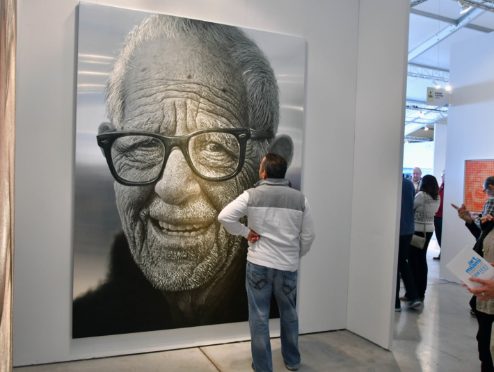
Glass sculpture @ Heller gallery, Art Miami 2017Galerie Bhak, Old man @ Art Miami 2017Javier Bellomo, Coria face @ Art Miami 2017Indian art in Santa Fe
As you can see framing can be fun but takes time to figure out. Next time you are at an art show or a museum, pay attention to framing, take notes, and frame your pieces in accordance with your knowledge and taste. Good luck!
3 Surprising Reasons How Art Improves Creativity & Well-Being
Discover the hidden power of art and how it can enhance your emotional well-being. Join me as I explore the often overlooked connection between art and emotion, and why it deserves more attention in our public education system.
Don’t miss out on the opportunity to enrich your life through the world of art – subscribe now!
4 Best Brands of Colored Pencils: are they worth the splurge?
Are you an artist looking for the best quality colored pencils? In this episode (that’s also available in a video format on YouTube), I reveal the top 4 brands that are worth the splurge. Plus, I’ll tell you about the most expensive colored pencils on the market! Whether you’re an artist, a student, or simply love to color, this video will help you choose the best colored pencils for your needs. If you’re tired of low-quality colored pencils and want to invest in the best, then this podcast episode is for you. I’ll compare each brand’s price, softness, and overall quality to help you make the most informed decision for your art supplies. Don’t miss out on seeing the best colored pencils for your next masterpiece! Warning. The episode is highly informative review of the top colored pencil brands!
Art, creativity & commercial success: the infamous fate of some famous artists
In this episode I discuss the birth of the 19th-century art movements, some famous artists and their career success. I share one of my personal life’s lessons in the arts and what you need to pay attention to working on your art and career as an artist. You can see the art and read here: https://veronicasart.com/the-infamous-fate-of-some-famous-artists/
If you find this episode interesting, share it with your friends and review the show!
Subscribe & rate this podcast on Spotify and Apple | Show your support for the podcast: here | Host: Veronica Winters, MFA | veronicasart.com
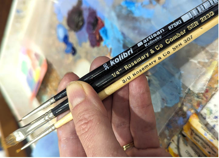
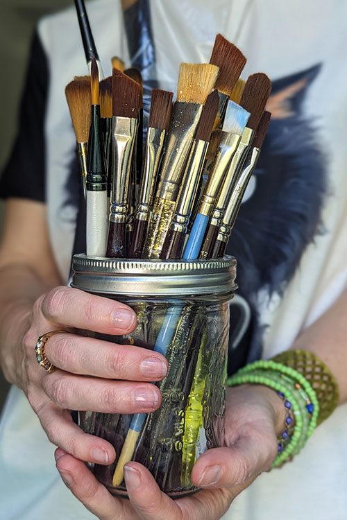
If you’ve tried painting, you know how hard it is to find a good set of brushes. Many of them are flimsy or too soft to spread the oil paint around. Cheap brushes can shed hairs like a cat. They don’t keep the fine point necessary to paint the details in oil painting. I went through many artist brushes trying to find something that works in my oil painting process. Here you’ll find information on how to pick a good brush for oil and acrylic painting, how to clean the brushes, and what brands you can try to purchase the brushes from for your art studio practice.
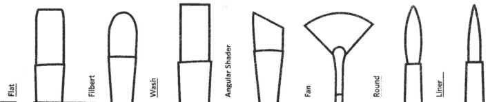
Painting brushes differ in size, shape, and type of bristles
Size
The higher the number written on a brush, the larger the brush you get. For example, #0000-0 brushes are for super fine detail, # 2-4 brushes are for small work, # 6-10+ are designed for a general application of paint.
Shape
There are rounds, flats, liners, chisel tips, filberts, and fans. The shape of a brush determines the stroke you can make with it. The rounds have a fine point and are good for small, detailed application of paint, flats are for a large coverage of paint or to make a wide stroke; fans are good for gentle blending of the edges and for creation of some textures like tree foliage. My favorites are the filberts because they give me a variety of strokes. Depending on the rotation of my brush, it can give me either a flat stroke or a thin, fine line that’s great for defining and maintaining straight edges.
How to pick a perfect brush for oil & acrylic painting
Types of brushes
In general, watercolor brushes are very soft and are not suitable for oil painting. They are too soft to maintain a point filled with oil paint. However, small, round Kolinsky brushes are very good for painting details, and watercolor 1″ flats are great for blending large areas of paint right after a painting session to soften the entire picture.
There are three kinds of oil/acrylic brushes: the bristle ones, the synthetic ones, and a blend of synthetic and sable hairs. Both the bristle and the synthetic ones are necessary for oil or acrylic painting.
First layer of painting: the bristle brushes
Use stiffer, synthetic brushes for your underpainting because the first layer doesn’t brush over smoothly. Many artists help the oil paint flow by using some solvent ( Gamsol) mixed into the paint. Both the solvent and the canvas surface wear out fine brushes when using them at this step!
The bristle brushes are used in a first, rough layer of painting to put the paint on canvas and to mass out shapes. It’s difficult to paint the first layer with the synthetic ones on canvas, because they are too soft for this step and don’t spread the paint around easily. I find that major manufacturers produce similar bristle brushes that don’t differ much in quality. I would avoid the cheapest ones because they shed hair a lot, which gets embedded into the wet paint if you don’t take them out of your artwork during painting. However, if you paint on panels and not canvas, the bristle brushes may be too hard to paint with.
When you paint with oils over the underpainting, it glides over the first layer much better, but often needs just a little bit of medium to have the flow. This is the stage when you switch from stiffer brushes to the synthetic ones. I find that “Simply Simmons” brushes are cheap, over-the-counter brushes sold at Michael’s that are quite durable and have a nice point when painting. Craft, unbranded brushes are a waste of money because they don’t hold the paint and have no stiffness necessary to move the paint around or to make clean edges and details.
With each layer, your painting becomes more refined in color and detail, and so do the brushes. I use Robert Simmons oil brushes that are cheap, durable, and hold the point well. I paint with #2 round and #2-4 filbert for most work. I also have #6-8 to paint larger areas. The Robert Simmons brushes’ quality is OK for its price. They don’t last for a year, but they perform quite well in comparison to other, more expensive brushes I’ve tried so far. I also buy them separately, if I need a particular size or a tip. Another brand I recommend is Rosemary and Cofor the majority of oil painting.
To complete big chunks of painting I like using a variety of filberts. The W&N Galeria set of brushes are great. They are quite soft but work well with oil paint.
Third layer of painting: synthetic and sable brushes
For a super detailed work, I love to use: 1. the Kolibri, artisan Kolinsky 3/0 sold at Natural Pigments 2. A variety of 3/0 or 5/0 Rosemary & Co oil painting brushes sold on their site, which I prefer using the most. 3. I also use a #0 liner “scepter gold II”, a sable/synthetic blend by Windsor & Newton, to paint fine details. 4. Recently, I found the Princeton, round, 18/0 to paint the tiny details as well but it didn’t last as long as the Kolibri one.
What about the brush handle?
I find that the brush handle length makes no difference in painting. If you do realistic painting with lots of detailed work, you want to minimize your hand movements to remain precise. I don’t see how long handles help artists do that.
I keep a wide, super soft watercolor brush (3/4 or 1″) for blending large areas to soften everything before I quit painting for a day. It doesn’t matter what brand it is as long as it’s a super soft brush like the watercolor brushes are.
If you want your brushes to keep their shape, it’s not only the quality of the hairs to pay attention to, but also how you wash them.
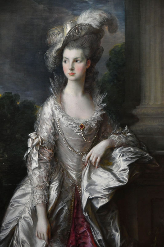
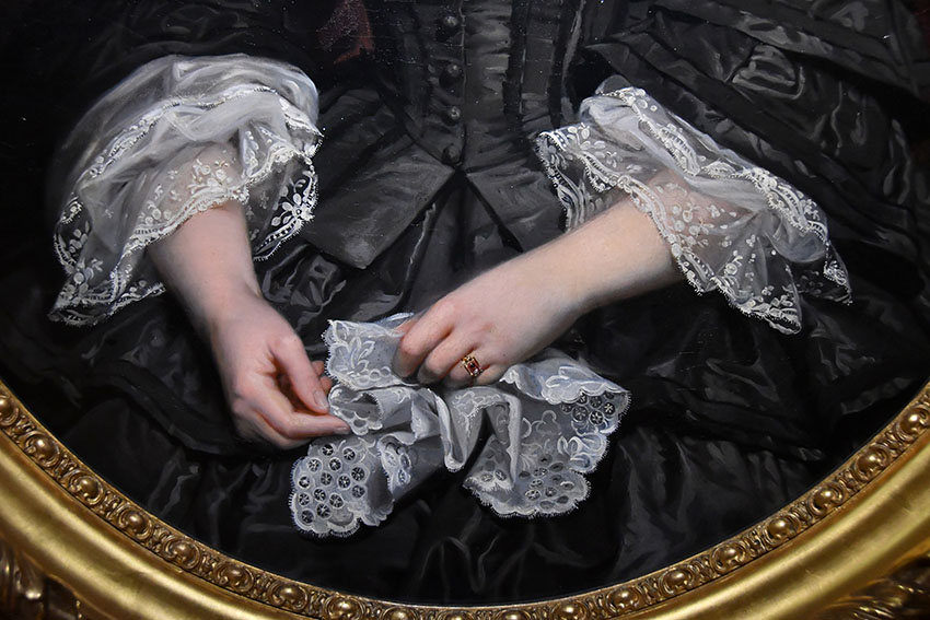
Thomas Gainsborough The Honourable Mrs Graham (1757 – 1792) 1775 , painting detail
How to clean the oil painting brushes
If you want your brushes to last, take good care of them. Squeeze all the unused paint out of your brush, using a paper towel. I Usually, I deep them in linseed oil first and then take the paint out with a paper towel.
Then you can use a solvent like Gamsol to swish them around in a glass jar, and then wash them out with a bar soap and warm water. I skip the solvent step most of the time because of the two reasons. One reason is a plain health precaution and another one is care for my brush hairs. The solvent dilutes the paint and damages the hairs. I find that cleaning with linseed oil and a bar soap works great and makes the brushes last longer.
To sum up, I take the paint off the brush with a paper towel and use the oil to take most of the paint off. I use a soap bar to clean them after every painting session. I wipe the water off of every brush, and rest them flat on a paper towel, so the excess water doesn’t run underneath the ferrules, damaging them.
One more thing. Brushes wear out a lot faster working on textured canvases. Use lightly textured panels or linen canvases to keep your brushes like new.
Presto!
Check out art, tutorials, & gifts by clicking on this image.
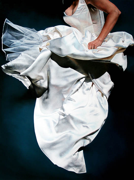
What is the color white? Is it the titanium white in oil painting? Or is it the color of your skin, feather, cream, silk, snow, kitty, pearls, chess, lace, car, flowers, crystals, swans, wall paint, clouds and the moon? Or is it the white of a happy smile, hope, or the light of your soul? Is it the blinding sunlight, the whiteness of an angel’s wings or purity and innocence of a child? It seems that white represents no color. Yet, it means so much to us. The bride’s wedding gown. The white glow of the sublime. The ethereal beauty of a white Greco-Roman marble sculpture. White light. White face. White lilies. White room. White staircase. White dove. White snow. It’s either a clean start or cold emptiness. We see unity in the symbolism of white across many cultures but not all. White can mean either a wedding or a funeral.
Technically, white isn’t a specific “color” like red or blue. When all the wavelengths of visible light are present and reflected by an object, we perceive it as white. In simpler terms, white is “all colors of the rainbow combined.”
Ai-generated female face in neutral white hue.
What is the color white technically?
The color spectrum & white
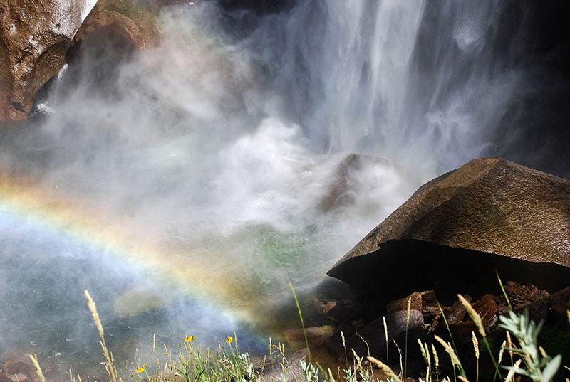
Rainbow. What is the color white? | photo: Veronica WintersColor spectrum | Images https://www.freepik.com/ and https://pixabay.com/
All the colors we see exist on the visible light spectrum, a range of wavelengths our eyes can perceive. Each color corresponds to a specific wavelength of light. White is an achromatic color, which means it lacks a “hue.” White light is “all colors combined.” We perceive black when an object absorbs all wavelengths of light instead of reflecting them. An opposite to white, black is the absence of reflected light.
What is the color white? | photo: Veronica Winters
What is the color white in oil & acrylic painting?
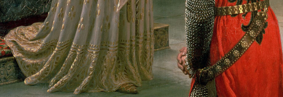
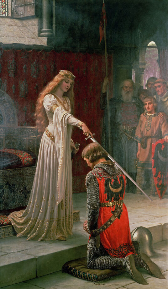
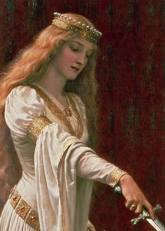
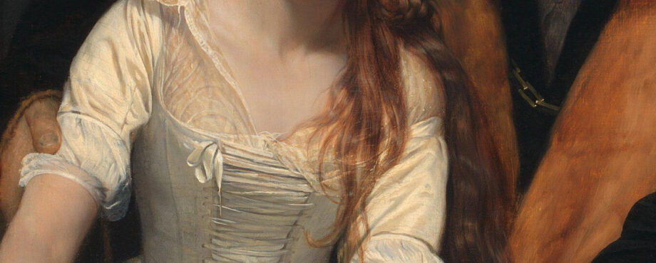
Closeup of a white gown and metal from the Accolade, Edmund Blair Leighton (1852–1922), oil on canvas, 1901, height: 182.3 cm (71.7 in); width: 108 cm (42.5 in), private collection
While prehistoric art got created with a white chalk made of the mineral calcite, white oil paint has a different composition and history. In oil painting, the ideal opaque white is neither warm nor cool. For generations artists painted with lead white until the 19th century when everything changed. Companies began to mass-produce art supplies including watercolor and oil paint. No more hand-grinding of pigments!
White comes from substances like titanium dioxide, lead carbonate, calcite or zinc oxide. Zinc white has zinc pigments. Flake white is a softer, warmer white that used to have lead in it. Flake white is found in early Chinese painting. Kremnitz white, Venetian white, French white, and Dutch white were also based on lead carbonate and lead hydroxide. Flemish white is based on lead sulfate. Cool color, the Titanium white is the strongest and most opaque white used by most contemporary artists today. A vast majority of the manufactured white pigments don’t have toxic lead in them. However, such paint is a lot more brittle and susceptible to the environmental changes, especially if it’s mixed with the safflower oil and not the linseed oil.
A modern invention, acrylic white is a chemical-based paint that’s made of pigment suspended in an acrylic polymer emulsion. It’s also made of plasticizers, silicone oils, defoamers, stabilizers, or metal soaps. Unlike oils, it’s water-based and dries super quickly. Used in house painting, acrylic paint dries to be water-resistant. Some artists love painting with acrylics while others don’t. Unique properties of each paint fit different creative personalities.
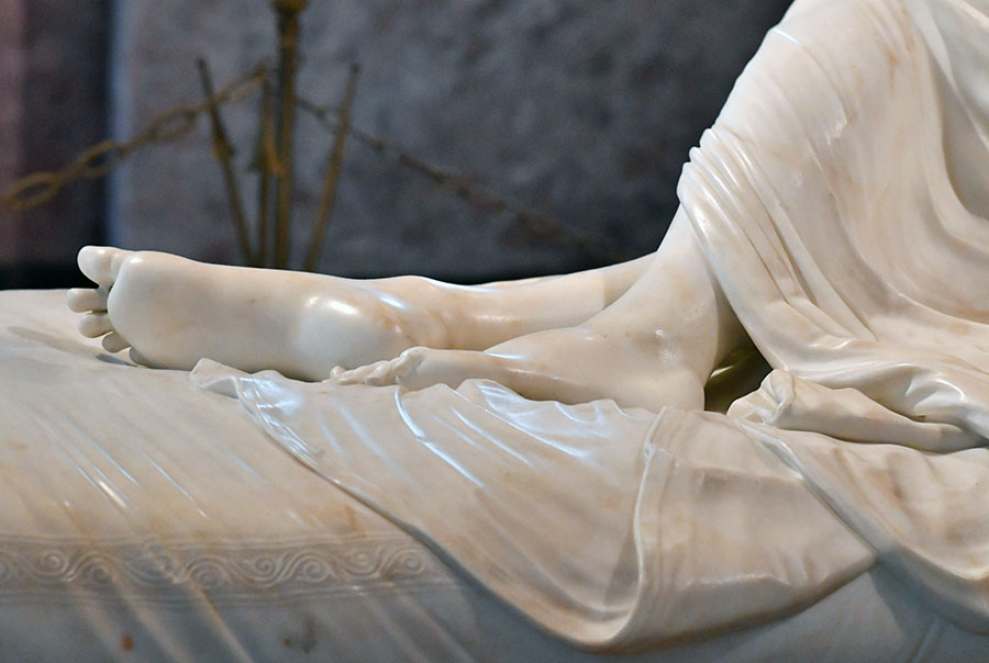
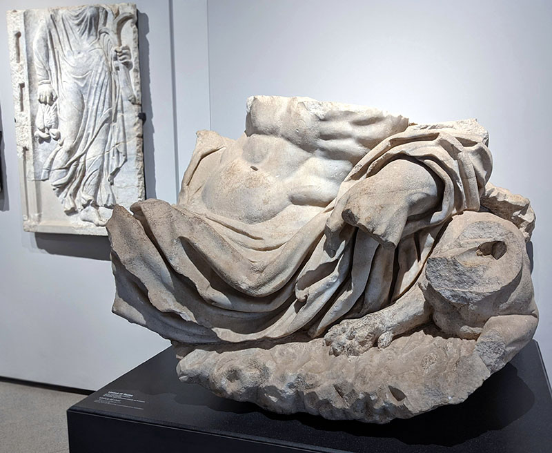
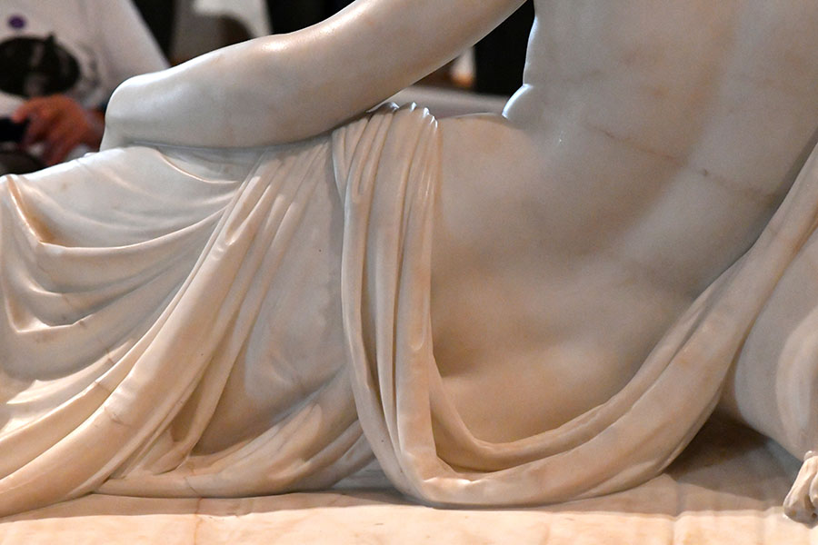
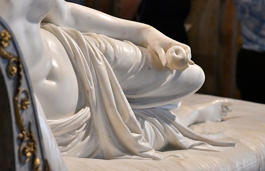
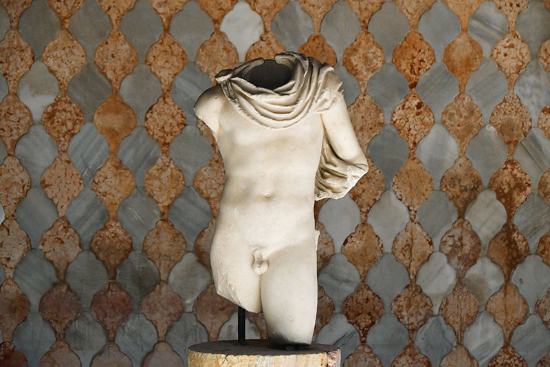
“Torso of river” statue fragment at the Palatine museum in Rome | Photo: Veronica WintersCanova, Napoleon’s sister, closeup of fabric in marble, Borghese gallery, Rome, Italy
What are the shades of white?
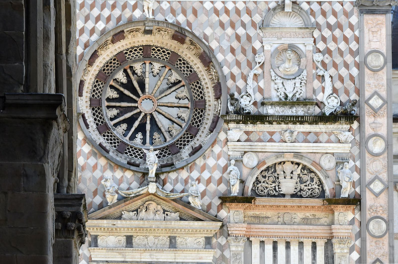
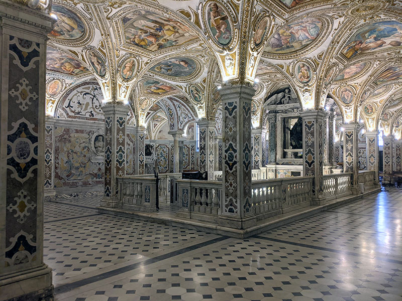
Duomo di Bergamo cathedral rose window wall. Near Milan, Italy. | look at all these shades of white! I absolutely love the use of color marble here. Also there are several different patterns and textures that describe the ornamentation of this cathedral. Beautiful!
While most people don’t think of white having shades, artists and creatives perceive a wide range of subtle variations of white while creating their art. Normally, we don’t see the difference between the shades of white unless we choose a wall paint in a hardware store or look at the neatly stacked rows of clothes in a shop.
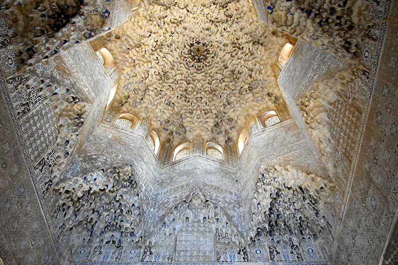
Shades of white seen in the Alhambra Palace in Granada, Spain
White should be neutral, but it’s often either warm or cool. Warm whites have a hint of yellow to create a sense of warmth and coziness. Ivory, eggshell, cream, antique white, vanilla, and beige are the shades of warm white.
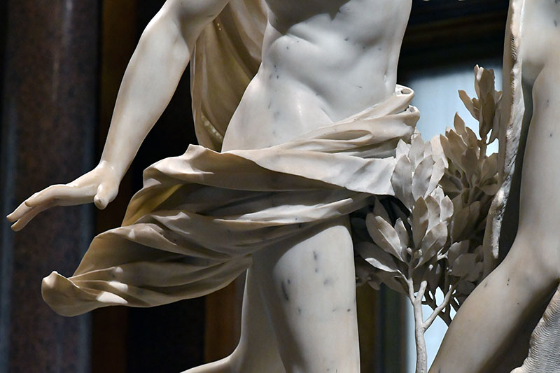
Bernini, Apollo and Daphne, closeup of fabric and hand, 1625, Rome, Italy. This white marble has a warm tone because of warm light. The dodge’s palace in Venice, Italy. Here the white marble has a warm cast on the left side and a bluish color on the right.Neutral color of the white snow in Russia.
Cool whites have a bluish-grey undertone giving a sense of timeless airy feel. Alabaster, pearl, white smoke and snow come to mind describing cool whites. But not all snow scenes are created equal. Some snow scenes have warm, yellowish color and bluish shadows seen under the sun.
Shades of white could also lean towards a specific color like pink, peach or green. Seashell white is a soft, pinkish-white reminiscent of the delicate hues of seashells.
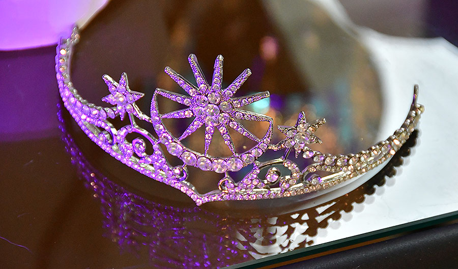
The crystal white tiara could literally be any color of the light projected onto it. Here it ranges from a purplish white to warm white.
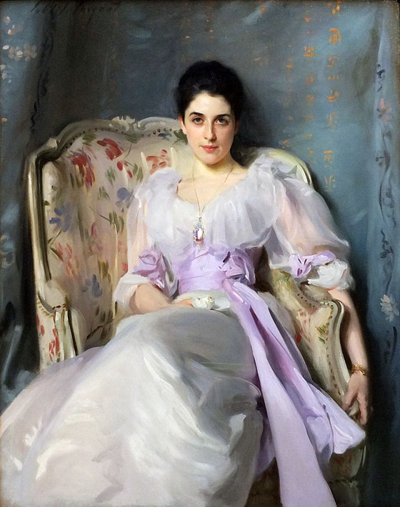
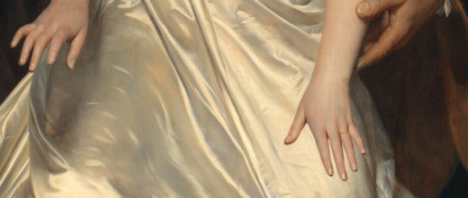
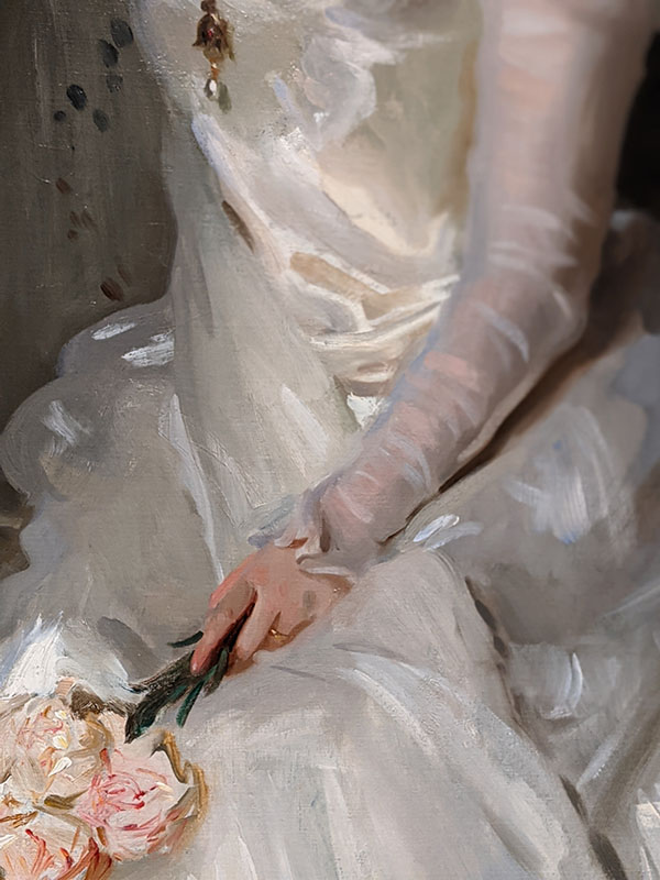
One of my favorite artists is John Singer Sargent. I love his use of bold brushstrokes, color and richness of paint he achieved in his large-scale canvases.
John Singer Sargent, Lady Agnew of Lochnaw (1864-1932), 1892, 127.00 x 101.00 cm, oil on canvas, National Galleries of Scotland.https://www.nationalgalleries.org/art-and-artists/5396/0?overlay=download I’ve seen this painting hanging at the entrance to the art museum in Edinburgh, Scotland. The artist painted ultra wealthy individuals and often participated in the arrangement and choice of gowns on his models. According to the museum’s notes, living a lavish lifestyle, Gertrude had to sell several paintings including this one to the National Gallery of Scotland in 1925!
Regardless, I love how fluid and beautiful the white fabric is here. Look at all these shades of white!
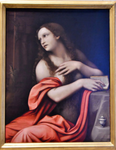
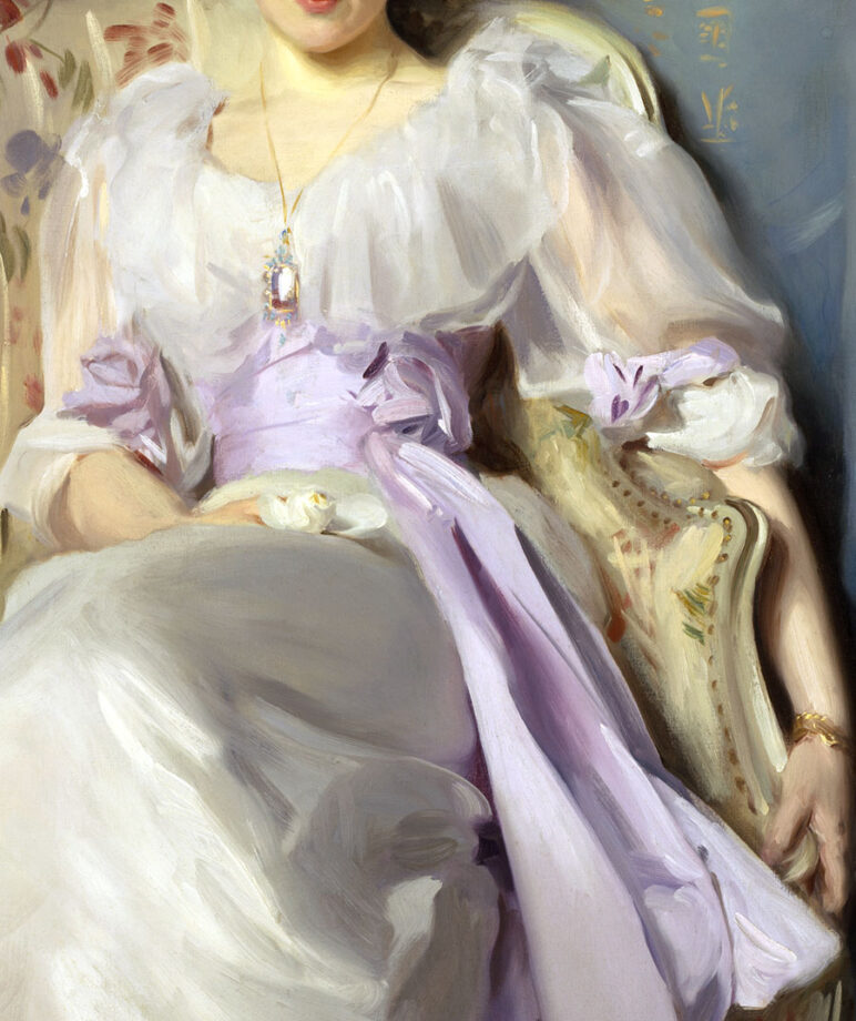
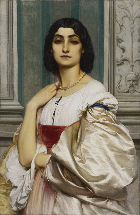
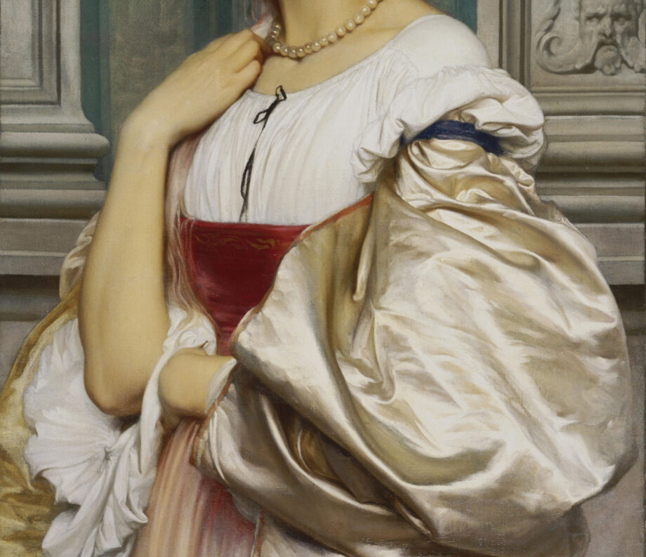
John Singer Sargent, Lady Agnew of Lochnaw (1864-1932), a closeup of the painting revealing beautiful shades of white shifting from warm to neutral to cool white.Sir Frederic Leighton, Portrait of a Roman Lady (La Nanna), Oil on canvas Dimensions: 31 1/2 x 20 1/2 inches (80 x 52.1 cm), 1859, Philadelphia Museum of Art While her face appears artificial lacking life and character I love how the artist painted all these different white garments! They range from neutral white in her robe to a warm white of silk cover to a pinkish white skirt. Also, a single string of white pearls matches the warmth of the silk. The background has some white elements that are greyed down and subdued to bring the figure forward.Sir Frederic Leighton, Portrait of a Roman Lady (La Nanna), Oil on canvas
Dimensions: 31 1/2 x 20 1/2 inches (80 x 52.1 cm), 1859, Philadelphia Museum of Art
The Symbolism of White across Art History
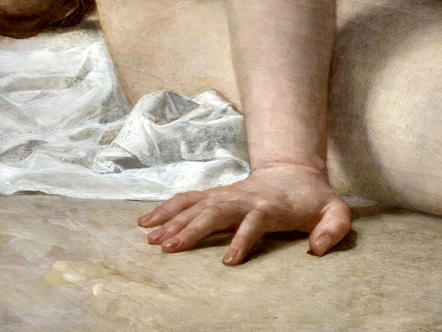
Paul Delaroche, The execution of Lady Jane Grey, 1833, National Gallery, London, a closeup of hands and white gown. Photo: Veronica Winters | Here the white fabric is warm while the “grey” shadows are neutral and warm somewhat as well.Antonio Canova, Napoleon’s sister, Venus Victrix, 1805-08, closeup of fabric in marble, Borghese gallery, Rome, Italy | The light is warm hitting the marble casting bluish-grey shadows.
The symbolism of the color white is quite astonishing if we think about it. There are universal associations with this color as well as the nuanced meanings of white depending on culture or context. One color. Two opposite associations.
Positive associations with the color white
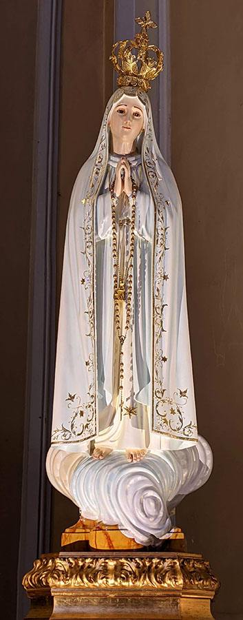
In Christianity, white represents purity, innocence, and divinity.
Think of the white angels, white robes of monks and heavenly figures, a white dove or the white lilies of the Virgin Mary.
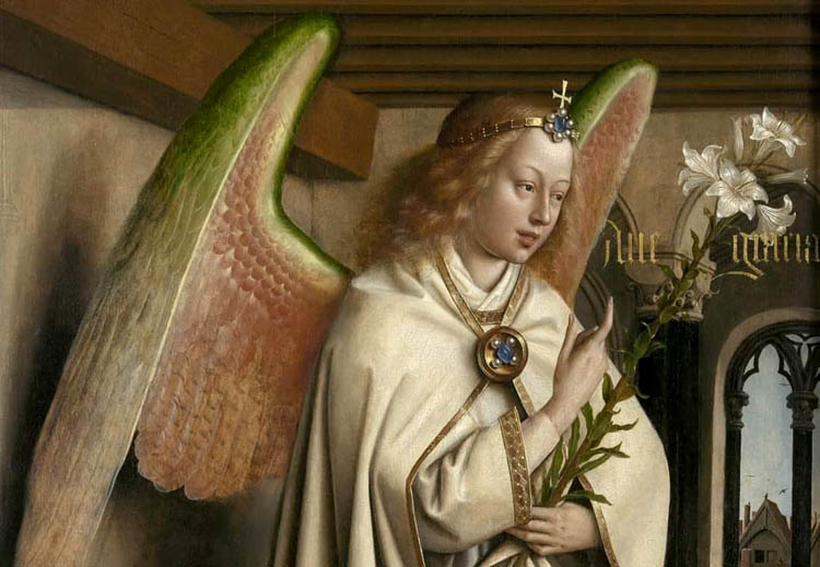
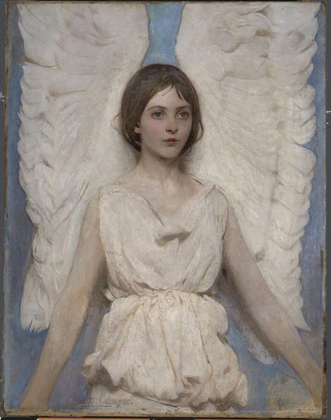
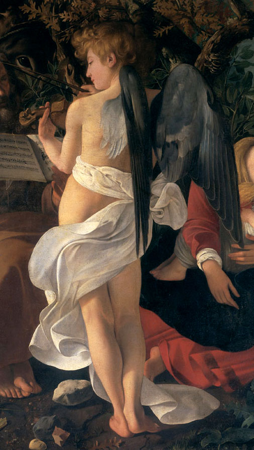
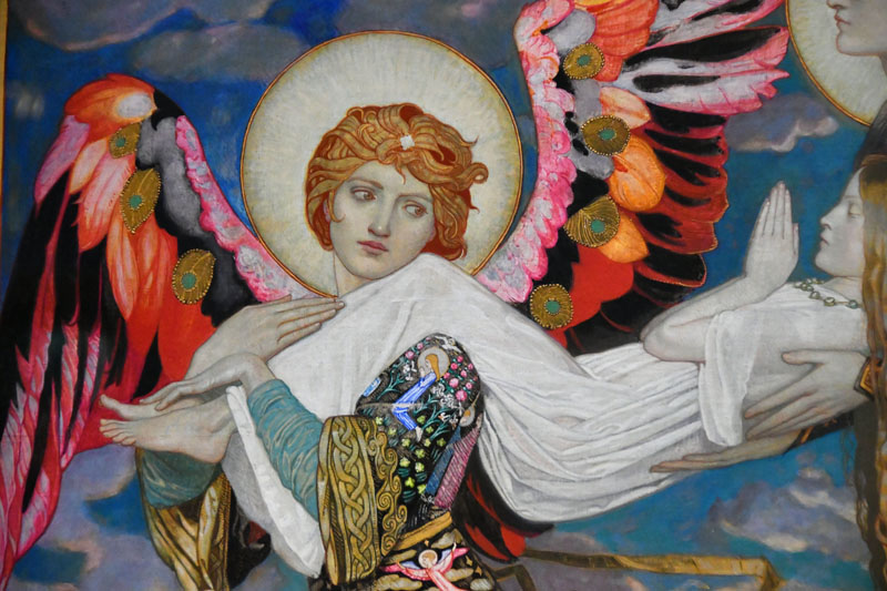
The Ghent Altarpiece. Adoration of the Mystic Lamb: The Archangel Gabriel, 1432. Here, Gabriel brings the white lilies to Mary in the annunciation. These flowers mean purity and virginity. The archangel wears a white robe with beautiful pearls decorating the fabric.Dressed in a beautiful white gown, the heavenly figure of Mary soars on a white cloud. This is one of the most beautiful religious sculptures I’ve seen in the European churches.Abbott Handerson Thayer, Angel, 1887, oil on canvas, Smithsonian American ArtMichelangelo Caravaggio, a closeup of a painting “Rest on the Flight into Egypt”, 1597. We see an angel playing music wrapped in swirling white fabric.
While the white clothing is ceremonial of passing into another world or Heaven, the ethereal glow of white light represents heaven and the divine, spiritual purity, enlightenment and truth.
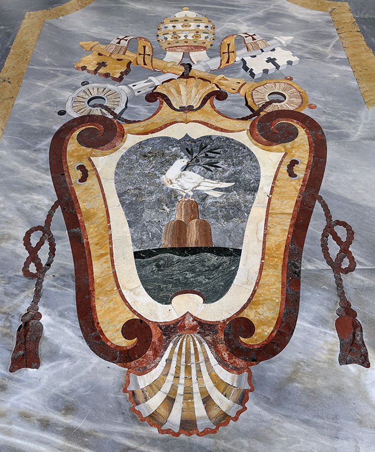
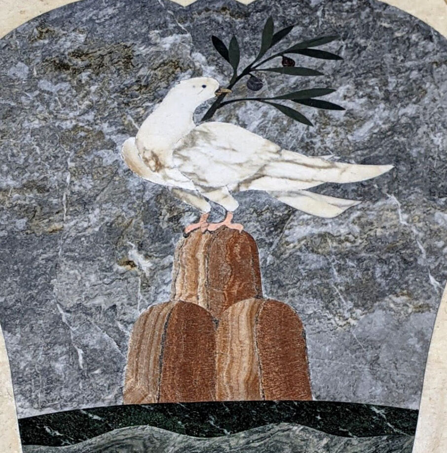
John Duncan, 1866-1945, Scottish, St.Bride, 1913 detail | Scottish National Gallery | White clothing is ceremonial of passing into another world or Heaven. It’s the color of the ascension into the Heavens.This is the official emblem of the pope with a dove or the Holy Spirit depicted in the center of it. I think I saw it in the Vatican, Italy. I love how Italian artists used colored marbles and stone to decorate the churches, placing the material on the floor and walls.A closeup of the Pope’s emblem showing the Holy Spirit
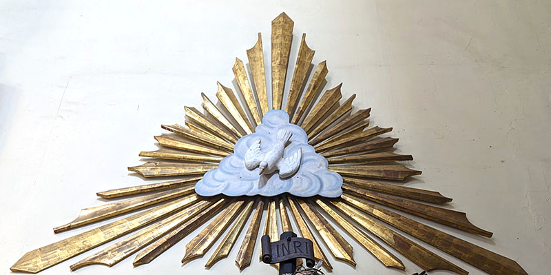
White dove or the Holy Spirit is a symbol of peace, forgiveness, hope, and love. In art, it forms the Trinity and flies in rays of sunlight with an olive branch in its beak.
Mexico City, MexicoPortrait of Pope, Leo X and his cousins, cardinals Giulio de’ Medici & Luigi de’ Rossi. Closeup detail of the white garment of the pope. Raphael, c. 1518-1520, oil on wood, 154 cm × 119 cm (61 in × 47 in), Uffizi, Florence.
White can symbolize hope, innocence, and royalty in ceremonies.
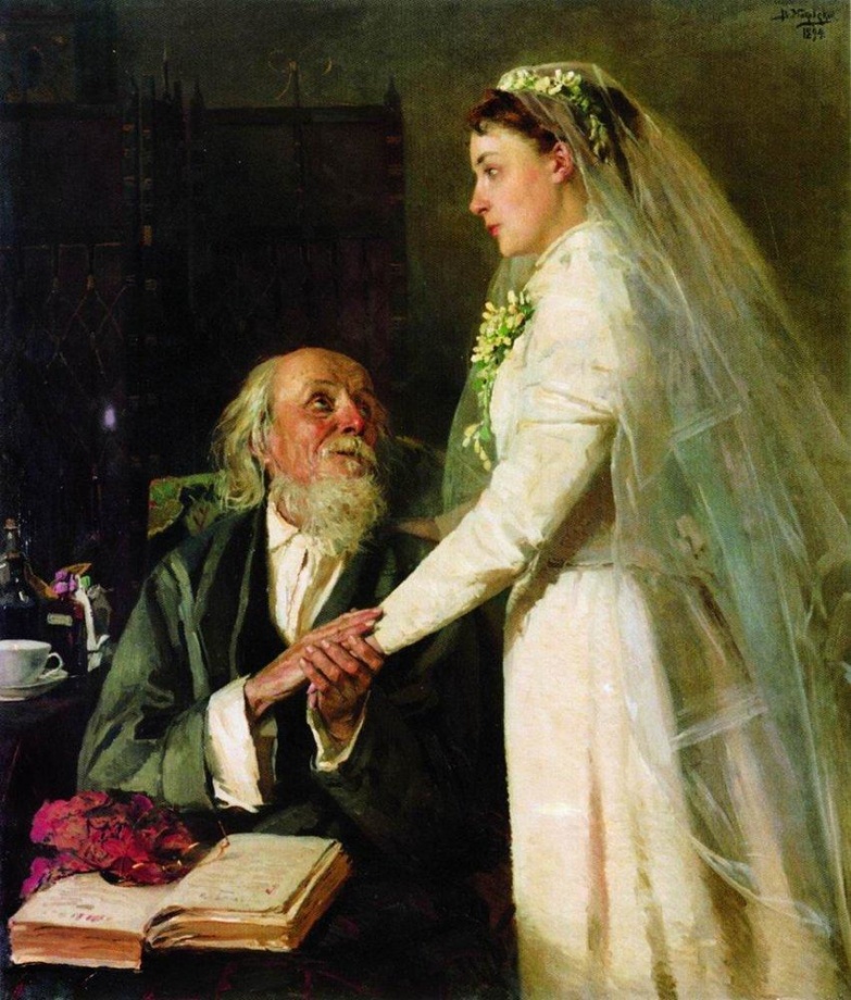
A white wedding gown means innocence and pure perfection especially of a young bride. White is the color of light and white pearls communicate similar symbolism.
Vladimir Makovsky, to the marriage (farewell), 1894; Russian Federation, oil on canvas, Samara Regional Museum of Fine Arts, Samara, Russia, Dimensions: 115 x 99 cm. | Here, although the bride wears a white gown and is about to get married, she is devastated by the normally joyful event. The artist commented on the common practice of parents giving their daughter to marry at a young age to fix the family’s financial situation.Fedotov, Matchmaking of a major, 1848 | This famous Russian painting carries similar symbolism where a young bride doesn’t want to marry an old man for money.
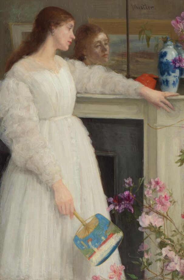
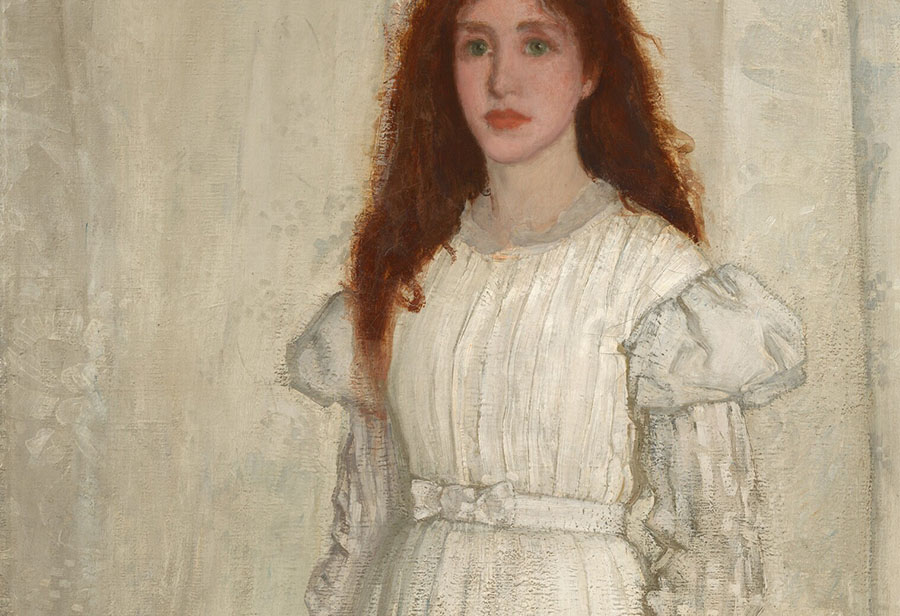
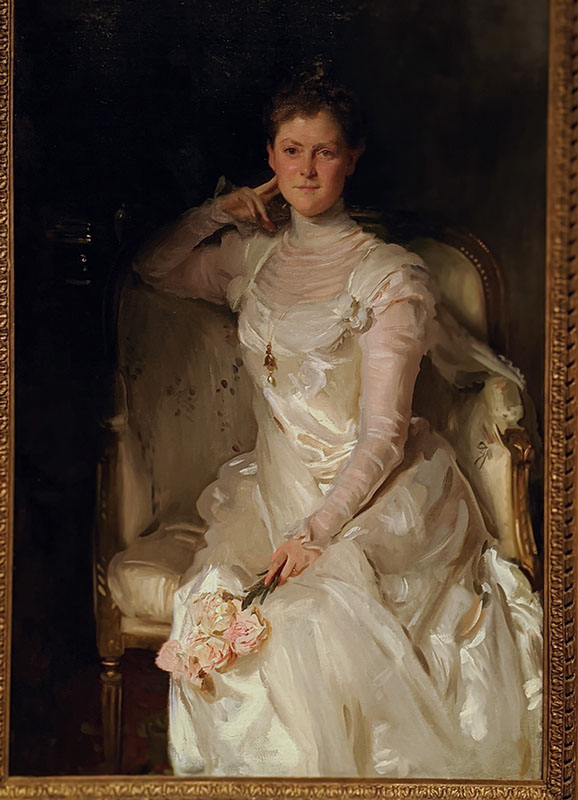
James McNeill Whistler (1834–1903), Symphony in Flesh Colour and Pink: Portrait of Mrs Frances Leyland, Image source: Frick Collection, NY., Henry Clay Frick Bequest, 1916.1.133
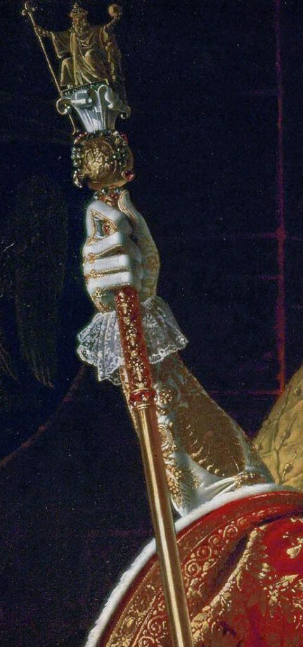
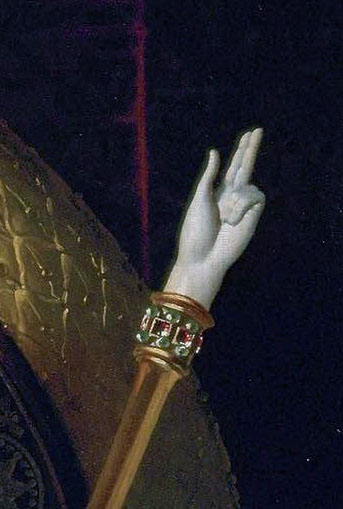
Accolade, Edmund Blair Leighton (1852–1922), oil on canvas, 1901, height: 182.3 cm (71.7 in); width: 108 cm (42.5 in), private collectionCloseup of a white gown and jewelry pieces from the Accolade, Edmund Blair Leighton (1852–1922), oil on canvas, 1901, height: 182.3 cm (71.7 in); width: 108 cm (42.5 in), private collection | White is the color of light, divinity, nobility and purity of the heart. White pearls also symbolize purity, wisdom, and sincerity. And let’s just say that these beautiful pearls make a great visual statement in paintings like this one!
White can represent royalty.
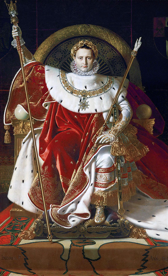
Jean-Auguste-Dominique Ingres, Napoleon on his Imperial Throne, 259 cm × 162 cm (102 in × 64 in), oil on canvas, 1806, Musée de l’Armée, Paris. | You’d be surprised, but this artwork wasn’t popular at the Paris Salon when he exhibited this monumental painting. It received vitriolic criticism mainly because Napoleon looked too artificial and Gothic. However, if you know other paintings by Ingres, this is the most elaborate one! Just like another French artist – Poussin, Ingres often received poor reception for his art at the Salon. Moreover, in the middle of his career he got so fed up with the criticism and poor receptions of his work that he began to exhibit his art in his studio and private apartments. A student of famous neoclassical painter David, Ingres took a different road in his vision of art than the contemporaries and critics didn’t get. In this painting you can certainly admire a perfect balance of color, lines, objects, textures, and symbols captured in one painting. The artist’s composition is a reversed triangle. Both composition and realistic textures are reminiscent of Jan van Eyck’s painting.
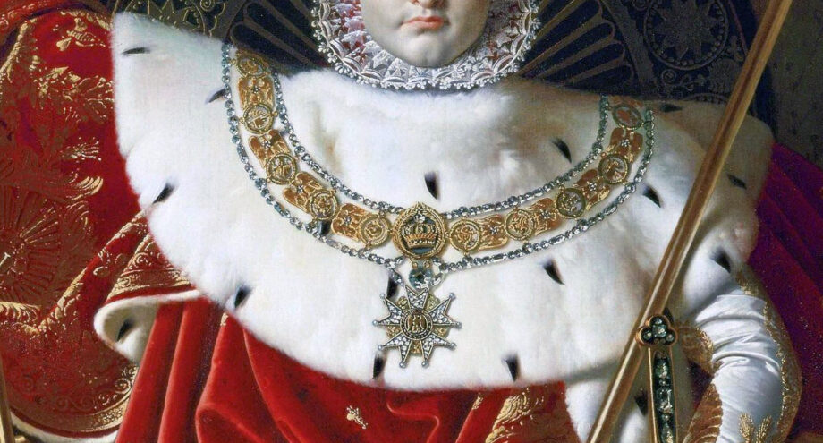
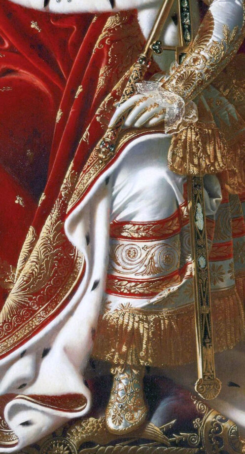
French artist, Ingres puts a lot of symbolism into this painting depicting Napoleon as a ruler blessed by God. Napoleon looks like a religious icon. The artist bestows a Roman-like golden laurel crown onto his head and paints a circular-shaped throne behind him to suggest the divine power of the ruler. White ermine fur encircles Napoleon’s neck – the symbol of royalty. The emblem of bees seen throughout the Vatican can be noticed on this lush, red cloak. The golden bees represent immortality and resurrection, while the Eagle represents military might. You can read about the life and work of the artist in a concise book titled “Ingres” by Karin H. Grimme.
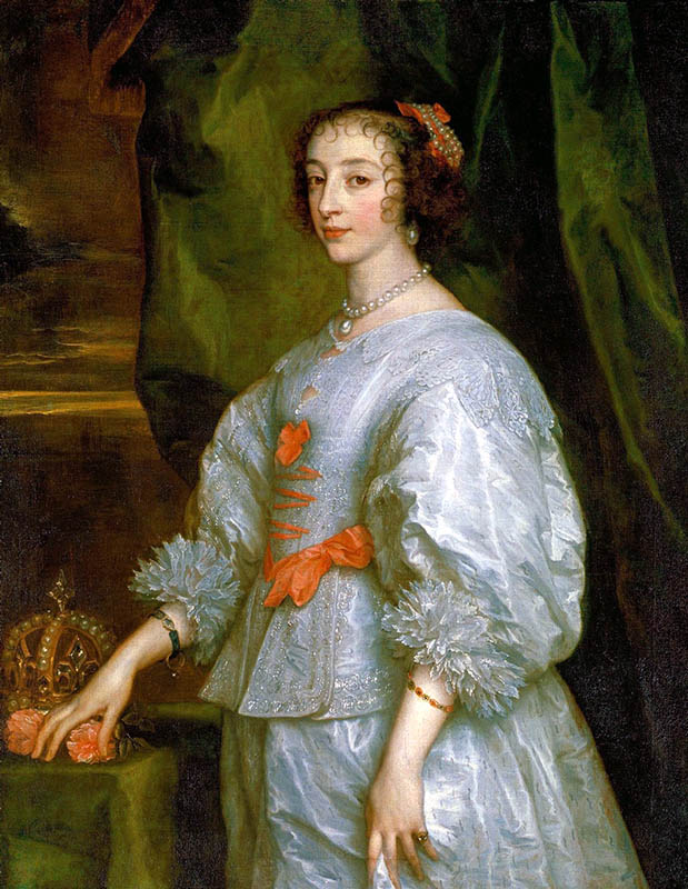
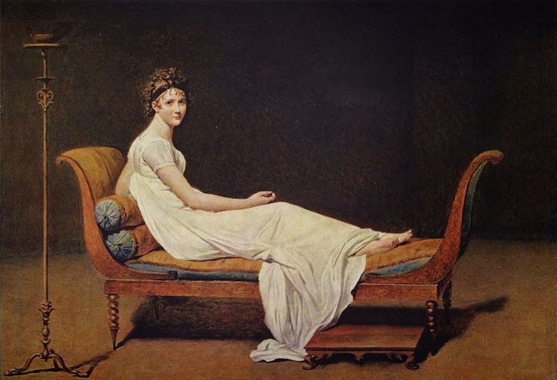
The sword represents the military power of French kings.The painting detail shows Charlemagne’s golden scepter – the symbol of the executive power.Jean-Auguste-Dominique Ingres, Napoleon on his Imperial Throne, 1806, detail of the Hand of Justice ( in white).Anthony van Dyck, Henrietta Maria of France.Marie-Antoinette, oil on canvas, 92.7 × 73.1 cm (36 1/2 × 28 3/4 in.), after 1783, unknown artist, at the Smithsonian National GalleryJacques-Louis David, madame Recamier, 1800, the LouvreSargent, Mrs. Joshua Montgomery Sears, a closeup of white gown at The museum of fine arts, Houston, 1899, Canvas or panel: 58 1/8 × 38 1/8 in. Sargent, Mrs. Joshua Montgomery Sears, The museum of fine arts, Houston, 1899, Canvas or panel: 58 1/8 × 38 1/8 in. John White Alexander, Repose, oil painting, 1895, American, the Met, New York | Similar to Sargent and Chase, Alexander loved to capture wealthy women in gowns at rest. This beautiful white dress stretches from left to right forming a diagonal, which is one of the ways to create a dynamic composition.
White is Heaven.
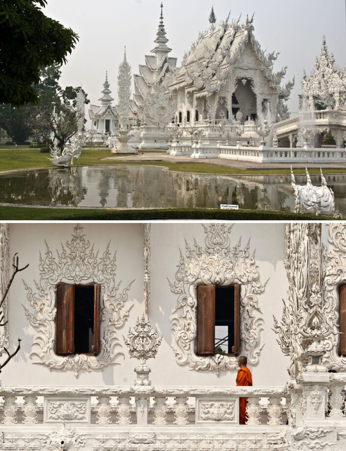
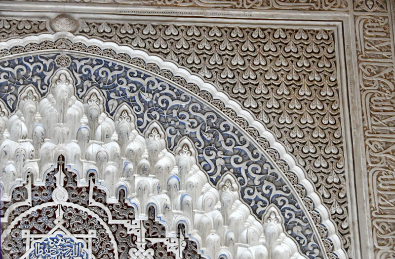
The Cathedral of Salerno inside. Italy.The Cathedral of Salerno inside, Italy. The Cathedral of Salerno was built between 1080 and 1085 on the ruins of a Roman temple.Ivan the Great Bell Tower at the Kremlin, image by Veronica Winters. | We can enjoy seeing the white stone cathedrals bathing in the warm sunlight. The Kremlin was built between the 14th and 17th centuries. The first white-stone walls and towers were built in 1367-68. The existing walls and towers were built by Italian masters from 1485 to 1495.Wat Rong Khun – the White Temple in Thailand. Photos c Veronica Winters | This looks like heaven on earth. Famous contemporary Thai artist, Ajarn Chalermchai wanted to build a temple that’s different from other wats. Normally, Thai temples are golden and the artist wanted to emphasize the Buddha’s purity who achieved Nirvana. Ajarn considered gold having a negative connotation about human behavior like lust. He put myriads of small mirrors into the white sculptures that beautifully reflect the light of the temple. These mirrors are the symbol of Buddha’s wisdom that shines throughout the universe according to the artist. He amassed a team of artists to build this beautiful site that represents heaven on earth. Wat Rong Khun is expanding as new elements are added to the wat. The admission is free for people to enjoy the garden feeling peace and joy. Isn’t it wonderful?The Alhambra was built between 1238 and 1358, mainly during the reigns of Ibn al-Aḥmar and his successors. Located in Granada, Spain, the Alhambra is one of the world’s finest examples of Islamic architecture that served as inspiration for many artists including Escher. This elaborate geometric design shows heavenly colors of white and blue. Image by Veronica Winters
White in mythology:
White crane, a closeup of a Japanese temple decoration. Photo: V.Winters | In Japanese culture, the white crane, or tsuru, is a national treasure and symbol of good fortune, longevity, and peace. It is also associated with loyalty, wisdom, fidelity, and beauty. The crane is depicted in art, literature, and mythology, and is said to live for 1,000 years. It is also associated with the Shinto god of happiness, and it is said that the god will come to a person who folds 1,000 cranes. Recently, the crane has become a symbol of peace, hope, and healing.Look at these beautiful patterns of gold, blue and white! We can see the white dragon in the center of the decoration. Two white cranes create symmetry in this elaborate decoration seen in Japan.
In Japanese culture, dragons are guardians of the Buddhist temples and their meaning varies depending on their color. The white dragon, or Hakuryuu, is a water god that controls rainfall and water. White dragons are also associated with great wealth and blessings in marriage.
The white dragon decoration, Japan.
White as a force in duality of nature:
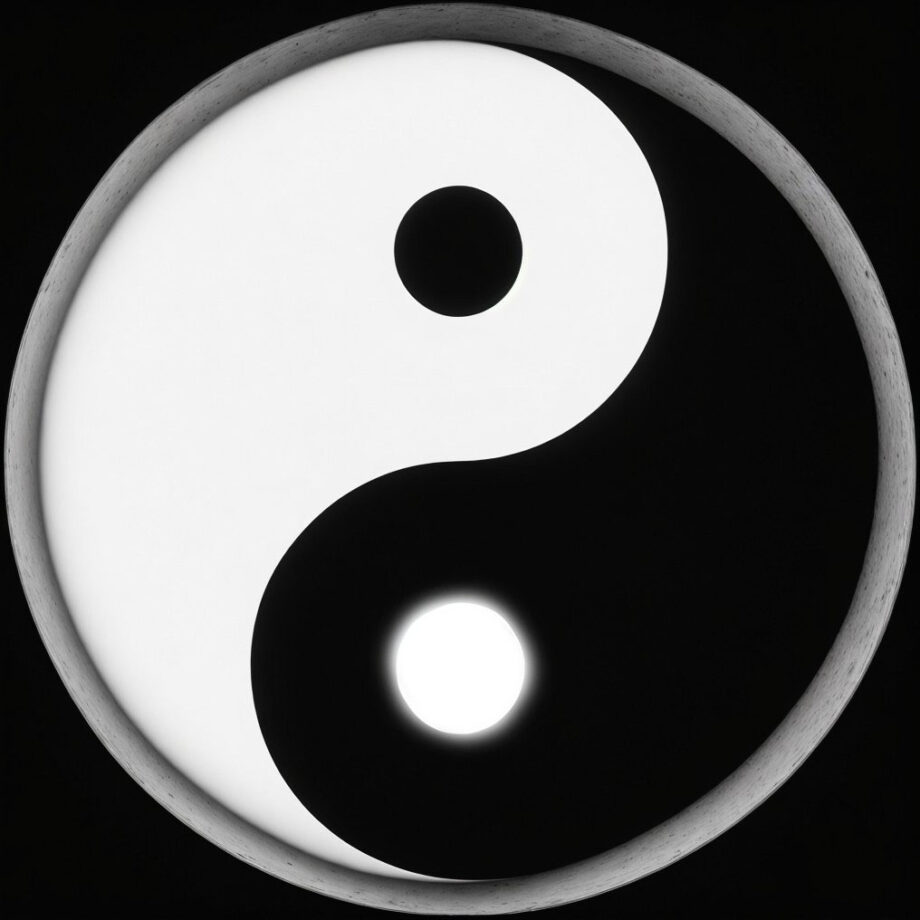
Yin and Yang is a core concept in the Chinese philosophy that describes two opposing yet interconnected and complementary forces that are believed to underlie all of reality. They represent intertwined aspects of a whole in a dynamic balance within the universe. Famous symbol of yin and yang is the taijitu, a circle divided into two halves, each containing a swirl of the opposite color. The swirl within each half represents the seed of the other force, signifying their interdependence. In art, it often means balance, where white can’t exist without black, just like the sun doesn’t exist without the moon.
Among Neolithic jades of ancient China are bracelets (huan), penannular rings (chüeh), half-rings (huang), a flat disc with a hole in the centre (pi) and a ring or short tube squared on the outside (tsung). In later historic times these shapes acquired a ritual or ceremonial function, the pi and tsung, for example, symbolizing respectively heaven and earth.
(From the book: the arts of China, 3d edition, Michael Sullivan)
White often represents all the light in the world, opposing the black of the darkness.
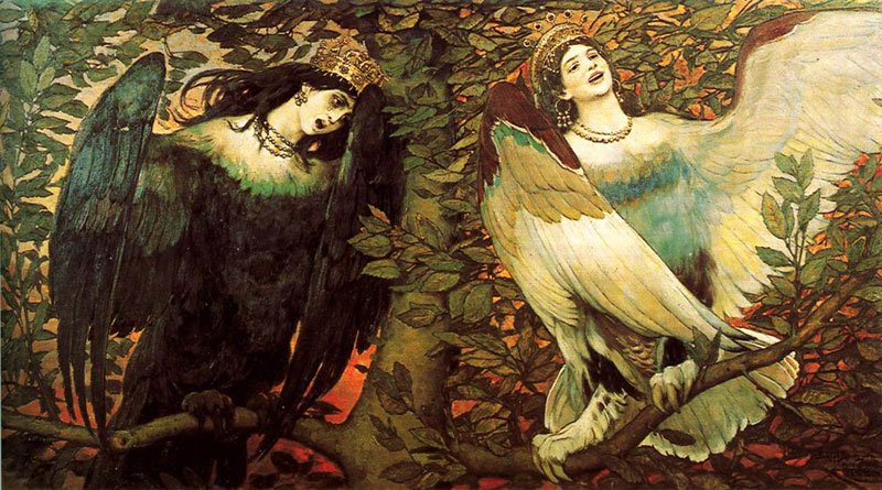
Viktor Vasnezov, Sirin and Alkonost. The song of happiness and sadness, 1896, The Tretyakov Gallery, Moscow
In this oil painting, “Sirin and Alkonost,” also referred to as “The Birds of Joy and Sorrow,” depicts two beautiful, half-bird, half-woman creatures from Slavic mythology. Sirin, on the right, is typically associated with joy and enchantment, while Alkonost, on the left, brings sorrow and mourning. Their contrasting melodies intertwine, creating a complex and evocative harmony that reflects the duality of human experience. The painting itself is a masterpiece of the Russian Romanticism expressed in symbolism that invites contemplation of life’s emotional range.
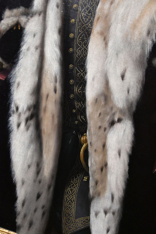
A close up of hands and lace in oil painting, Metz, France. Photo: Veronica WintersHolbein, The Ambassadors, an oil painting’s closeup of fur. London
The calming power of white:
The calming effect of white is obvious in snowy landscapes, white clouds or cashmere sweater that bring us feelings of peace. Tranquil nature relaxes our mind. Soft, white fabric evokes serenity. And white swans and snowflakes seem magical floating in water.
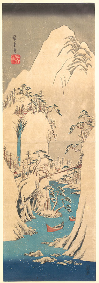
Snowy Gorge, Utagawa Hiroshige, Japanese, Edo period (1615–1868), the Met
White can carry a special meaning in objects we often see. For instance, symbolic of new life, a white egg represents birth. Moreover, we can read the Chinese ancient legend about the origins of the world.
“Once upon a time, the universe was an enormous egg. One day the egg split open; its upper half became the sky, its lower half the earth, and from it emerged P’an Ku, primordial man. Every day he grew ten feet taller, the sky ten feet higher, the earth ten feet thicker. After eighteen thousand years P’an Ku died. His head split and became the sun and moon, while his blood filled the rivers and seas. His hair became the forests and meadows, his perspiration the rain, his breath the wind, his voice the thunder-and his fleas – our ancestors.” This legend expresses a Chinese philosophy, that man is not the culminating achievement of the creation, but a relatively insignificant part in the scheme of things; an afterthought. By comparison with the beauty and splendor of the world itself, the mountains and valleys, the clouds and water- falls, the trees and flowers, which are the visible manifestations of the workings of the Tao, he counts for very little.
(From the book: the arts of China, 3d edition, Michael Sullivan)
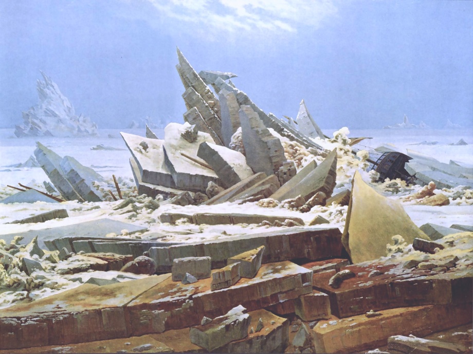
http://www.metmuseum.org/art/collection/search/68969 Rank Badge with Leopard, Wave and Sun Motifs Period: Qing dynasty (1644–1911), late 18th century, China, silk, metallic thread, 10 3/4 x 11 1/4 in. (27.31 x 28.57 cm), Textiles-Embroidered, Credit Line: Bequest of William Christian Paul, 1929Caspar David Friedrich, the polar sea or the sea of ice,1823–1824, oil on canvas, 96.7 cm × 126.9 cm (38 in × 49.9 in). This is one of my favorite Romanticism artists who painted the power of Nature to show its spiritual dominance over men.
White hue can also be a symbol of cleanliness. Healthcare facilities have white rooms, corridors, and doctors’ coats.
Contemporary architecture loves the color white. Both interior and exterior spaces have white paint and decorum seen across Florida’s new construction to amplify the light in the region.
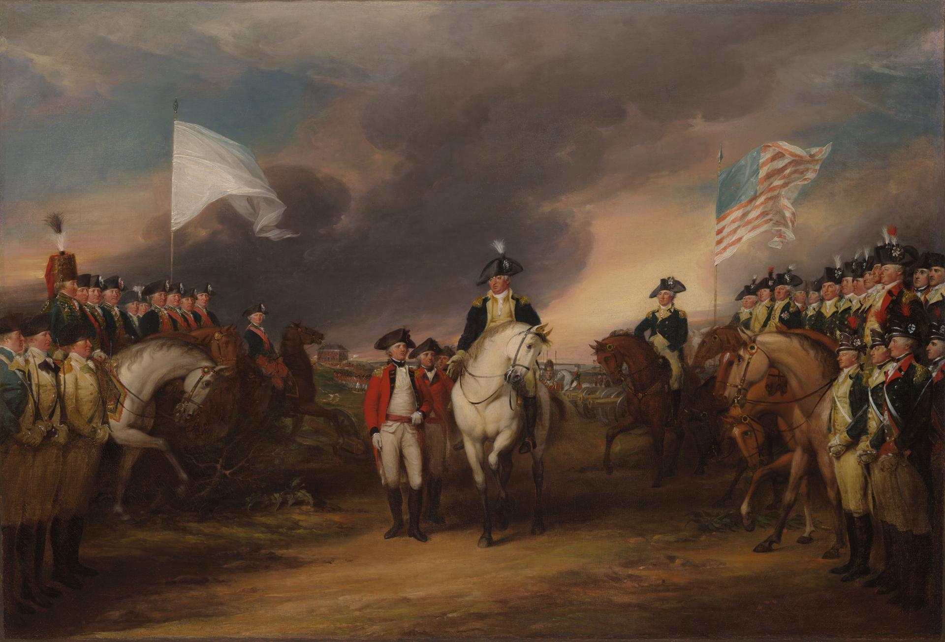
White can also represent neutrality or fairness, negotiation or surrender – the white flag of surrender.
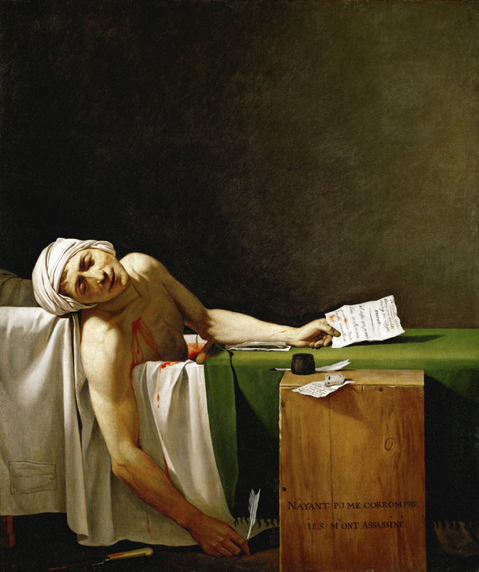
John Trumbull, The Surrender of Lord Cornwallis at Yorktown, oil on canvas, 1826,21 × 30 5/8 × 3/4 in. image from the Yale University Art Gallery. It can also be seen in a 12′ x 18′ size at the US Capitol Rotunda. This painting illustrates the surrender of the British army at Yorktown, Virginia, in 1781, which ended the last major campaign of the Revolutionary War. https://www.aoc.gov/explore-capitol-campus/buildings-grounds/capitol-building/rotundaJacques-Louis David, the death of Marat, 1793–1793, in the collection of the Royal Museums of Fine Arts of Belgium. This neoclassical painting has a very careful, classical design both in color and lines. Marat was a revolutionary in France and a friend of the artist. David was also a radical thinker and revolutionary who was once an official court painter to Napoleon but ended up in prosecution and escape from France to Belgium closer to the end of his life. Marat’s skin condition made him take long baths to soothe the pain where he got assassinated. This painting represents the ideals of neoclassical art and politics- simplicity, heroism, idealization, classicism, neutrality and stoicism. Color white helps communicate these virtues.
In modern art, white can symbolize a fresh start, an open canvas, or a space for interpretation. White is neutral, blank canvas. Artists like Robert Rauschenberg and Agnes Martin explored this potential in their monochromatic white paintings. Rauschenberg first painted his white canvases in 1951 in six variations, one to seven panels. Martin spent her 40-year career exploring the perception of stillness.
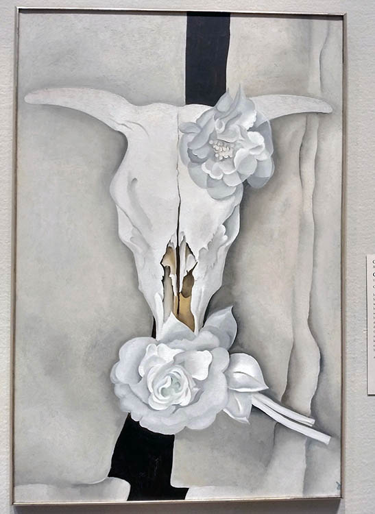
Georgia O’Keeffe (1887–1986), the white skull, Chicago Art Institute. O’Keeffe often painted the bleached white bones and skulls of the animals in New Mexico. She associated the skulls with strength of an American spirit.
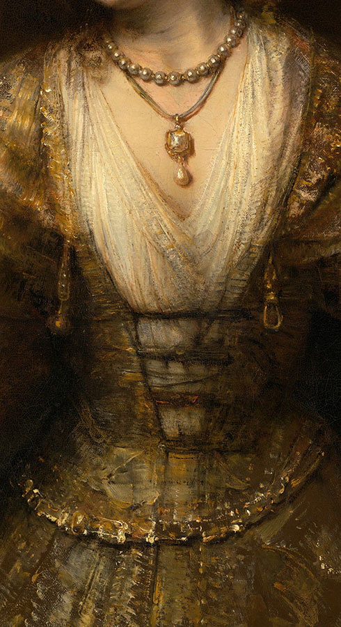
White means innocence.
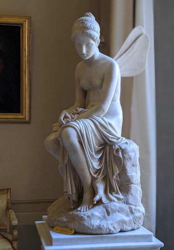
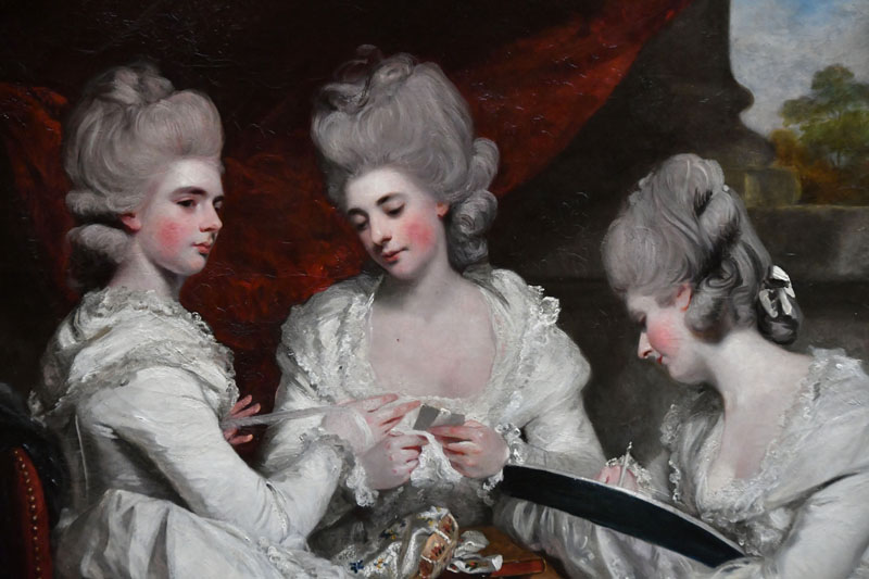
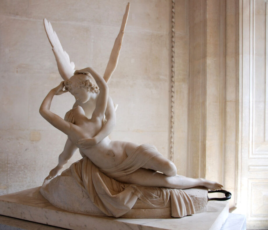
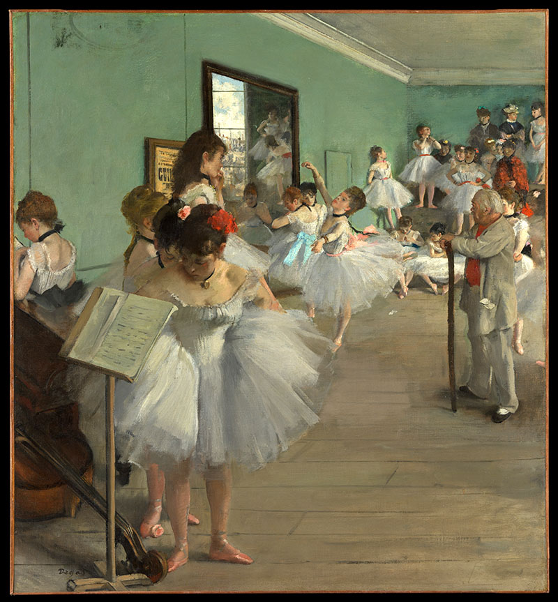
William Sergeant Kendall, art interlude, 1907, oil on canvas, American Art Museum at the Smithsonian Institution, Washington D.C.Rembrandt van Rijn, Lucretia, oil on canvas,(47 1/4 x 39 3/4 in.), 1664, closeup of fabric and pearls. National Gallery of Art, the Smithsonian, Washington, DC. Rembrandt depicts the suicide of Lucretia happening in Rome in the 6th century BC. She signifies virtue, loyalty and honor wearing white and pearls. You can read the full story here: https://www.nga.gov/collection/art-object-page.83.htmlPsyche Abandoned by Pietro Tenerani, Pitti palace, Rome, Italy. Image by Veronica WintersPaul Delaroche, the execution of Lady Jane Grey, National Gallery London. The only person dressed in white – Jane Grey symbolizes innocence.Paul Delaroche, the execution of Lady Jane Grey, National Gallery London, Photo by Veronica WintersSir Joshua Reynolds The Ladies Waldegrave 1780, closeup, Scottish National Gallery. The dresses in Joshua Reynolds’ “The Ladies Waldegrave” are a striking feature of the painting. All three sisters are clad in garments of a singular color: white. The material is most likely muslin, a popular choice for fashionable gowns in the late 18th century. White evokes purity, innocence, and a sense of classical elegance and timeless quality Reynolds appreciated in ancient art.Canova, Cupid and Psyche, marble sculpture, 1793, Louvre. Photo: Veronica WintersEdgar Degas, The Dance Class, oil painting, 1874, the Met, NY | Degas created a series of paintings devoted to the theme of dance. He captured white ballerinas in rehearsals sketching in pastels and painting in oil.Gerome, Pygmalion and Galatea,1890, oil on canvas, 35 x 27 in. (88.9 x 68.6 cm), the Met. “Between 1890 and 1892, Gérôme made both painted and sculpted variations on the theme of Pygmalion and Galatea, the tale recounted in Ovid’s Metamorphoses. All depict the moment when the sculpture of Galatea was brought to life by the goddess Venus, in fulfillment of Pygmalion’s wish for a wife as beautiful as the sculpture he created. This is one of three known versions in oil that are closely related to a polychrome marble sculpture, also fashioned by Gérôme (Hearst Castle, San Simeon, Calif.). In each of the paintings, the sculpture appears at a different angle, as though it were being viewed in the round.” The MetFrancesco Hayez Suzanna at her Bath, National Art Gallery of Scotland. A classical painting in many ways, the white fabric forms a circle around the nude communicating innocence of youth.
White as the representation of timelessness & memory
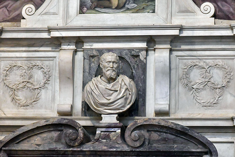
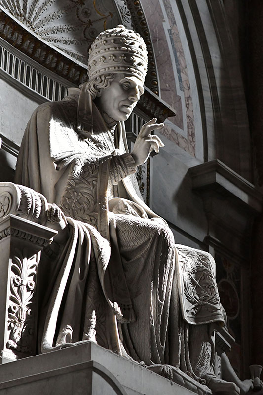
The marble sculpture at the CA’ d’ ORO Palace in Venice, Italy.Michelangelo’s tomb, detail, ItalyI love how lifelike this sculpture looks. It shows a pope blessing the crowd and wearing his crown. The light hit it so beautifully. It’s in St. Peter’s Basilica in Vatican City, Rome, Italy.
Negative white
Depending on our view of the world, specific events or cultural differences we can see the color white as cold, empty and artificially sterile. This kind of emotionless, stark white can trigger feelings of isolation, and emptiness. Moreover, white can be associated with mourning and death in some countries.
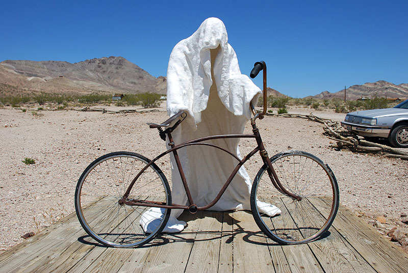
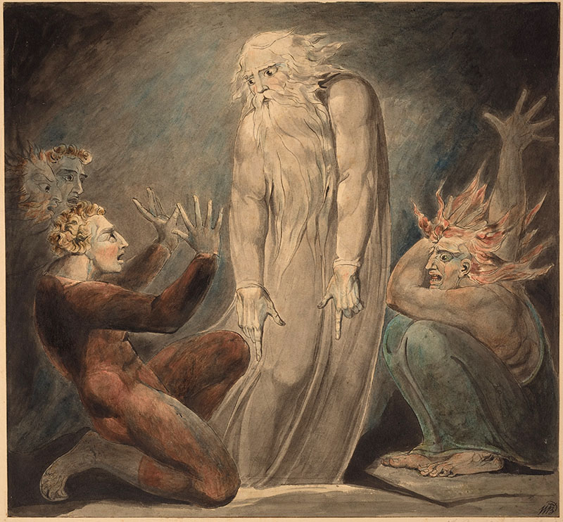
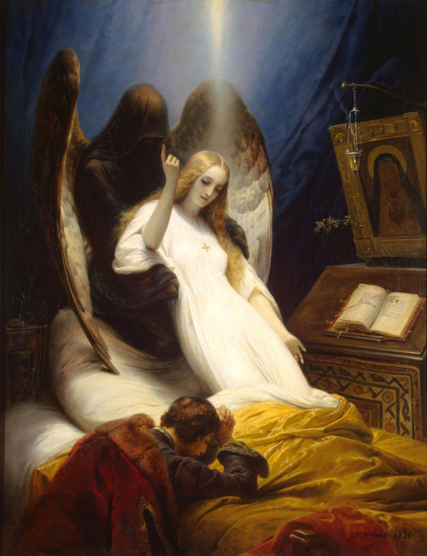
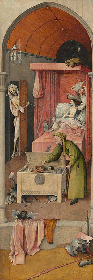
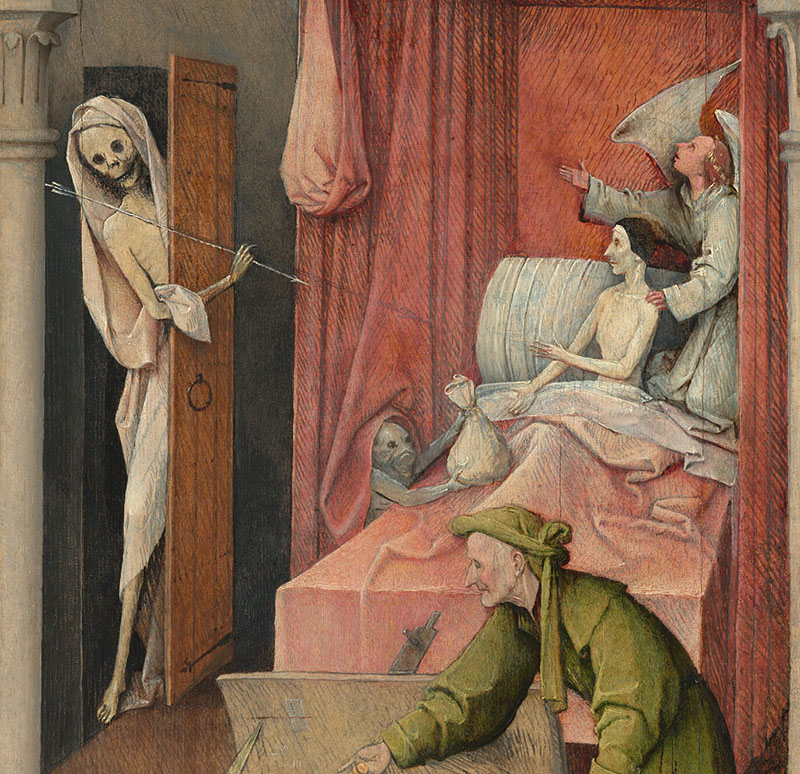
White ghosts scare us, representing the supernatural and death.
William Blake, The Ghost of Samuel Appearing to Saul, c. 1800, pen &ink, watercolor, National Gallery of Art, the Smithsonian, Washington DC
White can also represent death. White shroud symbolizes death, mourning, and loss.
Vernet, Horace. Angel of death, 1789-1863, the HermitageHieronymus Bosch, Death and the Miser, c. 1485/1490, oil on panel (other panels lost), 93 × 31 cm (36 5/8 × 12 3/16 in.), National Gallery of Art, Washington DCHieronymus Bosch Death and the Miser, c. 1485/1490, oil on panel (other panels lost), 93 × 31 cm (36 5/8 × 12 3/16 in.), National Gallery of Art, Washington DC. “In this panel Bosch shows us the last moments in the life of a miser, just before his eternal fate is decided. A little monster peeping out from under the bed–curtains tempts the miser with a bag of gold, while an angel kneeling at the right encourages him to acknowledge the crucifix in the window. Death, holding an arrow, enters at the left. Oppositions of good and evil occur throughout the painting. A lantern containing the fire of Hell, carried by the demon atop the bed canopy, balances the cross which emits a single ray of divine light. The figure in the middle ground, perhaps representing the miser earlier in his life, is shown as hypocritical; with one hand he puts coins into the strongbox where they are collected by a rat–faced demon, and with the other he fingers a rosary, attempting to serve God and Mammon at the same time. A demon emerging from underneath the chest holds up a paper sealed with red wax — perhaps a letter of indulgence or a document that refers to the miser’s mercenary activities. This type of deathbed scene derives from an early printed book, the Ars Moriendi or “Art of Dying,” which enjoyed great popularity in the second half of the fifteenth century. The panel may have been the left wing of an altarpiece; the other panels — now missing — would have clarified the meaning of some aspects of the scene, such as the discarded and broken armor and weapons in the foreground.” Taken from the gallery’s page https://www.nga.gov/collection/art-object-page.41645.html
Empty white rooms can feel lonely and even scary.
Blindfolded figures often represent ignorance, inability to see, and vulnerability, but the blindfolded Lady Justice has a different meaning. The blindfold represents that justice is unbiased and should not be influenced by a person’s appearance or other factors.
Justice, from the Cardinal Virtues, Nicolaes de Bruyn Netherlandish, Publisher Frederick de Wit Dutch 1648–56, the Met, New York. http://www.metmuseum.org/art/collection/search/423841
Whitewashing is a term denoting the covering up of unpleasant truth, describing censorship.
art museum, Metz, France
As you can see the color white carries several meanings and rich symbolism in art history and our life. What do you think of white?
PS If you see a mistake in this article, please know it’s not intentional. Reach out with the suggested correction to nika@veronicasart.com
The Color White in Contemporary Art
Ann-Marie Kornachuk, oil painting, copyright of the artistG Mortenson, Homework, copyright of the artistLorenzo Quinn, Hands, sculpture, Venice. Photo by Veronica Winters, 2017Lorenzo Quinn, Hands, sculpture, Venice, Italy. Photo by Veronica Winters, 2017Jorge Jiménez Deredia, capullo, marble sculpture-contessa gallery-art wynwood 2023Filippo Tincolini, Spacesman seat, Marble, exhibited in Miami Art Context 2023Michael Buthe, white painting at Tate Modern, 1969, London. I snapped a picture of this painting in 2019. A carefully constructed composition with white stretcher bars, Buthe blurs the line between the canvas and its support, emphasizing the artwork’s physical construction.Freedom, 22x30inches, colored pencil drawing by Veronica Winters
Do you shop at these places for canvases? Michael’s, Hobby Lobby, Walmart, Lowes or online art supply retailers? When everything doubled or tripped in price in the art supplies section, these affordable canvases seem to be a steal. But are they really worth it? Stop 🛑 painting on these canvases now!
4 reasons to stop painting on cheap canvases from Michael’s, Hobby Lobby, Lowes & alike.
Here are 4 reasons to stop buying cheap canvases at craft stores:
Cheap wood doesn’t hold the frame in a long run unless you frame the art soon after its completion. The frames are often crooked and the stretcher bars are not stapled together. It could be all right for a small canvas but not for a big one because large canvases need more support to hold everything up together.
You can’t be confident selling your art that’s produced using crappy art supplies. These canvases will begin to degrade within your lifetime (and this is a very conservative estimate).
This material is not a high-quality canvas. I can’t even tell you what it really is. It can rip and ripple easily. Constant flactuations in room temperature cause cracks in art. This material is asking for trouble.
This gesso (the white ground that covers panels and canvases) is not a high-quality gesso either. And that’s the biggest problem with the craft canvases in my opinion, because oil paint doesn’t form a permanent bond with this surface. It doesn’t stick even if it looks ok on the first sight. It’s very easy to damage the surface. Any shuffling of a painted art rubbed against something will damage the art. I’m not sure that acrylic paint forms a bond with this surface either. Beware.
Combine this horrible surface with low-quality, cheap paints and you got yourself a painting that will crack, fade and change it’s shape pretty soon. Do you really want that?
Affordable alternatives: paint on these high-quality panels instead
Here are some very good alternatives to paint on.
Paint on panels:
My personal preference is a medium-textured panel like Ampersand gessobord or aluminum panels by Artefex. Artefex Alcotpanel is aluminum panel with a primed cotton canvas mounted on ACM and ready to paint on. Da vinci pro wood boards are also very good.
The gesso quality is very important. Golden products are very good. I’m not an affiliate of any of these companies. I just like the quality and price of their art supplies. Panels don’t fluctuate with a change in room temperature or humidity unlike canvas. Old art looks ok painted on wood panels… Raphael Premium Archival OIL PRIMED linen panels are designed for oil painting only because their gesso is oil-based, not acrylic-based like the majority of gesso brands sold today. https://amzn.to/3VRUSBt
These art instruction books are on sale on Amazon!
Paint on canvas:
If you prefer the lightweight of a canvas, try working on a Belgian linen or more affordable canvas like Unprimed Cotton Duck #10 – Uniform Canvas Surface. It should be heavy and uniform. It’s best to buy a canvas in a roll rather than in a blanket format. The blanket could have creeses that are difficult to get rid of. It can be a challenge to buy a good canvas shopping online because you can’t see or touch it. Some canvases have a very thin thread and you can almost look through them. Look into the numbers to understand which one is good. For example, unprimed cotton duck #10 is a thick material…
I hope this post and video helps you decide on your art materials choices or at least save you some real frustration and disappointment when you see your art scratch, crack or fade.
A new leader & his order often destroyed the cultural and scientific heritage of any given society. During the repressions of the 1930s in Russia, the new government executed top scientists, artists, and writers. In China, Mao’s Cultural Revolution wiped out the intellect of country. Many centuries ago, the book of songs (which is attributed to Confucius today) was burned along with other ancient texts and people who opposed the new order. What remained was memory and some memorized poems and texts. The medieval ages & religious wars in Europe saw an unprecedented destruction of science & culture, reverting humanity by hundreds of years, leaving it in a thorough stagnation. It’s common to see state confiscation, scientific and cultural reversal, and overall decline instead of the birth of a thriving, new society after such events.
While new replaces the old where creation is impossible without destruction in a natural cycle of life, it seems that psychopathic leaders alter this cycle where they can. They rule with endless propaganda and control. Controlling people’s thoughts, ideas, beliefs, religion, and culture seems paramount to a leader’s success. Only psychopathic rulers can govern and hold on to this position for a long time. Otherwise, the ruler is assassinated, executed, or imprisoned.
We try to pick a president based on our morals, beliefs, and ethics, searching for a leader with a “heart.” Unfortunately, we won’t find one because he or she doesn’t exist. Each person takes a specific job in society based on their personality and inner life. Top politicians have qualities that other people don’t possess, and vice versa. Those people are low on empathy and emotion. Therefore, the decisions they make are easy for them to make. Obama can’t control TikTok. Hillary couldn’t tank Trump with her lies about Russian collusion. Trump suddenly worries about the morality of abortion, overturning the law. Putin uses religion and TV propaganda to justify his choices and outcomes. Democrats have captured the media with their agenda. The Republicans want to die in the Senate when they reach 100 years of age. As a democratic society, we end up with top politicians who serve the privileged few who rule and kill behind the curtain. And we-the people-become entangled in this web of rules, regulations, lies, prosecution, control, disbelief, and hurt. Strong voices get jailed. Others accept bribes. We pay taxes to bomb the world. We hope for a better outcome, only to lose it after another election cycle.
Just like the problem, the solution is never simple or clear. Every new idea or the structure of a society, like communism, democracy, autocracy, and even utopian communes, has beautiful thoughts that get corrupted by the human element. So it seems that a renewed system must consider human weaknesses and the inability to change to function differently and sustainably. Is it possible at all? We can only know this after some social experimentation. But who wants to do just that? Because progress is exponential, we can evolve and advance more rapidly with each decade. Perhaps, new ideas will sparkle and ignite a strong wave in evolution of humanity that’s more encompassing of the past, human element & the seed of life.