We’ve all been there—scrolling through endless art supplies and freebie groups to add another “must-have” item to our wishlist. We think that if we have that one material, everything will run smoother, students will be magically engaged, and the projects will practically teach themselves. But as the wishlists grow, so do the piles of supplies in our classrooms. It’s time to hit the pause button, simplify your art space, regain control of your classroom, and encourage creative bliss!
Embrace the “less is more” mentality to foster a welcoming art room.
Japan has a long tradition of tidying up as a path to clarity and balance. Hideko Yamashita, the creator of Danshari, teaches the art of releasing what no longer serves us to create space for what truly matters. Following this tradition, Marie Kondo’s The Life-Changing Magic of Tidying Up popularized the idea that less can be liberating, sparking joy and order in our lives.
These philosophies invite us to take a fresh look at our art rooms. Sometimes too much art clutter and chaos can make it harder for everyone to focus and fully explore ideas. What if simplifying our spaces ignited more creativity, focus, and joy for teachers and students alike?
This doesn’t mean losing the magic of art—it means curating your space with intention to amplify its purpose. Research shows that decluttering your environment can unlock greater innovation and engagement. Simplify your art space to foster calm and imaginative thinking and free up time and energy to focus on what truly matters—teaching and creating.
Simplify your art space with these six manageable steps!
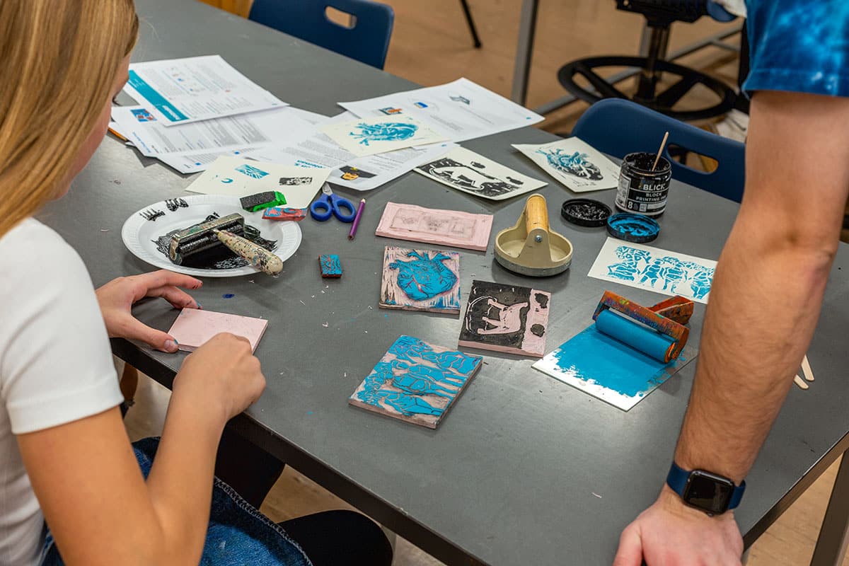
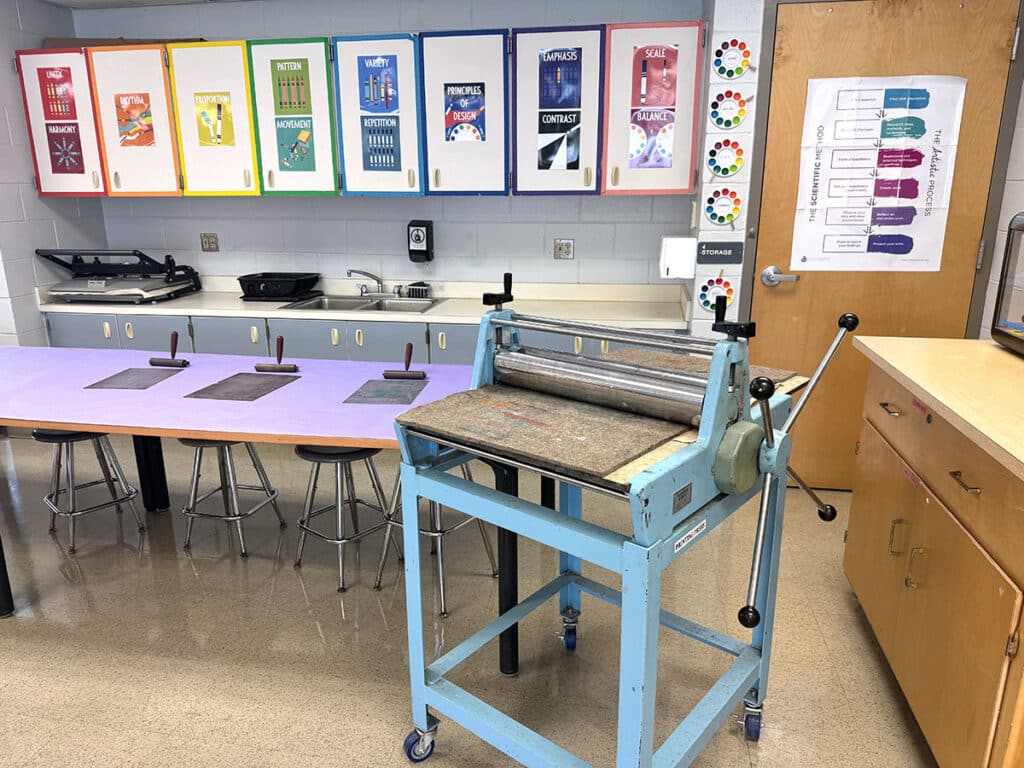
1. Divide your classroom into zones.
Start by thinking of your space as a collection of zones. Each zone can represent a type of artmaking or media, such as painting, drawing, or sculpture. Dividing your room into zones helps you focus on simplifying one area at a time, making the process more manageable. This division doesn’t have to involve physically relocating materials; it can be a mental assessment of each area.
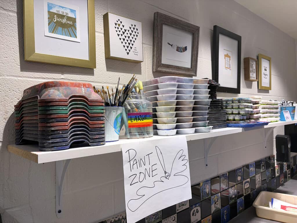
Here are three examples of common art room zones:
- Painting Zone
Brushes, paints, and palettes.
- Drawing Zone
Pencils, markers, erasers, and paper.
- Sculpture Zone
Clay and modeling tools.
2. Take inventory.
Within each zone, lay out all of your materials, tools, and supplies where you can see them. This will feel messy, but it’s an important step in visualizing what you have.
Ask yourself the following questions:
- Does this enhance my teaching?
Does this item spark joy? Joy isn’t just about happiness, it’s also about energy, connection, and purpose. Even if a material feels like a chore (looking at you, chalk pastels!), consider whether it’s required for the curriculum or adds value to your lessons.
- Does this inspire my students?
Think about how students interact with each item. Does it spark curiosity and engagement or does it sit ignored?
- Have I used this in the last two years?
If not, it’s time to let it go.
If you’re looking for a more structured approach to inventory management, The Art of Education has you covered with helpful inventory guides. Use them to streamline your material management and ensure your classroom is fully equipped for creativity.
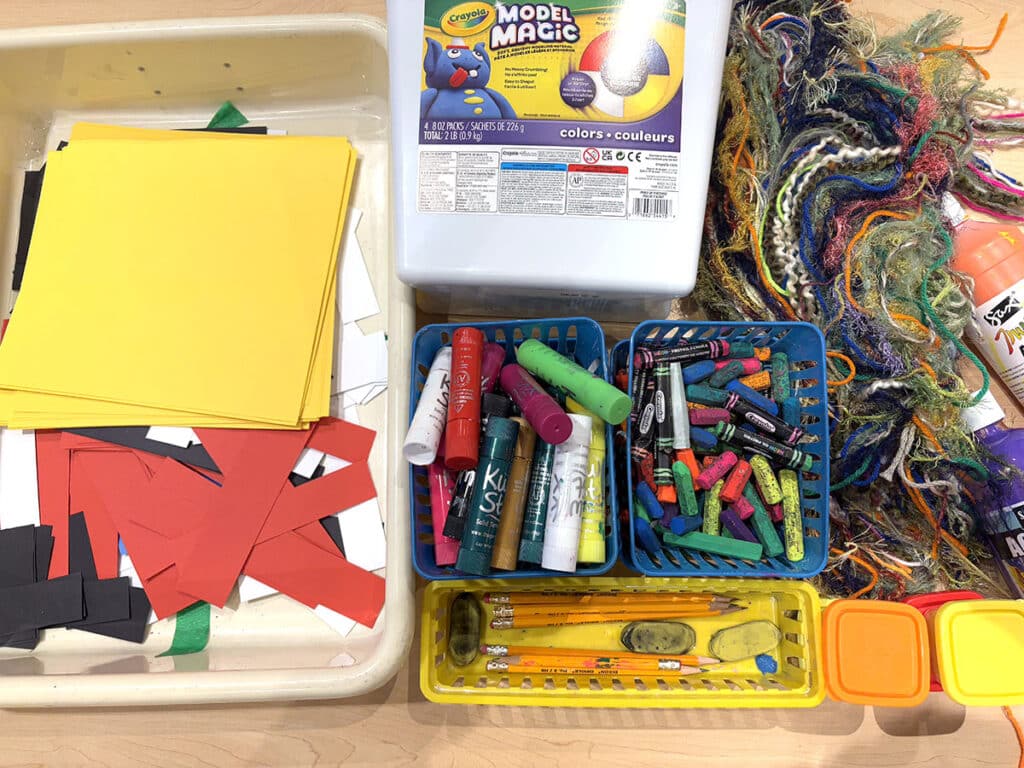
3. Organize supplies by category.
Zones set up a broad structure to simplify your art space. This particular step focuses on finetuning how you store materials within those zones for maximum functionality and ease. For instance, once you gather all paintbrushes together, further separate them by size or type.
For more tips on how to streamline your classroom, check out Organizing your Elementary Art Room for Success in PRO Learning. While this Pack focuses on elementary classrooms, the strategies shared are beneficial for all art levels!
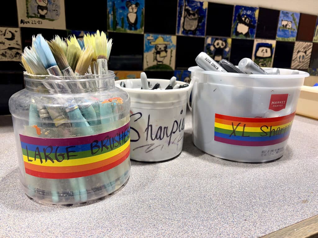
4. Label everything.
Labels are your best friend when it comes to maintaining an organized and accessible classroom. Use large, clear labels on bins, drawers, and shelves to make materials easy to find. Adding visual cues, such as icons or color coding, can further simplify identification for students of all ages and reading/language levels. Whether you prefer professionally printed labels or a quick piece of masking tape, the key is ensuring both you and your students can easily locate and return materials to their proper places.
https://www.youtube.com/watch?v=KvaI77y1zhc
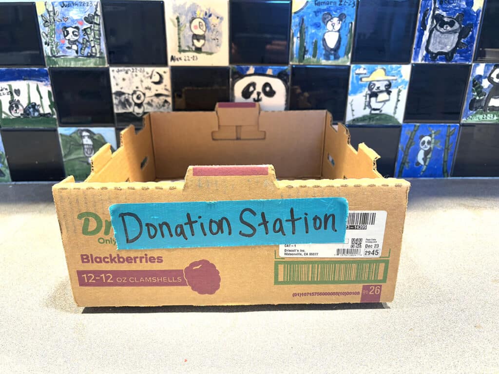
5. Create a donation station.
Turn simplifying your space into a purposeful mission to help others to make it easier to let things go. Set up a designated box in your classroom for items you no longer need but that others may find useful. Label it clearly as your “Donation Station” to make the process quick and organized. When the box is full, donate the contents to other art teachers in your district or community centers to spark creativity in new students.
6. Adopt a “one in, one out” rule.
To prevent unneeded items from returning, establish a simple rule: for every new item brought into the classroom, remove an old or unused one. This habit keeps your space balanced and ensures you’re only adding items that truly serve your teaching goals.
Simplifying your art space is more than just organizing—it’s a chance to refresh and reset. It helps you realign your art room with your values and goals and nurture an environment where creativity can truly thrive. Letting go of excess makes room for the things that really matter, like connection, growth, and inspiration. Each small step you take toward curating your environment brings you closer to a classroom where both you and your students will experience creative bliss.
Do you want even more tips to make your art room dreams come true? Check out the resources below:
What’s one thing you can let go of today?
What’s your best piece of advice to simplify your art space?
To continue the conversation, join us in The Art of Ed Community!
Magazine articles and podcasts are opinions of professional education contributors and do not necessarily represent the position of the Art of Education University (AOEU) or its academic offerings. Contributors use terms in the way they are most often talked about in the scope of their educational experiences.


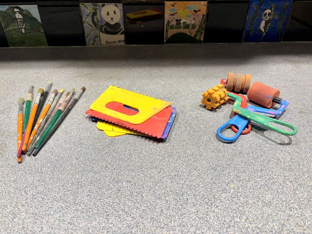
 Tools you find indispensable.