بلاگ

  • Curator at Large: The London Lowdown

    Curator at Large: The London Lowdown


    Uncover six exhibitions we think you should see in London before spring, from Japanese Art History à la Takashi Murakami to tech-tinged dreamscapes.

    By Sophie Heatley | 16 Jan 2025

    With Christmas behind us and New Year resolutions underway (kind of), I can’t quite believe we’re already halfway through January 2025. Torn between being thrilled that the hardest month of the year is almost over and somewhat shook at how quickly it’s gone, I’m distracting myself with the fortification of my arts and culture diet. Now definitely feels like a good time to sit back, have a coffee, and plan a few exhibition visits. Here are six we think you should check out in the next few months.

    Curator at Large: The London Lowdown
    Installation view, Japanese Art History à la Takashi Murakami, Gagosian, Grosvenor Hill, London | Photo: Prudence Cuming Associates Ltd

    Gagosian London presents new works by Takashi Murakami, reinterpreting iconic Japanese art through his signature lens. Blending tradition and modernity, Murakami explores Japan’s cultural evolution post-Edo period, pairing mythical guardians of Kyoto with contemporary landscapes. Using AI, sketches, and past works, Murakami reimagines historical motifs with vibrant inventiveness. Highlights include his take on the Four Symbols and re-workings of Matabei’s Rakuchū-Rakugai-zu and the Rinpa school. Also for the diary: the artist will be in conversation with Hans Ulrich Obrist on December 11 at the Royal Academy. 

    Gagosian Grosvenor Hill, London, until 8 Mar 2025

    Curator at Large: The London Lowdown
    Neena, aan uthii—Acaye Kerunen Installation View | Courtesy of Pace Gallery

    Pace presents Neena, aan uthii—Acaye Kerunen’s vibrant UK solo debut. Translating to See me, I am here in Alur, this exhibition showcases sculptures, sound installations, and performance inspired by Ugandan communities and ecological knowledge. Based in Kampala, Kerunen combines visual art, performance, and activism in climate-conscious creations. Her vivid tapestries use natural dyes from roots, flowers, and grasses, blending rich hues like indigos, tangerines, and fuchsias that reflect Uganda’s diverse landscapes. I wouldn’t want to miss this immersive celebration of embodied knowledge and environmental artistry.

    Pace, London, until 22 Feb 2025

    Curator at Large: The London Lowdown
    Installation view of Lawrence Perry: They Shoot Horses, Don’t They? at IBF Contemporary, London | Photo: Tom Carter

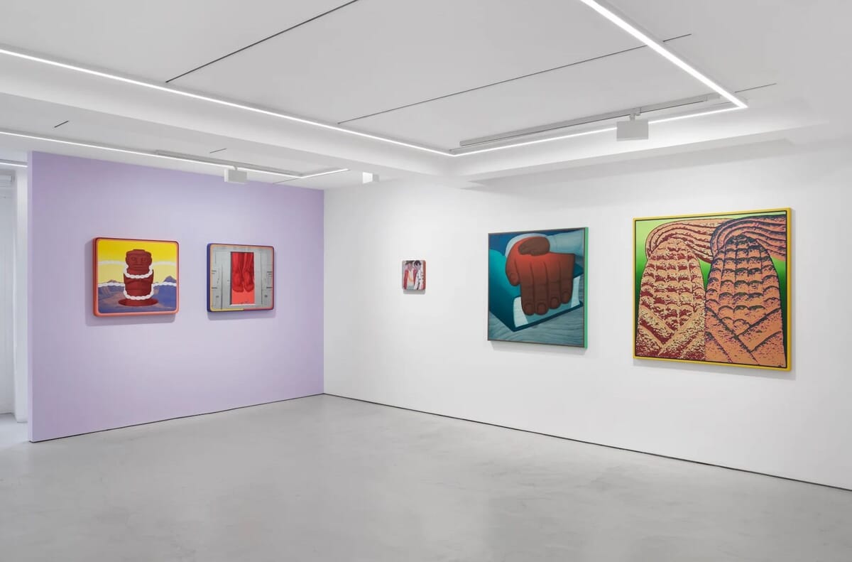
    Lawrence Perry’s psychologically charged, witty paintings bring universal fables into sharp, contemporary focus. Blending sumptuous textures with uncanny worlds, his work explores themes of desire, violence, and image saturation. Ambitious and visceral, the show crowns Perry’s unique and arresting style, an aesthetic that fuses Renaissance opulence with 70s Californian excess. 

    IBF Contemporary, London, until 12 Feb 2025

    Curator at Large: The London Lowdown
    Installation view of Claudia Martínez Garay: Borrowed Air | Courtesy of GRIMM Gallery

    Following acclaimed shows at Nottingham Contemporary and Dundee Contemporary Arts, GRIMM Gallery presents Borrowed Air, Martínez Garay’s third UK solo exhibition. Exploring “moments of rupture” where European modernity collides with Andean cosmo-visions, her works in printmaking, etching, and painting give voice to historically underrepresented perspectives. Pieces like Intrusos en sus tierras (2024) challenge official histories, using school textbook aesthetics and a striking brown-white chromatic motif to confront colonial narratives with political and emotional depth.

    GRIMM, London, until 22 Feb 2025

    Curator at Large: The London Lowdown
    Installation view of Jana Schroder: M. I. G. H. T | Courtesy of Skarstedt Gallery

    Showcasing a selection of new paintings across three different series: SYNACLIPS, FRONTRACKS SYNACLIPS SPE and CORTEXOPHIS, Jana Schroder: M. I. G. H. T. explores the Metamorphosis in Generative Human Thinking (M.I.G.H.T.), an acronym devised by the artist to evoke ambiguity and doubt. Immersed in a tech-tinged dreamscape, Schröder explores the clash between digital floods of information and our analogue minds, reflecting how constant connectivity is reshaping our perception and attention– and not necessarily for the better. Biomorphic shapes undulate in vivid pinks, greens, yellows, and blues, like neural networks suspended in water—a mesmerising look at our evolving relationship with technology.

    Skarstedt, London, until 1 Feb 2025

    Curator at Large: The London Lowdown
    Installation view from Jonathan McCree’s Through The Wrong End Of A Telescope | Courtesy of Sim Smith Gallery 

    I couldn’t not include Jonathan McCree’s Through The Wrong End Of A Telescope. A playful, improvisational journey, McCree’s third solo show with the gallery features a constellation of cardboard, cast aluminium, folded metal sculptures, paintings, and drawings in a fluid exploration of lived experience and non-linearity. Each piece invites viewers into a dynamic game of perception, challenging them to carve their own unique path through its emergent relationships. 

    Sim Smith, London, until 8 Feb 2025


    Source link

  • Page not found – The Potters Cast


    It looks like nothing was found at this location. Maybe try one of the links below or a search?

    Archives

    Try looking in the monthly archives.


    Source link

  • Deep Looking — Lynne Cameron Artworks

    Deep Looking — Lynne Cameron Artworks


    Several years ago, I gathered a set of questions to support people looking at paintings. The power of attention and noticing has been important in all my work, academic and art. Visual attention as a painter is different from the aural and analytic attention I needed in my research into spoken metaphor.

    These questions are an introduction to attending to paintings, particularly abstract painting. I’ve recently developed new questions that go more deeply into the theoretical aspects of painting – I’ll share these soon. Meanwhile here are my initial deep looking questions. They’ve been trialled in several gallery / artist talks – viewers are invited to sit with a painting for at least 5 minutes and then to respond to the questions on paper, through writing or mark-making. I am always amazed by what people find..


    Source link

  • Harris Walz Collagraph Prints – ARTBAR

    Harris Walz Collagraph Prints – ARTBAR


    If you know me at all or follow me anywhere, you know that I have strong guiding principles which I live by. None stronger than leading with love. Radical love is my north star, not that I am perfect, but I try and frame everything and respond to everything with that lens. This makes it easy for me to choose where my vote goes. As Jen Hatmaker writes, “We head into the voting booth with one of two mindsets: fear or love.” There is no perfect candidate, but I choose the ones who will fight for all the people and not just their own self-interest; who will protect women’s rights, marriage equality, voting rights, our earth. I hate politics, but it can’t be ignored. Art is my way of expressing hope for the future. If you are like-minded and inspired by these handmade prints, I am selling them in my Etsy shop. All proceeds will be donated to support these and other Democratic candidates.

    Harris Walz handmade prints in a stack next to a printing plate

    [ I am a participant in affiliate programs designed to provide a means for bloggers to earn small fees at no cost to you by linking to Amazon.com and affiliated sites. ]

    Supplies used to make collagraph prints:

    ~ Sticky back foam sheets

    ~ Good scissors

    ~ X-acto knife

    ~ Piece of flat cardboard

    ~ Printmaking paper

    ~ Printmaking ink (I used Blick but Speedball also good)

    ~ Brayers

    ~ Non-porous trays/surface for inking

    Transferring type from paper to foam sheet for collagraph printing.

    How to my typography-based collagraph prints:

    1. First rule of typographical prints: you are creating a mirror image. This means, all letters and words are backwards. So check your spelling! (*I’ve made this mistake too many times, including this time.*)

    2. I designed the typography on my computer. However you design yours, the next step is to use a pencil to make a thick, heavy outline of each letter.

    3. Turn the paper over and trace the letters onto the foam, hopefully leaving a clear enough outline for cutting.

    Cutting out foam letters to glue onto cardboard to make a collagraph printing plate.

    4. Cut your letters using good, sharp scissors. If they are really small, you might have to use an X-acto knife. You will definitely need one to cut out the inside of the letters.

    Gluing foam letters down to cardboard to make a collagraph printing plate.

    5. I measured and use pencil marks on the cardboard before sticking down the letters. The sticky-back foam makes it easy to peel-and-stick.

    Tearing Reeves BFK printing paper with a metal ruler.

    6. Cut down your paper. I tore mine using a heavy ruler. You can use cardstock that is already the correct size and skip this step. Just make sure your paper is bigger than your “printing plate.”

    Rolling out primary colored printing inks on trays with a brayer.

    7. Roll out the ink with the brayers. I added a little white just to brighten the color. I added a dash of purple and a dash of orange to the bright yellow just to both mute and warm the hue. You want a sticky sound when rolling. Not too much ink. In fact this was too much ink when I first started. I had to wipe some off. You don’t need much, just cover the roller completely and evenly.

    Rolling out primary colored printing inks onto cardboard collagraph plates.

    8. Roll the ink onto the foam. This part is tricky since I used three colors. Using one color is much easier. You might want to protect the cardboard around the raised foam that you are inking with a piece of flat paper. The roller can/probably will roll some ink onto the cardboard and that can/probably will transfer to the paper. In my opinion, it’s ok because that is the nature of printmaking, especially in this very rudimentary way. But if you are selling them or just don’t want those smudges, take the extra step in protecting the cardboard.

    Pressing printing paper down onto a printing plate, then pulling a print with Harris Walz typography.

    9. Lay your paper on top. I drew pencil marks to outline where the paper should go, which is kind of a must. Press down for a while, gently rubbing the back of the paper and feeling the letters underneath. Then slowly pull your print. The first few prints were bad, and usually are. The ink was too goopy. I started getting good prints around the 3rd or 4th run. I had to cut the ink way down.

    Rows of handmade Harris Walz prints lined up on a counter.

    10. After I finished all the good paper, I used cut-up old maps to print on. I love the way these look. Unfortunately, if you look closely, I messed up this entire first batch. I did not follow my rule of double/triple checking the backwards spelling, and I transposed two letters in PEOPLE. The bad news is that I used all the map paper and couldn’t use any for my second run after I fixed the letters. The good news is now we have another inside family joke. Not a day goes by that we don’t say “For the Poeple” to each other (we pronounce that like Edgar Allen Poe-ple).

    4 Harris Walz handmade collagraph prints in bright, primary colors.

    Hand holding one handmade Harris Walz collagraph print in primary colors.

    Here is a short reel on Instagram on the making of these prints. I only have 18 available in my Etsy shop!

    xo Bar

    – – – – – – – – – – – – – – – – – – – –

    Do you like collagraph printmaking? Here are some more ideas:

    Mushroom print on a table made with styrofoam sheets and printing ink.

    Block printing with styrofoam


    Source link

  • Art With Mr. E: 2024-2025 School Year!


    Welcome to a new school year!  Not a lot has changed in my room. 

     I always tweak little things here and there. 

    I’ve been in this classroom for over 20 years, and feel very blessed to have this space.  


    Please feel free to ask any questions you might have as you look through

     my pictures (or any post on my blog).  

    I have a nice big reading area.  I start every kindergarten class with a story.  I love children’s books, and feel it is important for children to have people read to them.  I believe it truly helps to ignite creativity. 


    Source link

  • Illustrator Spotlight: Kemal Sanli

    Illustrator Spotlight: Kemal Sanli


    Brief Bio:
    I’m a designer and illustrator from Istanbul, creating work that lives somewhere between nature and abstraction. I’m drawn to simple shapes, soft rhythms, and the emotional weight they can quietly carry.

    Artist Statement:
    These works are inspired by organic life — plants, fungi, growth patterns — reinterpreted through a minimalist and playful lens. I try to capture a sense of quiet energy and balance in each piece.


    Source link

  • Refound — Lynne Cameron Artworks

    Refound — Lynne Cameron Artworks


    We found the leaves pressed between two pieces of kitchen roll inside a book that I left here in NZ in October 2020. I have no memory of their collecting, pressing, laying aside.

    Refound, they are making new memories as she turns 6, as she creates and owns her artwork.


    Source link

  • Easy Paper Weaving Tutorial with Free Template


    Are you looking for an easy way to do paper weaving with kids?

    Are you not wanting to cut all those mats for your students?

    In this tutorial, I will show you how to make a paper weaving the easy way – with a FREE template included. I thought I had posted about this template and technique but realized I never did. In a Facebook art teacher group, another member asked for a source to buy paper looms, which gave me the reminder that I wanted to have this template available for others to use. Then, I decided I needed to make a little tutorial to go along with it! This is a staple in my art curriculum and I do this with first graders every year in some form or another.

    Colorful patchwork art with pink, purple, and red squares decorated with hearts, stars, and spirals. Features vibrant feathers along the edges, resembling a paper weaving masterpiece.

    Choose a Paper Weaving Theme

    Want to turn this into a Valentine’s project? Go for reds, pinks, and plenty of hearts! Feeling wintery? Try cool blues, crisp whites, and snowflake designs. Or, you can leave the color scheme and designs completely up to the kids. There are many fun ways to make this project unique.

    Another fun twist on this project is to use patterned scrapbook paper or painted papers for the strips.

    Watch the Paper Weaving Video Tutorial Below!

    Paper Weaving Template

    Here is the FREE paper weaving template I am using in this video. (If you like what you see, be sure to follow me on TPT!) The template comes with written directions on how best to pick the settings on your printer. You will need to cut paper strips for your students to use. I usually cut strips around 1.5″ wide.

    With this template, the kids are able to cut completely on their own with minimal help. I find that first grade and up works best for this project. Usually there is a child or two who may be confused and I try to encourage the peers who catch on quick to help out their neighbor.

    Art Supplies Used:

    Below is a list of some of the products I use in this video (as an Amazon Affiliate I receive a small amount of commission at no extra cost to you):

    Astrobrights Cardstock– for the loom

    Tru-Ray Construction Paper or Astrobrights Copy Paper for the paper strips

    White Paint Markers

    Crayola Construction Paper Crayons

    Crayola Metallic Markers

    Foam Shape Stickers

    Heart Shape Stickers: from Michaels craft store in the seasonal section

    Colorful paper weaving craft with red, pink, and purple squares, decorated with various shapes and feathers. The text above reads "Easy Paper Weaving Tutorial." Includes a free template for you to start crafting effortlessly.

    If you’ve enjoyed this post, please do me a favor and “pin” it to save for later or share with a friend! Your support means a lot. If you have any questions at all, watch the video to see the process in action. Then, download the template which has more detailed specs for printing and using the template. If you still have questions, feel free to comment below and I’ll do my best to help you out!

    Get a Free Guide for Easy Art Sub Activities!

    If you like what you see on this blog, please sign up for my newsletter!  I created a FREE Sub Tub art guide, with 10 easy activities you can leave for sub.  By filling out this form you will get the download.  Never stress about a sick day again!

    Free Art Sub Plans for Elementary Image of a collection of pages from an Art Sub Guide for teachers, featuring substitute art lesson ideas and project examples, with a title banner stating "Totally Free Substitute Resource.

    The post Easy Paper Weaving Tutorial with Free Template appeared first on Art is Basic | Elementary Art Ideas.


    Source link

  • A deeper layer of questions — Lynne Cameron Artworks

    A deeper layer of questions — Lynne Cameron Artworks


    I spent a long coffee break going through my turquoise notebook – that’s the one where I write notes about my reading. In my mind that day was how to think about some ‘self-portraits’ I’d been painting, how to tie them in to my practice. I re-read notes from poetry workshops to see what spoke to me now. Notes from zoom calls with my friend. Notes about ideas and notes to self. Sometimes screams of agony. Notes and connections. More of an on-going conversation than notes.


    The notebook’s timespan included encounters with Laurie Anderson’s Norton Lectures , Jane Hirshfield workshop at Coffee House Poetry, Bracha Ettinger on matrixial theory, Griselda Pollock on Charlotte Salomon, Gabriel Josopovici on Modernism, and the Weird Studies podcast. Iris Murdoch and Simone Weil on attention, on ‘unselfing’, linger in the background always.

    My conversation with the notebook turned itself into a list of questions. I realised as I listed them that these were the questions I needed to ask of the portraits.

    I gave each portrait half a day to answer the questions. By writing in response to the paintings, I wanted to lead myself deeper into the labyrinth, to explore the mystery while retaining the mystery. Not to ‘unpack’ or explain – impossible – to notice more. The answers became a starting text, to be worked into something more poetic until it fitted, resonated, joined forces, with the painting.

    I’m still working out how to best present these hybrid artworks, exhibition or book or … Meanwhile, here are the questions. Perhaps they would work for you? Or perhaps you could find your own set from your notebook?

    Questioning a painting

    What can be seen in the painting?

    What happens with attention?

                where is attention drawn on looking at the painting?

    what was my attention drawn to when I was painting?

    How does the painting gesture to beauty and goodness and tenderness? and to the shadow?

     What’s being amplified?

     Where’s the uncertainty?

     What’s the weirdness?

     What’s oscillating? What dynamics are in action?

     Any collaborations going on? e.g. with ideas, with other painters

     What has returned in a new way?

     What transformation has occurred / is offered?

     What possibilities are being held in creative tension?


    Source link

  • Modifying A Poster From Dollar Tree


     I was looking for a new encouraging/motivational poster at Dollar Tree recently when I came across a dinosaur poster.  I love dinosaurs, but don’t usually put up such things in my room. I loved it though, and thought I could modify it to be more “art” related.

     For a $1.25 and a little bit of work…totally worth it! 


    Source link